Artist Spotlight: Making a Scene with Custom Scene
Roman Jusdado on how to showcase your work with mockups.
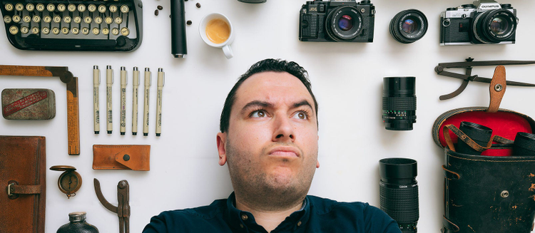
Roman Jusdado isolates all sorts of creative objects to give new levels of customization to Creative Cloud users. Image Credit: Roman Jusdado.
As a designer and photographer, Roman Jusdado has combined his creative skills into crafting and selling mockups under the brand, Custom Scene. His work consists of highly customizable scenes and impressively detailed mockups to help other creatives showcase their content and designs. Adobe Stock recently spoke with Roman about his formative experiences, what inspired him to start Custom Scene, and tips he has for anyone looking to present their work in the best way.
What’s your background? What did you love to create when you were growing up?
I’m a self-taught digital artist and photographer. I spent most of my childhood in France, where I was influenced by the art and comics culture. The only thing I would read as a kid were comics, and I watched a lot of cartoons! What fascinated me was how artists had their artwork perfectly inked and colored — I wanted to do the same for my own drawings!
What was your past relationship with Adobe products? Which apps do you use the most?
I love drawing, photography, filmmaking, animation and more, so I started to play with most of the tools that Adobe offers. It started first as a playground, just having fun with the tools. But I quickly realized I could make a living from it.
I use Photoshop on a daily basis. Not only is it the cornerstone of Custom Scene, but it’s a great tool to create product pages, presentations and graphics for my social media. For all the product photos that I take, I use Lightroom. Now I can edit pictures from my iPad Pro and that’s a blast!
Tell us a little bit about your work – what got you started making mockups and scenes?
Mockups and scenes weren’t what I worked on at first. Most of my client work was for digital illustrations. Back when I had to present a sketch or final artwork to a client I would prepare a little presentation or mockup. I posted some of my work on Dribbble and most people loved how I presented the artwork.
That got me thinking… instead of selling my own artwork, why not sell how I present it? So that’s what I did, create mockups. What really got me into Custom Scene is a comment about one mockup I got: “I like these mockups, but can I have one without the notepad?”. That was a lightbulb moment! Realizing that most stylized stock photos or mockups are great by themselves, but aren’t curated to customer needs.
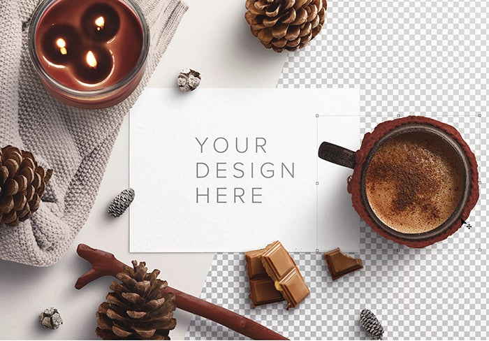
Winter Cozy Scene Creator Mockup by Custom Scene.
Where do you get ideas for scenes? What places give you new inspiration?
Since I started learning photography and styling scenes, I discovered that I like home/workplace décor. Home décor photography is a great source of inspiration for color schemes, materials used, texture, composition, lighting, everything!
In the UK there are a lot of craft fairs and charity shops. Seeing other artists’ handcrafted and vintage items really inspires me. Behance, Dribbble, Desinspiration, Pinterest, and Instagram, are good too. Although I could spend hours browsing on those websites, I try to limit the time I spend on them. I use them to unblock a design problem to see how other artists have overcome it, or to educate myself in new spaces when I create work for a new audience. Walks in nature are another way I get inspired. I like to take my camera when possible, this way I’m able to capture those inspiring places. There is nothing like nature to hit that reset button of creativity.
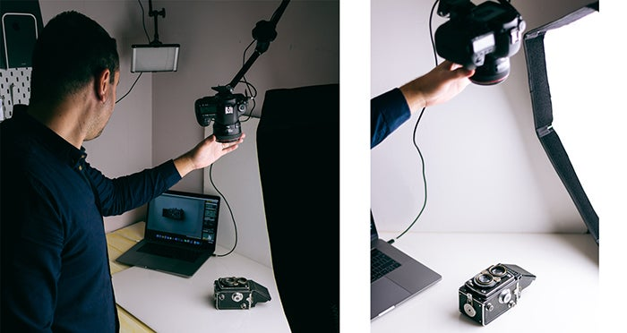
Roman shoots subjects from multiple angles to be able to isolate them in Photoshop as highly editable objects.
You seem to understand space and layout very well – what advice do you have for creatives and their work?
Oh, thank you! I do what most designers do – I move shapes and objects around until I judge it looks good. I have learned a few things along the way:
- Negative space: We all know what it is, but we often forget about it, and it is crucial in design. If you don’t let your design “breathe” with negative space, it’s like all the effort you have spent on your design would have been wasted.
- Simplicity: it’s easier to pull off a design that is chaotic or cluttered instead of keeping it simple. If simplicity is done the right way, your work will have greater impact.
- Balance: Would your design look ok if you rotated it 90 degrees or 180 degrees? If it doesn’t, it could be because it is not balanced. Shift elements around to keep your design as balanced as possible.
Presentation is key! Don’t just create a template and expect people to imagine how they would use it, Showcase it, put in examples, and blow their mind on how they could use your work.
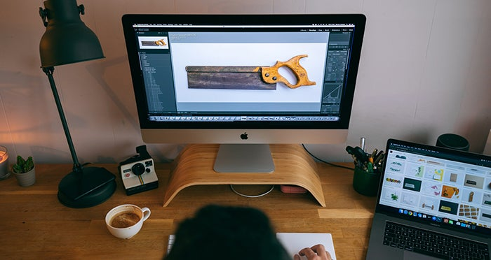
Roman edits the individual objects to showcase impressively detailed levels of texture, color, and shadow.
What do you think is the hardest part about creating new work for Custom Scene? What do you hope users get out of your work?
Being versatile has been a challenge. I like my products to have longevity, something that people will enjoy using in different projects for a long time. That adds a lot of value. I like to imagine Custom Scene as something that empowers artists to improve their creations – something that that helps you focus on doing what you love without the hassle of finding ways to present it. A lot of my current customers tell me their work has never looked so good, and that makes me want to keep doing it.
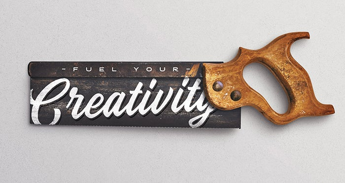
Handsaw Mockup by Custom Scene.
Take a look at Custom Scene’s mockups on Adobe Stock, including this free Wooden Frame Set and free Paper Goods Set for Photoshop.