New Fonts to Try in the New Year
454 additions to the Adobe Fonts library included with Creative Cloud subscriptions.
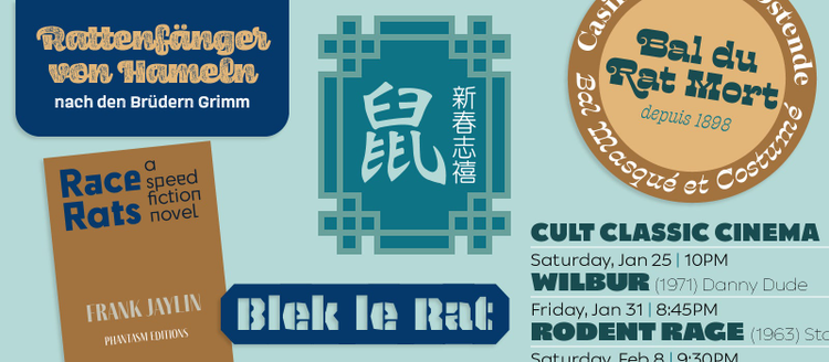
Why don’t you make one of your New Year’s resolutions trying out new typefaces? Your Adobe Creative Cloud subscription has you covered — discover the 36 typefaces and families that can be activated at no extra cost. We welcome two new foundries, Arphic Types from the Taiwan region brings digital typefaces with extensive Chinese support to Adobe Fonts, and Berlin-based supertype seduces us with their striking type stylings. Additionally, the library has been stocked with new typefaces from familiar foundries — as well as expansions of existing families — all already licensed for personal and commercial use with Creative Cloud.
Arphic Types adds new options for Chinese
Adobe Fonts welcomes Arphic Types, a leading global font and technology provider dedicated to the design of multi-language typefaces and the development of font-related technologies. This addition expands the selection of Chinese fonts in your Adobe Creative Cloud subscription. Fonts that carry the abbreviation B5 in their names indicate they support the Traditional Chinese character set, and fonts with the GB abbreviation support Simplified Chinese.
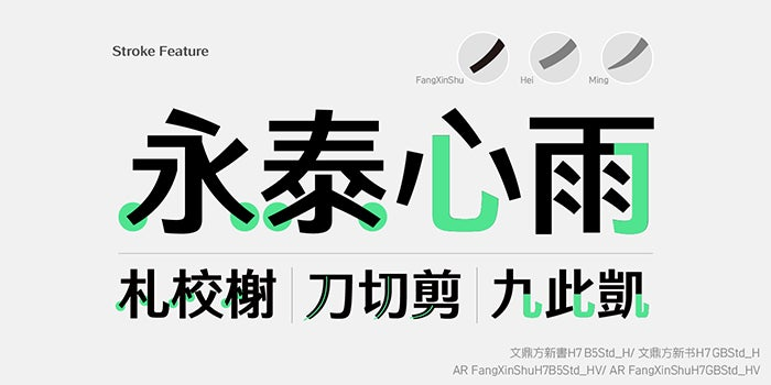
The width of AR FangXinShu’s strokes gradually decreases toward their extremities, adding a modern touch to the characters and improving their legibility.
The versatile AR FangXinShu injects the elegance of Mingti into the simple and steady design of Heiti. Its contrasted, slightly tapering strokes combine the best of both worlds, offering excellent legibility in large titles as well as in small text. AR UD JingXiHei favors simplicity, abandoning traditional design concepts and reducing decoration to the minimum to achieve maximum recognizability and clearness. Smooth curves and a lack of distinguishable contrast create a comfortable and stable reading experience. The rounded AR Yuan integrates Heiti’s features such as minimalistic stroke design and large counters. Elegant and strong, it differs from traditional Mingti and Heiti for being softer and well-balanced with a serious demeanor.
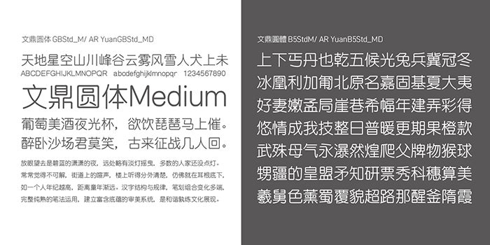
AR Yuan’s squarish shapes with rounded stroke endings give the typeface a contemporary, confident look that is both professional and personable.
The calligraphic AR Ming font family is geared toward the Chinese-speaking markets’ needs. With larger counters, rounded stroke endings, and a simple design concept, the typeface is a great choice for long-form reading in books, newspapers, and magazines. AR ShuLinSong’s characters adopt the generous counter structure of traditional Chinese Mingti. Their proportional shapes suit the reading habits of Chinese readers, especially for newspapers headlines, books, and magazines, as well as DMs and flyers. AR WeiBei is a modern interpretation of the traditional Weibei style, which has its roots in Chinese stone rubbings from the Northern Dynasties. This smooth, firm design achieves the perfect balance between hardness and softness.
Supertype joins with superb types
Berlin-based supertype is the joint venture of type designers Jürgen Huber, an alumnus of Erik Spiekermann’s legendary MetaDesign, and Martin Wenzel, KABK graduate and former collaborator of Petr van Blokland. When they are not developing custom fonts or designing typefaces for the retail market, they both teach typography at the HTW University in Berlin.
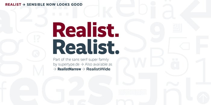
Realist is an all-round sans serif that brings clarity and eminent legibility to a wide range of applications on both print and screen.
Realist brings together grotesque and humanist traditions in a straightforward sans serif that speaks with a clear voice. Its efficient simplicity — or is it simple efficiency? — works wonderfully well in editorial design, corporate communication, product design, and any project where the message takes center stage. Alternates for key characters switch Realist’s tone from professional to personable.
Formerly one of FontFont’s showpieces, Wenzel’s best-selling humanist sans serif family Profile is now published through his own foundry supertype. With narrow shapes and open letterforms, the family of seven weights with matching italics is an economic and versatile, eminently legible typographic solution for the most diverse design challenges. The comprehensive character set with over 1,500 glyphs per font includes the Latin Extended, Cyrillic, and Greek alphabets, plus scores of typographic niceties like small caps, a wide variety of numeral styles, an extended ligature set, and arrows and pointers. Duper is Profile’s casual, carefree counterpart. Four versions for each character were drawn by hand on top of Profile’s skeleton to produce a mature, if not entirely serious, font family. Intelligent substitution technology working in the background alternates those versions for a true handwritten effect. Ode applies the same nonchalant but aesthetically sound method to the broken script model. This unorthodox approach resulted in a contemporary typeface with curvy and smooth features that is far more readable than the rigid conventional black letter types.
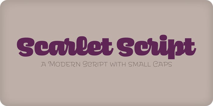
Scarlet Script, a connected script with opulent forms, is the bodacious, fun sibling of the top-heavy sans serif Scarlet.
Originally developed as the Glasgow School of Art’s custom typeface, Hothouse draws inspiration from letterforms by Charles Rennie Mackintosh (1868–1928), the school’s renowned architect. The (almost) monospaced square design explores the tension between strong right angles and floral-inspired decorative motifs with subtle curves. With interchangeable capitals and small letters thanks to their identical heights, this remarkable display face creates instant word logos on covers, posters, and packaging, and looks great in magazine design.
An admirer of the graphic language of the 1960s, Jürgen Huber imagined Scarlet as if it had been jointly designed by Alexander Girard and Aldo Novarese. The striking top-heavy display sans brings playful joy to the page or screen. As its name implies, Scarlet Script is its connected counterpart, with the same delightful disposition. Finally, Scarlet Wood offers three textured versions of Scarlet that look like they were stamped on a rough surface.
TypeTogether comes together with new type families
Veronika Burian and José Scaglione started collaborating as TypeTogether after they graduated from the MA Typeface Design course at the University of Reading. Since then, the independent foundry has grown into a major player producing high-quality custom and retail typefaces.
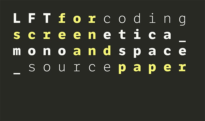
LFT Etica goes monospaced for all your programming and design needs.
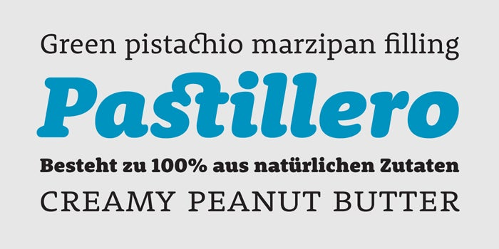
The Adelle superfamily includes the versatile and authoritative slab serif Adelle and its flexible and personable sans serif counterpart Adelle Sans. Ultra-thin weights were added for delicate, airy display typography, and condensed widths for Adelle Sans, for those situations when you need to fit those few extra letters or words on a line. With hints of typewriter typography, Trevor’s rounded corners make the economic slab serif come across as both strong and friendly, making it ideal for correspondence amongst others.
Catalpa doesn’t do “medium” — it offers four delicate thin weights and four powerful black weights for all your display needs.
Noort’s sculpted features lend the low-contrast serif face a robust and easy-to-read appearance. Elegant swash capitals and alternates and a set of fun cartographic icons are echoes of vintage historical maps. Portada is a serif family purposely created for long-form reading and excellent performance on screen. Optimized text weights and a set of handy icons make it a great pick for user interfaces and websites. And if you’re building those UIs and websites, LFT Etica Mono is the monospaced companion to LFT Etica that turns coding into a pleasant (and beautiful) experience.
The sparkling, script-like Lisbeth was built to infuse branding and packaging projects and magazines with spirit and charm. It comes with a quirky display style that livens up the page like a virtuoso jazz solo.
Drawing inspiration from historical types and reimagining them for the modern age, Temeraire offers some truly innovative stylings that will turn your designs into head turners.
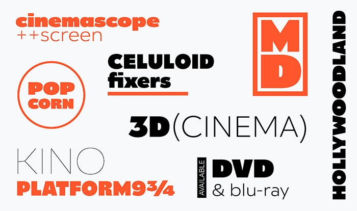
In the display font department, Fino and Fino Sans are a duo of contemporary titling faces with a dramatic contrast between thick and hairline strokes, which becomes even more pronounced in the title variants. They feature alternate letterforms and inventive ligatures that lend theatrical grandeur to editorial design, posters, and titles. Inspired by wood types, Catalpa’s wide letterforms give headlines gravitas. The typeface offers four super-thin and four punchy dark weights for maximum impact. Temeraire dives deep into typographic history and consolidates wonderful vintage type styles into a suite of arresting headline faces for books, magazines, and large format typography. Surprising styles, inventive ligatures and alternates, and arrows, symbols, and ornaments make the typefaces as fun to use as they are impossible to ignore.
Single typefaces from César Puertas, CJ Type, Underware, and Oh NO Type Co.
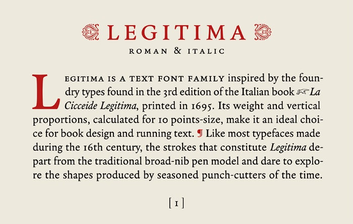
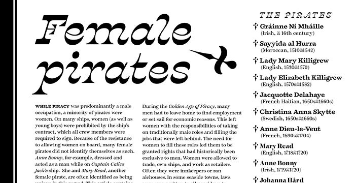
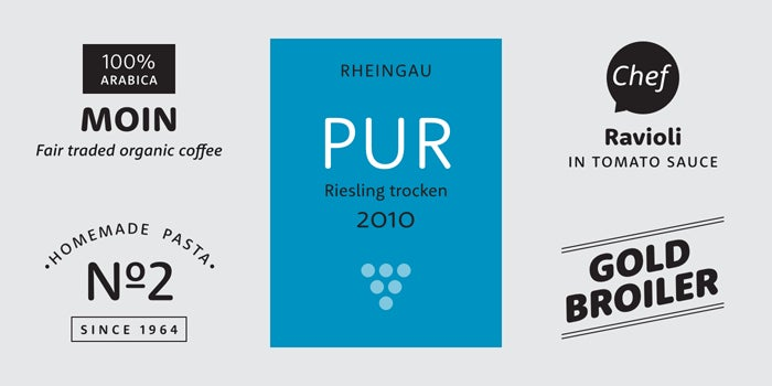
If you are looking for a well-balanced, hardworking book face, take a look at Legitima, superbly suited for immersive reading.
Colombian graphic and web designer César Puertas graduated from the Type & Media postgraduate master course in 2009. Legitima, his latest addition to Adobe Fonts, is inspired by 17th-century Italian book types. It has a moderate contrast, and its weight and proportions are optimized for a 10-point size. This makes the typeface a prime choice for running text in books, magazines, and newsletters.
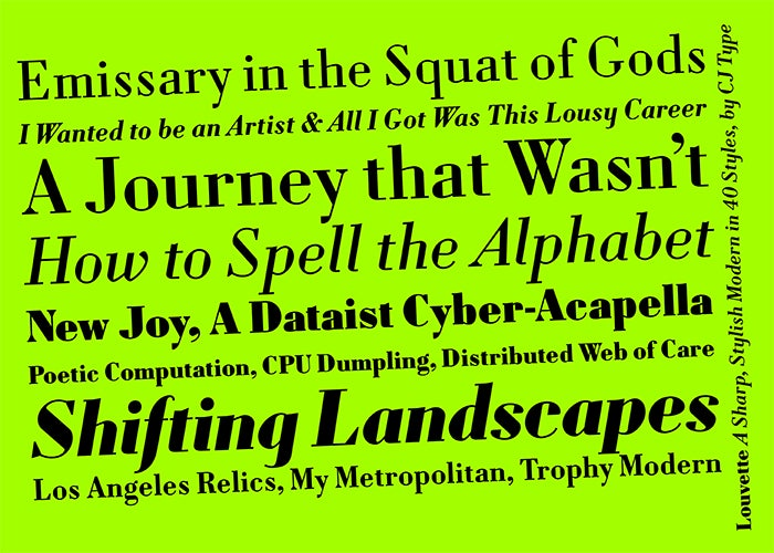
Contrasting tense curves against straight lines, Louvette creates a crisp text image.
In development for over eight years, Louvette is CJ Type’s second release. The serif face has a high contrast between thick and thin strokes. This contrast becomes increasingly dramatic in its four optical sizes, from the serviceable Louvette Text over Louvette Deck and Louvette Display to the scintillating Louvette Banner. Its surprising design featuring straight lines inside counters and abrupt cuts lends Louvette a unique flavor.
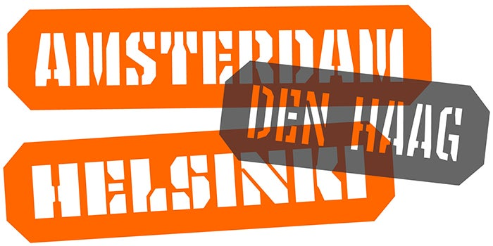
With several options of initial and terminal shapes, Tripper’s newly added Stencil weights create instant banners and cartridges with reversed-out text.
Underware designs typefaces that push boundaries, both aesthetically as technologically. Tripper, their exciting take on stencil faces, was already included in your Adobe Creative Cloud subscription. Drawn solely with straight lines, the letters in this forceful display typeface become wider as the six weights progress from light to black. Besides the “clean” cut, Tripper offers a textured rough variant that mimics spray-painted stencil graffiti. Now they have added a stencil version with letters punched out of solid background fields, allowing the user to easily produce ready-made banners and cartridges with text.
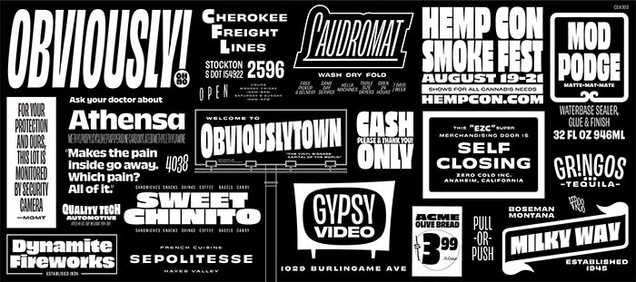
Obviously’s 96 styles guarantee that there is a weight and width — upright or slanted — of the cheerful sans serif for any imaginable setting.
Oh NO Type Co.’s typefaces always brim with personality. Obviously’s exceptionally large x-height and soft finish lends the sans serif a good-natured, joyous air. Its impressive breadth — six widths from the extremely narrow compressed to the generous extended, each in eight weights with matching italics — means the 96-style family can be deployed in many varied applications, from the largest display uses to the tiniest text.
Fonts with Latin charm from Sudtipos
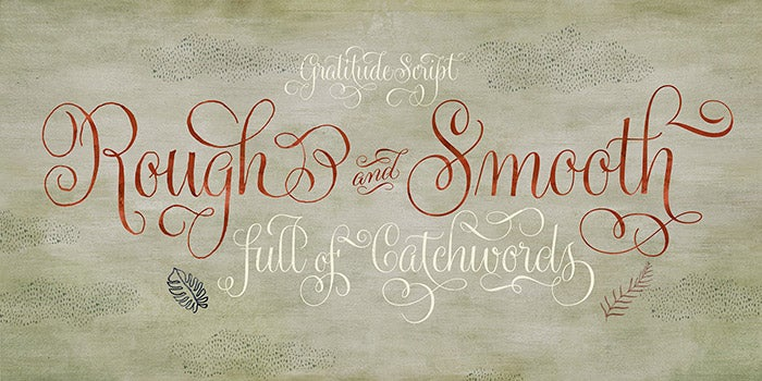
With Gratitude Script, you have your own professional calligrapher to embellish cards, invitations, and social media posts with breathtaking handwriting.
Argentinian type foundry Sudtipos adds three script designs to its considerable collection of fonts based on handwriting, calligraphy, and sign painting. The chubby, rounded Merengue Script looks painted rather than written. Its delicious curves and flowing flourishes evoke images of chocolate, ice cream, and pastries. A multitude of variants makes it possible to compose logos on the fly. Use it in advertising and on packaging to suggest flavor and friendliness. Gratitude Script is an elegant script offering a wealth of swirling swashes, ornaments, and catchwords. Countless alternates, ligatures, and initial and terminal variants make it possible to finesse your greetings and invitations down to the last detail. Sudestada balances between calligraphy and casual scribble, with rough outlines that emphasize its cheerful attitude. The loosely written letters jump and dance on the baseline, creating a high-spirited, fun atmosphere.
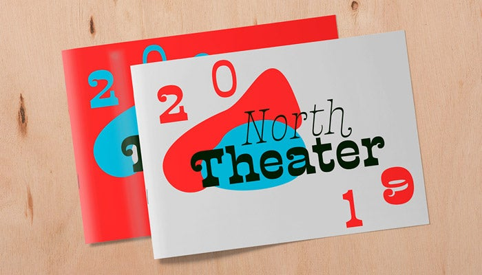
The ornamented top curves in the heaviest weights, reminiscent of the King of Rock ’n’ Roll’s signature coif, were the inspiration for Presley Slab’s name.
But Alejandro Paul and his collaborators do more than just script fonts. Landa is a modern interpretation of the earliest serif faces from the 15th century. Its angular letters, full of energy and personality, carve the text on the page or the screen. Discreet in smaller sizes, the typeface reveals its sculpted, expressive calligraphic shapes when used big. Presley Slab flips the world sideways by packing most of its weight in the horizontal strokes. The display face’s personality changes gradually from an ornamental typewriter-style design in the thin weight to an idiosyncratic Wild West slab serif in the black weight. Fun and funky, this exuberant design will liven up posters and packaging as well as covers and editorial projects.
Jan Fromm adds a duo of serif and sans serif siblings
German communication designer Jan Fromm sees typography as a fundamental visual component of graphic design. After attending Luc(as) de Groot’s classes, he has been working as a freelance type designer since 2003.
Even though they were developed to be used independently, Rooney and Rooney Sans perfectly complement each other to form a serious yet friendly type system.
With Rooney, Fromm created a typeface with rounded serifs and stroke endings that doesn’t become too playful or trivial. The design dresses the old-style serif construction — with open letterforms and a moderate contrast — in soft shapes and gentle curves. These properties make text look warm and smooth without taking away from its seriousness. Rooney Sans complements its serif counterpart. While it was developed as a standalone design, it shares the same construction and has identical weights, allowing users to apply the two typefaces in tandem for designing complex projects like newsletters, annual reports, corporate publications, branding and packaging, and other professional communication.
Stay ahead of the curve by starting the new year with new fonts. Activate some of the above typefaces and discover the myriad of typographic possibilities that they bring to your design work.
