How Simoul Alva Makes 3D Design Her Own As A Young, Talented Visual Designer in NYC
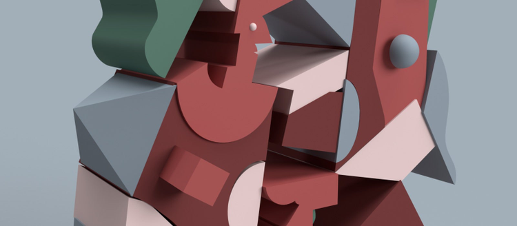
Just like Adobe Dimension itself, Simoul Alva makes impossible things happen. The 23-year-old designer and art director didn’t need to wait for graduation to begin

This fall, she landed a position as a visual designer at one of the most exciting agencies in our industry, founded this past summer by a young (but already legendary) entrepreneur. I’m talking, of course, about &Walsh, founded and directed by established industry powerhouse and tastemaker Jessica Walsh.
Before &Walsh, the Mumbai native had already clocked hours at Samsung Research America and Pentagram, among others. All this while also finishing up her Bachelor’s degree at India’s prestigious National Institute of Design in Ahmedabad. Read on to learn more about Simoul and her passion for 3D design, and also check out her tutorials on how to use Dimension to visualize a dynamic brand identity and re-create and reimagine timeless pieces of modern art.
A unique “intersection of craft, insight and experimentation”
Simoul says that it was open-minded experimentation that lead her to discover the power of 3D design; prompted by nothing but her own curiosity.
“When I stumbled upon Adobe Dimension on the Creative Cloud bar, I did something I had never done before. I opened up an unknown software, solely based on the description. I have been having the best time ever since.”
About introducing 3D into her daily practice, Simoul says: “It was like learning how to draw again. I would experiment by making renders everyday, simple ones, and slowly joining the dots to make more complex executions.”
Her first commission to work in 3D was for Wieden+Kennedy, in Delhi.
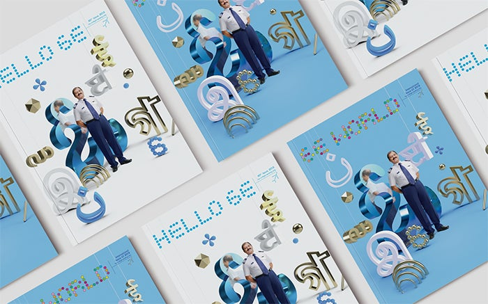
Simoul’s first commission in 3D from Wieden+Kennedy New Delhi: a cover illustration for airline IndiGo’s in-flight magazine.
“I always try to surrender and imbibe the approaches I come across while working with different people. This influences and adds to my problem solving skills everytime I take on new projects. The great thing about all the places I have worked with is that I was given a lot of freedom and responsibility to come up with ideas and try new things. That’s how I pitched Dimension; as a solution to the briefs I thought it would work well for and presented possible solutions using the tool.”
“Until that point, it was extremely experimental and didn’t really have to communicate. Over time I find myself being more confident about using the software and what I can achieve with it.”


Simoul created these designs inspired by the works of art by prominent 20th century painters, using Adobe Dimension. On the left is her 3D creation inspired by Henri Matisse’s Cut-Outs and, on the right, is her 3D creation inspired by Picasso’s Harlequin and woman with necklace.
Let’s take an updated tour of where 3D is taking Simoul – or we could say, let’s take a tour of where Simoul is leading the field!
Editorial illustrations in 3D
By keeping her rapidly-evolving work updated on her website and on Instagram, and by actively pitching visual systems in 3D, she attracted the interest of publications looking for 3D editorial illustrations, such as The New York Times, The Atlantic, and of course, WIRED.
“Sometimes clients reach out to me for my style and aesthetic in 3D design for editorial commissions, sometimes I have built a visual solution using 3D as a potential concept. It’s been a mix of reaching out myself or being reached out to.”

New York Times editorial illustration, the cover of the Thursday Styles section, from Nov. 20th 2019.
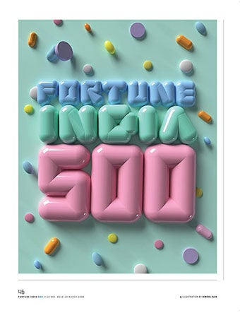
Editorial illustration by Simoul Alva for Fortune India.
As for reasons why her style may have stood out to employers: “My graphic design background influences my sensitivity to color, form, and composition, while my problem-solving background helps me find the right applications for 3D to create a tone of voice that makes it feel effortless.”
Effortless — a good word for many successful editorial illustrations; like daydream images, holding a few thoughts about a subject in our heads while we consider the points the author is making. This is something Simoul naturally grasps, and it bears repeating:
“[Working in 3D] makes impossible things happen, which is incredible for illustrations because it gives you freedom to express ideas and metaphors.”

WIRED editorial illustration by Simoul Alva.
So, is this new interest in 3D editorial illustration a passing phase, that Simoul will remain one of the sole artists to benefit from? She doesn’t think so. She says it’s “becoming more and more democratized as a medium” and “increasing in accessibility.”
“Design is always a reflection of the technology we have around us. Right now because of the growing applications of augmented reality and virtual reality, 3D is becoming an extremely powerful tool to have in the box.”
Of course, one of the best benchmarks for success is client/consumer response. A message that we’re getting loud and clear from designers who have been executing client work with Dimension, is that this has been a consistently validating aspect. “[They’re] pleasantly surprised by what it can achieve,” Simoul observes. “Sometimes they have particularly asked for the style, and are amazed when I share a preview with them that lets them rotate and explore the 3D model.”
“The idea of looking at an artwork from different angles and freezing angles that work for you, never ceases to amaze me. That changed what iteration means to me forever. It also made me a lot more strategic in approaching building an artwork. 3D as a medium is so versatile from being absolutely realistic to extremely stylized. This spectrum allows for so many outcomes. I enjoy having that kind of freedom in my work now and create with that.”
Ready to make your own discoveries in Adobe Dimension?
Simoul has been gracious enough to take on two different projects for the Adobe Blog, providing a wealth of opportunities to learn from her processes:
Holistic 3D brand design walkthrough
This one is a must-share. Simoul has gone above and beyond our usual tutorials, featuring designs within designs, and creating a thorough picture of an entire (fictional) brand identity, titled simply: Eco.
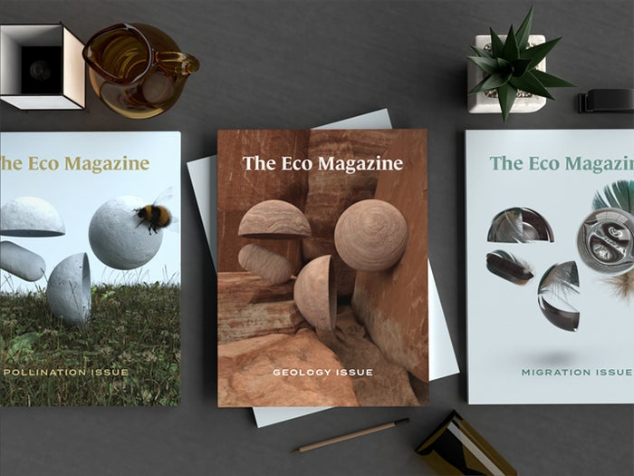
Original assets for Simoul’s fictional lifestyle brand, Eco.
It’s an app, it’s a magazine, it’s a website — it’s a lifestyle. More than a basic tutorial, in it you can watch clips of Simoul creating a magazine cover at an Adobe Max Live session, and learn step-by-step from how she conceives of all aspects of this type of extensive presentation — including a Keynote at the end. Check out the tutorial here.
Reimagining 20th century fine art tutorial

Simoul’s original animation, inspired by modern artworks by Herbin and taking her static image one step further. Animation created in Adobe Photoshop by using 25 renders made in Dimension and sequencing them in different frames.
In our continuous curiosity about the infinite ways Dimension can be employed to redefine our relationship to design, and art in general, we asked Simoul to reimagine works from four prominent 20th century painters: Auguste Herbin, Henri Matisse, Giorgio Morandi, and Pablo Picasso.
Some of the best of these new assets have been featured in this article. If you’re interested in learning about her approach, check out her new tutorial.
You can try out what she’s done, or use this material as inspiration to do your own thing. As Simoul says, “the sky’s the limit!”