Pantone’s Palettes Conjure Romantic, Royal, and Heavenly Moods at NYFW
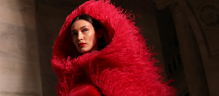
Image source: Caitlin Ochs/Reuters / Adobe Stock.
When Pantone unveiled Classic Blue as the color of 2020, Laurie Pressman, Vice President at the Pantone Color Institute, described the hue as a “reassuring presence, instilling calm, confidence, and connection.”
Perhaps that reassuring feeling comes in part from how ubiquitous it is: it has been described as the color of blueberries and the color “suggestive of the sky at dusk,” according to Pressman.
In the 20 years since the “color of the year” trend started, Pantone has often gravitated towards blue: their first color of the year, back in 2000, was Cerulean Blue. Then came Aqua Sky (2003), Blue Turquoise (2005), Blue Iris (2008) and, in 2016, Serenity (a pale blue hue that shared the 2016 title with Rose Quartz). Classic Blue is a darker shade that is noticeably warmer than Blue Iris and not as saturated as Aqua Sky or Blue Turquoise.
Yet, its discreet nature does not make it dull. Far from it. Classic Blue seemed to be everywhere during this February’s New York Fashion Week, and the creations of designers such as Carolina Herrera, Jason Wu, and Rodarte clearly showed that the shade can lend itself to myriad interpretations in fascinating dialogue with history, art, and literature.
Harmonious

Image source: (left) Caitlin Ochs / Reuters / Adobe Stock; (middle) Katarina Simovic / Stocksy / Adobe Stock; (right) Idris Solomon / Reuters / Adobe Stock.
At New York Fashion Week, Classic Blue does not exist in a vacuum; monochromatic collections are rare, overall. In Pantone’s Fall/Winter 2020/2021 color palette, its complimentary color is Amberglow, an orange, and the two work well together as we saw in the past years with Tibi, Marni, Delpozo and this year with Carolina Herrera, who created a pattern consisting of a light-blue floral motif on top of an orange background.
Also part of the palette is a deep, rich red called Samba, and it shows how easily red and blue pair together: without necessarily going down the patriotic route, a bright or deep red lipstick works wonders with a blue outfit: Oscar de la Renta had Bella Hadid outfitted with a bright blue coat worn over a red ensemble, while Marc Jacobs had models walking side by side wearing similar styles in blue, off-white, and deep red: both examples show how these two colors work together within the same collection.
Part of the NYFW palette is Ultramarine Green, described as a “deep, cooling blue green.” Tadashi Shoji and his use of green gloves paired with blue coats immediately comes to mind, while Ulla Johnson used a similar hue (plus a coordinate bag that is as close to Pantone’s Green Sheen as it can get) to conjure a 1980s power look.

Image source: Caitlin Ochs / Reuters / Adobe Stock.
Millennial-favorites such as the “millennial pink”-adjacent dusky pink Rose Tan and its warmer counterpart Peach Nougat are still well represented in fashion shows, Oscar de la Renta has a reinterpretation of the ball gown in a Rose Tan-like pink, for example, and it does not look more demure or less dramatic than its blue equivalent. Likewise, Jason Wu’s Peach Nougat-like feathered gown conjures the same fin-de-siècle reverie as its blue counterpart.

Image source: Caitlin Ochs / Reuters / Adobe Stock.
While Classic Blue provides a good canvas for bolder hues to pop, it can clearly stand as a bold and thought-provoking hue all on its own.
Royal

Image source: Caitlin Ochs / Reuters / Adobe Stock.
Carolina Herrera’s blue ensembles have an aristocratic feel: her blue billowy gowns alongside skirt-and-blouse combinations look regal or, simply, powerful.
Similarly, Oscar de la Renta’s blue creations, such as the reinterpretation of a ballgown and his column-like dress with patterns inspired by Van Gogh’s Starry Night evoke a Hollywood type of royalty.
This is fitting for a color like blue: Starting in the 12th century, in fact, blue became associated (not necessarily in this order) with the Virgin Mary, King Arthur, and French heraldry: just to make one example, the historical coat of arms of France, which started appearing in 1211, consisted of golden fleurs-de-lys on a blue field (known as “azure” regardless of the shade), and was used continuously for nearly six centuries, until 1792.
Romantic

Image source: Caitlin Ochs / Reuters / Adobe Stock.
Drawing inspiration, per the show’s notes, from orchids and Austrian expressionist Egon Schiele, Jason Wu created an ethereal blue gown complete with a bow tied behind the model’s neck and a cascade of feathers of the same hue adorning the skirt.
For their Fall 2020 collection, Rodarte drew inspiration from the early 1800s The result is an imperial-style wedding dress with a sky-blue train and an elf-like gown punctuated by dark-blue flowers. For its F/W 2017 show, Dior outfitted the models with dark blue tutu-like skirts, paired with chunky, color-coordinated sweaters. “Romantic” is the word that best describes the collections.
When it comes to color schemes, historically, blue and romanticism go hand in hand. Werther, the morose protagonist of Johan Wolfgang Goethe’s 1774 novel The Sorrows of Young Werther, famously wore a blue jacket when he first danced with his love interest Lotte, and, throughout the century, young men would imitate that fashion. Another great romantic hero, the writer and poet Novalis, wrote, in his novel Heinrich von Ofterdingen about a troubadour who is looking for a blue flower that appeared to him in a dream. This symbolized the ideals by which a Romantic aimed to live.
Heavenly

Image source: (left) Zoa Photo / Stocksy; (right) imageBROKER / Adobe Stock.
Japanese-American designer Tadashi Shoji clad his models in blue outfits that, according to the show’s notes, suggested a medieval east-meets-west vibe. For a modern twist, their eyelids were painted a vivid blue, giving them the appearance of creatures from outer space. This bold choice recalls both Pantone Classic Blue and the longstanding connection many artists have seen between blue and the vast sky.
Russian abstract painter Vassily Kandinsky was keen on examining the significance of color in terms of spirituality and in their relationship to music. “Blue is the typical heavenly colour,” he wrote in his book Concerning the Spiritual in Art. “The ultimate feeling it creates is one of rest. When it sinks to almost black, it echoes grief that is hardly human.”
Yves Klein (who famously created the electric color “International Klein Blue”) had a similar predilection for the color, a unique fascination with the sky, and a contempt for birds: “I have hated birds ever since for trying to make holes in my greatest and most beautiful work! Birds must be eliminated,” he wrote in an artist’s statement.
Among contemporary examples, in parallel to Fashion Week, the immersive digital art space Artechouse unveiled “Submerge,” an installation consisting of floor-to-ceiling abstract animations all celebrating Pantone Classic Blue.
Its intent? “Centering our thoughts, aiding concentration and fostering resilience.”

Image source: Idris Solomon / Reuters / Adobe Stock.
How will you use Classic Blue and Pantone’s exclusive New York Fashion Week palette in your next project? Check out our gallery for more inspiration on Adobe Stock.