Color Your Spring with Adobe Color Gradients
Gradients, new color harmony rules, and a slick responsive design for mobile.

Photo by Adobe Stock / Simone.
Spring is a time for inspiring natural colors and Adobe Color offers new tools to make the most of that inspiration. Collect these colors and bring them to Adobe Color on the web to extract them for harmonized color themes or smooth seamless gradients. Take advantage of our three new color harmony rules to make easy, cohesive color choices for your projects and designs.
Make the gradient
Gradients are one of the most powerful and versatile design components. They can add depth to illustrations, impactful color to your designs, or elegantly enhance UI. Finding a color combination and creating a gradient can be a tedious experience. The Adobe Color team has been hard at work developing easy but powerful gradient extraction tools.
Drop your image into the Extract Gradient tab, and our algorithm will automatically try and find a pleasing gradient in your image. If not to your liking, just click and drag on the photo to resample for a new color combination.
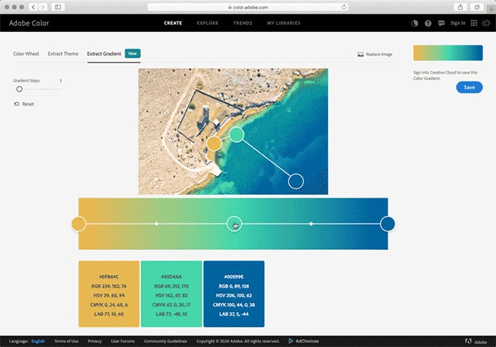
Photo by xbrchx / Adobe Stock.
If you are particular about where the colors in your gradient are, you can edit the color stop position as well as the midpoint position to get exactly the color blend you want. Add color stops for a maximum of fifteen different shades or remove them down to a minimum of two.
With the addition of gradients to the Adobe Color website, you can now find the beautiful things you create in My Libraries
New harmonization rules
Adobe Color offers three new harmonization rules to help you create the perfect color theme for your design needs. These harmonies make it easy to pick color themes with even more robust harmonization options.. Use the brightness slider on individual swatches for even more range to your color choices.
Split complementary
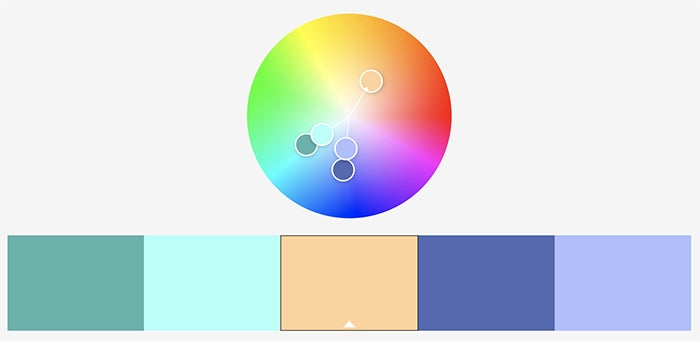
This harmony rule adds two complementary colors from the base color. Play with the angle of the split as the symmetric angle will stay intact, closer together provides similar colors, while a wider angle will give more contrast between the secondary shades.
Double split complementary
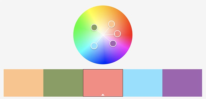
Using this rule gives you two pairs of complementary colors spaced evenly around your base color. Add more contrast by using the angle of the pairs to move from similar to contrasting colors. Double split complementary is great for cases where you need a lot of contrasting colors to your palette.
Square
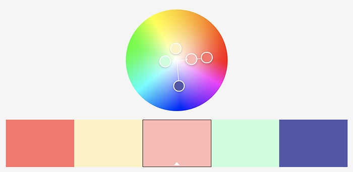
Square color harmony uses a set of four points equally spaced around the wheel, and a second saturation option for your base color. This color rule offers maximum color contrast options.
Meet us on mobile
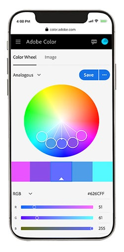
You won’t be able to create gradients on mobile yet, but in the meantime download Adobe Capture on Android or iOS and create them directly from the camera on your mobile device. We hope you enjoy our new mobile experience and please do reach out with feedback and feature requests.
Play the Adobe color game
In this time of social distancing and remote working, the Color team has been hard at work bringing you not just tools to enhance your creative and collaborative workflows, but also to have fun, compete with your friends, and encourage team building.
The Adobe Color Game is a fun and competitive color-matching web game that tests memory and color recognition. Earn points by correctly repeating the color sequences, and fine tune your ability to distinguish between similar shades of hue. Share your high score on Twitter and see who among your friends can master our tricky color wheel.

Image by Erica Larson.
#MadeWithAdobeColor
The Adobe Color team loves building color tools for our community. Chat with us on the web by selecting the feedback icon in the top menu and tell us what new color workflows you would like to see.
We are so excited to see what you create, and we would love to continue the conversation! While sharing your work on Behance, don’t forget to select Adobe Color under “Tools Used” for the opportunity so we can see the beautiful things you create. Be sure to tag them with #AdobeColor on social media.
As always, follow us through the Creative Cloud social channels (Facebook, Twitter, and Instagram) and on the Adobe Drawing Instagram!