Celebrate Global Accessibility Awareness Day with Adobe Color
Accessible design starts with color choice, and Adobe Color is creating tools to bring accessibility directly into color creation.

Photo by macrovector / Adobe Stock.
Building tools for accessibility

Image by petrroudny / Adobe Stock.
May 21 is Global Accessibility Awareness Day, but for Adobe Color, accessibility is on our minds 365 days a year. Color vision deficiency, more commonly referred to as color blindness, affects about 3-5% of the world’s population. When you add in contrast sensitivity, age-related vision degeneration, and other issues, this is a serious portion of the population that can benefit from accessible visual design.
When designing with color, it helps to think from the start about accessible design. Factoring in how your users perceive the color choices you are making early on will save you valuable time. Too often this step still happens after the color ideation phase, meaning that you have to go back to the coloring board to find new hues that work with your design concepts. Adobe Color is rethinking how and where designers make their accessibility checks, and bringing the process directly into the color wheel.
Conflict lines
For people affected by color blindness, combinations of certain hues and shades make it hard to distinguish between colors. With Adobe Color’s new accessibility tools, you can check your theme against the three most common types of color blindness: Deuteranopia, Protanopia and Tritanopia. Deuteranopia and Protanopia are both types of red-green color blindness. People with these types of color blindness have trouble distinguishing between reds, greens, browns, and oranges. Tritanopia is a type of blue-yellow color blindness and causes confusion between blue and green, purple and red, and yellow and pink. The accessible color wheel targets all three of these types of color blindness and provides a simulated view of how your theme will appear to those affected by each type.
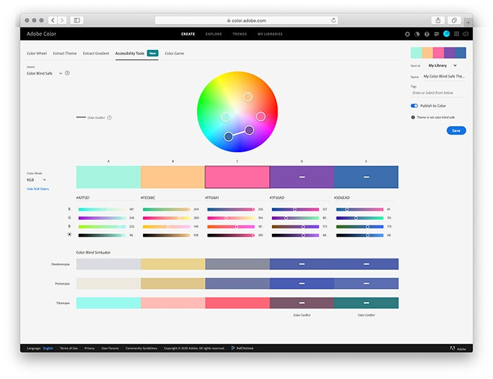
Using the accessible color wheel, problematic color combinations are flagged by our conflict lines, which highlight which swatches may be indistinguishable to someone with color blindness. This allows you to create color palettes with five swatches that are distinct from each other for your entire audience.
Conflict lines connect two swatches that are not distinct from each other for at least one type of color blindness. Check the simulator below the color sliders to determine how these colors will be viewed by people with the most severe form of all three types of color blindness.
Conflict guides
Now that you have identified which swatches have problems, you can easily resolve them in a natural manner using sliders or the new color wheel with our conflict guides, which appear on the color wheel when a swatch is activated with a click. When the mouse is pressed down three guide lines (one for each type of color blindness) emanating from the swatch help you avoid problematic color combinations for that color. By avoiding connecting any line to another swatch puck you will be able find colors that are not in conflict. Note you can also adjust the Brightness* slider to avoid a conflict too.

When you save a theme without conflicts from the accessibility tools, it will automatically be tagged and displayed with a badge indicating it was created with our accessibility tools. This allows you to quickly see which themes are color-conflict-free when browsing your libraries.
Building accessible tools
While we have been hard at work designing tools for accessibility, we have also been taking a look at how accessible those tools are. The Adobe Color website is now fully responsive, ensuring that the experience is comfortable and easy to use on a variety of devices.

Image by Golden Sikorka / Adobe Stock.
We know that navigating web content with accessibility tech can be a frustrating experience. For those who visit Adobe Color with mobile accessibility devices, we have made the design fully responsive, meaning it will perform well on a variety of screen sizes. Sliders and color fields can all now be changed with arrow keys for easy natural adjustments, and you can use tab navigation throughout the complete creative experience. We have also implemented a better flow for users who visit Adobe Color’s create tools with screen reading software, reducing the friction of navigating each section. If you visit Adobe Color with a screen reader or accessibility device, please let us know how you find the experience and what we can do better.
What’s next?
Next up we are working on accessibility tools for contrast, including text and graphic elements. We are also building workflows to help design themes for monochromacy and other kinds of color sensitivity.
We would love to know how you use the Color service, so please reach out to the team by selecting the feedback icon in the header menu. Let us know what features you want to see from Adobe Color.

Image by Aurielaki / Adobe Stock.
#MadeWithAdobeColor
We are so excited to see what you create, and we would love to continue the conversation!
While sharing your work on Behance, don’t forget to select Adobe Color under “Tools Used” for the opportunity so we can see the beautiful things you create. Be sure to tag them with #AdobeColor on social media.
As always, follow us through the Creative Cloud social channels (Facebook, Twitter, and Instagram) and on the Adobe Drawing Instagram.