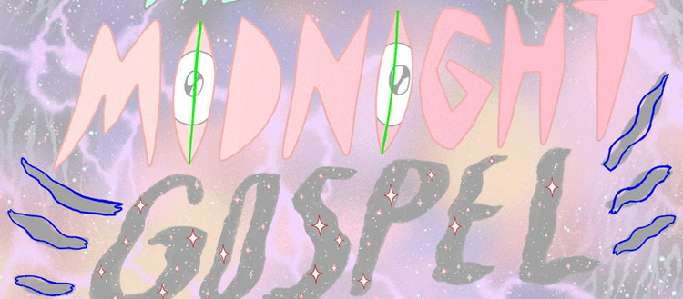
Midnight Gospel on Netflix Animated by Titmouse
Transforming a podcast to an animated series.
Popular imagination typically associates animation with children. Titmouse is known for bending the rules of engagement time and again, and they did it once again — this time with an adult animated series on Netflix. I got a chance to talk to Antonio Canobbio, chief creative officer for Titmouse, and Mike L. Mayfield, supervising director for “Midnight Gospel.” Here is an excerpt.
Tell me a little bit about yourself and your association with the animation industry.
Antonio: I started in the animation industry knowing absolutely nothing about it. All I knew was that I drew a lot and loved cartoons. Learning on the job isn’t necessarily the best way to go. There is a great deal of “paying dues” attached to it. Only after joining Titmouse and getting my hands dirty in all areas of making cartoons did I fall in love with the process. I got to art direct shows like “Metalocalypse,” “Black Dynamite,” “Motorcity,” “Niko and the Sword of Light,” “Little Big Awesome,” and “Nerdland,” to name some. And lucky me, we are making plenty more these days.
Mike: Animation is all I’ve ever wanted to do, and I’ve always been obsessed with what makes something funny. I’ve made comedy cartoons my whole life (as a kid, flipbooks) and still make shorts for fun whenever I can. In 2003, I got my BFA in animation from the University of the Arts and started my first job at “King of the Hill.” Since then, I’ve been lucky enough to work exclusively in adult animated comedy, and for over a decade in some sort of directing capacity. I knew of Titmouse since the birth of the studio, but finally got to work with them in 2010 when I directed season one of Brad Neely’s “China IL” for Adult Swim.
What is your role on “Midnight Gospel?”
Antonio: There are no templates for a show like this one. So I worked with Pen, Duncan, Mike, Jesse, and Elle discussing processes — helping from shaping teams, guiding art, to reviewing final footage.
I worked most closely with Jesse Moynihan, the art director, discussing his vision and making sure it was carried to the final picture. I miss working with this genius.
Mike: I was the supervising director, as well as a writer (alongside creators Pendleton Ward and Duncan Trussell, with a few others). I at least dipped my toe into every aspect of the production, both to make sure everything was aligning with the creators’ vision and because I honestly find every step really fun! During production, I might weigh in on BG paintings in the morning, animate a shot over lunch, and then sit in on an audio mix in the afternoon. It kept my days amazingly varied, and I had the honor to be in the trenches with brilliant, creative minds in every department.
How did the idea for “Midnight Gospel” come about?
Mike: Pen and Duncan could detail the very beginning, but Pen was a fan of Duncan’s podcast (“The Duncan Trussell Family Hour”), and the two met over coffee to discuss ideas for a cartoon. Both of their minds work in such fun, interesting ways that it’s no surprise a show so unique and special came out of that initial meeting! I was brought in pretty early, and when I started, they had concepts for Clancy’s world (the Chromatic Ribbon) and a bunch of potential apocalypses he could visit in his universe simulator. From there, we dug in with the storyboard artists, Storyboard Supervisor Joey Adams, and Editor Megan Love to assemble these disparate puzzle pieces into full narratives. At every stage, we added gags, and (with the guidance of Art Director Jesse Moynihan) some really wacky beautiful art. It wouldn’t exist without Pen and Duncan, but they were also so gracious about letting go and allowing the series to be truly collaborative the whole way toward a final product.
How does this idea differ from other (traditional) animated series? What made you want to work on it?
Antonio: When those two guys, Pen and Duncan, walk into your shop with a show, you know it will be different, you know you’ll have fun. You don’t say no. Netflix did the same thing.
Mike: In so many ways, “The Midnight Gospel” is experimental TV. Although I’ve worked on plenty of sitcom-style shows, I personally lean toward oddball projects and how to make a functional, watchable show within unchartered territory. Animating to real interviews has been done, sure — but to my knowledge, never in such a way where what’s appearing visually only has tangential or symbolic ties to the conversation. We really wanted to construct ecosystems that felt unique and whole, whether that was inventing the entire life cycle of parasitic clowns or a hellish “Groundhog Day” prison break. I’d argue that these episodes, regardless of the podcast conversation, still function as engaging narratives and are only further elevated by the insights the characters discover as they discuss some big and heavy topics.
Each one of the TV shows you do has a different look and feel. Tell us a little bit about the approach you took for this particular series.
Antonio: I’ve seen companies fail because they are trendy and don’t renew themselves. I make sure we don’t repeat work we’ve done so we stay fresh and it’s more fun! Pen had the same idea, I think. He did not want to create another conventional TV show and repeat what he had done in the past. This took time and effort ahead of production to develop this concept into a show. We had some form of originality to every step of the production to fit our needs.
Mike: Not only did we work hard to distinguish “The Midnight Gospel” from other shows, we also knew right out of the gate that Clancy would visit different planets that each needed a distinct visual flavor. To unify them all for the series, we wanted everything to feel handmade and minimize anything that looked too digital or computer-generated. Art Director Jesse Moynihan did a lot of concept art with gouache and air brush, and the look he achieved with these physical-world techniques was constantly referenced for the BG paint style. We knew we wanted the character animation to inhabit these gorgeous pieces of art in an integrated way, so we developed a process to get digital vector lines looking like gritty colored pencil and solid-color fills to include real paint and paper textures. We mostly animated on threes (three drawings per second) because lowering that rate makes the movement feel more tactile and less digital, and we included airbrush “puffs” on animated props wherever possible.

How did Adobe Animate help you achieve this?
Antonio: Pen was very clear about letting the animators be creative and infuse ideas into the animation — pretty moments, I call them. At Titmouse, we have various tools to make these ‘pretty moments.’ Adobe Animate was the perfect canvas to free animators and letting them animate fully in house — in the U.S.!
Mike: For the textured lines and fills specifically, we did rough animation and then cleaned up using the paint brush tool in Animate (guided by Animation Director Mike Roush). Then, we did an elaborate “secret recipe” in After Effects (developed by Compositor Nicolas Mermet) to separate the lines from the fill and composite each with a different stack of effects. This got us the gritty colored pencil lines with paper and paint textured fills. For BG painting, we were able to use Photoshop to mimic all the real gouache and airbrush concept art made by Jesse, and we took textures from Photoshop into Animate to make props feel more tactile and handmade.
What else are you excited about in the near future?
Antonio: Getting back to the office and seeing people face-to-face would be nice, for one.
We’ve been inundated with cool projects lately, even since before isolation. I’d be curious to compare the number of animated projects in production today, to the one 10 years ago for the industry in general. It must be staggering.
Most importantly, I’ve witnessed a shift coming from platforms and networks, and I believe they’ve recognized the need to take risks in order to get ahead. “Midnight Gospel” is a perfect demonstration of this courage.
We are looking at more original work and content with a point of view. I’d say that’s exciting!
Mike: Adult-animated comedies, especially more challenging and thoughtful shows, have only increased in numbers recently, with more and more variety in tone, style, and point of view. I’m excited just to see what comes after a show like “The Midnight Gospel!” I’m hoping the decision-makers keep green-lighting unconventional pitches. I’m hoping shows like this keep inspiring young artists to be the ones to pitch genre-bending cartoons and work their way onto teams making out-there, creative stuff. And I’m hoping the diversity among creators keeps expanding. I think we’re seeing all of these things happening. With the huge and scary problems the world is facing, it’s at least cool to be so excited about the artform of animation, where it will venture next, and how it will find new ways to connect with people emotionally.
At Adobe, we believe that everyone deserves respect and equal treatment, and we also stand with the Black community against hate, intolerance and racism. We will continue to support, elevate, and amplify diverse voices through our community of employees, creatives, customers and partners. We believe Adobe has a responsibility to drive change and ensure that every individual feels a sense of belonging and inclusion. We must stand up and speak out against racial inequality and injustice. Read more about the actions we’re taking to make lasting change inside and outside of our company.
We also know many people are still impacted by the current COVID-19 crisis and our thoughts are with you. The entire Adobe team wants to thank you, our customers, and all creators around the world for the work you do to keep us inspired during this difficult time.
