How to create user-friendly sign up experiences: The Signup Screen UI Kit

Web forms can be notoriously hard to properly design. Decades after the first websites went live on the web, designers are still striving to create signup screens that make it easy for users to register their data. The last thing you want is a form that’s too labor-intensive or even confusing – something sure to drive users away. A 2014 web form interaction study found that designers that stick to fundamental usability guidelines in form design saw more successful form submission and faster submission time in their experiences.
Marisa Blair, who runs the design agency xo pixel and recently designed the Signup Screen UI Kit for Adobe XD, understands this reality all too well.
“Designing signup forms for different screen sizes can be challenging for designers. Signup forms that work on desktop screens don’t always translate well on mobile devices. Designers sometimes overthink the process and make signup forms more complicated than necessary by asking for too much info or repeating fields,” Marisa said.
One way you can ensure that your signup screen always has a great user experience is to use her UI kit. Download the Signup Screen UI Kit for free, and read on for Marisa’s tips on getting the most out of it.
How designers can get the most out of the Signup Screen UI Kit
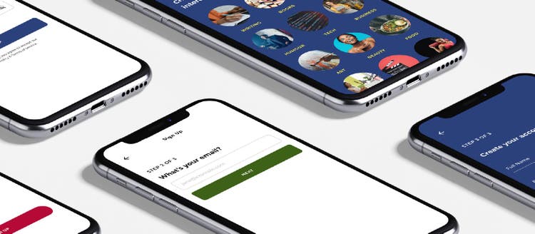
The Signup Screen UI Kit helps you design forms on signup screens that are frictionless, ensuring a smooth signup process for your users each time.
Here’s how you can jump right in and get started:
- Download Adobe XD for free.
- Download the Signup Screen UI Kit.
- Start exploring the UI kit to see all the layout options available to you. Easily modify text, colors, images, and components to your liking. Add, remove, and rearrange form elements using XD’s features.
- Get into prototype mode. Once there, bring your signup screen to life by adding interactions to signup form elements.
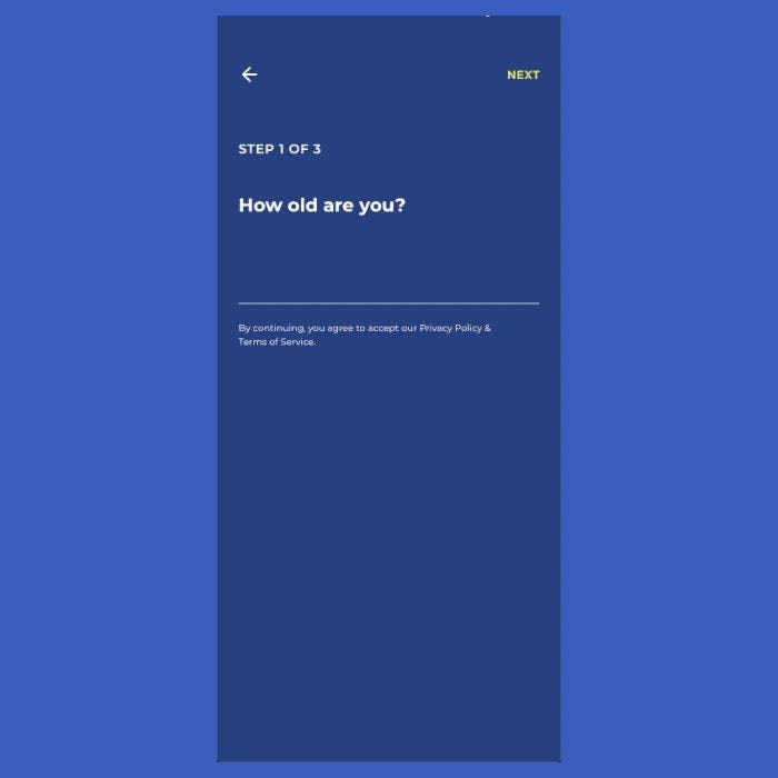
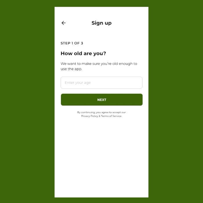
- Experiment with the UI kit’s collection of 18 layouts and 19 components to create the best signup form for your users.
Exploring some of the biggest challenges to successful signup screen design
Building a high-converting form—one that reduces friction by making everything very straightforward—has always been challenging, even when much of the web’s traffic came from desktop. In the last few years, the share of mobile users has overtaken desktop, adding an extra degree of difficulty for designers who must now design forms with a mobile-first mentality. Conceptualizing a signup experience for a smaller screen comes with its own unique set of issues.
“Designing signup forms for mobile devices is even more challenging. Not only is the screen size smaller, but typing an email address or password on mobile often involves using different keyboards to access special characters,” Marisa explained.
Designers are therefore faced with the prospect of longer user flows on mobile, even though their forms need to be built for speed to still ensure pleasant UX. “As a result, getting started takes much longer for users on mobile, and mistyping emails and passwords is quite common. Capturing just the right amount of information from users while making the signup process quick and easy is a delicate balance,” she said.

Marisa’s UI kit has taken these idiosyncrasies of form design into consideration, leading to a solution that helps designers create forms that work well on large and small screen sizes.
“The Signup Screen UI Kit features a variety of signup screen layouts for both desktop and mobile. Each signup screen layout allows designers the flexibility to customize it with their vision and will further inspire designers to create user-friendly signup screens that can easily translate from mobile to desktop (and vice versa).”
Speed in UX is essential, too, when it comes to forms. Users don’t want to bother with cumbersome forms, nor do they feel like typing in their passwords from scratch, particularly on mobile devices where it’s harder to do so.
“To create a faster signup experience for users, the UI kit features signup screen layouts that allow users the option to sign up through their pre-existing social media accounts. This reduces the need for users to have to remember even more passwords and other account info, so they can get started faster. Each form also allows users to show and hide their password, thus reducing mistyping errors while making it easier for users to review and remember their password,” Marisa said.
How Adobe XD’s latest features power the Signup Screen UI Kit
XD is a robust tool with a lot of depth for designers. As such, the Signup Screen UI Kit takes advantage of some of XD’s latest features—stacks, design tokens, and scroll groups—to really empower creatives to design and prototype their signup screens.
Every layout that you’ll interact with in this UI kit is designed with a mix of components and text; you can efficiently add, remove, or rearrange them by using stacks.

You also have the ability to design interactive dropdown fields with components and scroll groups. Scroll groups come into play in this UI kit by letting users scroll through various lists of topics during the mobile signup process.
Finally, Marisa has ensured a degree of customizability here that makes the design process smoother.
“All colors and character styles are given custom names—instead of their default hex values. When you share the design with developers in XD, developers can download and reference a CSS file that contains all the design tokens that include these custom names.”
Taking concepts and user flows that already exist and making them better
Forms and the signup process have been around right from the early days of the web, as some of the most fundamental aspects of websites. With so much form saturation, how does a designer identify only the most useful aspects of signup screens to include in the layouts of her UI kit?
“The Signup Screen UI Kit was inspired by some of the most popular apps and websites that many of us use today. Signup screens have been around forever and are found on practically every single app or website. As a result, I found inspiration from the best of the best signup screens that I’ve had the pleasure of using over the years that provided an excellent user experience,” Marisa revealed.
To get started designing user-friendly forms every time, download the Signup Screen UI Kit today.
At Adobe, we believe that everyone deserves respect and equal treatment, and we also stand with the Black community against hate, intolerance and racism. We will continue to support, elevate, and amplify diverse voices through our community of employees, creatives, customers and partners. We believe Adobe has a responsibility to drive change and ensure that every individual feels a sense of belonging and inclusion. We must stand up and speak out against racial inequality and injustice. Read more about the actions we’re taking to make lasting change inside and outside of our company.
We also know many people are still impacted by the current COVID-19 crisis and our thoughts are with you. The entire Adobe team wants to thank you, our customers, and all creators around the world for the work you do to keep us inspired during this difficult time.