Color choices that are accessible

Image source: Unsplash.
Color is a foundational element in any creative work. When I took the challenge to design the Color Accessibility feature for Adobe Color, it wasn’t a linear path. While I was conducting research and learning more about accessibility, I realized there was no single tool that holistically helps a designer make a choice of colors that are color-blind safe — a choice that impacts roughly 300 million people globally. This made the case for bringing accessibility into Adobe Color even more compelling, and it is one reason why Adobe wants accessibility to be part of every creative’s process right from the beginning of a project.
Why do you need to think about accessibility?
Accessibility as a concept is focused on constantly enabling, rather than limiting, design ideology; it helps users concentrate on the most important aspects of their activity. Reflecting on accessibility in the early stages of design instead of the later stages leads to efficient and effective utilization of both time and money. This is mainly because it minimizes the difference in the digital experience of users with disabilities as compared to users without disabilities.
Let’s understand the optics of color blindness
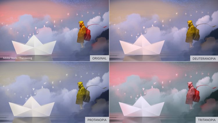
Via Thanawong/Adobe Stock.
Ninety-nine percent of color-blind people can see color — just not in the same way as someone who isn’t impacted by color blindness. There are three distinct types of color blindness:

Via рина Кузнецова/Adobe Stock.
- Protanopia: Referred to as “red weakness,” this variation of red/green color blindness results in individuals being unable to perceive red light.
- Deuteranopia: Also known as “green weakness,” this type of red/green color blindness renders people unable to perceive any green light.
- Tritanopia: People who suffer from blue/yellow color blindness have difficulty distinguishing between blue and yellow colors. This form of color blindness is far less common than its red and green counterparts.
The color wheel of the new accessibility tool in Adobe Color targets all these types of color blindness and enables simulation of any theme while taking into account the type of color blindness.
Ensure color themes are color-blind safe
Adobe Color embarked on its journey of supporting color blindness by enabling users to check their color palettes for accessibility with the launch of the color-blind-safe themes feature on Global Accessibility Awareness Day, May 21, 2020. This unique Adobe invention lets users check their color palettes for accessibility on the go.
Step 1: Pick or create a color theme and check for accessibility
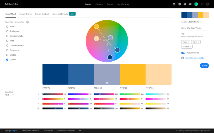
Launch Adobe Color and either start with the color wheel in the Create tab to build a customized color theme, or choose one of the curated color themes from the Explore section, then check for accessibility.
Step 2: Check pucks on color wheel for any color conflicts
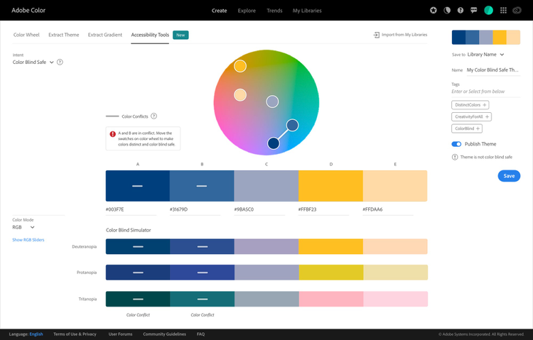
Through the accessibility color wheel, problematic color combinations are flagged by conflict lines, highlighting the swatches of color that could be indistinguishable to someone with color blindness. This allows designers to create color palettes containing five swatches that are distinct from each other.
Step 3: Move the pucks around with the help of conflict guides
To fix a color conflict and build themes safe for color blindness, designers can move the pucks in the direction indicated by conflict guides or try altering the RGB level or brightness.
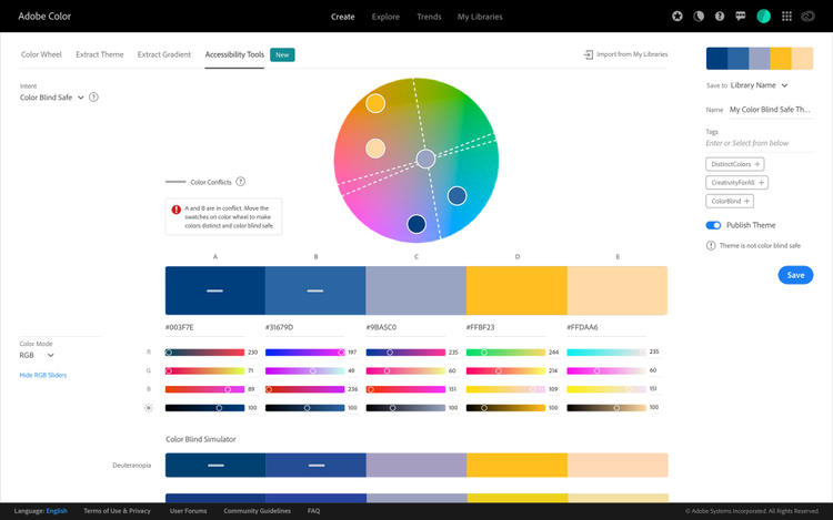
Step 4: Getting it right
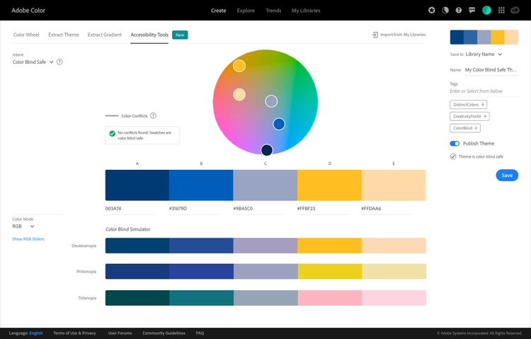
Once the color conflicts are solved, designers can check how the theme will appear to a color-blind user. The system also affirms whether the theme is color-blind safe when saving.
Step 5: Proactively choose color-blind-safe themes
As a next step, Adobe Color will be launching versatile color-blind-friendly palettes as a part of the Explore section, where designers fetch color themes from community resources like Behance and Adobe Stock.
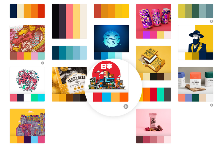
Examples of accessibility at its peak
Example 1: Slack offers its users special color-blind accessible themes that alter the colors of the entire user interface.


Designed by David Gibson, Two Twelve.

Royal Children’s Hospital (Melbourne) wayfinding solution via Dexigner.
Example 2: Since icons and visual designs express the core ideas and intents of brands and products, the inclusion of accessible color palettes is vital for brand and product success.
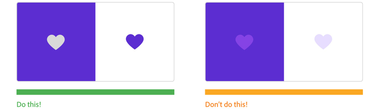
We have to be proactive to make sure that our designs reach a broad audience of people, not just people who look and act like us.
Nathan Curtis, design system advocate and founder, EightShapes
