Computer monitor color management: Truth behind tone
“I try to apply colors like words that shape poems, like notes that shape music.” — Joan Miro, Spanish painter, sculptor, and ceramicist
There’s no such thing as “just blue.” There’s full-of-cheer Sky Blue, impending doom Midnight Blue, and the crisp assuredness of Classic Blue, the Pantone Color of the Year 2020. The wrong blue sends the wrong message. The best way to make sure everything in your field of vision is also true to your vision is by ensuring accuracy throughout your color-critical creative process.
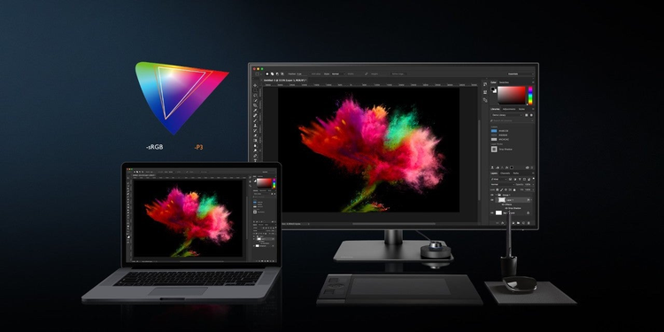
The purpose of color management is consistency in colors, as perceived by the human eye, across devices. The benefit of color management is that projects you create in Adobe Photoshop, Illustrator, InDesign, or other tools look the way you want them to throughout your workflow. So, yeah, it’s important.
Color management is so important, BenQ pioneered AQCOLOR technology with the goal of putting supremely color accurate displays within the budget of the artists, designers, and content creators who most need them. You can learn more at BenQ Ambassador Art Suwansang’s Adobe MAX session, “Communicate with Color: Create with Color Accurate Monitors” Tuesday, October 20 at 1 pm PST, but we’ll get you started here.
Here are four ways to make sure your monitor gives you confidence in your color.
Wide color gamut coverage
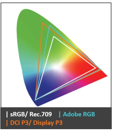
The first step in color management is determining which and how many colors you can access on your monitor. The collection of hues that can be displayed are shown as triangles with the D65 white point somewhere near the middle. Each of the triangles in the colored space above represents a color gamut, the range of colors that can be displayed on the device, or in the format at hand. Different color gamuts, also called spaces, are geared for different usage. Bottom line, the bigger the color space, the more colors you can access.
Don’t assume a product that says it has coverage of a particular space covers all of it. Check the specs. A percentage point or two of variation won’t bother most people, but that bigger price tag for more complete coverage will also deliver more colors and smoother transitions. Look for coverage percentages in the mid-to-high 90s.
Here’s a brief color space cheat sheet:
Rec. 709 – meant for high definition television and general video-related work, this color space covers nearly the same gamut as sRGB.
sRGB – (standard Red Green Blue) the smallest and most commonly used color space, including 35% of visible colors. Created for use in monitors, printers, and digital display.
Adobe RGB – 35% larger than sRGB with greater coverage of blues and greens, thus preferred for most photography, including outdoor, nature, and pro display.
DCI-P3 – (Digital Cinema Initiatives) 25% larger than sRGB, created for movies and video. However, it is now more mainstream and is widely used in phones, tablets, laptops, and external displays.
Display P3 – created by Apple for digital display with similar coverage as DCI-P3.
Note: To help ensure consistency, be certain to tag the file you are working in with a color gamut. It’s also vitally important that you and your collaborators are each working on a calibrated display.
Delta E (ΔΕ)

Delta E is the mathematical measurement of the difference between two colors, with one of those being the accurate control, or reference color. In this case, it’s the variation between the color that is shown on the display vs. the reference color. It ranges from 0-100, with zero as imperceptible difference and 100 completely different. In most cases, a Delta E between three and six is a close enough match for comfort. However, color-critical work demands greater precision with Delta E’s equal to or less than three. BenQ developed its Design Monitors to meet or exceed this standard.
As with working in the same color space, a low Delta E ensures greater accuracy, thus, consistency in your workflow.
Calibration

Calibration is the measurement and adjustment of color display to match a set standard. Types of calibration include factory, hardware, and software. This process determines how accurate your computer monitor is out-of-the-box, and how well it maintains accuracy once it’s set up in your workspace.
Factory calibration occurs, obviously, in the manufacturing facility by trained professionals and is done with specialized equipment. This step ensures a color accurate starting point. If you can get your hands on your display’s factory calibration report, like the one shown above, you can see the exact standards it met from day one.
Hardware calibration can only be done on specially equipped monitors. The results of hardware calibration are remarkably precise because all the color adjustment is done on a dedicated computer and chip inside the display. This is unlike a software calibrated display where the color adjustment occurs at the video card output. This type of calibration can be achieved with calibrators from manufacturers such as X-rite and Datacolor.
Lastly is software calibration. This is the most common type of end-user calibration. Using a calibrator and its included software, you can quickly calibrate the graphics card to assigned parameters. The result is a remapped graphics card signal that closely matches the reference value. The precision of your results depends largely upon the capability of your graphics card and the quality of the panel inside your display.
Make sure you calibrate regularly to keep your results reliable.
Certifications

Every industry has standard-bearers to set and measure performance and provide objective third-party validation. These organizations determine the parameters a product or service must meet to earn recognition or accreditation. Calman color calibration software is the most widely used solution to ensure precise color from content creation through consumption. To earn Calman Verified status, displays must meet demanding, repeatable standards for color accuracy. BenQ is the first manufacturer in the world to offer Calman Verified monitors. If your work is color-critical, this certification should deliver peace of mind.
Color is everything. It is emotion, imagination, and communication. Pantone is the center of the color universe and grants “Pantone Validated” status to displays that have demonstrated the ability to deliver superior color fidelity in reproducing the Pantone Matching System (PMS). If you care about color, you care about Pantone Validation.
Colors you can trust
BenQ’s motto is “Because it Matters.” Like you, we are driven to create excellence. We engineer premium equipment to empower premium results. Do we hope you’ll choose a BenQ designer monitor? Of course, we do. But more important than what you create on is that you create at all. We support you in telling your stories, weaving your dreams, and expanding your imaginations endlessly. Why? Because it matters.
We hope to see you at the BenQ session with Art Suwansang, “Communicate with Color: Create with Color Accurate Monitors” Tuesday, October 20 at 1 pm, and Team BenQ wishes you a great Adobe MAX 2020!
