Hello, and welcome to another edition of “From the ACR Team,” the blog series that brings you direct insights from the team that builds the imaging features for Lightroom, Lightroom Classic, Lightroom mobile, Adobe Camera Raw, and the Camera Raw filter in Photoshop. I am the lead engineer on the new Color Grading feature, and I’m very excited to introduce it to you today! I will take you through the new controls, share some tips and tricks, and help you get started on color grading your images.
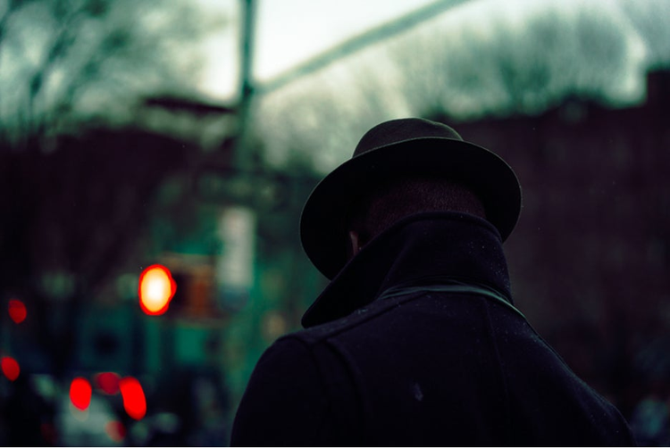
I will also showcase some outstanding work from some of our early expert testers — including the featured image above by Paola Franqui! We were aiming to make a feature that is capable of producing stunning results easily and intuitively. Getting feedback and seeing the work of these experts during development was so helpful, and I’m grateful to be able to share some of their images with you here.
If you’re already familiar with color wheels, you’ll be right at home — go play! If you’re not, I’ll get you started — they’re fun and easy to use. As with all image processing features, the best way to learn is to experiment. Undo and reset are always available: You can’t hurt anything by experimenting here. So — push things too far, see what happens, pull them back — or leave them there! If you haven’t played with Color Grading yet, take a break from reading and give it a try.
Adobe Lightroom
Your best photos. Made even better.
Learn more
From Split Toning to Color Grading
You’ve probably noticed that Split Toning is gone; it’s been replaced by Color Grading. But don’t worry: Color Grading is 100% compatible with the old Split Toning. Color Grading is an extension of Split Toning — it can do everything Split Toning did, plus much more. Your existing images with Split Toning settings will look exactly the same as they did before, your old Split Toning presets will also still look the same when you apply them, and you can still get the same results if you had a familiar starting point when doing Split Toning manually. We’ll explore the details in the “Split Tone Compatibility” section below.
If you’ve never used Split Toning or Color Grading, here’s the idea: you can apply a color tint to your image based on the brightness of the pixels: Lighter pixels can be tinted differently from darker ones. With Color Grading, you can also control your midtones.
This is not new to digital imaging; toning and split toning are traditional darkroom techniques. Toning used to be done by bleaching your prints and then applying a toner; different looks can be achieved by how you apply the bleach. The digital version is easier — if for no other reason than the fact that you can change the toning without making another print — and definitely less smelly! (I know there are odorless toners now — when I was learning darkroom techniques, toning was a very stinky affair.)
Color Grading has been also a staple of video editing for a long time; it has been gaining popularity in still photography for a while now as well.
What does Color Grading do that Split Toning didn’t?
Color Wheels! Midtone control! The Blending slider! Luminance sliders! Global Control! Exponentially more control and power! Okay, I’ll take it down a notch. With fewer exclamation points, here is an overview of the new controls:
Color wheels
The most obvious change from Split Toning is the color wheels. Color Wheels are an industry standard control, including in Adobe Premiere’s Lumetri Color panel.
Across the top of the panel, you will see a row of icons to set the view.
On desktop applications, the first view is 3-Way, which shows the Shadows, Midtones, and Highlights all in one view. Mobile apps do not have a 3-Way view — it would be a little too small to be useful.
The next three icons will take you to a larger, “detail” view for each of the ranges; changes you make to the wheels in the 3-Way view are reflected in the corresponding detail views and vice-versa. The detail views are just larger versions of each color wheel by itself.
The last icon is for the Global color wheel. The Global control is a little different from the three range-based wheels, so it does not appear in the 3-Way view. More on Global below.
A quick summary of color wheels: The handle inside the wheel controls both hue and saturation. The distance from the center controls the saturation. When the handle is in the center of the wheel, saturation = 0 (no color tint). When the handle is at the edge of the wheel, saturation = 100. Similarly, the handle’s angle on the wheel sets the hue. There is an additional handle on the edge of the wheel; this is a dedicated hue-only handle.
To see the connection between the Split Toning sliders and the color wheels in a very concrete way, go to one of the single-wheel detail views by clicking on any of the icons in the row across the top of the panel. Then open the disclosure triangle under the wheel to show the hue and saturation sliders.
Move the saturation slider back and forth while watching the handle on the wheel. You’ll see that it moves in a straight line from the center to the edge, like a spoke on a wheel.
Leave the handle somewhere in the middle of the wheel and now move the hue slider in the same way. You’ll see that changing the hue moves the handle in a circle around the center of the wheel.
Now click in the wheel and move the handle all around: you’ll see that the sliders both move at the same time. Handy! This is why the disclosures with the sliders are closed by default — you can use the wheel to choose your colors more quickly. But if you like sliders, they’re available to you.
Using the color wheel allows you to quickly and easily explore different colors to apply to the image. There are several helpers built into the wheels: For more info, see “Getting the Most Out of the Color Wheels.”
Midtone Control
The other obvious addition is the Midtone control. Split Toning allowed you to apply a color tone to the shadows and another one for the highlights. Color Grading adds the ability to apply a third color tone to the midtones. The highlights, midtones, and shadows together are called the “three-way” color wheels.
With Split Toning, you could shift the division between the two ranges with the Balance slider; moving Balance to the left made more pixels get treated as shadows, moving it to the right made more pixels get treated as highlights. The Balance slider still sets the divisions between the ranges, with the same left/right behaviors as before. Which pixels should be considered midtones is now also defined by the Balance slider.
Take a moment here and experiment a bit on some of your images. The best way to understand is to experiment and explore on your own. So, take a break, go play with the three wheels and the Balance slider, and see what you can do!
Okay, I hope you had fun! As you can see, the three wheels and the Balance slider by themselves are very powerful, but with three ranges to manage, the Balance slider could use a hand to enable even more control. Enter the Blending slider.
Blending
Blending allows you to control how much the three tone ranges overlap each other. On some images, changes to Blending will be very subtle; on others it can be quite dramatic. The default value is 50, which gives a nice amount of smoothing and independence to the ranges.
When Blending is set to 0, the amount of overlap is minimized; it’s not a hard cutoff though, there are still overlaps to make nice transitions. Each range is largely free from the other ranges; if you set the midtones to have a green toning, you will see the green no matter what toning you have set in the shadows or highlights.
When Blending is set to 100, the three ranges all overlap each other. This provides a very smooth look, but the color tones all mix and blend together. Using the same example of “green midtones” as before, the green will get blended in with the shadow and highlight toning.
This is again best understood by experimenting. Let’s look at an example together.
Start with a monochrome image. Color grading, like Split Toning, works well for tinting black and white images. Starting here also allows us to see the effects of Color Grading without worrying about any interactions with the underlying color.
Feel free to download this image to experiment with, or choose a black and white image of your own (or both!) For best results while you’re learning, look for images that have areas of shadows, midtones, and highlights so you can see how the three ranges interact.
Let’s start by setting Blending to 100; Shadow Hue to 240, Shadow Saturation to 100, Highlight Hue to 0, and Highlight Saturation to 100. The hues don’t need to be exact, just make them blue and red.
As you can see, with Blending = 100, there is a lot of overlap between the shadows and the highlights. They blend across the midtones, making a range of purple tints there — without having set any midtone tint yet.
Before adding a midtone tint, let’s explore what Blending does with just shadows and highlights.
Move the Blending slider all the way down to 0.
As you can see, the purples disappear. The shadows are blue, the highlights are red, and the midtones are untinted, showing the original gray tones. Slowly move the Blending slider back and forth between 0 and 100 to see how the blue and red combine across the various Blending values.
A note here: It may look like higher Blending values “boost” the shadow and highlight tints, making them stronger. While the effects of them do get more pronounced, they’re not really getting supercharged. By increasing the Blending, the shadow and highlight tints are allowed to reach into more areas of the image, so you see more of the pixels getting affected by them. As you decrease Blending, fewer pixels are being affected by them, so they seem to diminish.
Now reset Blending to 0; it’s time to add some tint to the midtones. Set Midtone Hue to 120 and Midtone Saturation to 100. Again, it’s not critical to get the hue to exactly 120; just make it green.
With these settings, you can clearly see blue shadows, green midtones, and red highlights.
Now watch the image as you move the Blending slider to 100. The clearly defined colors start to blend together, making a mix of all three across the image.
As you can see from comparing these two images, Blending is a very powerful control, particularly when saturations are high.
Now experiment on your own a bit. Move your midtones all across the wheel to see how they blend with shadows and highlights at Blending = 100, then move Blending down to 50 (the default value) and see how it works there.
This example started with fully saturated shadows and highlights to make the effects very obvious. Now try lowering the saturation of the shadows and highlights and experiment with Blending with lower saturations; you’ll see that the differences are not nearly as dramatic as they were with higher saturations.
Blending works consistently across all saturations, but as you’ve seen, it’s not always as obvious when they’re lower. Because of that, we’ve added feedback to the Balance slider. On the desktop, hold down option (Mac) or alt (Windows) while using the Blending slider to temporarily boost the saturation of the three ranges to 100. This allows you to quickly see how your tints are mixing as you adjust the Blending. Releasing the opt/alt key will show your actual saturation settings.
You can do the same thing on mobile by adding a second finger touch to the screen while using the Blending slider.
Luminance controls
Color Grading also adds the ability to adjust the luminance for each range. There is a slider beneath each color wheel, with ranges from -100 to 100. Luminance changes can be applied even without applying a color tint.
One of the most common questions from our early testing was: “How are the luminance controls different from the Basic or Light panel controls?
One answer is based on intent. The luminance sliders are used to make color grading-specific changes. That is, if you want to lift your blacks/shadows for a specific treatment, you can do it here, leaving the rest of your image settings as they were. Similarly, if you want to dim and tone the highlights significantly, this is the place.
In addition, the Basic/Light panel’s Exposure, Highlights, and Shadows controls are much more sophisticated than the Color Grading Luminance controls. If you’re looking for highlight recovery, the Highlight slider is still the tool to use. The Color Grading Luminance controls are designed to work hand in hand with the color tinting ranges, moving and shifting with the Blending and Balance, so they are optimized for that rather than being primary image adjustments.
A note on applying tints to black and white pixels: If you apply a color to a black pixel or a white pixel, it will still be black or white. In order to see a color on black or white, it first needs to become a shade of gray. Sometimes you want black to stay black and/or white to stay white, but sometimes you don’t. When you do want to, lifting the shadow luminance will allow you to tint black, and lowering the highlight luminance will allow you to tint white.
Global control
Aside from the three main color wheels, there is another new one: Global. You can think of the three-way wheels as Split Toning plus midtones; similarly, the Global wheel is akin to “Split Toning minus the split.”
The Global wheel applies a color tint plus luminance adjustment to the entire image, across all the ranges. If you’re looking for a simple warming or cooling (or any other color toning) across the entire image, Global makes it easy.
Global can also be applied on top of the three-way adjustments. This is great for applying a color grade with the characteristics you want across the three-way wheels, and then additionally toning the entire image without changing the relationships between the three-way toning.
Blending and Balance have no effect on the toning applied by the Global wheel.
Color Grading approaches
Here are some simple guidelines that may be useful to you as you learn to use the new Color Grading tools. I recognize that there are as many workflows as there are people, so if you have an established way of working, feel free to ignore this.
Make your base edit first
One way of working is to adjust your overall tonality and get your image where you want it before applying color grading to it. If you’re trying to compensate for blown highlights from the Color Grading panel, you may be disappointed. The Highlight slider is a much more effective tool for that. The same applies across the board; get yourself to a good white balance using the dedicated white balance tools before visiting the Color Grading panel; make your base contrast adjustments in Basic/Light; get specific colors to a good base before applying Color Grading; etc.
If you’re after a very stylized look, of course you can and should use all the tools at your disposal!
You don’t need to use every wheel
There are now three main color wheels, plus Global! You don’t need to use every one of them on every image. For simple tasks, you may just end up using the Global wheel. Or if you’re used to Split Toning, you may continue to apply just shadows and highlights. Another option is to use midtones like you would have used Split Toning highlights, and then leaving the highlights color wheel alone. Or, just apply shadows. There are many ways to go here, so don’t feel like leaving a wheel untouched is a bad thing. It’s all about your vision!
Give Blending and Balance a try
The default values for Blending and Balance work well; people often forget that they can change them to get different effects. When you’re feeling like you’re getting close with your color grading, try moving the Blending and Balance sliders a bit. Look at the image and move the sliders until you feel like you’ve got the look you want dialed in. You may be surprised by the values you’ve set on the sliders! And again, if you don’t like it, you can always undo the change.
Try using Global on top of three-way toning
There are some very subtle but effective possibilities to be found by combining the three-way toning with the Global wheel; try adding a little Global toning and see how it feels.
A little bit goes a long way
Low saturation settings can have a strong impact on your image, even if the effect itself is subtle. Human color perception can pick up on small changes!
Don’t forget about the Camera Raw filter
You can apply Color Grading to your Photoshop layers and selections using the Camera Raw filter. This is a very handy way to tint any pixels when you’re in Photoshop.
Adobe Photoshop
Make. Believe. Photoshop.
Learn more
When do you want to use something else?
Color Grading is great, but no tool is the right answer for every situation. So when should you use something else?
Adjusting/correcting overall white balance
You’ll get the best results from Color Grading when you set your White Balance first. Trying to use Color Grading to overcome a wonky white balance will likely be frustrating, so get yourself to a good setting first. You can of course still use White Balance as a creative control, and even pair a creative White Balance with Color Grading, although you may not need to do that as often anymore.
Reducing saturation
Color Grading can only add color with varying degrees of saturation. It cannot reduce saturation in the underlying image.
Some color graded effects use reduced saturation, so to explore that, head over to Basic/Color for global saturation changes or the Local Correction tools for local adjustments — and if you’re using Lightroom Classic or Camera Raw, don’t forget about range masks! You may also want to reduce the saturation for a specific color across the entire image; the Color Mixer is the tool for that.
Changing a specific hue
Speaking of the Color Mixer, that’s also still the place to go for hue-specific changes. Yes, you can change the tint of your sky with Color Grading, but if you want to only target the sky blues, the Color Mixer is a better choice. Once you get the colors of your image to a good base, then apply your Color Grading. Another tip: If you haven’t yet explored the relatively new Local Hue adjustment in the Local Correction tools, it’s a powerful way to very selectively change hues.
Getting the most out of the color wheels
While the color wheels are fairly intuitive, they are also packed with lots of little assistants to help you really fine-tune your color grading. Here is a deeper dive into the details of the interface.
(… And feel free to skip over this section and get right to the photos from some experts. This will still be here as a reference for you later!)
Soft Constrain
You may have noticed that you can click or tap anywhere on the color wheel to make the handle jump to the indicated spot.
If you click/tap directly on the handle, you will engage the “soft constrain” mode. As long as you drag roughly along the same hue, your changes will only apply to the saturation. Once you drag far enough away from the hue, the constraint breaks and you can drag freely.
Double-click/tap to reset
Double-clicking/tapping on the handles will reset the value of that control to its default value.
There are some additional tools for the desktop apps:
Hard Constrain
Hold down the shift key to keep your current hue and change only saturation. This is akin to using the old saturation slider.
Hold down the command/control key to keep your current saturation and change only hue. This is akin to using the old hue slider.
Fine Adjust mode
Hold down the option/alt key to engage the Fine Adjust mode: your moves on the wheel will result in smaller changes, allowing you to make very precise changes.
The hard constraints are also available in Fine Adjust mode.
You can right-click or two-finger tap on the color wheels to bring up a context menu. From here, you can reset the color wheel you clicked on, the 3-Way wheels, all the wheels (3-Way plus Global) as well as copying the settings of the clicked wheel or pasting settings copied from another wheel.
“Muting” a Color Wheel
In Lightroom Classic and Camera Raw, there are small eye icons by each of the color wheels.
You can press and hold on these to temporarily remove the effect of the associated color wheel from the image. This is very helpful when evaluating your work; you can very quickly see what a given wheel is contributing to the overall effect.
These will be coming to Lightroom in a future version.
Split Tone compatibility
As I mentioned earlier, images with existing Split Tone settings and applying older presets with Split Tone settings will reset the Color Grading settings so that they render in the same way they did before. But what does that really mean? Here are the specifics:
Blending will get set to 100
Split Toning didn’t have any control over the Blending and always used what we now call Blending = 100. By setting the Blending slider to 100, we get the old Split Tone look.
All other new controls are set to zero
The new controls didn’t exist in Split Toning, so they will get set to zero in order to show the same result as before. The specific settings are: all the midtone controls, all the Global controls, and all the luminance controls.
If you want to work with only Split Toning controls, you can do this yourself as well. From the defaults, simply move Blending to 100 and then only make edits to the shadow and highlight hue and saturations. This will give the identical results that you would get from the old Split Toning interface.
Examples and Inspiration
As we developed Color Grading, we partnered with several expert color graders to make sure we were building a tool that could help them achieve their visions and styles. Seeing so much amazing work being created with Color Grading was very rewarding for me, and I’m excited to share the works of just a few of our partners with you today.
Todd Hido
Website: http://www.toddhido.com/
Instagram: https://www.instagram.com/toddhido_/
“I was able to easily achieve variations in colors particularly between the highlights and the shadows that were more elusive with the prior setup. The new color grading panel really is intuitive and also lets you see very easily what happens when you just play around with different colors and different blends and balances.”
Katrin Eismann
Website: https://www.katrin-eismann.com/
Instagram: https://www.instagram.com/katrin_eismann/
“The color of an image is the emotion of the image, with the emotions ranging from bright, warm, summer pastels to somber, muted, cooler tones and everywhere in-between. I approach each image by returning to the original photo shoot in my mind, and recalling why I took the image. What was I seeing and feeling and how can I now use image processing to best express that moment? After correcting tone and exposure and adding Clarity and Texture, I take a step back to connect with the mood of the scene. This is the point that I experiment with color grading to draw out and explore the personal interpretation. In most cases, I prefer to work with complementary colors to create a visual dialogue between the light and dark values in an image.”
Nikk La
Instagram: https://www.instagram.com/nikk_la/
“My approach to toning/grading is playing off the supporting colors that’s already in the photo, and from there I use the color wheel to enhance those specific colors while adding in complementary colors.”
Paola Franqui
Website: https://www.monaris.me/
Instagram: https://www.instagram.com/monaris_/
“The new Lightroom Color grading tool is a total game changer. I believe that color grading is one of the most important parts of a photographer’s post processing workflow, and Color Grading is exactly what we needed. I see this tool helping photographers build a unique style that will function as a brand for their work. A+!”
Parting thoughts
I hope you enjoyed this introduction to Color Grading. As Katrin mentioned above, color can really help express emotion in your images, from bright and sunny to dark and moody — or anything in between!
As always, have fun experimenting and playing. While I definitely wanted to get you started on the right foot with some guidance, the best way to learn a tool is to use it.
I’m looking forward to seeing what you create!
Stream Adobe MAX On-Demand
Adobe MAX is chock full of inspiring ideas, the latest tools, and practical tips and tricks — everything you need to nourish your creativity. While you’re waiting for MAX 2023, check out the valuable sessions from 2022.
Stream now