Ironhack reimagines its UX/UI design bootcamp in response to COVID-19

All images courtesy of Ironhack.
As the world deals with the fallout from COVID-19 and the ensuing lockdown, design remains unconquerable. Designers around the world continue to come together and collaborate, finding new ways to improve people’s lives at this difficult time. Equally important is empowering the next generation of designers and helping them become great storytellers and problem solvers themselves.
It was with this in mind that my teaching assistant, Kathryn McClure, and I quickly transitioned from the usual, in-person UX/UI immersive bootcamps from our Miami campus to remote classes. With the pandemic spreading fast by mid-March, our campus made the call to move things entirely virtual, so we had no choice but to adapt to the new reality.

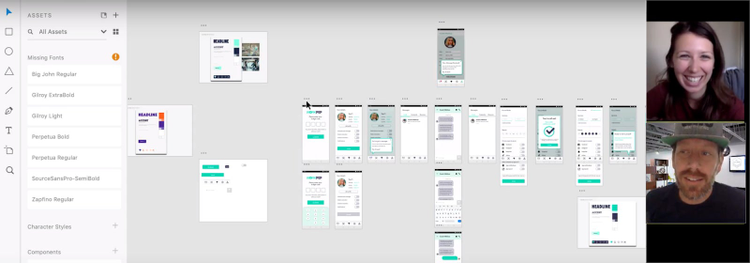
Lauren Todd presents her high fidelity screens and prototyping of a workplace wellness app over Zoom.
An unpleasant Friday the 13th surprise
Since 2013, our alternative education startup has been dedicated to educating and upskilling professionals from all walks of life, so they have the 21st-century skills they need to be competitive in our modern economy. With nine campuses all over the globe, I’m happy to say that more than 5,000 students have graduated to date.
Our UX design students invest an average of 400 hours over the nine weeks of our courses, but it’s not uncommon for many of our students to spend as many as 650 hours reading, researching, optimizing their designs, and writing case studies.

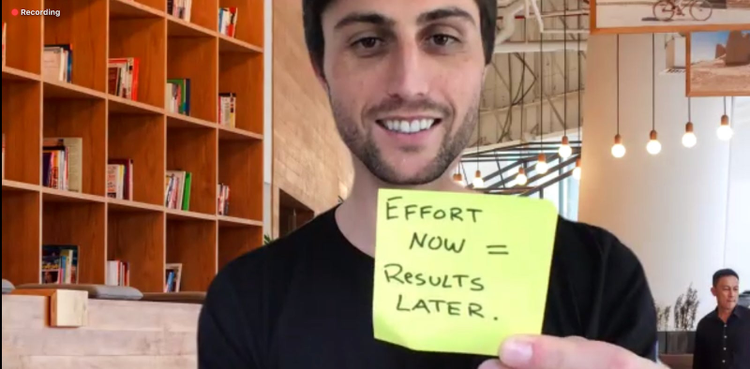
Joshua Bechtler-Levin shares his thoughts over a team-building Zoom call.
We do great work with our students, so when we had to shut down in-person classes and move things online due to the lockdown (on Friday the 13th, no less!), I knew we couldn’t let them down. With just one week left for our cohort in bootcamp, we had a short Zoom tutorial over the weekend and then transitioned the last week into a completely virtual classroom.
After that, we had just another week to make preparations to continue teaching every subsequent bootcamp cohort online. We learned from some of our coworkers at other campuses who had already made the full transition into a live, virtual environment, as well as from helpful documents shared by the design community.
What we learned from our switch to a virtual classroom
We came away with several, major takeaways from this experience. We use Adobe XD in the classroom, so we also pleasantly discovered that XD plugins were incredibly helpful; they have been absolutely essential to our virtual bootcamp’s success.
1. Keep things short – We went minimalist with our lectures and even cut some lectures by 50 percent to keep students focused.
2. Allow for more breaks – We found that doubling the number of breaks succeeded in increasing engagement and minimizing tiredness. We did two short breaks for each hour of live lectures, with workshops requiring fewer breaks.
3. Give more individual attention – Our students needed more personal time with us instructors, by a ratio of triple from what it was before the lockdown. This has been very time-consuming for us, but absolutely crucial in this new teaching reality. We’ve used Zoom breakout rooms with great success for this, as well as to keep projects moving, thanks to private group spaces and interview rooms to support student testing and research.
4. Be flexible – We always planned our days ahead of time, but we were also open to making adjustments. To fit our students’ morale and pace, we were happy to reevaluate our plans for each day and make changes accordingly.
5. Use work sprints – We learned that scheduled work sprints kept everyone focused and efficient. Time-boxing was something we depended on to keep our interactive classes moving forward.

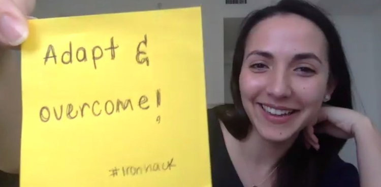
Monica Maloff collaborates with her class during the virtual bootcamp.
How XD features and plugins gave better value to our students
To make the most of our new, live, interactive teaching environment, we used the latest XD features and plugins. We’ve been thrilled to discover that there are more than 150 third-party plugins for XD (and growing). Extensibility is a key part of design tooling in the 21st century, and so teaching our students to use integrations effectively is also a key part of our teaching strategy.
To stay up to date, we always check Adobe XD’s latest features page. Here are our experiences with one particular feature and two plugins we found very useful at this challenging time.
Coediting
Even when you’re far apart, collaboration is just as important to creating a successful product. XD’s Coediting feature made this easy, as it empowered all of our students to work simultaneously on the same document, regardless of their location.
Students benefited from streamlining their UX/UI process stages into just one document. This let them “divide and conquer,” so to speak, in their design flows. What’s great is that our students have really enjoyed the collaboration aspect of learning UX design, and I think Coediting played a large part in making happen.
As Victor Ronda, a web-development student from Barcelona, put it: “Despite being at home, I felt like I was at a table with my classmates. I have worked very well with them. We have helped each other a lot, and we have even had to mute ourselves! So, given the unfortunate circumstances, the experience has been good for me.”
Whiteboard plugin
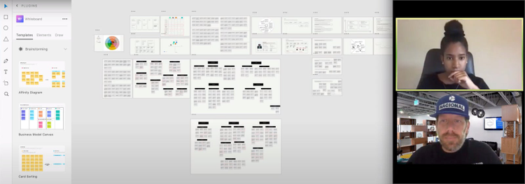
Our students were particularly excited about the Whiteboard plugin, and as instructors, we really liked it as well. We initially used a standalone whiteboarding platform, which was pretty good, but this plugin blew us away with its ability to integrate straight into the design platform. Again, the streamlining of our students’ entire processes in just one document made things so much simpler, and it was easier for us as instructors to interact with our students’ work, too.
Gone are the days where we instructors had to use screenshots, upload files, and rely on other mediums to follow student projects. Having just one document benefited us in the following ways:
- Quickness getting to where we were needed.
- Troubleshooting issues right in the document.
- Checking in on student progress on the spot.
The templates available in this plugin significantly improved our students’ workflows. The sheer variety of tools, elements (like wireframing and flow charts), and drawing ability impressed us all. We found it particularly helpful that we were also able to customize individual elements to fit our personal design. Finally, the mind-mapping tool and labeling elements provided further value to our students.

Bianca Soloman uses the Whiteboard plugin in Adobe XD to share her work during a remote class.
Useberry plugin
We found the Useberry plugin to be quite the game changer in our virtual classes, as well. The cool thing was that one of our students discovered this, and we immediately strived to incorporate it into how we use XD.
Before Useberry, we relied on another platform for user testing, but it’s always better when you have integration with your design app. Right off the bat, we found that students succeeded in speeding up their lo-fi and mid-fi testing with this plugin.
Other benefits included:
- The easy-to-use dashboard for reviewing tests.
- Being shown alternate flows created by user choice.
- The engagement created from tongue-in-cheek copy to ensure testers understand their goals.
- Everything in one location to save time and streamline the entire design process.
Something our students also thought would be useful for a future update is for the plugin to recognize component states and “invisible” elements.
Working through COVID-19 better than ever
Because of the speed and thoroughness with which we reacted to the pandemic and the lockdown, we succeeded in transitioning our in-person bootcamps to a fully online teaching environment. We continued helping our students level up their skills, and we discovered the tremendous value of XD and its plugins as part of our teaching tools.
It gives me a lot of joy the way our students have adapted and reacted to this new normal. As our student Timur Tanurhan, a web-development student from Berlin, said, “I’m glad I chose to continue with the bootcamp despite the situation with the Coronavirus. In my opinion, the remote learning option is great! I don’t feel like I’m missing anything.”
That’s our goal at Ironhack. Whatever the circumstances, we want to make sure the next generation of designers has everything they need to advance their careers and their design practices. After all, the world needs them now more than ever.