What’s new in Source Sans 3
New updates to the Source Sans 3 font family / Paul Hunt
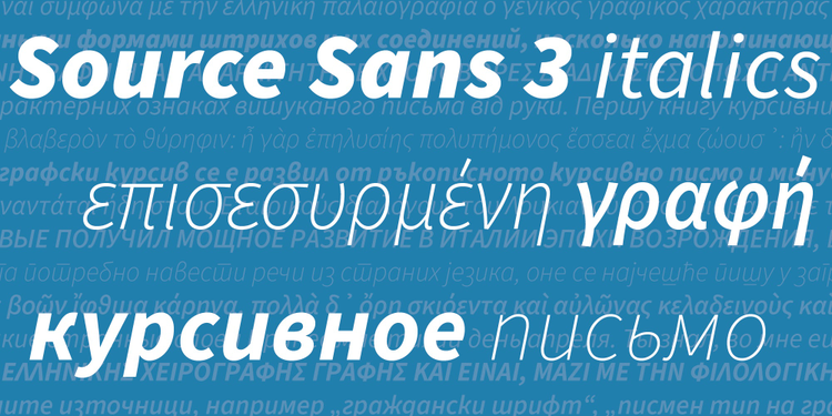
The primary motivation for this update is to add Greek and Cyrillic characters to the italics in order to harmonize the Unicode character coverage for the entire type family. Additionally, I took this opportunity to update the family in several other significant ways.
In terms of design, I revisited the stroke terminals, which had a slight flaring quality in the original design. This update removes this unwanted artifact as much as possible. An intermediate Semibold master has been added to the design space in order to better control horizontal strokes, crossbars, and diagonals that tended to become too spindly in the intermediate weights, which has been particularly noticeable in the Regular. The “Pro” designation has been dropped and replaced by the number 3, which indicates the family’s major version number.
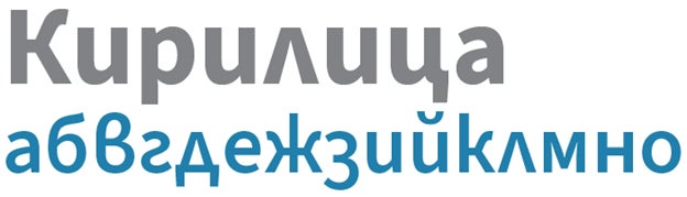
Bulgarian Cyrillic embodies more of the cursive nature of written forms.
This new version introduces Bulgarian preferred forms for Cyrillic that can be applied by language tagging. This seems only fair as the Cyrillic script was originally conceived by the Bulgarian Tsar Simeon I. Additional stylistic alternates for Cyrillic diagonals have been added for those who find the default forms with curly terminals distracting.
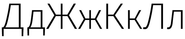
Alternate forms for ж & к provide a cleaner finish for users who desire a more modern appearance.
Source Sans 3 provides full support for Na-Dené, the linguistic family to which Diné bizaad (Navajo) belongs. I had attempted to support Diné language from the very first version of this family; however, there were some issues with the display of nasalized vowel characters marked with ogonek.
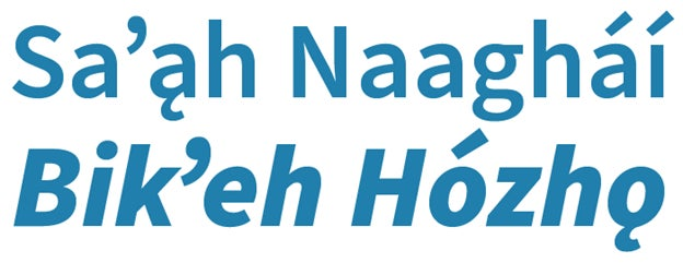
Typography for Na-Dené languages traditionally centers alignment for the ogonek diacritic instead of right-side alignment as preferred in European orthographies.
Thanks to consultation from Andrew Keith Strauss, proper shaping for Diné bizaad has been rolled into Source Sans versions since late 2018 and is accessible using an OpenType stylistic set. Correspondence with Andrew also inspired me to widen the typographic support to cover all of the Na-Dené languages. For the sake of completeness, the fonts also support Ket language, which has been postulated to be a long-lost, Siberian cousin of the Na-Dené family that uses an adapted Cyrillic alphabet. Look out for more details about Na-Dené support, coming soon.
As Adobe’s first open-source font family, Source Sans 3 continues to evolve with an emphasis on inclusivity in language support. We hope this contribution provides useful benefits not only to Adobe customers, but also the open-source community, type developers, and anyone who uses type.
