Positively colorful: Adobe Stock’s 2021 visual trend, Mood Boosting Color
After 2020, we’re looking to elevate our moods in any way possible. From brands to creators, magazines to video games - bright, saturated color beckons.

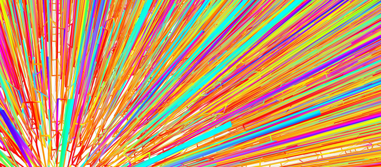
Image source: Adobe Stock / Jeremy Pawlowski/Stocksy United.
After a year that could be described as the ultimate downer, many of us are looking to elevate our moods in any way possible. From major brands to indie creators, magazines to video games, an explosion of bright, saturated color beckons. Suddenly, rainbows are de rigueur, in a very big way.
Color is a potent element of every one of Adobe Stock’s 2021 visual trends, but in Mood Boosting Color, it is the main event.
A full-color burst of optimism
“Mood Boosting Color was the first — and most fun! — of the visual trends I gathered this year,” says Brenda Milis, principal of creative and consumer insights, Adobe Stock. “As I conducted research throughout the year in search of emerging visual patterns across creative projects, the myriad visuals of full-spectrum color were almost overwhelming.”
These rainbows appearing everywhere are not just a traditional multicolor arch (although there are plenty of those, too). The most interesting rainbows are popping up as saturated swathes of color, adorning visuals and campaigns across print and motion, in digital and analog worlds. The recent “Shot and edited on iPhone” campaign from Apple is a standout example. Offline, The Home Edit saw a huge rise in popularity during the pandemic, drawing millions of fans with aspirational images of organized interiors along a vibrant color spectrum.
“This was the only trend that presented itself to me,” says Milis, “and it had the powerful effect of making me feel more positive throughout the long months of last year.”

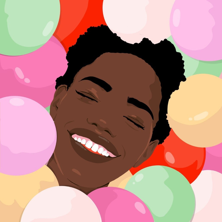
Image source: Adobe Stock / Josephine Rais.
A trend specifically calibrated to engage consumer optimism and stir happy, energetic emotion, Mood Boosting Color continually ups the psychological ante. In past years, a precursor to this trend might have involved dousing the page or an entire room with Millennial pink — today, brands are expanding their color range and exponentially increasing the visual impact.
Powerful is an apt description for the impact of this color phenomenon. Strong colors have a noticeable effect on our minds, giving us a jolt of vitality.
“It’s nothing new that bright, beautiful, multi-hued visuals can have a really uplifting, inspiring impact on us,” says Milis.
The colors we focus on and surround ourselves with can influence our mood, appetite, and energy levels. To flood our visual senses with multiple bright colors can mean flooding our brain with a cornucopia of emotional messages, leaving us excited, on high alert, and primed for action.

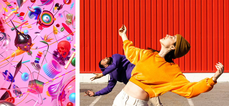
Image source: Left: Adobe Stock / Luke & Morgan Choice/AvantForm Right: Adobe Stock / VISTA by Westend61.
Spectrums and symbolism
“One thing I’ve spent time thinking about is the difference between what is clearly a visual trend from the powerful symbolism of rainbow and Pride,” says Milis. The potent symbol of the rainbow encapsulates “the spectrum of lived experiences, identities, spirits — it’s all there.”
Rainbows have fascinated us forever. For many different cultures, rainbows have been thought to have spiritual importance, even as pathways for gods to travel across the sky. In Greek mythology, the rainbow was the personification of messenger goddess Iris — in Norse mythology, it was Bifröst, the magical bridge connecting the realms of gods and humankind; in Buddhism, the rainbow expresses spiritual attainment — ”the penultimate transitional state of meditation in which matter begins to be transformed into pure light.”
It was 1978 when artist, Vietnam War veteran, and drag performer Gilbert Baker created the first rainbow flag for San Francisco’s annual Pride parade. It was embraced by the gay community and widely adopted and continues to be an immediately recognizable LGBTQ+ symbol over 40 years later. More recently, in 2017, the city of Philadelphia adopted a new version of the rainbow Pride flag to include black and brown stripes, as a symbol of racial inclusion.

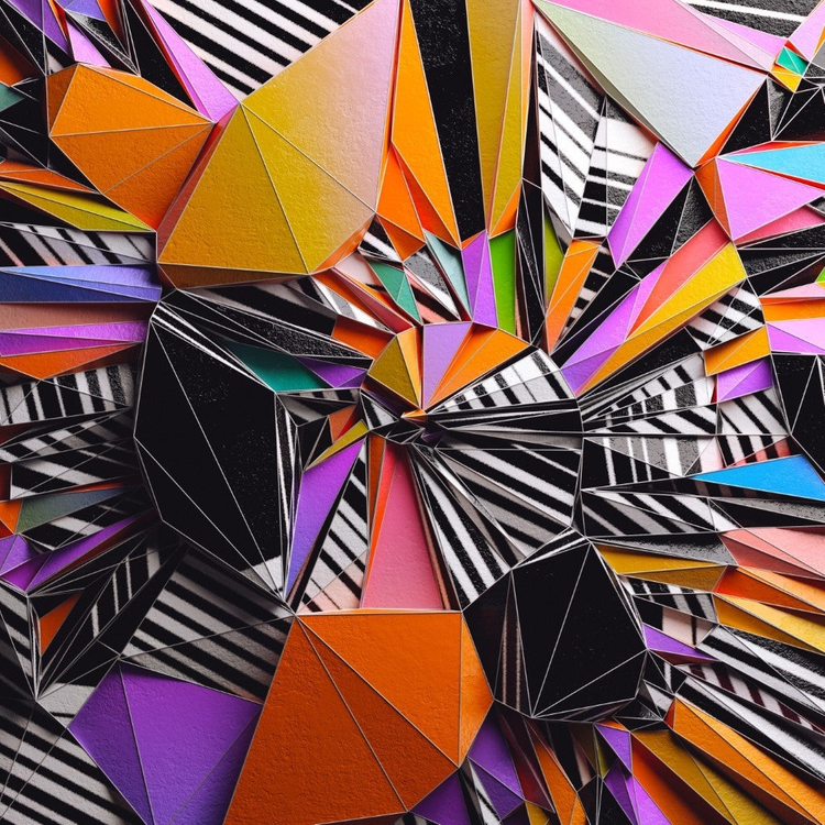
Image source: Adobe Stock/ Raw & Rendered/AvantForm.
Even when used in the most serious of contexts, the vibrant colors of the rainbow retain a sense of cheer and playfulness. Visuals including the rainbow and broader use of color spectrums have expanded in use and meaning to indicate diversity and inclusion, expressing solidarity and hope for the future.
“I particularly love seeing creatives, especially creatives of color, incorporating rainbows and using the colors alongside black,” says Milis. “I’ve seen this combination used to embrace not just Black power but Black joy. That’s becoming a very public conversation, around not just fighting for equality, but also celebrating the Black identity. There’s a very beautiful, joyful, political aspect to this trend.”
At a time when the COVID-19 pandemic was sweeping the country with no end in sight pre-vaccine, disproportionately affecting Black and brown people in the U.S., individuals and brands alike celebrated Black joy — defiantly, expressively, and colorfully — through organic hashtags, viral TikTok clips, and brand campaigns like #BlackJoyMatters from VSCO.
“It’s so amazing what an emotional power color can have,” says Milis. “I’m delighted to see so many people, including collectives working together for social justice, embracing and using this chromatic strategy.”