Scaling fantastic user experiences, over drinks
Omnichannel at ZX Venture’s design system utilizes Adobe XD and Adobe Creative Cloud to maintain quality of user experience across brands, continents, languages, and cultures.

There’s always been a universal, enjoyable aspect to getting together with your friends and family over beverages. People talk, build relationships, and enjoy the company of others. It’s one of the most time-honored ways of bringing people together.
As the global head of design, omnichannel at ZX Ventures, DTC Group inside AB-InBev, I rely on design and user experiences to translate this camaraderie to our digital experiences. Our venture consists of startups that sell beer straight to customers — for example subscription websites, traditional e-commerce websites, or courier apps. It’s an exciting world to be a part of.
As part of the omnichannel team, my role encompasses product and marketing design, product and marketing, overseeing the numerous ventures and their design teams. I support and advise our portfolio companies from design operations as well as personally designing for them. Supporting our businesses and bringing designs to life would be impossible without a great framework and toolset in place.
For us, the framework is a design system and templated approach to using it, and the toolset is Adobe XD and Adobe Creative Cloud. With this approach, we’ve been able to effectively scale our work and maintain quality and consistency of experience across dozens of different brands — working across continents, languages, and cultures.
Using design systems to manage dozens of brands
When overseeing a portfolio of early stage businesses, it is important to prioritize more than 20 brands — we’re essentially popping in and out of our various businesses at any given time and solving problems and helping however we can. Our job is to ensure that each brand stays true to its vision and what makes it special, while also staying consistent with the overall branding and quality standards of ZX Ventures and Anheuser-Busch.
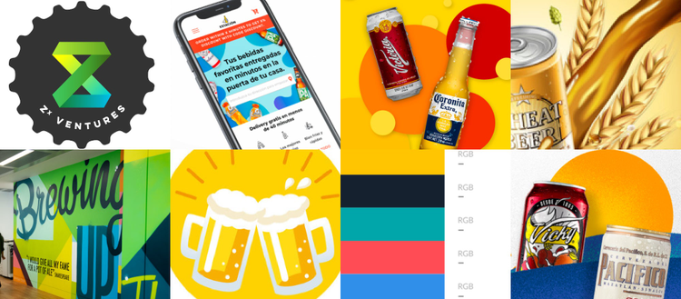
We have a master ZX Ventures design system, which we use as a template for each brand we invest in — this template provides us with a brand foundation when building digital experiences, a way to avoid any redundancies (why build a new button when you have a great one already?). Additionally, having this template and sharing it with each brand gives them and us a chance to build on top of our central vision to create something truly unique. We achieve this personalization in two key ways.
First, we use data from existing ventures to inform how our design system visually communicates the value proposition of a specific brand; this will then be constant in each single application for that brand, going forward. We then identify any variables — like colors, logos, and copy — that we curate for a specific culture market or business type. For instance, while copy changes from language to language, the tone and general layout remains the same; while the logo template is constant across different businesses, the brand name will differ.
Second, we rely on iterative testing to make sure we get it right. Every time we bring a product or design system to market, we rely on A/B testing to determine what’s working and what’s not. We map out our certainties, doubts, and assumptions — then, we establish which design decisions we made on data and which ones we made on assumptions. For example, we recently tested lifestyle or product imagery to see what content performs better and how that can inform other design decisions made on assumptions. You could say we are slightly obsessed with testing.
We’re also addressing the inevitable challenges in language created by working with so many diverse teams. At the moment, we design in English and then get either a product manager or local designer to translate into the local language, which takes time and requires a lot of testing after the fact. Since having more designers who speak Spanish or Portuguese is vital, we’re hiring more designers in Mexico and other Latin American countries.
Simultaneously, we’re establishing standards for linguistics. For instance, we want to enshrine our tone of voice for UX and the consistency of copy for calls to action.
A UX designer, for other UX designers
Our work with our various ventures and their individual designers takes a very bottom-up approach — we are here to be the problem solvers and support. Designers and founders come to us with their biggest challenges, and we solve them collaboratively. Together, we identify patterns in their problems and then find a solution for those problems.
To do this, we follow a three-step process:
- Evaluate the symptoms
- Identify the root cause of the problem
- Build out a program to address the design problem
For example, in one case, we determined that one of our brand’s designers was spending too much time manually choosing their primary colors and fonts since nothing was standardized. This is a case where the solution was to use our templated design system, creating a custom design system for this brand, to maximize efficiency. For another brand, however, we created simple UI kits for already existing experiences, allowing us to update some of the user interfaces on their websites.
Overall, our design systems have led to massive time savings and increased productivity for our individual designers. For example, one designer was able to reduce her design time by 50 percent and onboard her intern in just one hour.
Leaning on Adobe XD to do the heavy lifting
Working with many different designers, scattered in teams across different countries (many of whom are now working from home), we need a solid tool we can count on that would help us realize our vision of a central design team, ensuring brand consistency while also empowering individual brands to be unique. For us, that is Adobe XD.
For our team, the biggest benefit is the many collaboration capabilities in XD. Since we’re dealing with different time zones and different parts of teams, it’s crucial for us to clearly and quickly see what we’re all working on. To that end, using Creative Cloud Libraries has been a huge help, too — we’re always going from Illustrator to Photoshop to XD in our workflows.
For example, on the Creative Cloud library panel, when I need to copy our master design system and create a new one, I can do that in just one click. In my new design system, I can then change things like colors for the links. By changing these colors in the assets panel, XD applies the change to each instance of it in the design document, saving us massive amounts of time.
Uniting people through great digital experiences
With our work at ZX Ventures, I believe we are bringing people together and helping our designers do great work, wherever in the world they are or whichever ventures they’re working at. The cool thing about my role is I get to support other designers — as they improve their skill set, it helps our businesses grow as well. I find this super empowering.
Ultimately, I believe this results in better digital experiences for our customers, too — like great drinks at a party, great digital experiences go a long way in connecting people, especially when we can’t all be together in person.

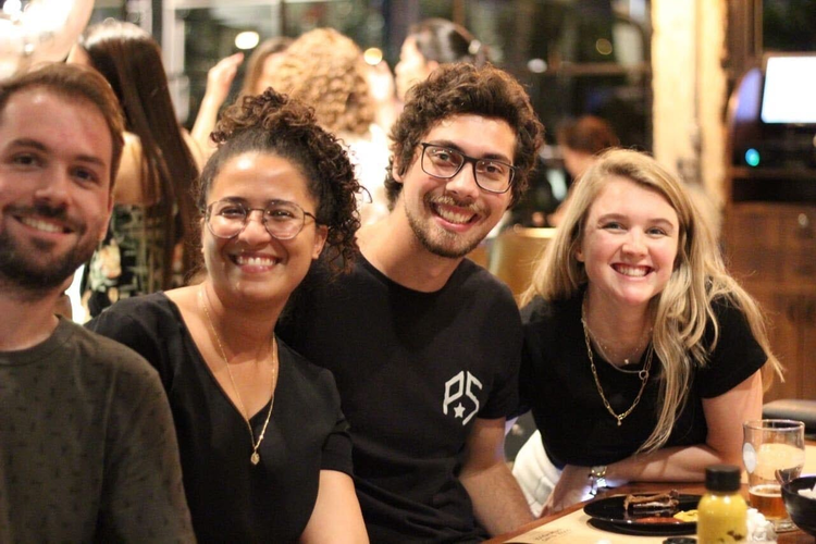
ZX Ventures & Zé Delivery Designers in São Paulo, Brazil. Left to Right: Diego Carrion, Fernanda Magalhaes, and Otávio Sueitt.