Celebrating creativity at SXSW
Adobe celebrates the filmmakers and creators of SXSW 2021

After a great showing of films, music videos, art, and more at SXSW this past March, we wanted to take a moment to recognize some of the incredible projects shown at the festival. Adobe is a proud sponsor of the SXSW Film Awards, including the Adobe Editing Award — which went to editor Lam Nguyen of R#J (edited on Premiere Pro!) — and the Film Design Awards, celebrating the best in poster design, title design, and virtual cinema. We were inspired by the creativity and passion of storytellers everywhere, not to mention thrilled to see Creative Cloud tools helping to tell these stories. Thank you to the many film editors who used Premiere Pro to the award-winning title designers, poster designers, and motion graphics artists who relied on After Effects and Photoshop for their SXSW projects.
We spoke to some of this year’s SXSW filmmakers about how they got the job done. Check out their stories below, including how they got their start in the business, their favorite hacks and hidden gems, and advice for aspiring filmmakers:
Lam Nguyen, editor of R#J — Winner of the Adobe Editing Award
Edited on Premiere Pro

“R#J”
Somehow I’ve had this knack to pick up tech instinctively ever since I was a little kid. My first real edit experience was in high school which was analog tape to tape edits. I learned digital editing at the University of Denver film program. Media 100 was the editing software at the time and recalled how fascinating that was. Since then, I got introduced to Final Cut Pro and eventually Adobe Premiere Pro.
What were some specific post-production challenges you faced that were unique to your project? How did you go about solving them?
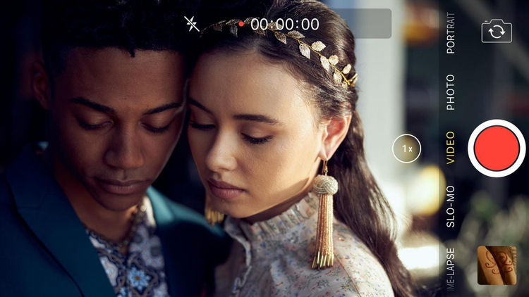
The challenge was the constraints presented by telling the entire story on 9x16 iPhone screens. Once I was able to add fundamental camera techniques and treated the screen life comps (iMessage, Instagram, etc.) as video clips then we started to feel like, “Okay we can tell a story now.” We wanted to be mindful of keeping this cinematic and so when we realized we could break away to traditional film for a bit and merge the two formats together — that’s when the magic started to happen.
What’s your hidden gem/favorite workflow hack in Adobe Creative Cloud?
If you right click on your After Effects linked comp in Premiere Pro — go to edit original — and that will automatically pull up the After Effects sequence for you instead of having to try to find the comp manually for quick edit changes. I also learned that while using After Effects, you can quickly change key frames to smooth in and out with shortcut “fn+F9.” Saves the extra step by right clicking on key frames to get what you want. Also with a clip selected in After Effects— you can double click on any effect to apply it instead of having to drag and drop.
Jeremy Workman, editor of Lily Topples the World — Grand Prize Winner for Documentary
Edited on Premiere Pro

“Lily Topples the World”
How do you begin a project/set up your workspace?
Coming from a more formal approach to film editing, I really spend a lot of time setting up a project before I start making cuts. I know editors love the ability of Premiere Pro to just jump right into the editing process right away. Premiere is so good for that because you can throw practically anything at Premiere and start editing in an instant! But I try to resist those urges. I try to take it real slow at the beginning and “delay delay delay” before I begin making any edits. So, consequently, I spend an inordinate amount of time organizing footage, building clear folders, creating project hierarchies, renaming clips, setting up project bins in a really systematic way. And then I spend insane amounts of time making selects. I never rush this part of the process and it really helps me be in the best position to edit. One of my editing mentors once told me that editing begins when you first receive the footage. So, I try to follow that logic. I also discovered that by going slow at the beginning stages, I am so much lightning faster when I’m making cuts.
Tell us about a favorite scene or moment from this project and why it stands out to you.
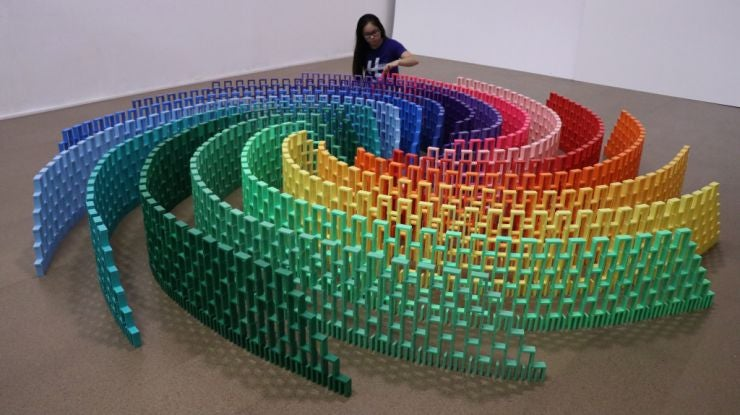
My favorite scene to edit in Lily Topples the World was a huge public domino topple at the Brattleboro Museum in Vermont. The scene comes early in the film and it is a massive domino piece that is built and toppled in the lobby of the museum with hundreds of people watching live. It was a blast to edit it because it’s a really fun and flamboyant scene with a million shots of the toppling dominoes amid all the amazed attendees. What made it extra fun was how I used a ton of cameras for this scene. I think I hit about 10 different cameras in this scene. Footage came from my documentary crew shooting in 4k, from Lily’s consumer HD camera, from other domino artists that were there. And then, I also crowd-sourced footage from the audience! So, I just literally took whatever I could get my hands on for this scene. It was such a wide variety of material ranging from 4k AVC files to short iPhone clips. Premiere Pro did such an amazing job being able to import all the different file formats and blend it in an insane multi-cam set-up! It was bonkers.
What’s the toughest thing you’ve had to face in your career and how did you overcome it? What advice do you have for aspiring filmmakers or content creators?
In my early 20s, I realized that I could definitely make a great career by being a professional trailer editor. I found myself editing trailers for Hollywood studio films and big television series. It was great, very challenging, extremely rewarding. But I realized that I wanted to also tell my own stories, and I had things that I wanted to explore as a filmmaker. So, I just went for it and jumped off that precipice and put the editing career on hold. It was scary and I was scraping by for a few years, but in the long run, it was a really great decision for me. Sometimes you need to just have faith in what you believe in and go for it. Don’t give up. And then, don’t listen to people who say something isn’t going to work or isn’t going to be good. Just put your head down and do your thing!
Henry Loevner & Steven Kanter, writer/director/DP/editor of The End of Us
Edited on Premiere Pro

“The End of Us”
How do you begin a project/set up your workspace?
HL: I don’t necessarily start editing the beginning of the film. I go for the low hanging fruit first to build momentum and find a groove.
SK: I’ve learned the hard way to devote time to thoroughly organizing my bins and sequences. Then I’ll simply watch back the raw footage and jot any rough ideas about the tempo and approach for my scenes so I can revisit with some direction.
Tell us about a favorite scene or moment from this project and why it stands out to you.
HL: I love all of our Skype/phone call scenes. They were shot live on the day rather than pre-recording one half of the call. And something about the awkward lag on the calls just brings out an authentic performance and some interesting natural pauses.
What were some specific post-production challenges you faced that were unique to your project? How did you go about solving them?
SK: Due to the subject matter of the film, we really wanted to move as fast as possible with the post process so we could get the film out there. So Henry and I decided to split the edit down the middle, carving off chunks of scenes for our first passes. We then shared our sections with each other and traded extensive notes. This worked surprisingly well for us, as we were able to view each other’s halves with fresher eyes.
What’s the toughest thing you’ve had to face in your career and how did you overcome it? What advice do you have for aspiring filmmakers or content creators?
HL: Even a good filmmaker can make a bad film sometimes. There’s a lot of randomness to how some projects work and others don’t. So I think it’s important to not put too much emotional stock into any one project. Don’t get stuck. It’s about forward momentum over time.
SK: Learning to stop making things for other people and instead focus on what I want. Ironically, when you pursue the specific things that interest you and truly bring you joy, there is an unexpected universal appeal that comes with it.
Saskia Marka, title designer of The Queen’s Gambit Title Sequence — Winner, Title Design Competition
Created with After Effects, Photoshop, and Illustrator
How did you begin this project? What was the collaborative process like?
I wanted to give the concept a modern approach. That’s why I created a 25 second mockup with processed gif animations by David Whyte, which I showed to Scott Frank and his team. He loved it and from that point I had total freedom of what was going on behind the credits. The look of the sequence is 1920s with a warm fuzziness, but the credits are very modern in style and typography. My intent was to create opposites on different levels.
Who is your creative inspiration and why?
Pinterest. It’s the most creative tool for me, because you can always dig deeper into all directions, find links to new options that never get boring, or find similar pictures. I’m also inspired by nature, abstract art and design, typography, photography.
What advice do you have for people aspiring to get into the motion design space?
You should have fun with what you are doing and be as playful as you can be. Even if you might be working with a tight style guide that doesn’t leave many options — try out new things, use filters for what they are not made for, mess things up. Draw outside the lines. Even if you might not use your results now, you might need it later for something else or you get a new inspiration out of it for yourself. Don’t plan everything, let things happen. Don’t try to reach perfection, but always give more than your client expects you to. That’s how it works for me at least!
Michael Riley, Creative Director & Illustrator of Birds of Prey (and the Fantabulous Emancipation of One Harley Quinn) Title Sequence — Special Jury Recognition, Title Design Competition
Created with Photoshop, InDesign, Premiere Pro, and After Effects
How did you first get into motion design? What drew you to it?
When I was a student at Rhode Island School of Design, I did a six-week internship under Tibor Kalman at his studio, M&Co. in New York. Tibor was finding all kinds of ways to break free of norms within graphic design. He used typography and graphic elements to express ideas and emotion in film titles and music videos. His use of typography and graphic design in motion in concert with film was something really exciting and different. His motion work was groundbreaking, and it opened my eyes to so many more possibilities within graphic design.
What was the inspiration behind your title sequence? What were you trying to achieve?
This project was all about Harley Quinn. The design of the title sequence was meant to be a visual expression of Harley’s character. She’s wild, strong, smart, compassionate and very human. The title sequence’s visual style and some of the elements were inspired by the production design from the film. The movie was bold, bright and colorful. For the tone of initial storyboards, I took inspiration from the spirit of Cy Twombly’s work, some of which consists of wild, expressive, bold, almost out-of-control scribbling. I thought that spoke to Harley Quinn’s character.
Describe your favorite part or component of the title sequence. How did it come together and how did you achieve it?
For me it was all about the fun of drawing. I’m addicted to Procreate on my iPad, and the way Procreate seamlessly integrates with Adobe Creative Cloud — specifically Photoshop — made the process enjoyable, because I was able to focus on the visual ideas and not worry about the tools. It was a very intuitive process. I spent many weeks drawing and illustrating as many visuals as possible that were inspired by the film. I’ve always used drawing as a tool to come up with ideas, but I don’t always use illustration in the final animation. I think a title sequence should reflect the characters and the story of the film, and in this case, using wild colorful illustration seemed to be a good fit.
What advice do you have for people aspiring to get into the motion design space?
Treat any design opportunity as a gift. Cherish clients that bring you any creative opportunity. Work hard. And stay persistent!
Taylor Brusky, editor of Waze & Odyssey, George Michael, Mary J. Blige & Tommy Theo’s “Always” — Special Jury Recognition, How the Hell Did They Do That, Music Videos
Edited with Premiere Pro and After Effects
How and where did you first learn to edit?
My first introduction to editing was when I was in the 6th grade and I bought a toy camera from Toys“R”Us which came with its own editing program. It was designed for kids, so it included a lot of fun special effects, such as aliens and explosions. When I was in the 7th grade, I upgraded to a mini-dv camera and I taught myself how to edit in Adobe Premiere. I found Premiere’s user interface very intuitive. Premiere was easy for me to learn, even back then as a young teen.
How do you begin a project/set up your workspace?
I start a project by importing the audio and video into Premiere. After importing it, I send the video to Adobe Media Encoder where I transcode it to 1920x1080 Prores 422 LT. I often edit high resolution footage that is 4k-6k in resolution, so it is important for me to transcode it for my offline edit. I relink to the raw, higher resolution media at the end once the edit is locked.
What were some specific post-production challenges you faced that were unique to your project? How did you go about solving them?
The video is designed to look like it is all one take with no editing. But in reality, there are a lot of hidden edits scattered throughout. The hardest part of the edit was finding ways to hide the edits. A lot of them required complex visual effects such as rotoscoping. Luckily we had a great VFX team who handled that aspect, but there was still a lot of work on my end trying to get it all pieced together once they finished the effects. Our director Nelson De Castro did an excellent job planning out all these edits in advance. He is a creative genius who makes every one of his videos mesmerizing to watch.
Congrats to all the SXSW winners who used Creative Cloud tools to bring their stories to life:
Adobe Editing Award
Category Winner: R#J
- Editor: Lam T. Nguyen
- Adobe Tools: Premiere Pro, After Effects, Illustrator, Photoshop
Documentary Features Competition
Grand Prize Winner: Lily Topples the World
- Director/editor: Jeremy Workman
- Adobe Tools: Premiere Pro, After Effects, Media Encoder, Photoshop, Lightroom
Music Videos
Grand Prize Winner: Madame Gandhi - “Waiting For Me”
- Director: Misha Ghose
- Editor: Sourya Sen
- Adobe Tools: Premiere Pro
Special Jury Recognition for Pure Joy: Southpaw
- Editor: Sawako Kabuki
- Adobe Tools: After Effects, Media Encoder, Photoshop
Special Jury Recognition for How the Hell Did They Do That?!: Waze & Odyssey, George Michael, Mary J. Blige & Tommy Theo — “Always”
- Director: Nelson de Castro
- Editor: Taylor Brusky
- Adobe Tools: Premiere Pro, After Effects
Episodic Pilot Competition
Grand Prize Winner: 4 Feet High
- Editor: Mariana Quiroga
- Adobe Tools: Premiere Pro
Poster Design Competition
Grand Prize Winner: Bob Moses Featuring ZHU – Desire
- Creative Director: Owen Brown
- Art Director and Illustrator: Benjámin Kalászi
- Graphic Designer: Diego L. Rodríguez (Paramoidme)
- Adobe Products Used (Poster): Photoshop
- Adobe Tools (Music Video): Premiere Pro, After Effects, Animate, Photoshop, Illustrator
Special Jury Recognition: The Box
- Creative Directors: James Burns and Shal Ngo
- Graphic Designer: Aleksander Walijewski
- Adobe Tools: Photoshop (Poster design) — Premiere Pro (Editing)