The Cleveland Orchestra enters its “Second Century” with UX design at the center
As the Cleveland Orchestra moves into its second century, UX is front-and-center and driving how the design team is reimagining their digital experiences.
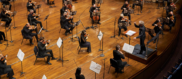
Image credit: Roger Mastroianni.
To attend a live concert is to participate in a one-of-a-kind experience. While we’re moved by the sounds and acoustics around us, so too does the audience have a profound effect on the atmosphere of a performance. Having grown up surrounded by musicians, I’ve been fortunate to often find those opportunities just around the corner. Unfortunately, with how hard the performing arts have been hit by the COVID-19 pandemic, stages have gone silent and cultural institutions are among the last to welcome back audiences. Until our venues are able to open again, and bring live experiences back, it’s our responsibility to make sure that people can find new ways to resonate with us online. Digital is their primary point of contact now.
I’m the lead interactive designer for The Cleveland Orchestra. When I joined in 2018, right after the Orchestra’s Centennial Celebration Season, we started to map out what larger role digital could play in our “Second Century.” At the time, our digital products were essentially conduits to the in-person experience of attending a concert: a website or mobile app could help get you into a seat at Severance Hall or Blossom Music Center (the Orchestra’s Summer home). But what if that one-way street went in either direction, offering our guests more choice in how they engage with us?
We decided to take this one step further — developing a thorough and robust strategy for creating enriching digital experiences that don’t replace or compete with their in-person counterparts but complement and augment them. It wasn’t long before those ideas turned into working prototypes. Adobe XD helped break our ideas out of our notebooks and place them into our hands.
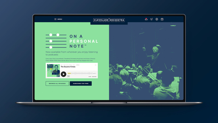
Already spanning two seasons, The Cleveland Orchestra’s podcast tells the stories about the music that has shaped their lives.
Content design at the heart of digital strategy
Our digital strategy is informed, at its core, by how we now approach, create, and deliver content unique to digital mediums. At the center of this is choice, in both format and access.
For example, last spring we launched a podcast, On A Personal Note. In this series, musicians, guest artists, and staff share their personal connections to a piece of music, their relationship with the Orchestra, or even a traumatic life event and how music helped them get through it. The show is not so much about music itself and more about the people who help bring it to life and their personal, behind the scenes stories.
Digital can be a way to capture these moments and deliver a slightly different perspective, something that would be difficult to achieve in person because of all the operational needs, even in more “normal” times. Over the summer we published a limited-time audio archives series, TCO Classics: a curated catalog of concerts throughout our history that had been recorded, but were never published for free, online. Listeners were able to navigate through a new set of concerts each month from our website, stream their audio in-full, and learn more about their historical importance.
In the fall, we then launched a brand-new streaming service, Adella (named after our founder, Adella Prentiss Hughes), which enables people to watch our new concert broadcast series, In Focus, from the comfort of their home. Without audiences in person — but with the full scope of Severance Hall to film from — a myriad of unique angles of the performance were suddenly available to our at-home audiences. Paired with behind-the-scenes footage and musician interviews, In Focus and other audio-visual offerings — via the Adella website and mobile/TV apps — provide fresh, complimentary experiences to what we’re already doing best: live classical music.
What each individual series has in common is giving our audience an entirely new way to get to know and interact with The Cleveland Orchestra musicians, conductors, and guest artists — who they otherwise might only witness from their seat at a distance. As UX designers, our priority is to ensure we deliver this content, via our digital experiences, consistently. While each project’s branding and editorial were being developed in real-time, Adobe XD allowed our team to anticipate how they could appear in a multitude of ways. We would plug draft content into our wireframes and see what users would inevitably see, or discover user-interface challenges worth communicating back to our editors. It always starts with the content, and then we leverage digital to best deliver that experience to people.
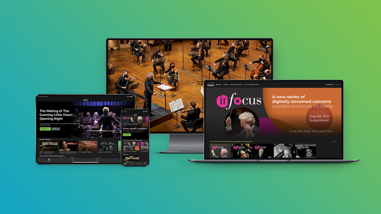
Adella, The Cleveland Orchestra’s digital streaming service and mobile/TV app.
Prototyping a new user experience with Adobe XD
Near the end of 2020, we relaunched The Cleveland Orchestra’s official website, and debuted a new mobile ticket app to go along with it shortly after. Both of these projects began as Adobe XD prototypes in early 2019, and went into development around roughly the same time later that year. With over 100 years of history to lean on — concert programs, cultural details, seating charts, etc. — we had a lot of real-world content to run with. From the beginning, XD empowered us to import whole concert seasons into our designs, and create vibrant prototypes to share with the team.
It works with the scale of the Orchestra — we could explore what dozens of concerts were going to look like on the new homepage in real time, right away. Does the typography start to break down at a certain volume? What photographic compositions work best in this layout? How big should the icons be? If we wanted to see how our first concert in 1918 looked in our 2021 designs, we could.
Rapid prototyping with Adobe XD meant we could avoid common pitfalls early on and determine all the different gaps in the experience. We are now always able to ensure everything fits in the real estate of the screen, before any new experience is coded (a lifesaver with everyone working from home). This has also meant we can play around and find fun and exciting new ways to display actual concert information.
A mobile-first approach
The Cleveland Orchestra attracts the youngest audience of any orchestra in America — 20 percent of our classical music concert guests are under the age of 25 — thanks to our innovative Center for Future Audiences. In addition, over 50 percent of our users visit our site from their smartphone or mobile device. When in-person concerts return, mobile use will most likely be even higher, and we’re going to inherit an even more tech-savvy audience regardless. Therefore, we approach everything from a mobile-first perspective to create a cohesive experience.
Our event pages, for example, can be really short or really long. You may have an opera with a huge production and a lot of artists that are performing. Or you may have a shorter program for solo recitals, or ones with an incredibly wide date range such as our holiday concerts. We needed to nail the mobile experience for these page-types, which are easily our most frequented, and make them feel comfortable regardless of screen size. We also needed to reduce friction: the amount of time you have to wait, as well as the number of actions you need to perform, to do what you want to do. This inspired us to create a whole sub-navigation for our new event pages, and even rethink how we display performance dates — both of which you can see today.
We’re grateful to see our commitment to mobile-centric design already being recognized — the site was recently nominated for Best Mobile User Interface in the 25th Annual Webby Awards. Adobe XD made it easy for us to introduce new interface patterns when we needed them, and encouraged an immediate feedback loop with its sharing features. The openness and communication went through the roof, both for our internal team and external development partners.
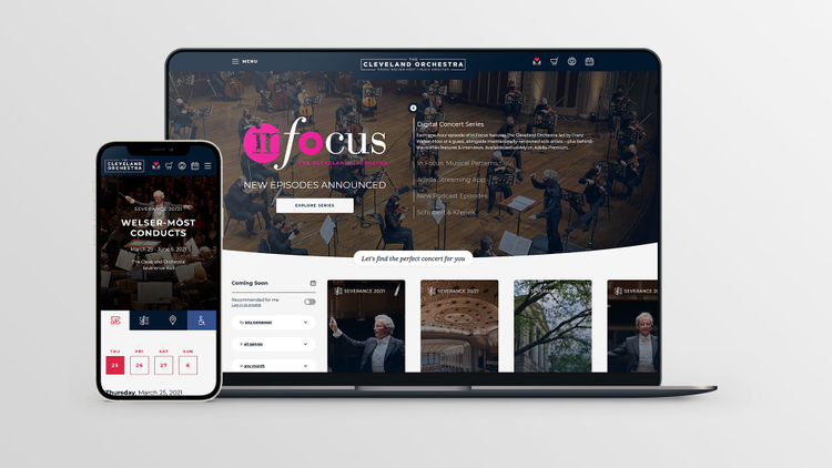
Adobe XD made a big difference to the redesign of The Cleveland Orchestra’s official website, including high-traffic event pages.
Simplicity is the future of ticketing
A key aspect of our “Second Century” is a modern approach to ticketing, and our brand new Ticket Wallet app fulfills a real user need. There’s often a sense of urgency or even a little bit of stress involved in getting a ticket to live events — maybe you’ve forgotten your tickets at home, or you’re running a little bit late and the Will Call line is longer than you expected. We still want to let people obtain physical tickets, but we also want to offer an option that allows people to instantly access their tickets and have them available in one place on their phone — something our audience now expects anyway. Whenever there’s any new information, tickets are also updated digitally in real time. There’s no need to reprint tickets, which solves a problem for us internally, too. This has been especially important during the pandemic (when concerts are able to run for limited, invited guests), when event information would need to adapt as we adhere to health, safety and social distancing policies.
Our Minimum Viable Product for the Ticket Wallet app kept getting simpler and simpler. Adobe XD allowed us to focus on simulating the entire mobile user experience with mostly real data. When we handed off the prototype to a developer, it just felt like a real app. They were able to easily see what we were trying to go for. It already included animations, and everyone knew exactly what all the buttons were supposed to do. It excited stakeholders, led to more constructive conversations, and made getting buy-in significantly easier.
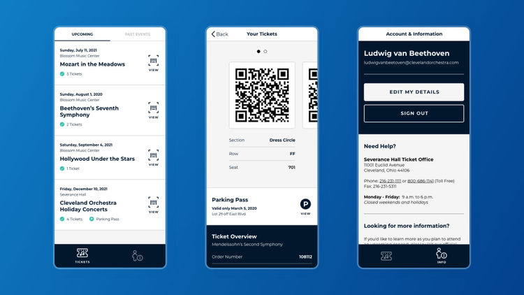
The new Ticket Wallet app gives ticket holders and subscribers with The Cleveland Orchestra instant, secure, and paperless access to their concert tickets, including seating information and parking passes. See a demo of the prototype.
We also used Adobe XD to build a digital design system, which we based both the new website and Ticket Wallet app on. Visually and interactively, they go hand in hand — sharing that design language also improved communication between separate developers. Sometimes it’s hard to bridge that gap when you’re handing things off and you have to correct the course. XD, however, helped us validate our own assumptions and understand how difficult the build process was going to be from the beginning.
Digital presents the opportunity for people to interact with cultural institutions in improved and sometimes new ways. A website or app is often what gets people to a physical location in the first place, and it’s important that we think about that user experience more holistically. Digital is no longer just a means to an end, but a compelling destination for those sorely missing the arts and live entertainment in their lives.
We need to ensure our audience and supporters have a vibrant experience however they choose to approach us, and are excited to continue engaging with The Cleveland Orchestra. During the pandemic, we also need to make sure that we’re still available and that people can connect with us. Organizations like The Cleveland Orchestra play a fundamental part in serving our communities in Northeast Ohio and around the world, with the aim of inspiring and enriching lives by creating extraordinary musical experiences at the highest level of artistic excellence. A purposeful digital user experience is vital to that, and ensures that we’ll continue to grow with our audience for generations to come, and respond to the world around us for the next 100 years.
Hear firsthand how Andrew and team used Adobe XD to reimagine the future of classical music experiences at the Cleveland Orchestra. Sign up for the virtual XD Meet the Makers with Andrew on May 19.