Today’s aesthetics and tomorrow’s visual trends insistently weave threads from the past into the tapestry of the future. Often, the most interesting view of current visual media comes to us through the lens of art history. Adobe Stock’s design trend Back to Bauhaus — part of our annual Creative Trends forecast — is an opportunity to explore great works of architecture and design as a source for cutting edge inspiration and visuals for today.
https://www.youtube.com/watchv=IjFUX_Ju_ZQ&list=PLD8AMy73ZVxUYfaMWzxCfSnKAv7r3gldX&index=3
Today, Bauhaus philosophy and aesthetics have practitioners across the world, all of which can be pinpointed to a very specific origin: an experimental higher education institution called the Staatliches Bauhaus (“house of building”), which was founded in Germany in 1919. The school offered a curriculum that was radical for its time, combining two Weimar-based schools — the Weimar Academy of Arts and the Weimar School of Arts and Crafts — under a single roof. Students of the Bauhaus School simultaneously learned art, architecture, and technical craft, at the campus which was based in Weimar for six years, then relocated to Dessau through 1932, and finally made one last move to Berlin in 1933, before closing under mounting pressure due to the rise of Fascism in Germany.
Much of contemporary architecture — and indeed, the entire concept of “liberal arts education” — owe a debt to this influential school and its radical take on aesthetics, function, and education, as well as other experiments in social progress that briefly flourished in Germany between the two World Wars. Though the burgeoning intellectual and artistic landscape of post-WWI Germany and Austria soon gave way to much more oppressive politics, we can still feel the ethos of the Bauhaus in modern design in a widespread emphasis on functionality, accessibility, and education.
Form, craft, and context
It may seem, at first, that a school that centralized craftsmanship as a core value would have little place in a digital era, but the emphasis on craft can be as meaningful to graphic design as the physical craft of woodworking was to the original Bauhaus School.
“Back to Bauhaus was one of the first we identified specifically, in the return to the craft [of graphic design],” says Shea Molloy, vectors and illustrations lead at Adobe Stock, on Back to Bauhaus as a 2021 design trend. “I think that that trend is coming, specifically, from so many designers getting excited about the 100th anniversary of Bauhaus, which was 2019.”
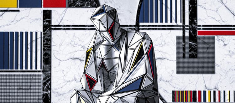
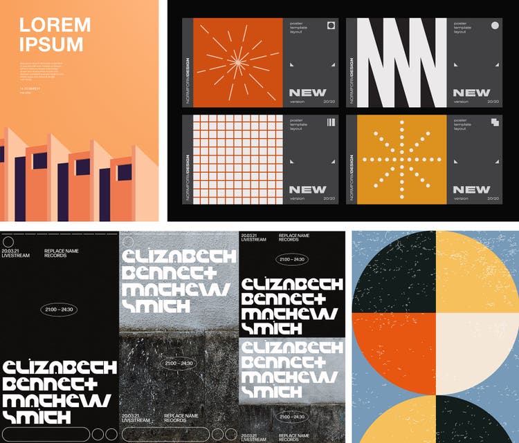
What may have begun as artists being inspired by or designing media for organizations sponsoring Bauhaus-related programming, extended beyond the initial throwback fervor and into a fresh application. The Back to Bauhaus look is characterized by strong, spare compositions, ample whitespace for balance around discrete but related subjects, dramatic shadows, and clean illustrations.
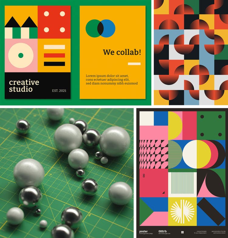
There is also a Bauhausian emphasis on geometrics and playing with shapes in new ways, which lends itself readily to digital layouts and 3D design, where elements can be shifted, replicated, and mirrored with ease.
“[Bauhaus] was also pretty political,” says Molloy. “I think that when you see people leaning on digital design to send political messages, this kind of design is striking and refreshing in a way that makes people pay attention. You can see an echo of the Bauhaus ethos in PSAs, political campaigns and murals, and the way designers are employing data visualizations to share and support political messaging.”
While the original Bauhaus flourished during a time of unprecedented social liberation in Germany, it also preceded the extreme backlash of rising Fascism. This tension can find parallels in our current, highly polarized political climate, and its aesthetic resonance make it a good match for present day social movements, and a desire for plain-spoken, readable, verifiable information design.
A few recent examples of relevant, recent data design include Scout’s innovative urban planning tools, the COVID-19 global dashboard from Johns Hopkins (widely lauded as being clear and easy for laypeople to understand), and NYC Open Data abstract traffic visualizations (a clever reimagining of Piet Mondrian’s artwork, Broadway Boogie Woogie).
Alexey Brin.
A new wing on the Bauhaus
As a contemporary design trend, Back to Bauhaus will always have a foothold in architecture-related media, as well as minimalist magazine treatments, package design, and music-related posters and ephemera.
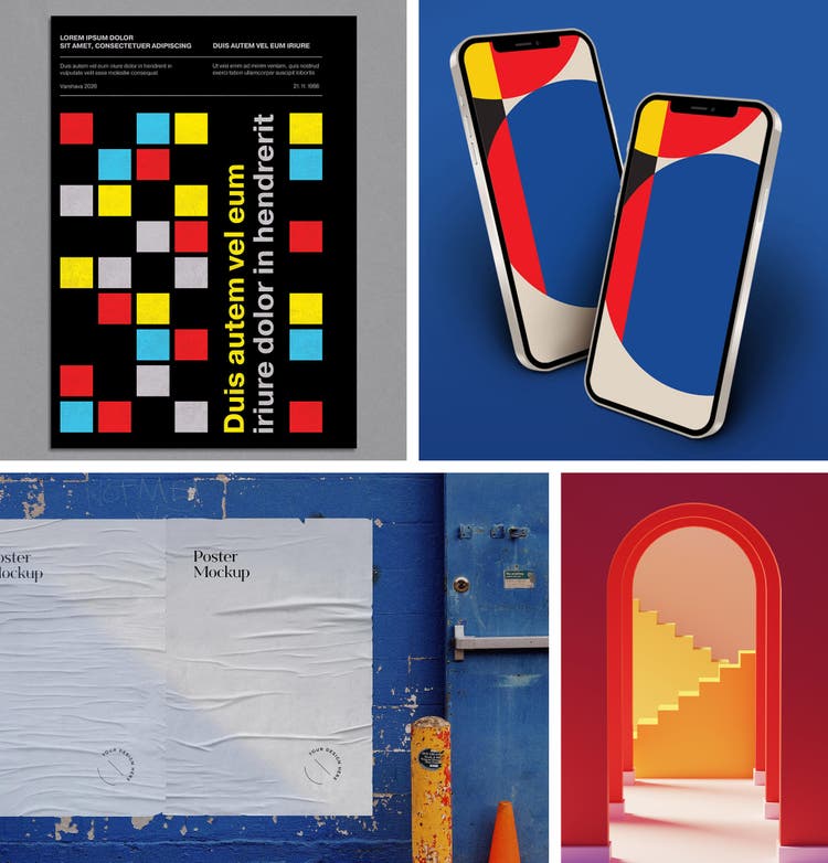
Limited palettes are a signature of the Bauhaus, especially color-blocked primaries that can offer informational wayfinding through press and program materials. There are opportunities to push the limits of the primary palette, but color treatments tend to range in varying tones and hues of these core primary elements, and layouts leverage high-contrast between a handful of simple colors for visual punch and impact.
Those wishing to make a literal connection can explore fonts from the Hidden Treasures of the Bauhaus collection on Adobe Fonts, featuring re-discovered typographical gems of Bauhaus design, restored and recreated by renowned type designer Erik Spiekermann and team. Iconography is also a great type fit for the shape play of Back to Bauhaus style, again reinforcing it as a great go to option for materials designed to instruct, inform, or politicize. Along with its continental contemporary, Russian Constructivism, Back to Bauhaus loves the confluence of red and black, plus a little blue, to cool things down, or yellow to brighten the mood.
Many current takes on the Bauhaus are not shy about directly referencing their inspiration. Art prints, like this poster work by Wes Karchut, will often name-drop in the text treatment, and there are infinite takes on the iconic architectural installations of the original school. Entire thought catalogs are still devoted to analysis and updates of the Bauhaus, and a wealth of typography studies have been done, down to analysis of the impact and intention of each line, form, and letter — truly a craftsman approach to graphic design.
For today’s practitioners, textile designers like Molly Fitzpatrick are cleverly translating the graphic, linear nature of Bauhausian aesthetics into an array of woven home goods. Kansas City-based artist and designer Greg Azorsky has found ways to deploy Back to Bauhaus on everything from t-shirts to menorahs. Adobe Stock contributor blackcatstudio has numerous ways to bring Bauhaus to your house — or brand.
When it comes to both fashion and utilitarian products, accessibility continues to be a key consideration for Bauhaus-influenced designers.
“While ‘accessible’ in the Bauhaus days may have meant something was available to the working class, today it can mean many things,” says Molloy. Some examples that really rework form to improve functionality with a lens of accessibility and intersectionality include customizable wheelchairs from Disrupt Disability, and ADIFF, a form-refactoring utilitarian fashion brand that supports refugees.
Perhaps the greatest challenge for the Back to Bauhaus enthusiast is the need to create your own wing on such a venerated school of thought and form — but with building blocks this powerful and fundamental, it’s a design tactic sure to raise something backed by history and open to new evolution.
Stock content creators wanted
Get inspired by design past and present, with the curated Back to Bauhaus gallery on Adobe Stock.
Designers and illustrators, get our full Back to Bauhaus Call for Content here for more inspiration, then upload your work to start selling your Bauhaus-inspired templates, vectors, and illustrations.


