Have you ever received an email, a slide deck, or a document and seriously questioned the formatting choices of the sender? Maybe the font was too ornate, too small, or just plain hard to read. In this case, you felt the strong impact that typographical choices have on readability. After three years of research and studies, what we now understand is how incredibly individualized reading is, how nuanced comprehension is for each person, and how many more questions we have left to answer.
Adobe’s most recent research paper, published in ACM’s Transactions on Computer Human Interaction (TOCHI), explores how font selection affects the reading performance of a general population of adult readers. Lead author and Adobe Research intern Shaun Wallace and his coauthors have thought a lot about how fonts matter in communication. This paper was recently covered by Fast Company (“Are Some Fonts Ageist?”) and the Nielson Norman Group (“Best Font for Online Reading: No Single Answer”).
Note: The following paper studied font, not to be confused with typeface. What is the difference between font and typeface? Typeface is a group of characters, letters, and numbers that share the same design (for example, Times New Roman). A font is a specific style of typeface, such as Times New Roman in 16 pt and bold.
Latest Adobe Research shows incredible speed gains by simply changing font
This study looked at a diverse group of 352 participants, from 18 to 71 years of age, of which 46 percent were female, 22 percent bilingual, and all self-reporting they are comfortable reading English. The study measured 16 common typefaces and their effects on reading speeds, preferences, and comprehension scores. The measurements used are inspired by an optometrist’s eye test. Just as an optometrist will rotate letters and ask, “Which is easier for you to read?”, here we toggled fonts back and forth and measured font preference. Then a reading test was followed by a set of multiple-choice questions that probed participants’ comprehension of what they had just read. We asked about their interest and knowledge of the content, which we then used to rule out the effects of these factors on reading performances.
Our Findings:
There is no “best” font. Different readers read fastest in different fonts (without losing comprehension), so personalization will be key.
- On average, an individual read 35 percent faster with their fastest font than with their slowest font.
- This did not come at the expense of comprehension. Participants’ comprehension was high (around 90 percent on multiple-choice comprehension questions) across all fonts.
- However, no one font was a clear winner for all participants. Reading tools of the future (such as devices) will need to allow readers to personalize their font experiences.
The fonts people say they prefer aren’t often the ones with which they read fastest. Different people prefer different fonts, but that preference does not equal performance. Participants read their fastest font on average 14 percent faster than when reading their preferred font, even though 73 percent of participants believed their preferred font would be their fastest. Thus, we need to help people discover their own best fonts.
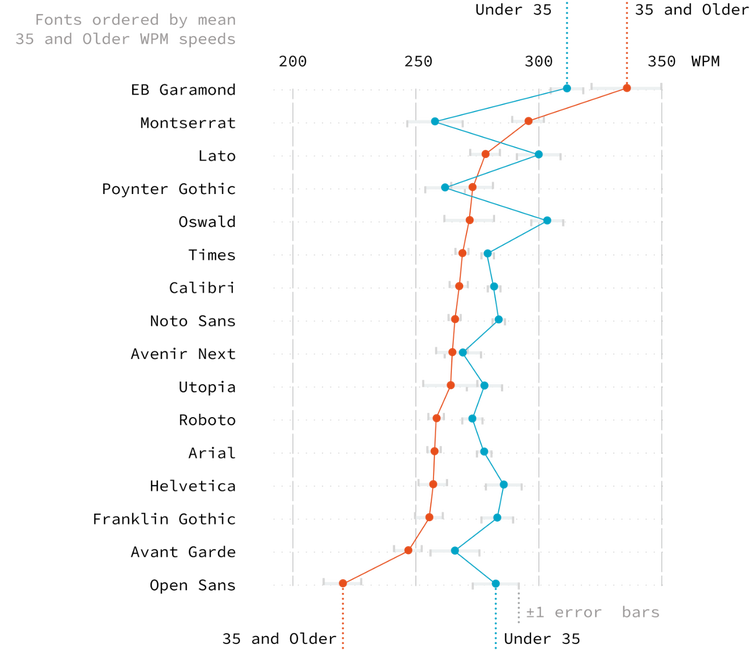
Certain reader characteristics, particularly age, can be predictive of the best fonts for those readers. Garamond and Montserrat typefaces tended to be better for older participants. There may be multiple factors at play here, including familiarity with a particular font or the visual properties of the fonts themselves.
These surprising results encourage further research, including investigating aspects of text formatting beyond font, other metrics of performance beyond speed & question-based comprehension, testing on other, diverse populations of participants. It also suggests a need for tools to get readers the best formats to help them read faster.
The Readability Consortium, of which Adobe is a founding member, is already running follow-on readability studies with children, adult learners, and dyslexic readers. We are investigating text characteristics including character width, weight, and spacing, and the effects of reading rulers — text highlighting or underlining that helps a reader keep their place on a line of text — by collecting data on eye movements and voice recordings of people reading aloud. We are also building models to match readers to the best font formats that improve speed and comprehension.
We envision a day where the digital assistants in our pockets and on our desks can alter the text on the screen to our unique needs, eyes, and brains. To get to this future, we invite technologists, vision scientists, data scientists, typographers, educators, reading experts, and anyone else interested to join us in making reading better for everyone.