Why is color accessibility important?
Artwork by Manisha Gupta.
Colors have a huge impact on the look and feel of any product. When designing for people, color becomes a strong medium to communicate and a powerful tool for accessibility. We asked Alison Murphy, a designer at Pearson’s, “What does accessibility in design mean to you?”
“There is a great thing in universal design called the ‘curb-cut effect’ — essentially, by making something accessible to a certain audience, you often improve the experience for everybody,” she answered. “Color themes that work well for a vision challenged audience will work well for everyone!”
Accessibility comes with multiple advantages, the most prominent being the uniform access and interpretation of information unaffected by the limitations of the different types of audience.
Take healthcare systems for instance. Amidst the current pandemic situation, lack of minimum contrast ratio in the colors of healthcare apps and websites may hinder communication of important information on products or services for people with low vision, color-blindness, or aging. Accessibility enables the basic color contrast, so that everyone can read the complete information provided and leverage the relevant parts.
Designers sometimes get swayed by design trends, brand palettes, or their personal love for low contrast typography that makes them choose colors that are not legible for all. No aesthetic choice should ever come at the expense of accessibility. So, how do you pick colors that fit with your desired style, while also solving for color contrast? Well, now you can with Adobe Color.
Introducing Adobe Color’s Contrast Checker
Contrast Checker is Adobe Color’s new accessibility tool for creating WCAG compliant color themes based on an advanced recommendation system. The contrast-checked color palettes can easily be shared through Adobe Creative Cloud Libraries and can be readily accessed within any Creative Cloud apps. Simply put, Contrast Checker enables you to dynamically fix color legibility of your designs, and meet WCAG criterion.
Read on for a look at color contrast and its importance, and how Adobe Color’s Contrast Checker can help you easily meet accessibility standards.
What is WCAG?
To get started, let’s look at the Web Content Accessibility Guidelines, commonly referred to just by its acronym, WCAG. They are a set of guidelines and recommendations for how to make your web content more accessible. It was developed by the World Wide Web Consortium and represents an internationally accepted standard for web accessibility of sites and applications.
What is contrast ratio?
Colors need to have sufficient contrast between the text color and its background (technically called luminance contrast ratio) for them to be readable for anyone. This includes text on images, icons, and buttons, as well as the colors used to convey other graphical information such as diagrams and maps.
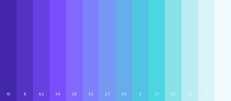
The highest contrast ratio is 21, when one color is black and the other is white. The lowest contrast ratio possible is 1, when both the colors in a combination are the same, and hence have the same luminance. So all other possible contrast ratios lie between 1 and 21. A key point to note is that, with solid colors, the contrast value does not change if you flip the colors — for example, blue text on a white background has the same contrast value as white text on a blue background.
Hence to make things more accessible, maintaining a “good” contrast ratio is a must. This can be done by making one or both of your colors lighter or darker to achieve a higher contrast value.
The WCAG standard assigns two contrast ratio ratings, AA and AAA that are considered “good.” These ratings are applied at different contrast values (3, 4.5, and 7) depending on your need (using small or large text size vs just examining the color of a graphic object). One thing to keep in mind is that although AAA ratings are better than AA ratings, they can really limit your colors options. So unless you have a specific AAA requirement, getting a AA rating is still an option worth aiming for. Adobe Color’s Contrast Checker tool will help you quickly find these AA ratios, which occur at values 3, 4.5, and 7.
Get started with Adobe Color’s Contrast Checker
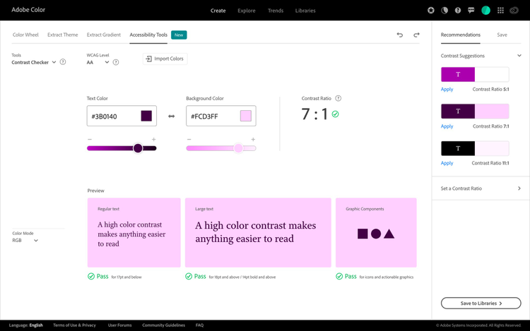
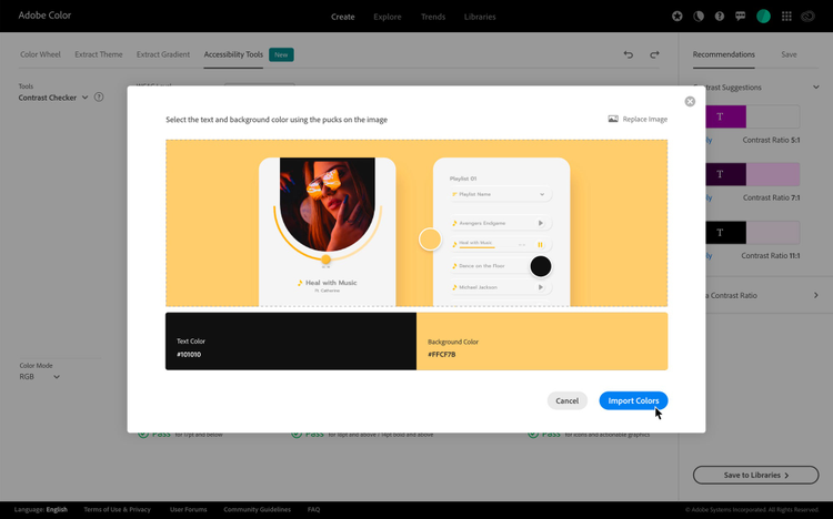
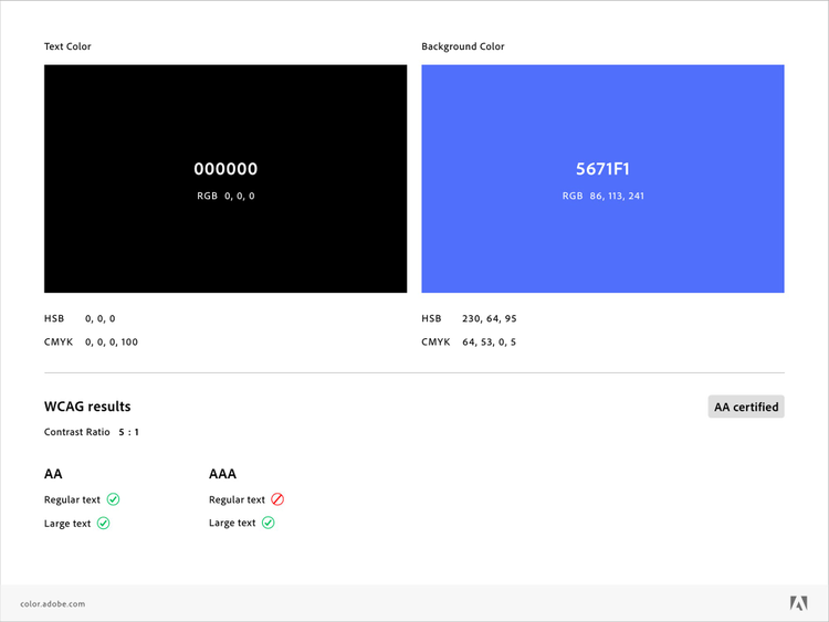
You can start using the Contrast Checker by visiting Adobe Color, and going to Accessibility Tools > Contrast Checker. You can input the text color and background color values or upload a screenshot of your project to pick the colors you want to check for contrast.
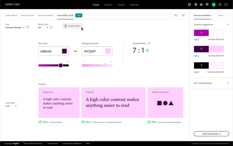
You can also import your own images or graphics to sample colors from. Use the ‘Import Image’ button to browse for files on your device or drag and drop right onto the window.
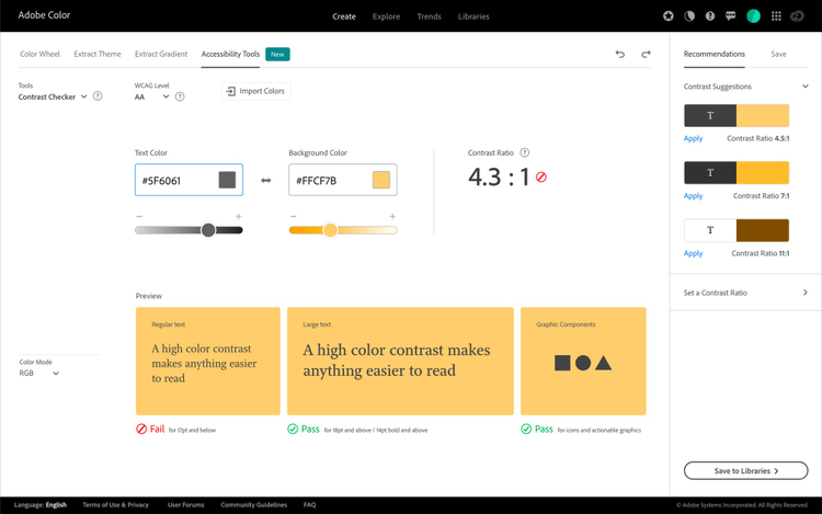
Check for accessibility
Once the colors are imported, look for the Pass or Fail sign below the Preview section to assess if the contrast is adequate to meet the WCAG criteria. If not, the first quick way to fix it is through the sliders underneath the input boxes — moving towards the ‘plus’ sign will increase the contrast ratio staying close to the original hues.
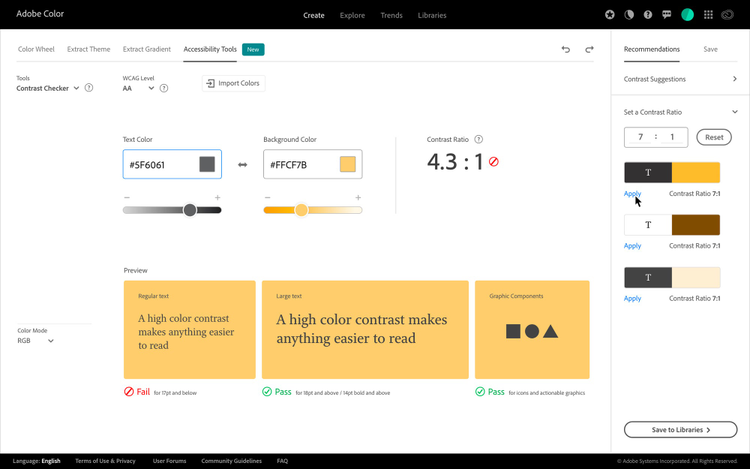
Work with recommendations or set a contrast ratio
When compared to other tools or plugins available in the market, the prime differentiator is the Recommendations system. By default you will have contrast suggestions for 3:1, 4.5:1 and 7:1. These conform to the WCAG minimum contrast requirements and help to solve the contrast problem in a single click.
A second way to improve the contrast is by inputting the desired contrast ratio you want to generate under the “Set a contrast ratio” section. Enter the values, evaluate your choices and hit “Apply”. You will get a live preview of the colors combining Regular text, Large text, and Graphical components on the background color. This facilitates a quick decision on whether the contrast is good to go or needs further iteration.
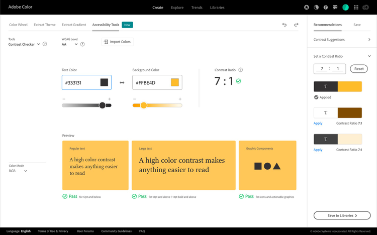
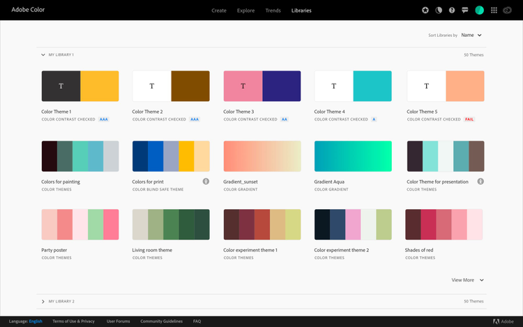
Once you feel confident about the color choices, go ahead and save it in Creative Cloud Libraries. Within the Libraries section, the two-color themes that are contrast checked will be marked with the highest qualifying level — AA or AAA (highlighted in blue). On the other hand, all color themes that failed to meet the criteria can still be used in your designs, but ‘Fail’ denotes that they did not pass the Accessibility check.
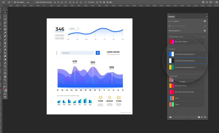
Update your colors anywhere within Adobe ecosystem
To make the experience more seamless, the two-color themes will then be saved as an asset within Libraries that help to organize, use, and share re-usable creative elements within your favorite Creative Cloud applications. This allows the user to update the colors in their designs without the hustle of any back and forth to copy or remember color values.
Sharing made easy with Adobe-certified accessible themes
Since design is a collaborative process, Adobe Color helps you share color themes with your team members. Each color theme has an option to “Download jpeg”, which downloads not just the swatches, but gives add-on information like different color mode values, WCAG results, and Adobe certification.
We are very excited to introduce the Contrast Checker tool to the design community with a goal of empowering designers to create accessible-first color palettes.
This empowers the designers to address their basic challenge of the need to learn about color accessibility and its application in their designs. Once choosing the background and foreground colors with the minimum contrast ratio becomes a habit, it will automatically lead to designs with much higher visibility across a wider range of users. Accessibility is all about indulging in design creation that can be enjoyed by all.
For more advanced accessible color creation, Adobe’s open source tool Leonardo enables designers and developers to collaborate on generating accessible and adaptive color themes. Read more about Leonardo here and how to create adaptive themes here.