How Epsilon bridges global collaboration with XD
All images courtesy of Epsilon.
Epsilon, a global outcome-based marketing company, is recognized for creating engaging experiences that balance emotion with analytics, personalizing consumer journeys, and helping marketers anticipate, activate and prove measurable business outcomes.
“We take creative storytelling and pair it with data and technology,” explains Vic Piano, Epsilon’s vice president and executive creative director. “It gives the work soul and adds that layer of personalization that everybody wants today. It guarantees we’re going to get a lift in our engagements and that resonates with our customers.”
Every project is different, but achieving simple usability is always the main goal.
“Our UX designers explore why something is happening,” says Michael Shur, Epsilon’s director of user experience. “They partner with a very robust analytics team, as well as with data scientists. But if the analytics indicate a high bounce rate on a page or other user experience issues, we will conduct more extensive user research to ensure we design the best user experience possible.”
One step ahead of the competition
Over the past few years, Epsilon has considerably grown its UX and design operations, which also include visual designers, content strategists, copywriters, and researchers. Creating a global UX team has also given Epsilon a strategic advantage – it has meant they are able to design beautiful, data-driven experiences with a more efficient and effective workflow.
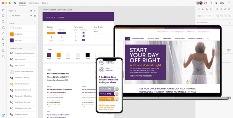
“We are a shop that never closes,” Shur explains.
Ideally, he finds it beneficial to sit down with people in the same room, get to know them, and read their body language. But the fact that Bangalore is 10.5 hours ahead was an unexpected game changer.
“We end the day when our colleagues are about to start, but the work can just continue, without us having to do extra hours in the evenings or on weekends,” Shur says. “It enables us to deliver much faster. Adobe XD perfectly meets the needs of our 24/7 operation.”
Here’s how Epsilon mastered the round-the-clock workflow—without designers needing to put in round-the-clock hours—with the help of Adobe XD.
Cross-continental collaboration with XD
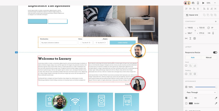
The distributed UX team at Epsilon switched exclusively to Adobe XD, and this has helped them maintain consistency and improve collaboration despite working in completely opposite time zones. Cloud documents, which save automatically, offer a faster way to create and share designs, especially when used with the XD Coediting feature. For the first time, multiple people on the team can design and iterate together in the same document at the same time.
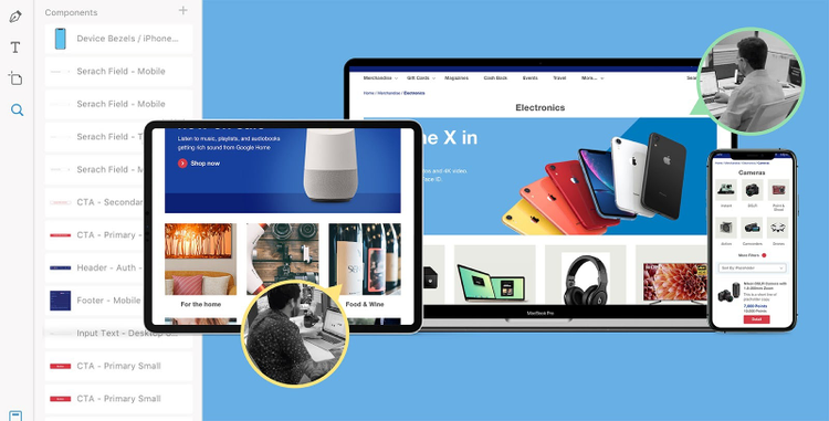
This has changed Epsilon’s workflow at a very practical level. They no longer have to spend a lot of time enforcing file-naming protocols and reminding people to upload files to SharePoint.
“XD has taken version control off our shoulders,” Shur says. “We now share a living document, and it doesn’t matter who worked on it last. Whenever we open it up, we always have access to the source code and know that it’s in its very latest iteration.”
Keeping an efficient mindset after joining global leader Publicis
Now part of Publicis Groupe, the world’s third largest communications group, Epsilon has even more demand for its services worldwide. Because clients expect a seamless experience, Epsilon has retained a strategic focus on efficiency — whether that’s cost, time, or workflows.
“We constantly look for tools that allow us to very quickly create designs and get them in front of our customers,” Piano says. “It’s a tremendous advantage. When we do that, customers continue to come back for more.”
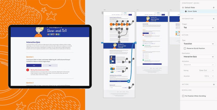
It’s the UX team’s responsibility to create prototypes, but previously that was limited to more low-fidelity versions. Working at a new level of scale, the complexity of creating beautiful, interactive prototypes became prohibitive for Epsilon due to the time or cost involved with other tools. This was another reason Epsilon switched to a better design tool – XD’s prototyping capabilities make it easy to go from wireframe to full prototype; it’s just another part of the UX design process. When the team is ready to share a design, they can just create a link. When someone clicks it, they can experience an interactive version of the design in their browser on desktop or mobile viewports.
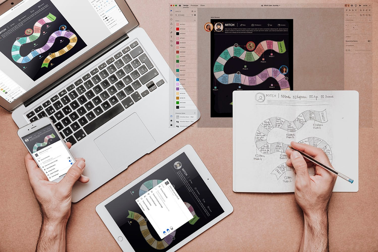
“We make a URL to the prototype available for usability testing or to get feedback from a client,” Shur explains. “And then we’re able to change it in real time. We just update the URL seamlessly, and no one knows we’re in there making changes. It has shortened the whole cycle dramatically and allowed us to make high-fidelity prototyping and usability testing more of a baseline in our UX offering, rather than something that’s just nice to have.”
Collaborating via online tools, which also include Slack and Skype, has removed any barriers between team members. It’s irrelevant where they’re located.
“I feel physically closer to some of the folks on the team in India than I do with folks that are right in my own backyard,” Shur reveals. “It’s been an amazing eye opener!”
Spreading the team over two continents has not only improved collaboration, it also has made the team more diverse, as members are from different cultures and bring a variety of work experiences to the team.
“We had a UX designer with a very strong gaming background on the team. She shared UX learnings that she had encountered that I didn’t know about,” Shur says. “I lean on my team’s varied expertise.”