Designing images on the iPad with Kervin Brisseaux
Hello! My name is Kervin Brisseaux, and I am an artist based in New York City. Today, I’m going to briefly walk you through an intermediate, step-by-step, cross-application tutorial.
I’ll show how I edit my photography in Lightroom, illustrate over my edited photo in Adobe Fresco, and add some finishing touches in Photoshop. All of this will be done on the iPad to showcase just how seamless this process can be — even when you are on the go.
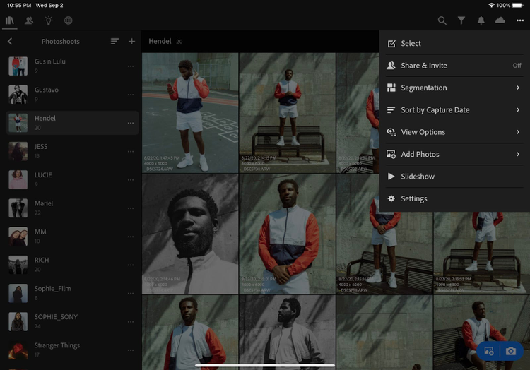
Lightroom
LR01 – We can start by bringing in a RAW or JPG file into Lightroom. RAW files are more ideal to maximize the amount of dynamic range you have to work with, even for simple color edits.
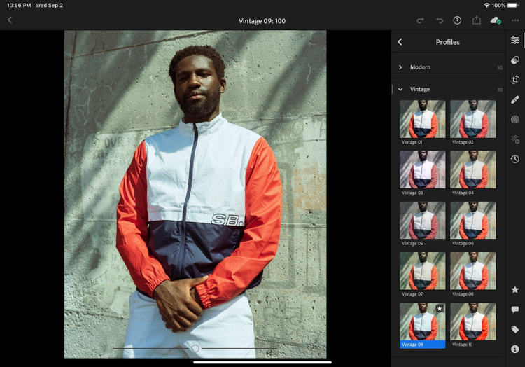
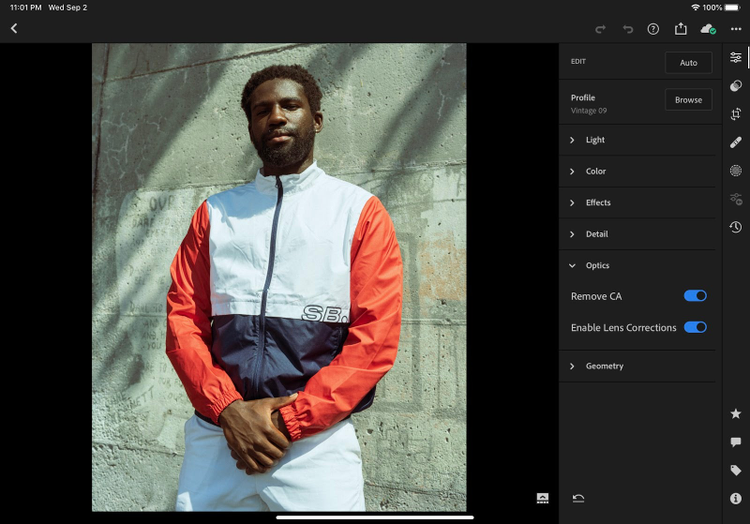
LR02 - Start by selecting a default color profile to start with. Here, I chose Vintage 09.
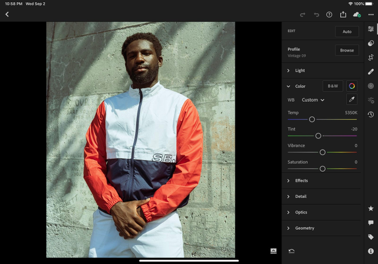
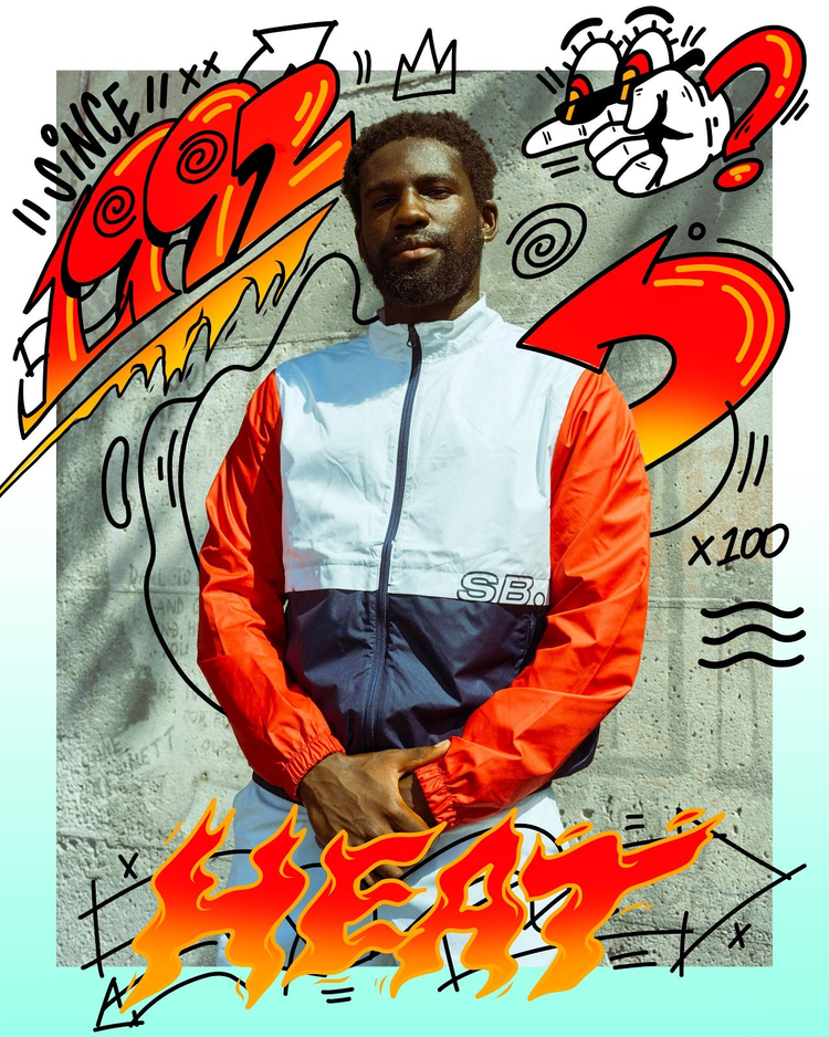
LR03 – Many color adjustments are easy to make no matter how big or small. For example, we can play with the Temp and Tint sliders to give the overall photo a warmer or cooler hue. Here I’ve opted for a cooler temp with a subtle green tint to balance against the warmth of the light against the model’s skin tone and red sleeves of the jacket. This captures the ideal mood I’m going for.
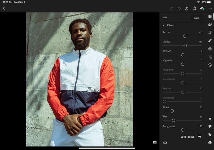
LR04 – Under “Effects,” let’s enhance the details by adjusting the Clarity and Texture. Adding some additional grain can also help push the retro aesthetic that we are currently creating in this photo.
LR05 - Lenses have unique characteristics in how they capture a photo. Within Lightroom, you can choose to keep those aspects as is or make quick optical corrections by selecting “Remove CA” (chromatic aberration or color fringing) and “Enable Lens Corrections” to remove unwanted edge darkening and distortion. The algorithm of how this works is dependent on the lens you were using when taking the photo.
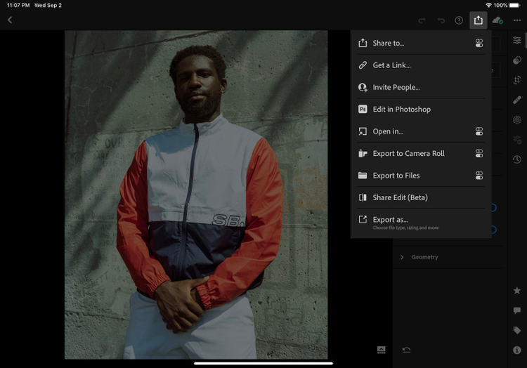
LR06 – Once we are satisfied with the look of our photo, we can export the photo using the share button and save it to our camera roll.
Fresco
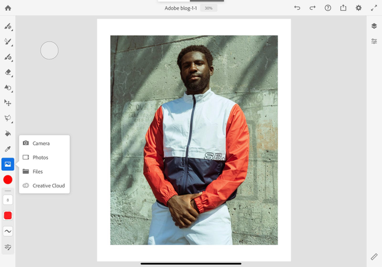
FR01 – Now that the photo is ready, we can really start to have fun and create illustration elements to combine with our photo using Adobe Fresco. Let’s start by creating a new project (4000px x 5000px) and importing our photo from the camera roll.
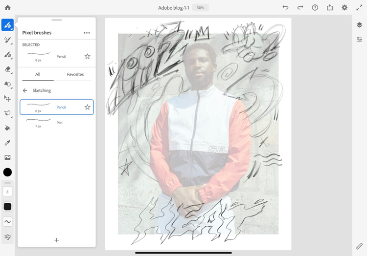
FR02A, FR02B – Let’s lower the opacity of our photo and begin to sketch our idea using the default pencil brush.
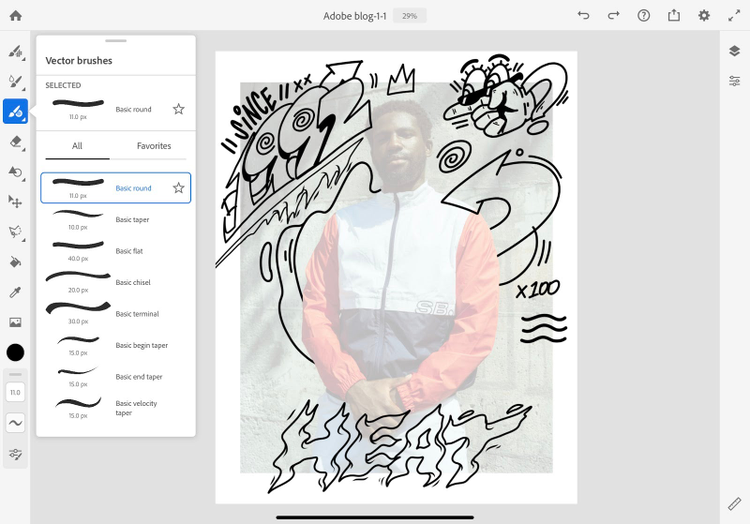
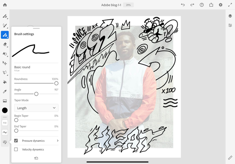
FR03A, FR03B – One of the great advantages about working in Adobe Fresco is that we can seamlessly work with raster and vector tools. With the vector brush, I use the basic round preset and ink my sketch. To adjust the size of your linework using the pressure of your pen, be sure to turn on Pressure dynamics under the brush settings.
FR04 – In a new layer, add some base colors using the vector brush and paint bucket. Remember, when using the paint bucket tool, you’ll need to make sure your drawn shapes are completely closed otherwise the color will inadvertently fill the whole canvas.
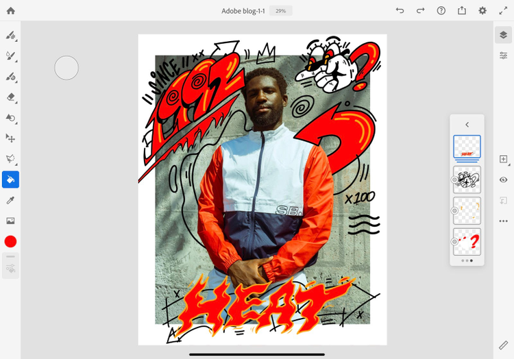
Photoshop
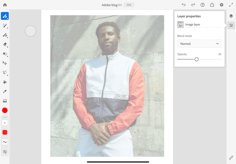
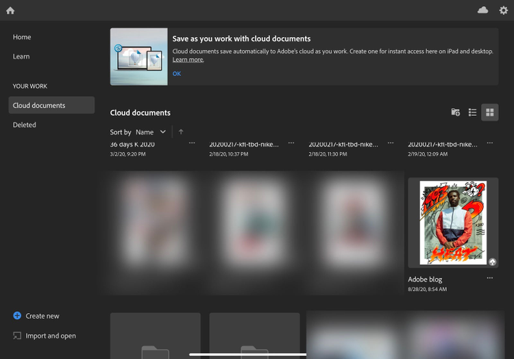
PS00 – When you feel satisfied with your base colors, let’s migrate our file directly into Photoshop for some finishing touches. To do this, simply open Photoshop on the iPad and locate your Fresco file under the Cloud documents.
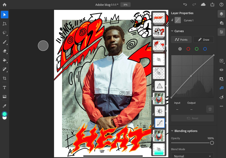
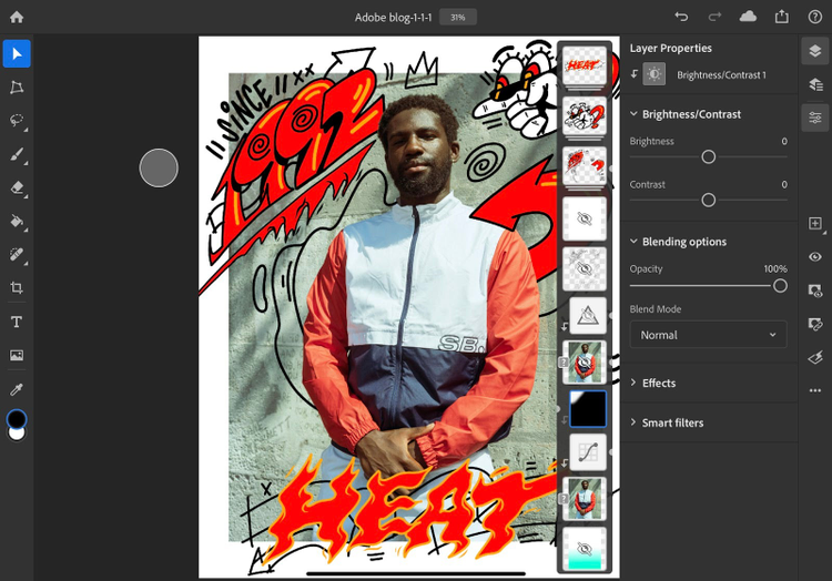
PH01A, PH01B – In this specific scenario, I want to tweak the base photo to allow some elements of the illustration to have more visibility, especially in that upper left corner. To do this I’m going to use Curves and Brightness/Contrast adjustment layers. Using a layer mask, I brush in the adjustments to keep them confined to areas that need it most.
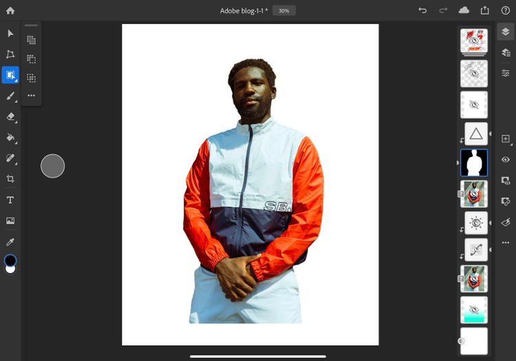
PH02A, PH02B – We can bolster the colors of our model without further affecting the background by doing the following steps. First, let’s hide all our illustration layers leaving only the photo. Duplicate that layer, and be sure to place it above the original along with all its adjustments. By using the Select Subject feature, Photoshop automatically creates an active selection around our subject. In the bottom dialogue box, tap “Mask” which now creates a cut out of the subject, removing the background.
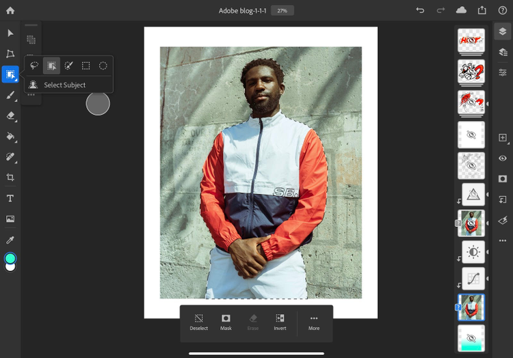
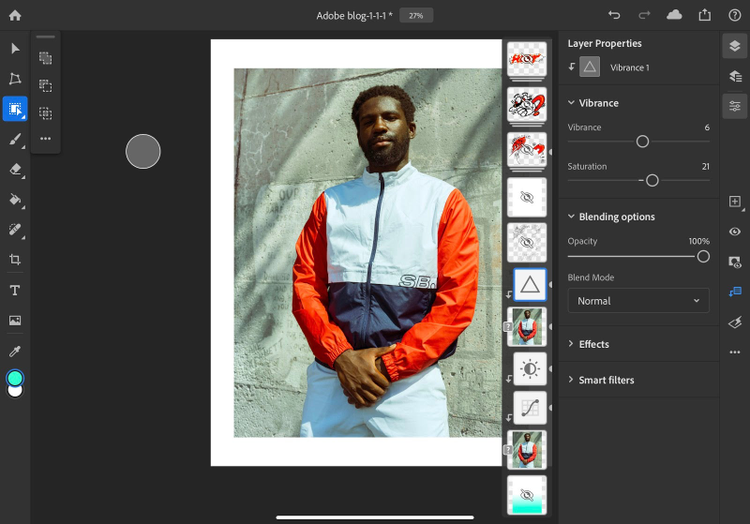
PH03 – Add a Vibrance adjustment layer to our new cutout layer to increase the richness and vibrancy of our colors.
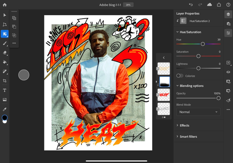
PH04 – Adjustment layers also make it very easy to create some quick color tweaks to our work. We can modify the color palette of our illustration with a Hue adjustment layer and layer masking.
PH05 – Finally, as a finishing touch, let’s be playful with the depth by adding a teal gradient behind the photo.
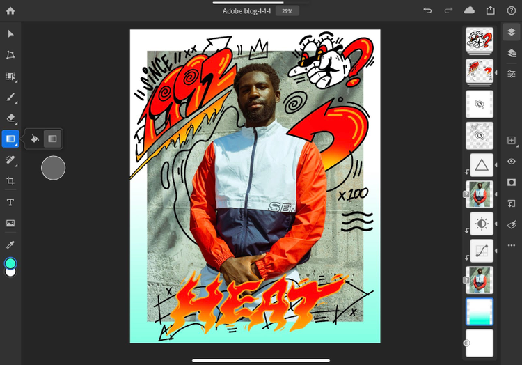
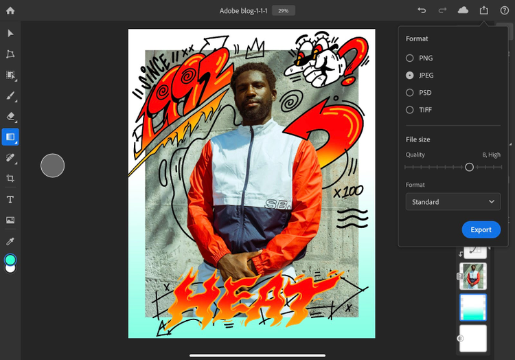
PH06 – Once you are satisfied with the result, you can click the share button and export a JPG.
And that concludes our tutorial. I highly encourage you to go back, continue to experiment across the platforms, and — most importantly — have fun!
Share what you create with us on social media @adobedrawing, @Lightroom, and @photoshop, and follow Kervin on Twitter and Instagram @brisseaux.
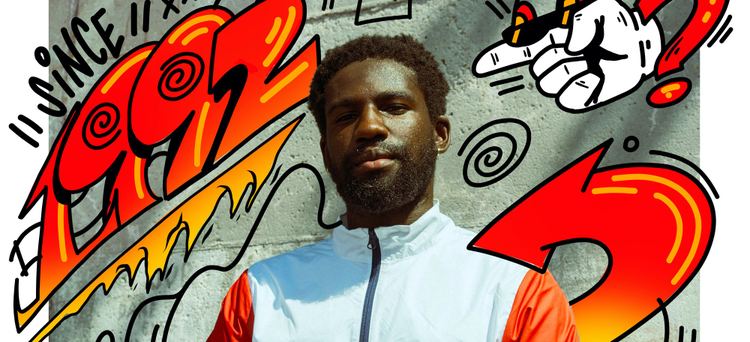
Featured Model in photo: _viewsfromthebench