The Power of a GIF: Designers share their tips for designing impactful GIFs with Adobe Photoshop

Image courtesy of Hoodzpah. Scroll down to see the full GIF.
The web is a highly visual place, and in the age of social media, a scroll through one of your feeds can be a feast for the eyes. For designers looking to make an extra impact on a world of short attention spans, a little animation goes a very long way. It’s a love of animation that has led to the popularity of GIFs – by far the easiest way to make a short, effective animation that most people will be able to view on their devices.
But simplicity isn’t always simple. Tools like Adobe Photoshop may make it easy to create GIFs, but there are many design principles that go into making one that is successful.
“My biggest piece of advice on creating GIFs is ‘keep it simple,’ said Amy Hood, co-founder and principal designer at Hoodzpah, who recently shared her best piece of advice on how she creates her GIFs. “I am a ‘more is more’ person, so this is something I often forget and end up wasting tons of time on silly details that distract more than they add to the concept. Pick one movement, motion, or idea to convey, and focus on making it clear, emotive, and as short and punchy as possible.”
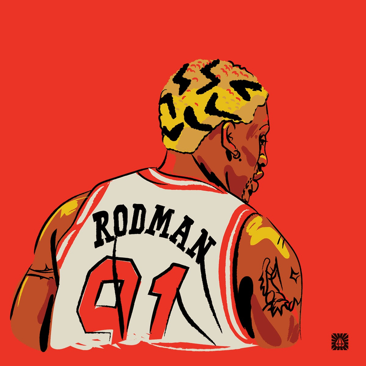
Dennis Rodman in GIF form, created by Amy Hood, showcases her approach: “Pick one movement, motion, or idea to convey, and focus on making it clear, emotive, and as short and punchy as possible.”
There are many other tips, tricks, and guiding principles to keep in mind when creating GIFs and ways to use Photoshop to pull off whatever your vision is. Read on for more advice from top designers on how they make fun and functional GIFs.
Keep it simple, keep it short
The beauty of GIFs is that they make a quick impact on viewers. They grab your attention, without requiring it for too long. Deciding how long to make your GIF is a key consideration.
“I think three to six seconds is the sweet spot,” Hood said. “Having it that short keeps you honest about sticking to a simple concept. Also, you always need way fewer frames than you think you do.”
Keeping GIFs short is a good idea for technical reasons, as well. The medium is known for being easy to display and view on the web and in social media feeds.
“You want to make sure that your files aren’t too big that it takes a while to load. You want to be able to have it pop up and grab your viewer’s attention as soon as they see it,” added designer and letterer Kim Vu.
In order to do this and make sure she conveys her message, Vu said she carefully considers which part of her particular design most needs emphasis. With this in mind, she thinks about which motion would best serve that design, such a color flash or change in size, and her advice is to do this as early in the design process as possible.
“How you go about designing a static illustration versus an animated one is very different. When you’re beginning your design process, I think it’s helpful to consider if your artwork will be a GIF or not,” Vu said. “When you’re making something move, there are parts that need to be separated and different pieces that need to be created in order to make those sequences into GIFs. This initial foresight can save a lot of time and headaches down the road.”
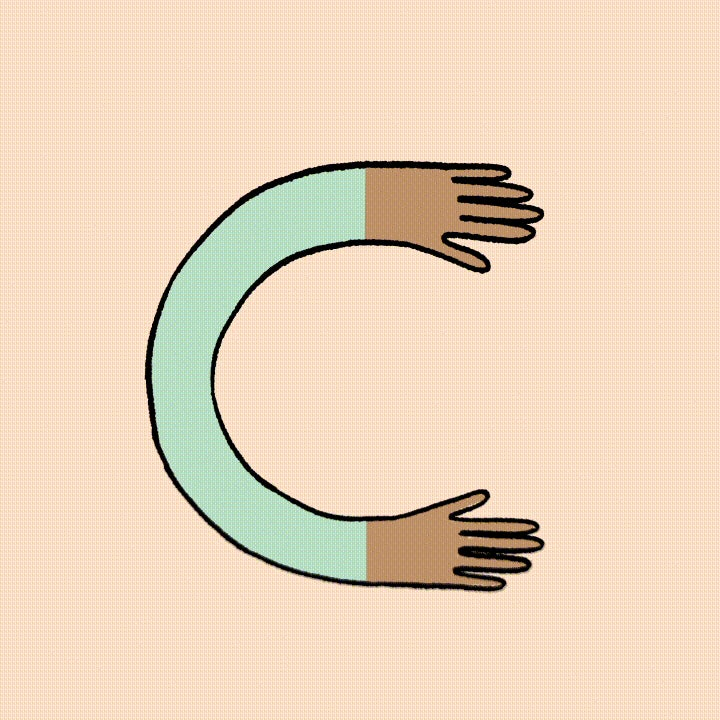
A GIF by Kim Vu. A simple object and a short animation that suits it often equal an impactful GIF that easily loads on most devices and in most contexts.
Ethan Silva, owner and designer of Bad Lucky Studio, is very much of the same mind as Vu. For him, simplicity is key for both creative and technical reasons.
“The fewer moving parts you use, the more animated and fun you can make your GIF while still keeping the file size down,” he said. “It comes down to considering the message you are trying to communicate. Finding a balance between eye-catching motion and keeping the integrity of your message is key. Sometimes, we get to make a GIF just for the sake of creating something fun. In this case, go nuts!”
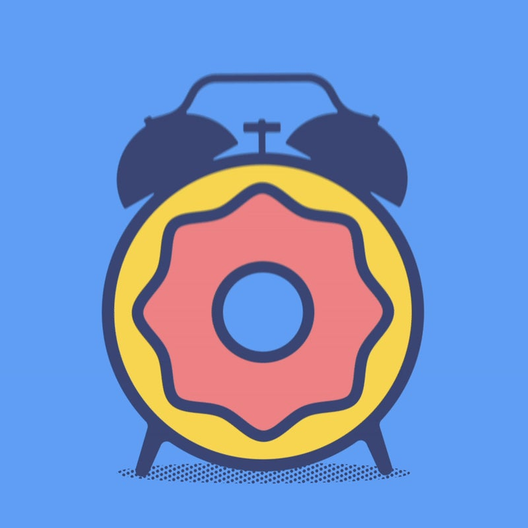
Donut Time by Ethan Silva. “Sometimes, we get to make a GIF just for the sake of creating something fun. In this case, go nuts!”
Looping, timing, and the limited use of color in GIFs
For Silva, it’s very important to “limit your colors” to keep file sizes down. For him, two or three colors in a GIF is the sweet spot. For Vu, “the fewer colors the better.” She recommended experimenting with how low you can go. While the default number of colors when exporting your GIF from Photoshop is 256, you can usually get away with much less.
“Colors make a big difference in trimming down your file size,” she said. “I usually go by the rule of keeping it under 1MB.”
For Cymone Wilder, designer and founder of Simon and Moose, color and animation are best used sparingly. Working primarily as a letterer, she tries to keep her GIFs as minimal as possible for maximum effect.
“I like my work to feel very raw and analog. I always want to make sure turning it into a GIF does not take away from that feeling,” she said. “I’m not typically looking for the smoothest or cleanest look, but instead something that feels like a crunchy frame-by-frame.”
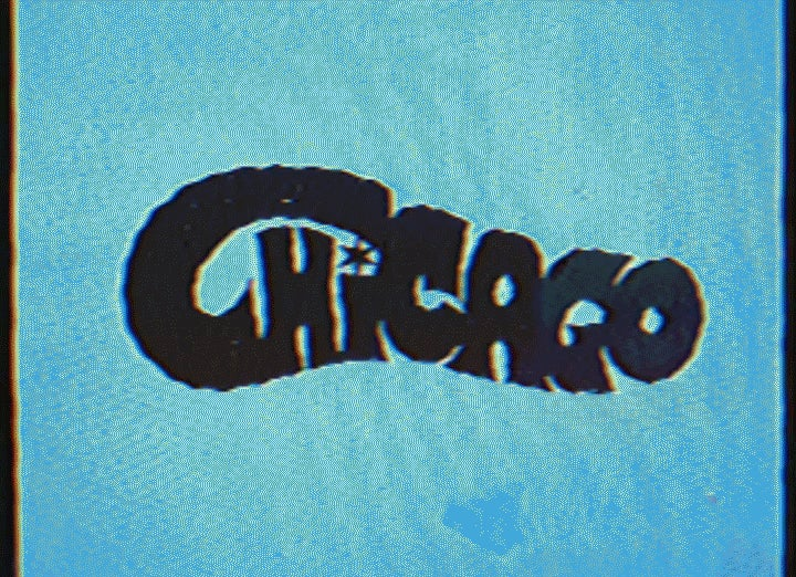
Chicago, by Cymone Wilder. A simple animation that brings her lettering to life.
To ensure she achieves her desired analog look, Wilder said she starts designing her GIFs with pen and paper. For her lettering, she uses the onion skin process with tracing paper to make sure that everything looks correct with her GIF concept. She then takes photos or scans it to bring it into Photoshop.
“My GIFs do not often live within the context of other work and are really just adding a little chef’s kiss to my lettering,” she said. “Just a little wiggle, instead of path trace animation, really does the trick for me.”
The great thing about GIFs is that even if your design is fairly simple and animation is fairly short, it can be looped. It’s an attention-grabbing technique that will still ensure file sizes stay low.
“Make it loop and make it seamless. Don’t just think of the beginning and end of a GIF, but how the ending is going to transition back to the beginning,” Vu advised. “You can control the numbers of loops, but it just makes more sense to make it loop forever. You can’t really control when it’s going to start and stop once it’s out there on the interwebs.”
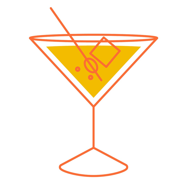
Kim Vu’s endless cocktail. A very simple, short animation that’s delicious to watch on loop.
Top tips for designing GIFs in Photoshop
Photoshop is the go-to tool all of our designers mentioned when creating their GIFs. While GIFs are inherently simple, there are some techniques and tricks to making sure the design process goes smoothly. Their top tips are:
- Label your layers! The differences look very minute in your timeline, and you’ll have a lot of frames to work with, so labeling will keep you organized (e.g. Running_001, Running_002, Running_003, or Eye_Open, Eye_Blink). “Whether it’s animating in sequence or by parts, this is just good practice,” Vu said.
- If you’re importing video into Photoshop to create your GIFs, make sure to limit your frames. You can easily do this by limiting your import to every two frames. “You may still have to go in and delete some duplicate frames, but this will get you most of the way there,” Silva said.
- Dithering is your friend, especially for gradients, blurs, and making sure your GIF doesn’t have strange color bands. “I usually try to keep it at 100%, but play around with this and see how low you can go without compromising the quality,” Vu said.
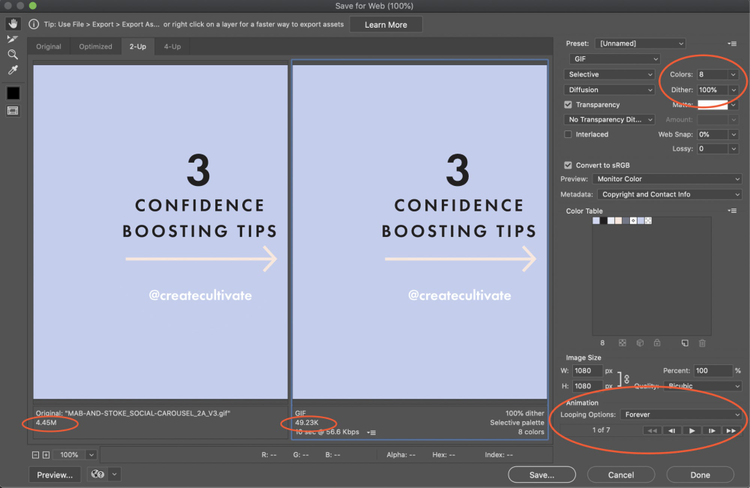
Kim Vu’s GIF production workflow in Adobe Photoshop: forever looping, controlling of GIF size with few colors, and dithering.
GIFs are a highly versatile medium and make an excellent asset for any project. Vu said they address a very specific but important need for designers that you can’t meet with images or videos.
“Still images are designed with a single focal point in mind, while videos allow you to take your user on a journey with many focal points. But how can you be certain of the length and attention of the viewer?” she said. “That’s where GIFs come in. They’re great for emphasizing an idea, a key feature, or grabbing attention and maintaining interest. With GIFs, you can really control where you want the viewer to look and what you’d like them to take away from it.”