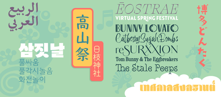
Adobe adds new fonts with Japanese, Korean, Arabic and Armenian language support.
Having made it through the month of March, some of us are tentatively starting to dream about journeying to new horizons. Adobe Fonts allows us travel around the world typographically with fresh additions to Adobe Creative Cloud. They include new East Asian foundries and fonts catering to the Japanese and Korean markets, Arabic and Armenian language extensions for popular type families, and — as usual — a whole slew of exciting, original designs.
Adobe Fonts
Unlimited fonts, no extra charges, already licensed.
Learn more
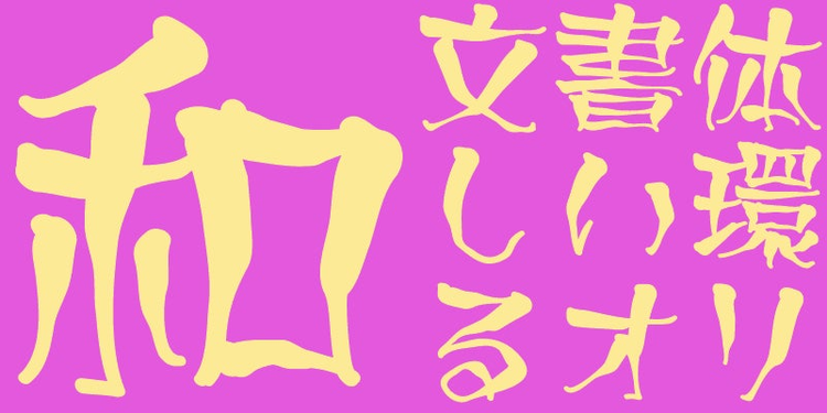
Openings to East Asia
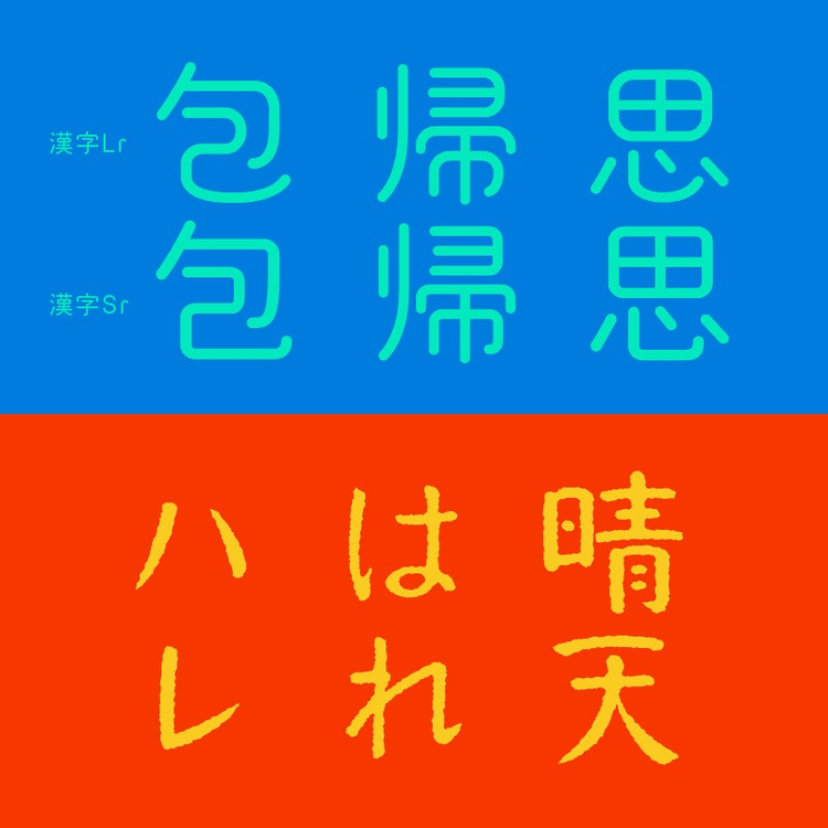
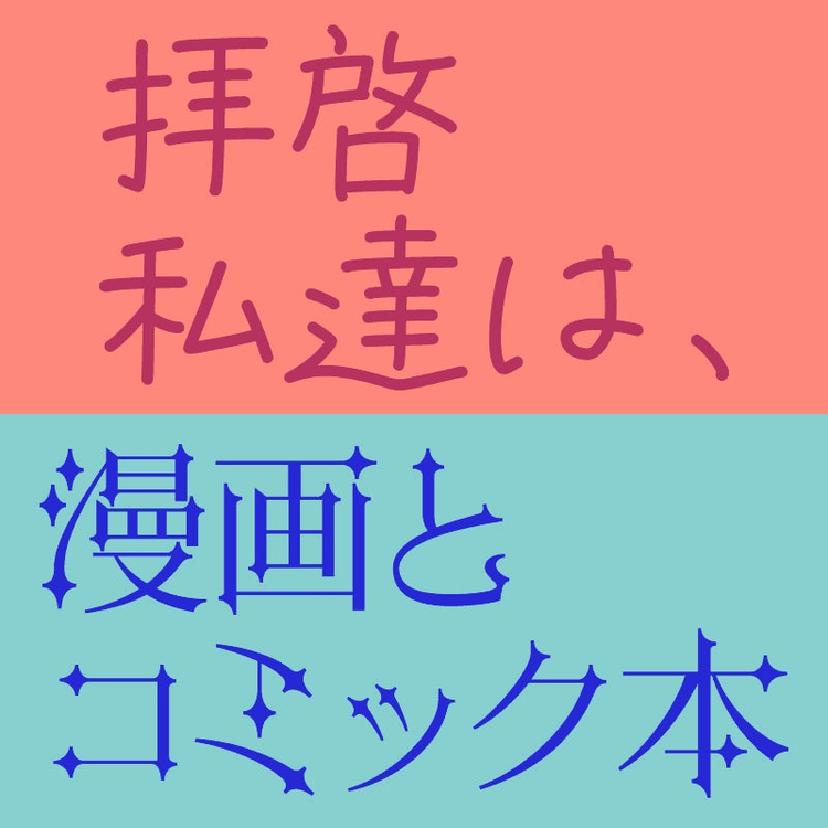
New Japanese foundry Font1000 questions how many of the 7,000 characters in the JIS standard are actually necessary. Because fewer characters were needed in the phototypesetting era, the foundry selected a core set of 1,000 kanji (ideographic) characters required for typesetting Japanese. These kanji characters are selected from character-frequency data compiled by newspaper companies, publishing houses, and linguistic research organizations — the character set also includes additional kana syllabic characters and punctuation marks.
Another new foundry is TYPE-LABO, home of Yutaka Satoh, one of Japan’s leading independent type designers. TYPE-LABO aims to create typefaces that users and readers alike will enjoy by conveying meaning beyond textual content. Eschewing artifice and displaying a great design sensibility, the foundry produces strong, well-balanced fonts characterized by versatility.
Tokyo-based Kinuta Font Factory — the third new Japanese foundry on Adobe Fonts — develops fonts that inject contemporary accents into traditional letterforms. This results in unique and novel typefaces that nevertheless feel familiar. Discover their modern geometric designs with boxlike or rounded stroke endings and different levels of squareness, or wrap yourself in the comforting blanket of their more traditional calligraphic creations.
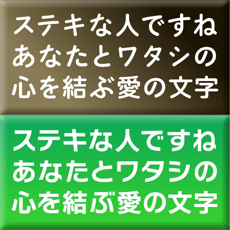
It is not all new foundries, though: Visual Design Laboratory adds the friendly, rounded monoline VDL-PenLetter and two striking Mincho designs, VDL-GothicMincho and VDL-KuroMincho, to their library of Japanese fonts.
Minjoo Ham has expanded her electrifying display face Dunkel Sans with additional styles and widths. In the new Glatt variants, Dunkel Sans’ lively strokes have been straightened for a tighter, more geometric appearance.
NohType’s Noh Sori is a new Hangul design project for phonetic transcription of foreign letters that don’t exist in Korean. The typeface inserts new, phonetic Hangul characters to allow for the correct pronunciation of foreign locations and names. Some letters were adopted from old Hangul — others are new designs based on the principles of Hangul.
Learning new languages
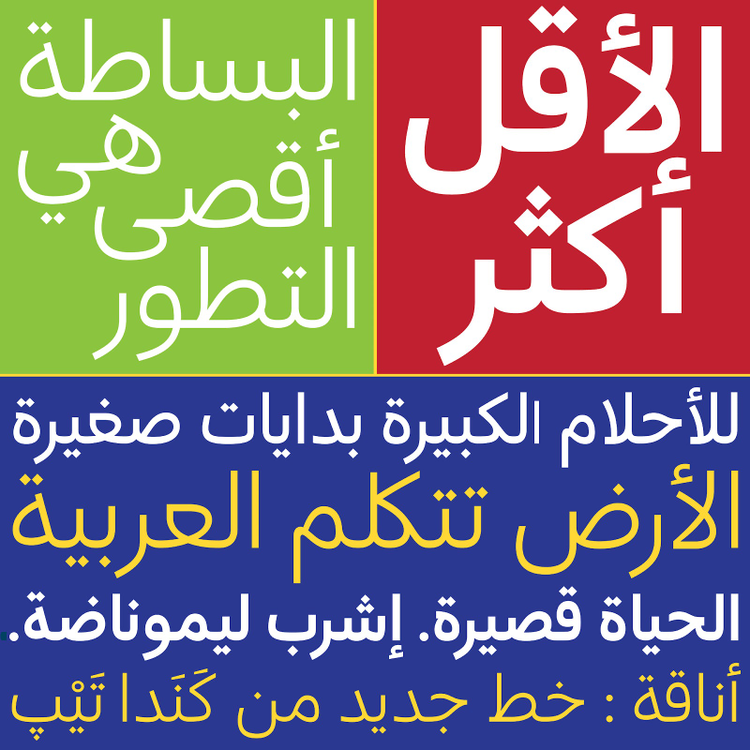
Rosetta Type Foundry addresses the needs of global typography by collaborating with native type designers to create innovative fonts for a polyphonic world. The sturdy text face Arek now has a counterpart for Armenian, an underserved script. The pan-European (PE) families Clone Rounded PE, Avory I PE, and Skolar Sans PE support all Cyrillic-script, Latin-script, and Greek languages. Skolar Sans is also available in Gujarati and Arabic now, and the affable Nassim Arabic was designed from the outset as an Arabic-Latin family.
More and more foundries are exploring Arabic type design. Canada Type, for example, has produced Anaqa, a contemporary Arabic companion to the popular Semplicita. During Anaqa’s development, it became clear that the typeface also works with other humanist sans serifs like Gibson, Informa, and Davis Sans.
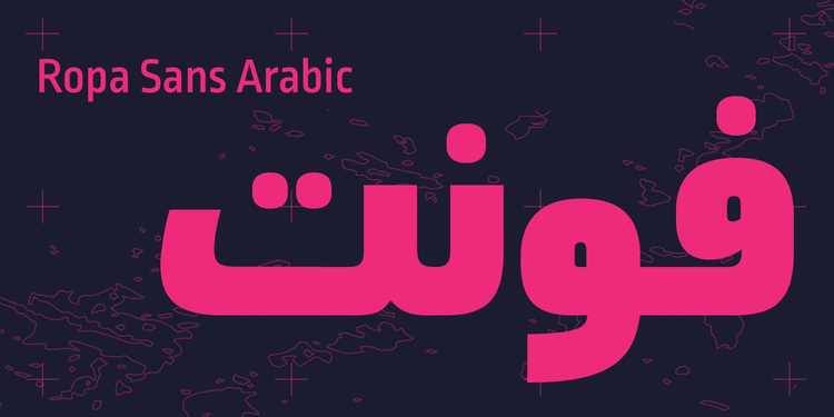
Lettersoup’s popular Ropa Sans — also available in Soft and Mix finishes — already boasted support for Extended Latin, Greek, and Cyrillic. Now Ropa Sans Arabic adds the Arabic script to its considerable linguistic arsenal.
Dalton Maag expanded the language support of their all-purpose sans serif family Aktiv Grotesk — a viable alternative to overused neo-grotesques — to include Thai, Devanagari, Hebrew, and Arabic. This is not their only typeface to cater to the Arab world: the supple sans Effra and the refined serif Bressay (available in Text and Headline cuts) were also augmented with the Arabic script. Finally, the fabulously curvaceous fat face Blenny now exists in a Thai version, too.
New typefaces and families
Dalton Maag also has brand-new type families in this release. The connected script Ballare flows gently on page or screen. Highgate transforms traditional British stone carving into a functional sans serif family. Mendl Sans interprets art deco’s elegance in two flavors: the retro Dusk and the architectural Dawn. Darkmode On and Darkmode Off meet the challenges that come with modern interface design by offering two variants. As their name implies, the two versions guarantee a consistent appearance when switching between normal and knocked-out or reversed text.
Russian foundry ParaType adds five typefaces covering extended Latin and Cyrillic to Adobe Fonts. Airy pairs an alphabet of summery hand-drawn letters with a set of fun doodles straight from the margins of a sketchbook. Carol Gothic’s traditional blackletter shapes look great on apparel and packaging, and sparkle in editorial design. Delicate and elegant, Kudryashev Display adds a touch of refinement to luxury items. Inspired by 19th-century type from St. Petersburg foundry Ossip Lehmann, the striking Lehmann sports thin triangular serifs and sharp, spiral-like terminals. The graceful calligraphic script Reed offers lots of swashes and two surprising stencil styles.
Resistenza is back with the friendly and energetic textured script Adore You. The calligraphic serif face Turquoise adds elegance to titles and headlines, and includes an inline variant. Royale is a monoline ornamental serif face that would lend high-end food and cosmetics packaging vintage flair. Voguing and DreamTeam introduce an inventive striped texture to a geometric all-caps sans serif and a straight-sided display sans, respectively.
From the hand-scribbled serif face Hachura to the powerful, dark square sans serif Force and the calligraphic script Capellina (which comes in smooth and rough finishes), Outras Fontes has display styles for everyone.
A wealth of single additions
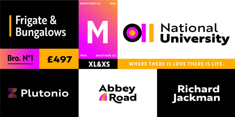
TipoType adds two new widths to Brother 1816: Brother XS&XL. The XL width quite literally expands this multifunctional, multifaceted sans serif, while the space-saving Brother XS enables you to wedge more characters into a line of text.
Inspired by the Aetna wood type style of the late 19th century, Mark Simonson’s Etna tames this quirky Victorian design into a family of six weights with matching italic and condensed styles suitable for contemporary use.
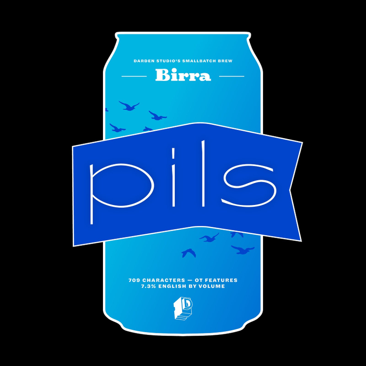
Beer lovers, rejoice. Darden Studio has added another freshly brewed style to their Birra series. Like its namesake, Birra Pils is a light, refreshing sibling with a generous width and Jugendstil-inspired design details.
Short of using actual curse words, OH no Type Co.’s superb serif siblings Swear Text and Swear Display can only be described as frickin’ fantastic. With decisive letterforms and exaggerated razor-sharp serifs, these iconoclasts are guaranteed to turn heads. Wait until you discover the reversed-stress Citali styles — they are preposterous(ly good)!
New type from Type Network
Once again, Type Network’s foundry partners delight us with new typographic gems.
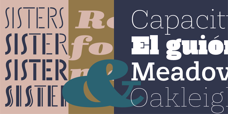
The Catalan typographic adventurers Type-Ø-Tones add four eclectic font families to their collection on Adobe Fonts. Skope experiments with the sort of horizontal stress that characterizes the lettering style of comic book masters Josep Coll and Manuel Urda, mixed with contemporary favorites Francesc Capdevila (aka Max) and Joost Swarte. Taking cues from Thorowgood’s early-19th-century 6-line Egyptian Pica, Rothwood molds the vintage letterforms into a contemporary framework, from a wispy Hairline to an impressively dense Ultra weight. Sisters is a surprising set of four stencil faces built on the same geometric skeleton, allowing the user to explore their similarities and their differences.
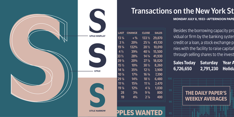
Designed for excellent legibility and optical balance with a subtle nod to classic French sans serifs, Kontour’s Utile and Utile Display are subtly flared typefaces in two finishes suited for immersive reading and matching display typography. Their economic sibling Utile Narrow packs more text into a line.
Greg Thompson mined the treasures of the art deco movement to cook up a contemporary interpretation of Broadway. Broadacre revisits and expands on Morris Fuller Benton’s 1920s classic, turning it into a 15-style display family.
Crawl out of your shell and inject new life into your typographic arsenal by activating some of these exciting new fonts. And do not worry about the cost — all Adobe Fonts are included free of charge in your Adobe Creative Cloud subscription. Experiment with abandon!