Creative impact: Why a color accurate video editing monitor matters
Putting your work in front of the world can be terrifying. But, when you feel good about your content — when you believe in it — anxiety becomes excitement. Fear becomes confidence. And messages connect. That is especially urgent now when sharing powerful ideas accurately and in a timely fashion defines us more than ever. At BenQ, we believe that if your medium is video, and your method involves editing, using the right video editing monitor is crucial.
We watch, on average, five hours of video a day across devices. Successful amateur and professional video editors have two things in common. First, creatives control their processes by minimizing risks. Thus, they get the best video editing equipment they can for their needs. (Note: best doesn’t always mean the most expensive.) Second, they maximize efficiency and control of their results. It’s the only way to consistently generate quality content while staying on top of deadlines. Equipment and process are refined and revised, improving both “work” and “flow.”
Begin with the end in mind. The scale and budget vary between pros and amateurs, but the goal is consistent: impactful content, created efficiently. Thus, some features affect quality of results, and others affect efficiency of completion. We explore them below.
Get your message right
Improve your odds of making the right impression by prioritizing monitor features that facilitate creativity and mitigate common pitfalls. Let’s look at resolution, color performance, and brightness.
Resolution is the key to details
Resolution, the approximate number of pixels on your screen’s horizontal axis, impacts the detail you can discern — more pixels, more details. If you need to brighten the glimmer in a digital eye, it’s useful to zoom in on your subject. When refining subtle details on 27 inch or bigger displays, the added clarity of 4K can elevate “good” to “spectacular.” While it can seem that more pixels mean better results, that’s not necessarily true. If you work on a smaller than 27-inch monitor, 4K is a lot of dots on a tiny screen. You will likely have to scale your resolution down to 2K, half the pixel count, to be able to read text. This comes down to personal preference — and possibly your eyeglass prescription.
Make your colors accurate
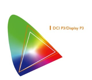
Color attracts attention, defines mood, and conveys messages — and accuracy is essential. The menacing crimson dragon you spent days refining won’t scare anyone if the final rendering comes out in delicate shades of pink. So accurate coverage, which is measured in Delta E, of a broad color gamut is a must. Lower Delta E means greater consistency of the color displayed with its mathematical reference color. For editing purposes don’t accept a Delta E above 3, which is nearly imperceptible to the human eye. You’d ideally shoot and edit in the same color space, but realistically, the common default choices for video are Rec. 709 and DCI-P3, or P3. A word of caution: check coverage percentages. Look for a monitor with as close to 100 percent coverage as possible. There’s an in-depth explanation of color spaces in this blog by Frame.io, which was recently acquired by Adobe.
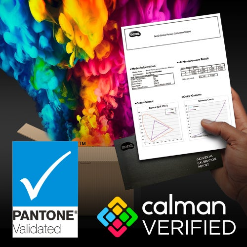
With so much dependent upon color, you’ll likely look for assurances as earned recognition from industry leaders. Pantone, the center of the color universe, awards Pantone Validated status to displays that demonstrate superior fidelity in reproducing the Pantone Matching System (PMS). Calman color calibration software is the industry standard. Portrait Displays, the company behind the software, bestows Calman Verified status on displays that pass rigorous color accuracy tests. If your designer monitor is factory-calibrated, it’s also helpful if you can get a look at its unique calibration report.
When brightness matters
Now to shine a light on brightness. This spec is often misunderstood in the video editing process, as you likely need fewer nits than you think. Higher brightness can be useful when examining individual frames, but to maintain color consistency, recommended brightness for color correction on a standard LCD screen is 120 nits. Some design monitors are equipped with uniformity technology that keeps brightness and color consistent across the panel. And then, there’s HDR.
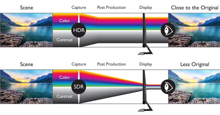
High Dynamic Range makes images look more realistic by sampling and balancing bright-dark tone variation within content to retain accurate shading. Details in darker images become distinguishable and bright regions are not washed out. Once you’ve sorted your creative specs, it’s time to put them to work for you.
Put the “pro” in productivity
Every step in your process should work for you — including your monitor. And several key steps take place before you touch the power button.
Your head might swirl with ideas, but your desk set-up shouldn’t. Before you start, utilize clutter-reducing tools, set your priorities, and make yourself comfortable. Cable management and some strategic bins can reduce clutter. Clearing distractions from your desk can also open some space in your mind. And opt for monitor stands that adjust for height, tilt, swivel, and pivot or VESA wall mounts to keep your monitors at eye height. Neglecting ergonomics can cramp your creative flow.
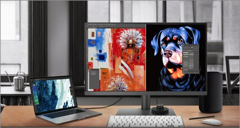
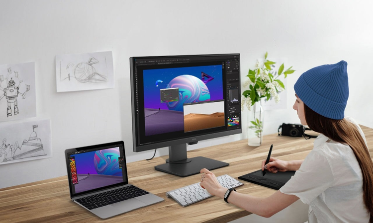
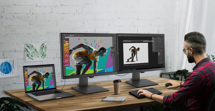
Before you push the power button, how many power buttons do you need? Long timelines and multitasking take up a lot of screen space. Dual monitors and ultrawide monitors commonly resolve that pain point. Some of your setup will depend on your preferences, others on your desk space and budget. Make sure you get the connectivity you need for your peripherals, including ports for USB-C, HDMI, DisplayPort, and USB Hubs. That may seem like a lot of prep, but it sets you up for success.
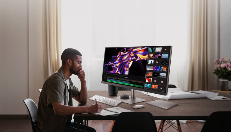
True design monitors offer perks that ease your process. For example, you can view the same image in different modes, such as Animation and CAD/CAM, or different color modes, side-by-side. Picture-in-picture (PIP) and picture-by-picture are also multitasking essentials. As an added perk, some manufacturers build in shortcuts that feel like cheats, such as the BenQ Hotkey Puck G2, or M-book Mode, which matches your monitor’s color to your Mac.
Finally, you must protect your eyes. Low blue light features interfere with color accuracy, so you don’t want them engaged during color-critical work. However, you likely do plenty of work that doesn’t require that precision. Invest in a professional monitor that has eye care modes you can engage or shut off at will. Then, get in the habit of using them.
Add flow to your workflow
Once your proposal has been accepted and the pre-production script, storyboard, and animatic are created, you’re ready to start production. As mentioned, the ideal color-consistency strategy here is to shoot in the same color space and high resolution you’ll edit in. If you think of each color gamut as a 3D triangle, it makes sense that working from the same triangle of colors gives you the same hues in creation that you initially captured. All of these must be included in the color space you edit in for confident accuracy. The same is true in live shooting, 2D, and 3D animation.
Post-production includes the refinement and polish that add a professional appearance. When filming is done and the initial assembly “A” cut is complete, it’s time for the first round of color correction. Make sure your monitor is color-calibrated and set to the right color space. Depending on your work environment, calibration enters your workflow in different ways. This video covers the differences between hardware and software-calibrated displays. Your monitors might be factory-calibrated and accurate out-of-the-box. You’re set. No need to do more. Some displays can be hardware-calibrated using specialized software. Influencers and independent creators can save by buying displays that include calibration software. Video studios, however, are likely to use highly effective, and expensive, calibration software, such as Calman or LightIllusion. The best hardware-calibrated video-editing monitors will support both options.
After editing in visual effects and dialing in the composition, it’s time for another round of color correction. By prioritizing color accuracy throughout the process, you can breathe easy as your video is distributed, knowing the tones behind your topic are true and their integrity is properly preserved.
Because it Matters
At BenQ, our motto is “Because it Matters.” We put everything into our monitors for designers, artists, and creatives because you put everything into your work. You inspire us. That’s why BenQ empowers your genius with our cutting-edge tech and innovative workflow-enhancing shortcuts. Because every moment, memory, and imagined creation of yours deserves to be seen as you intend. Because it matters.
This Adobe MAX 2021 post is sponsored by BenQ.
