2022’s Pantone Color of the Year is a brand-new hue for the metaverse age

Image credit: Adobe Stock / troyanphoto.
Pantone had a surprise in store with their choice of 2022 Color of the Year: Very Peri (PANTONE 17-3938). Rather than pick from their extensive catalog, for the first time in the Color of the Year’s 23-year history, the Pantone Color Institute decided to create an entirely new color to “reflec[t] the global innovation and transformation taking place” as we emerge from isolation into a radically changed world. The color unexpected – not unlike our transition into the world’s new post-pandemic normal.
Last year, Pantone’s two-color choice showed how uncertain the world felt going into 2021, but this year, we look towards something brand-new. Very Peri mirrors our collective desire to get back a sense of play, fun, and hope. It’s revitalizing and joyful. Even Pantone's video short introducing the color evokes a sense of spritely whimsy. Bubbles pop into tendrils of furry, fiber optic texture, undulating in an unseen current.
This new color communicates a readiness for the future. According to Leatrice Eiseman, executive director of the PANTONE Color Institute, “As we move into a world of unprecedented change, the selection of PANTONE 17-3938 Very Peri brings a novel perspective and vision of the trusted and beloved blue color family, encompassing the qualities of the blues, yet at the same time with its violet red undertone, PANTONE 17-3938 Very Peri displays a spritely, joyous attitude and dynamic presence that encourages courageous creativity and imaginative expressions.”
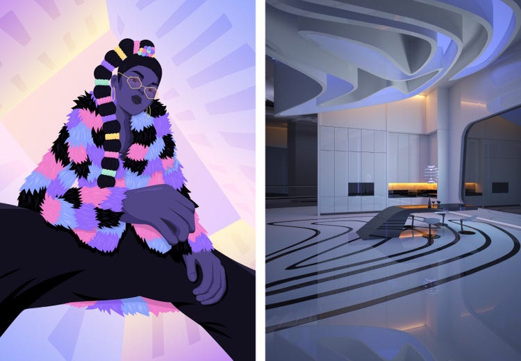
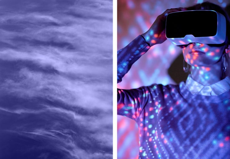
The pandemic has shifted our experiences online towards a primarily digital space, and the line between physical and virtual has blurred. Very Peri’s purplish hue is associated with high-contrast gaming and technology and online spaces, and invokes the concept of the metaverse and our evolving relationship to it. Soft blue combines with warm base notes of red to create this shade that illustrates depth, comfort, and balance.
What began as a tech space color has become an aesthetic brands are adopting for everything from movie posters and album covers to product packaging and otherworldly haute couture. The color was also unveiled digitally as well as the traditional swatch – a sign of the digital world firmly making its mark.

Image Credit: Left: Adobe Stock / hatthranit Osman, Right: Adobe Stock / Татьяна Леднева.
Coloring outside the box
Historically, purple has been underutilized commercially, treated as more of a supplemental, niche color. Though that’s changing, as technology companies have embraced it to stand out from the crowd — with Roku and Twitch both using it in their branding and logos. The growing trend left Brenda Milis, Adobe Stock’s principal of consumer and creative insights, seeing purple — everywhere. “A lot of brands began releasing purple app icons. It developed into a trend as a very blue-inflected purple — often referred to as 'blurple' — began to dominate online spaces through 2021. There's a warmth to it, so it offers a sense of comfort. It's not hitting you over the head with a strident tone.”
Very Peri allows designers to branch out into experimental territory without losing feelings of reassurance and delight. Its capacity matches perfectly with what we predict in our 2022 creative trends forecast.
Very Peri’s energy and jubilance work well with the Powerfully Playful visual trend and the Soft Pop design trend. Both focus on positivity and cheer with an underlying sense of wellbeing and nostalgia. The motion trend, Dimensional Delights, taps into these emotions too while sitting on the cutting-edge of dreamlike visual styles that delve into bold, new frontiers.

Image credit: Adobe Stock / troyanphoto.
https://main--blog--adobe.hlx3.page/media_13602a15ee08a6b2b2cb7b73f40bc3251b0374d54.mp4
Image credit: Adobe Stock / Stu Ballinger.
The dawning era of digital discovery
Speaking of new frontiers, more people are turning to the concept of the metaverse to understand our expanding footprint in digital spaces. Very Peri reflects this exact cultural moment where our connections are increasingly formed in virtual landscapes. Gaming platforms like Roblox are teaming up with fashion brands like Gucci to sell digital merchandise for avatars in their virtual world. Nike purchased RTFKT, a virtual sneaker company that designs shoes as NFTs specifically for the metaverse. Very Peri is featured heavily in this imagery, especially by brands seeking a way to connect with tech-savvy audiences in digital spaces.
Tom Spota, head of motion at Adobe Stock, considers Very Peri an essential element in the Metaverse Mix motion trend. “When you see companies like Nike making acquisitions like that, you know you should pay attention. Very Peri has a part to play in this new vision. It’s a color that represents these digital universes. It’s a color you want to be using for these concepts.”
Milis agrees. “The metaverse is a place of connection, innovation, socializing, and creativity. It’s a totally decentralized set of spaces and places. Nobody controls it. It’s like the internet. It’s so big now that brands are getting in on the aesthetic with a color palette that evokes those same feelings of connection. Very Peri is very of the moment.”
The idea of the metaverse captivates our imagination, and the color of the year has been illustrating techno-futuristic worlds since the seventies and eighties. “It’s not necessarily a new color to represent digital spaces,” says Spota. “This color has been used in cyberspace and metaverse artwork on the covers of novels for decades. You look at William Gibson’s Burning Chrome or Neuromancer, for example, and you see they incorporate Very Peri. It's retro-futuristic. I think it's because it's not a color you often see in the natural world. It's synthetic, artificial, but pleasant to look at."

Image credit: Left: Adobe Stock / Julia Manga Right: Adobe Stock / Clique Images/Stocksy.
https://main--blog--adobe.hlx3.page/media_148d388d7dd403daa6c402939e90ef294ecfdad30.mp4
Image credit: Adobe Stock / OlScher.
Purposeful optimism and grit
Very Peri is also inspiring because it marks a time when we are learning to find moments of joy and happiness where we can, despite the challenges we face every day. According to Milis, “Very Peri hits the right notes because it synchs with the pillars of our 2022 trends — positivity and optimism. It’s not a thoughtless optimism. There’s a foundation of grit to it. It’s speaking to our determination to remain hopeful and keep the home fire in our hearts warm and burning.”
Explore the Adobe Stock Color of the Year Very Peri curated gallery for ideas on how you can incorporate this beautiful, innovative hue in your work.
Feeling inspired? Upload your work to Adobe Stock.