
Keep up with all things MAX
The latest from the stage and sessions in Los Angeles. Register to unlock new ideas, creativity, digital skills, and more.
“From the ACR team” is a blog series that brings you insights directly from the team that builds the imaging features for Lightroom and Camera Raw.
For the past two years, I’ve been working on a project for viewing, editing, and sharing High Dynamic Range photographs. I’m thrilled to announce that this feature is now shipping in all Lightroom products (on desktop, mobile, and web) and Camera Raw. In this post I’ll explain what it is, how it works, and how to get the most from it.
To see the photos in this post in High Dynamic Range, I recommend that you use a macOS or Windows system with Google Chrome or Microsoft Edge version 116 or later and a High Dynamic Range display that supports 1000 nits or brighter. Note that other browsers and platforms may not display the photos on this page in HDR. Recommended displays include Apple XDR displays, such as a MacBook Pro with an XDR display (2021 or later), and any display VESA-certified as DisplayHDR 1000 or DisplayHDR 1400.
Does the term “High Dynamic Range” make you cringe and recoil? Does it make you think of overcooked images with big halos and garish colors? Let me assure you — that is not what this feature is about.

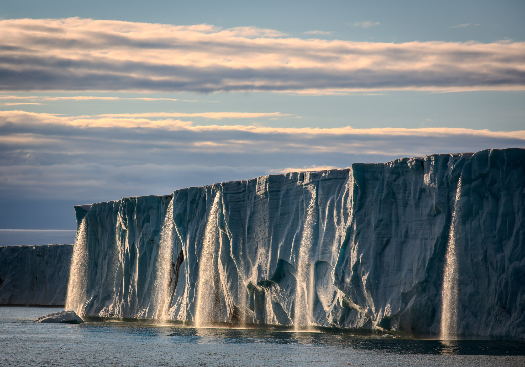

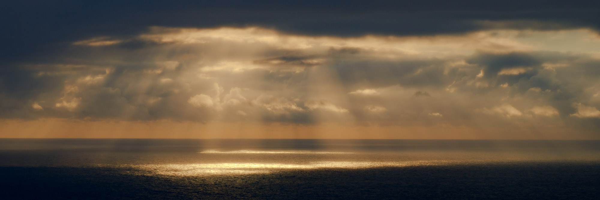
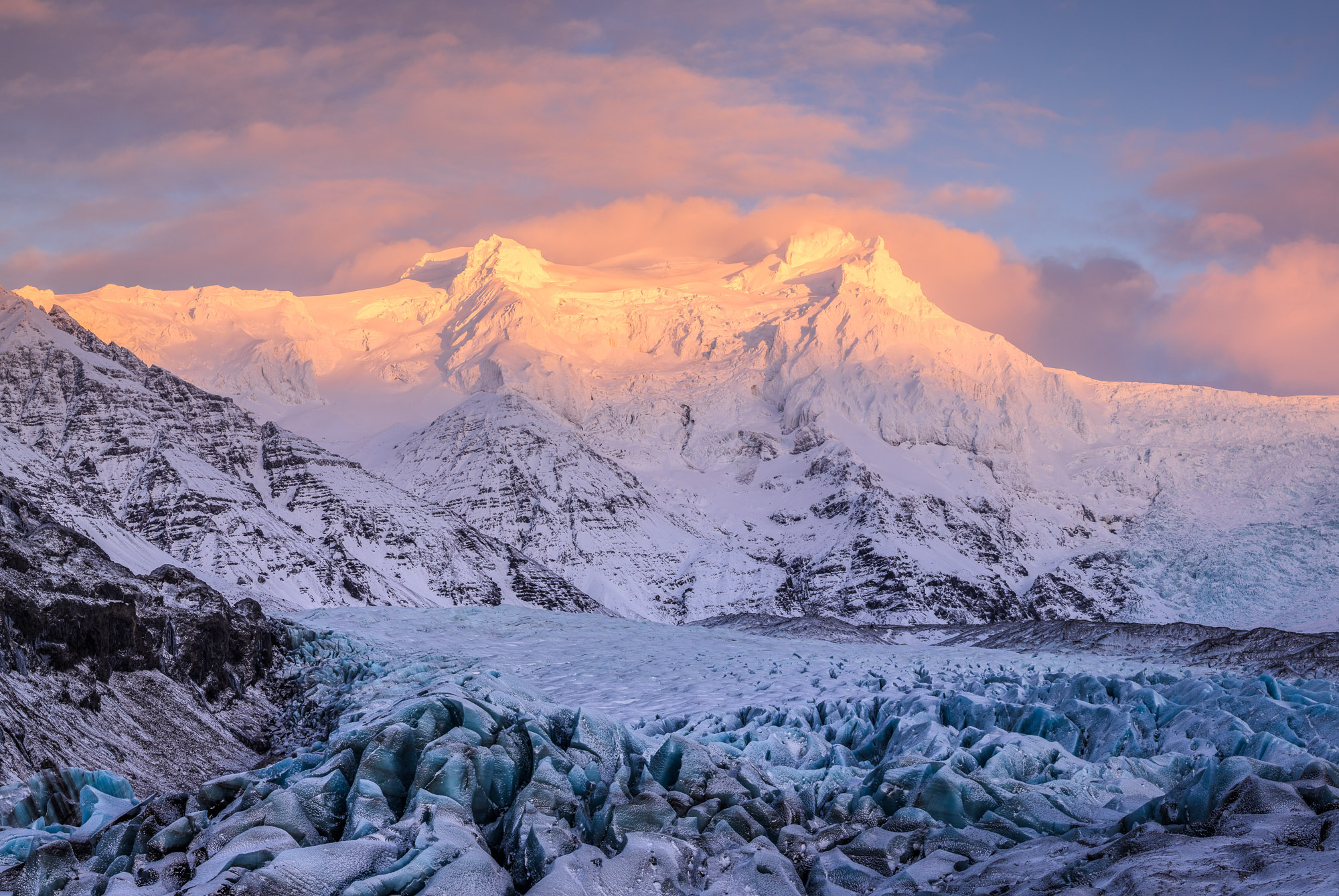
Waterfalls and Ice Cap, Svalbard. Hover over or tap the image to reveal the HDR version.
I captured the above photo of waterfalls plunging off a melting ice cap in the summer of 2014. I edited the photo using the new High Dynamic Range (HDR) feature in Lightroom. The Standard Dynamic Range (SDR) version is shown by default — place your cursor over the image (or tap the photo if using a mobile device) to show the HDR version. The difference between the two is dramatic: the backlit clouds and waterfalls spring to life in HDR. Now that is what this feature is about!
In photography, the term Dynamic Range refers to the contrast between the brightest and darkest tones of an image, measured in f-stops. As a rule of thumb, a photo with under 4 stops of dynamic range is considered low contrast or Low Dynamic Range, whereas a photo with 8 or more stops is considered high contrast or High Dynamic Range (HDR). A moonlit landscape, like the one below, has an extremely high dynamic range, with over 15 stops separating the bright moon from the dark foreground.
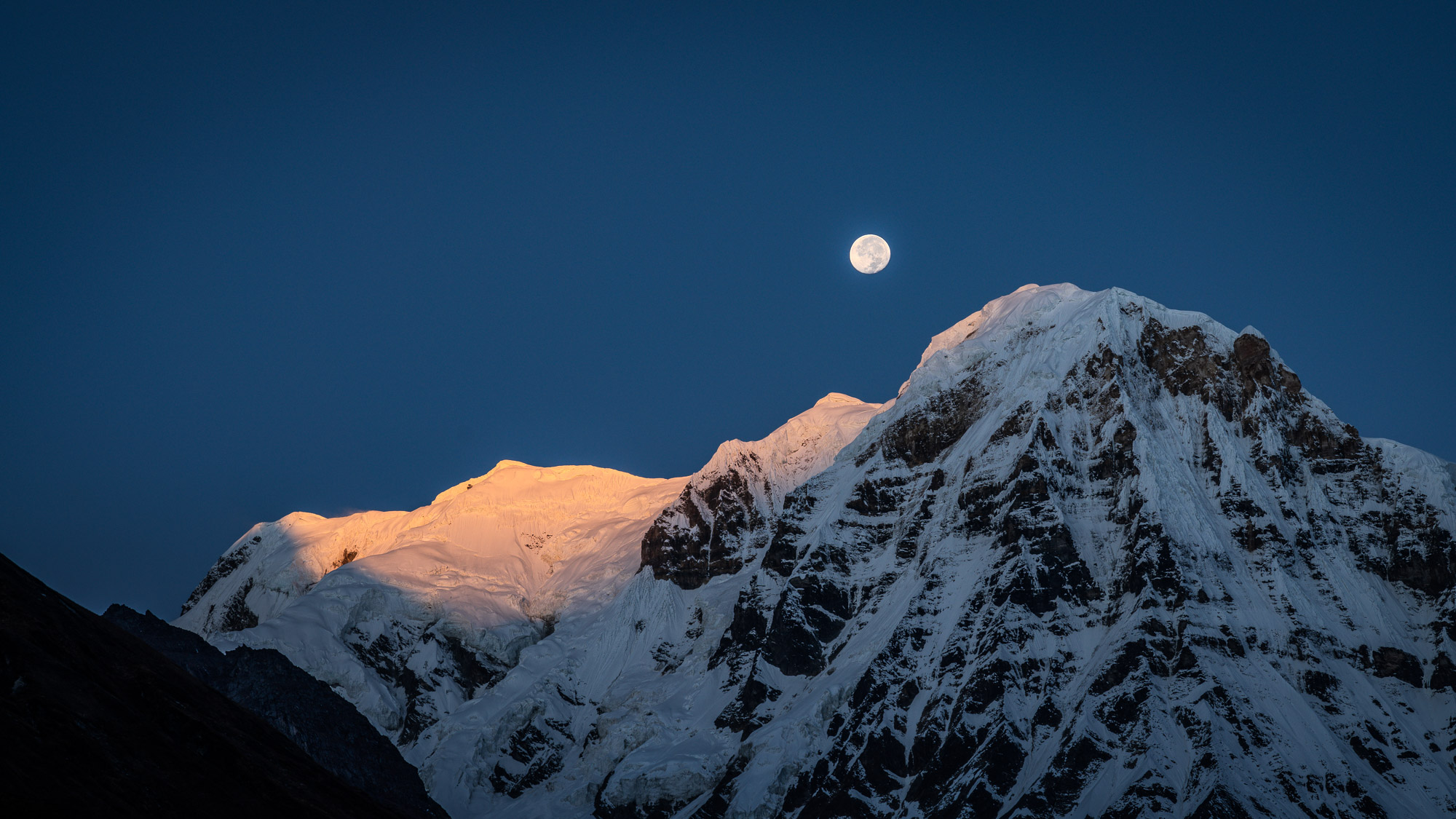
Moonset at Sunrise, Nepal. Hover over or tap the image to reveal the HDR version.
Doesn’t Lightroom already support HDR? Yes … well, sort of. Lightroom supports capturing HDR photos, importing HDR photos, and merging multiple frames to create HDR files. Until now, however, every photo that you’ve seen on-screen in Lightroom has been a Standard Dynamic Range (SDR) rendition. In other words, Lightroom processes all photos, including HDR photos, so that the results look good on a standard display — this process is called tone mapping. Exporting photos to formats like JPEG and PNG also involves tone mapping them to SDR.
To summarize, Lightroom has been able to import, merge, and capture HDR files for many years, but so far, we’ve been displaying and sharing them as SDR. All of that is about to change, however, thanks to the emergence of HDR displays.
HDR displays are now increasingly found in phones, tablets, laptops, and televisions. But what are HDR displays, exactly? What separates an HDR display from a normal one? What does it mean for a display to support 1000 nits? To answer these questions, let’s start by talking about luminance. The term luminance refers to the amount of light shining in a particular direction, measured in candelas per square meter, more commonly called nits. Here’s an example:
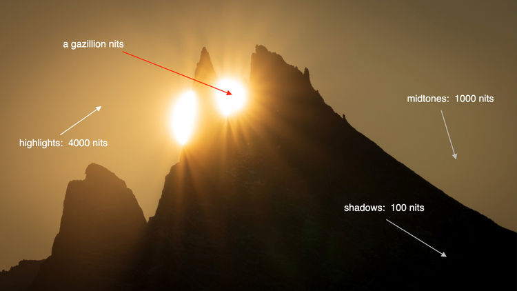
Let’s examine the amount of light in different parts of this scene. In the areas we might call the shadows, the luminance could be 100 nits. The midtones might be 1000 nits, the highlights 4000 nits, and so on.
Displays also use nits to quantify how bright they are. In the past, a typical display had a maximum luminance around 250 nits. Today, some phones and tablets can support 1000 nits across the entire screen, with peak luminance up to 1600 nits. That’s several times brighter than a standard display! Furthermore, modern displays use various technologies (such as local dimming and OLED) to retain deep blacks and improve contrast. These are called HDR displays because, thanks to their high peak luminance and deep blacks, they can deliver a much higher range of contrast than before.
One way to think about traditional SDR photography is that the on-screen results are limited to the standard brightness range of the user interface. That is, an SDR photo cannot be brighter than SDR white, the maximum white often used for text, icons, menus, and other interface elements. This is similar to how photos printed on paper cannot be brighter than the paper itself.
That’s no longer true with HDR displays. Tones can now be brighter than SDR white, as in the example below (place your cursor over the image to see the HDR version, or tap the image if using a mobile device):

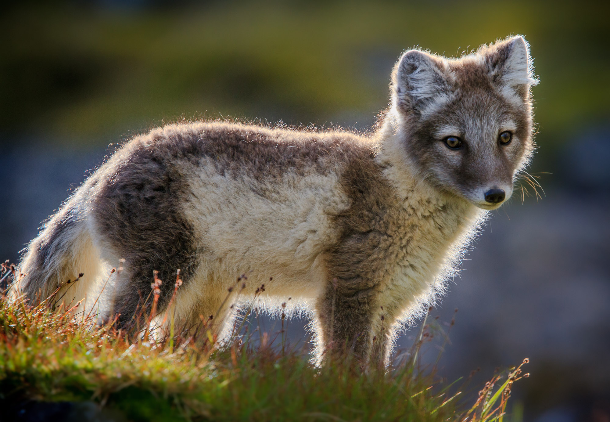
Arctic Fox, Svalbard. Hover over or tap the image to reveal the HDR version.
Here’s an arctic fox pup enjoying a warm summer day. The raw file contains a huge dynamic range, from the dark nose and eyes to the bright backlit fur. Until now, however, editing and sharing this file has always required tone mapping the image to SDR — that means bringing down the highlights and adjusting contrast so that all tones fit within a limited range. At last, I can edit the file in HDR and see the highlights as they ought to be: lively and luminous! The HDR rendition gives a much greater impression of sunlight shining through the fox’s fur.
HDR displays offer an extra two to four stops of highlight headroom compared to a normal display. Tones and colors have more room to spread out: brighter highlights, deeper shadows, improved tonal separation, and more vivid colors. As a result, photos optimized for HDR displays have greater impact and provide an increased sense of depth and realism.
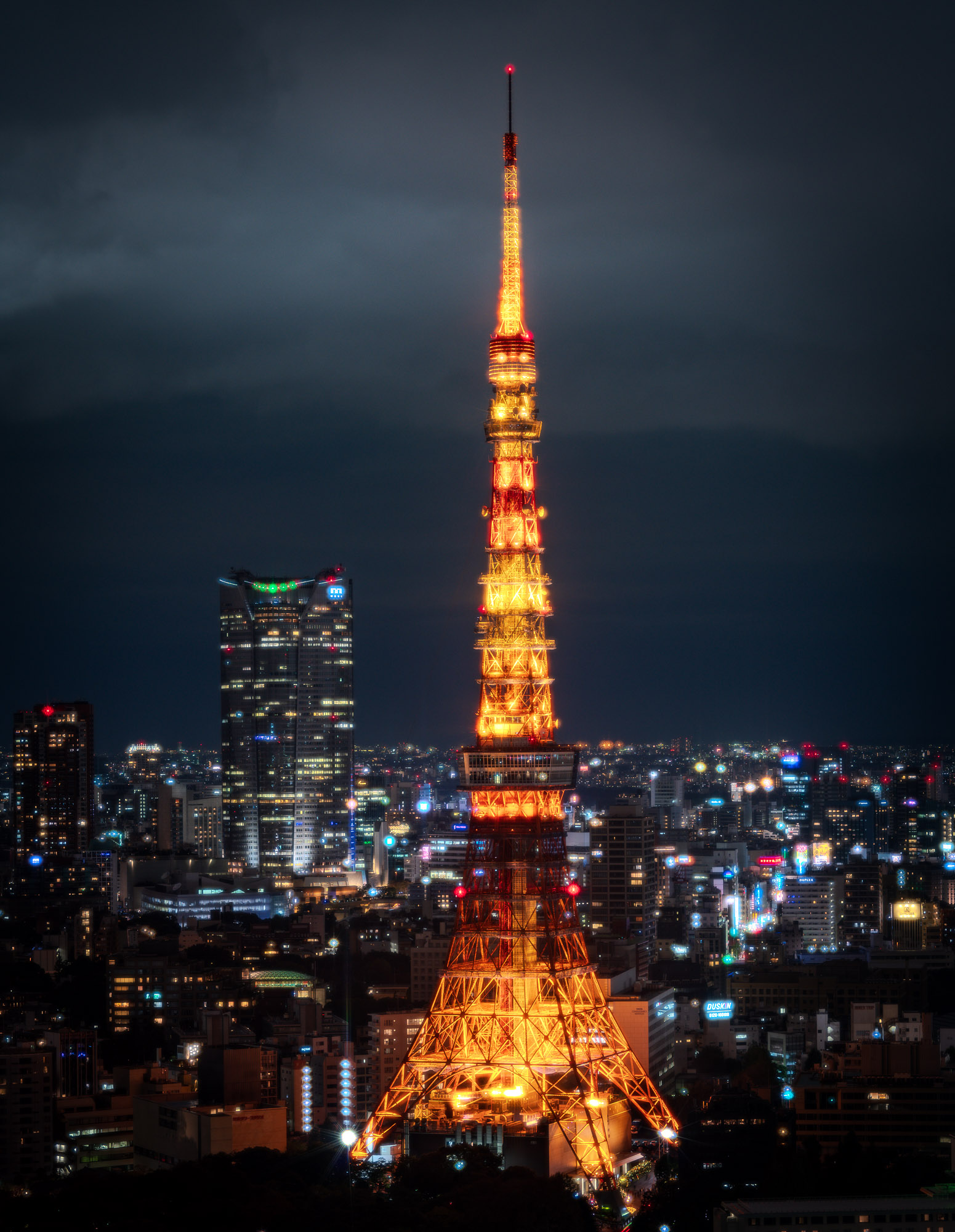

City Lights, Tokyo. Hover over or tap the image to reveal the HDR version.
With the October 2023 release, Lightroom and Camera Raw now support viewing, editing, and sharing photos in HDR. They take full advantage of the extra highlight headroom provided by HDR displays. Combined with existing HDR features (import, capture, merge), this means that Lightroom and Camera Raw now offer a complete end-to-end HDR workflow:
(*) introduced in the October 2023 release
Let’s explore how to use these new features!
To use the new HDR features in our desktop apps, you need an HDR display and a supported graphics processing unit (GPU) — for details, see the GPU FAQ for Lightroom, Lightroom Classic, and Camera Raw. For macOS, I recommend Apple XDR displays, such as the MacBook Pro 14” or 16” (November 2021 or later). For Windows, I recommend using a display with at least a 1000 nit capacity. See the DisplayHDR site for a list of VESA-certified displays with a rating of DisplayHDR 1000 or higher.
HDR in Lightroom iOS works on all currently supported iPhone and iPad devices with iOS 16 and later. For the best experience, use a device with a Super Retina XDR display, such as an iPhone 15 (any model), iPhone 14 Pro or Pro Max, or 12.9” iPad Pro (5th generation or later).
HDR in Lightroom Android is currently available only for Google Pixel 7 Pro on Android 14. We plan to expand HDR support to other devices in the near future.
Getting started with HDR is as easy as pressing a button. In the desktop and web apps (Lightroom, Lightroom Classic, Lightroom Web, and Camera Raw), there is a new button named HDR at the top of the Edit stack, next to the Auto and B&W buttons. In the mobile apps (Lightroom Android and Lightroom iOS), the HDR button is at the bottom of the Light panel.
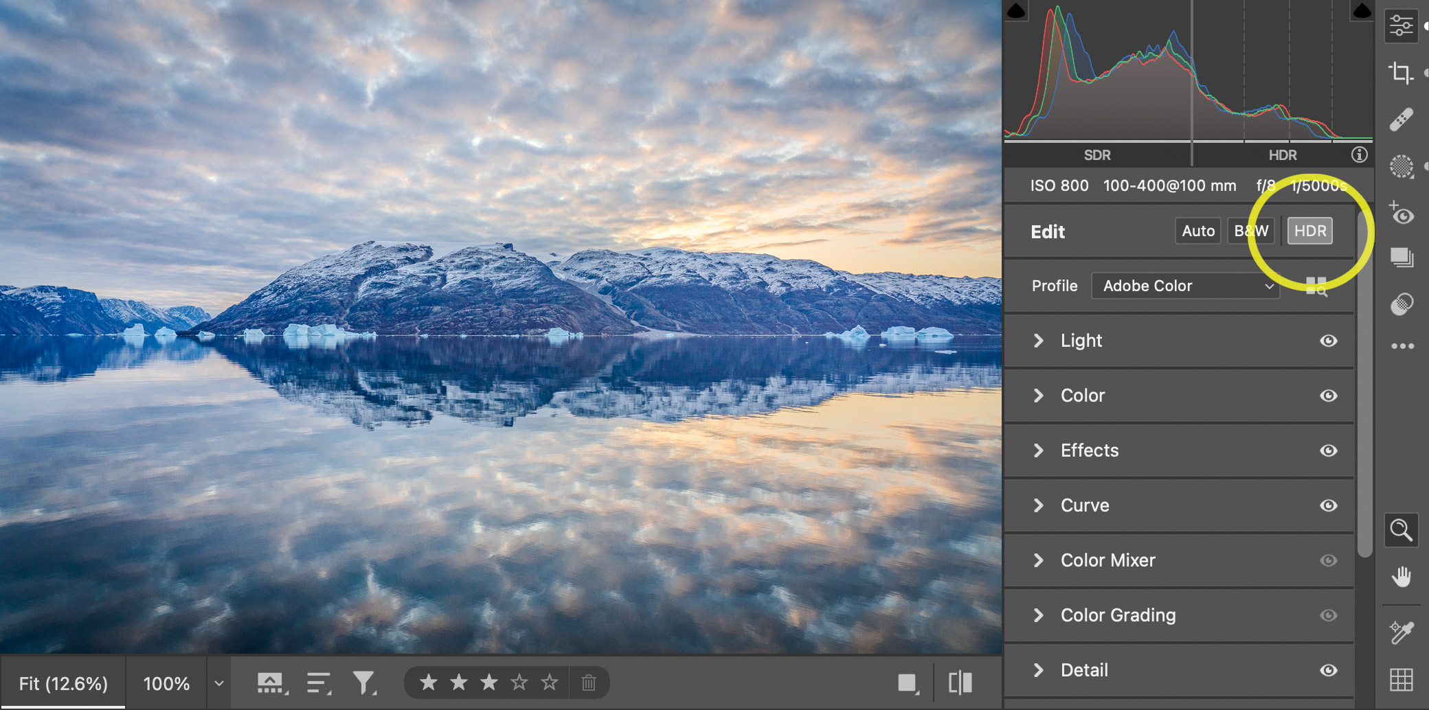
Just press the HDR button (circled in yellow) to get started.
Turning on this button causes the entire photo processing pipeline to support HDR. Critically, this means that tones in the final image are no longer constrained to the usual SDR range. Instead, these tones can be brighter than SDR white: that is, brighter than menus, windows, text, and other user interface elements! The visual effect might be startling the first time you experience it.
All of the controls you’re accustomed to using in SDR mode will also work in HDR. I really mean all of them: basic tone controls (Exposure, Contrast, Highlights, Shadows, and so on), advanced controls like Curves, Healing, and Masking, and even new features like Point Color and Lens Blur.
Most controls look and feel the same in SDR and HDR, but Point Curve is a little different:

In HDR mode, the Point Curve is divided into two parts, SDR (bottom and left) and HDR (right and top). The HDR section provides direct and very precise control over the highlights — we’ll see some examples later on how to use it. In Lightroom Classic and Camera Raw, the points on the curve usually have coordinates values in the range 0 to 255 — in HDR mode, however, the curve offers an extended range up to 500. The center of the panel (the midpoint of the two thick gray lines) represents the SDR white level — in other words, the maximum white of an SDR image. A value of 500 represents four f-stops above SDR white.
You can apply HDR editing to any photo, but it works best on photos that inherently hold a large range of tones. This includes raw photos, DNGs created with the Merge to HDR feature, Apple ProRAW DNG files, and Google Pixel DNG files. Some cameras directly record HDR photos in the HEIF format — this includes recent Apple iPhones and recent cameras from Canon, Nikon, and Sony. All these files are supported in Lightroom and Camera Raw and work great with HDR editing.
Keep in mind that a single raw file can hold a lot of dynamic range already, so it’s not always necessary to use exposure bracketing and the Merge to HDR feature. For instance, the following photo is from a single DNG raw capture from a 2018-generation phone:
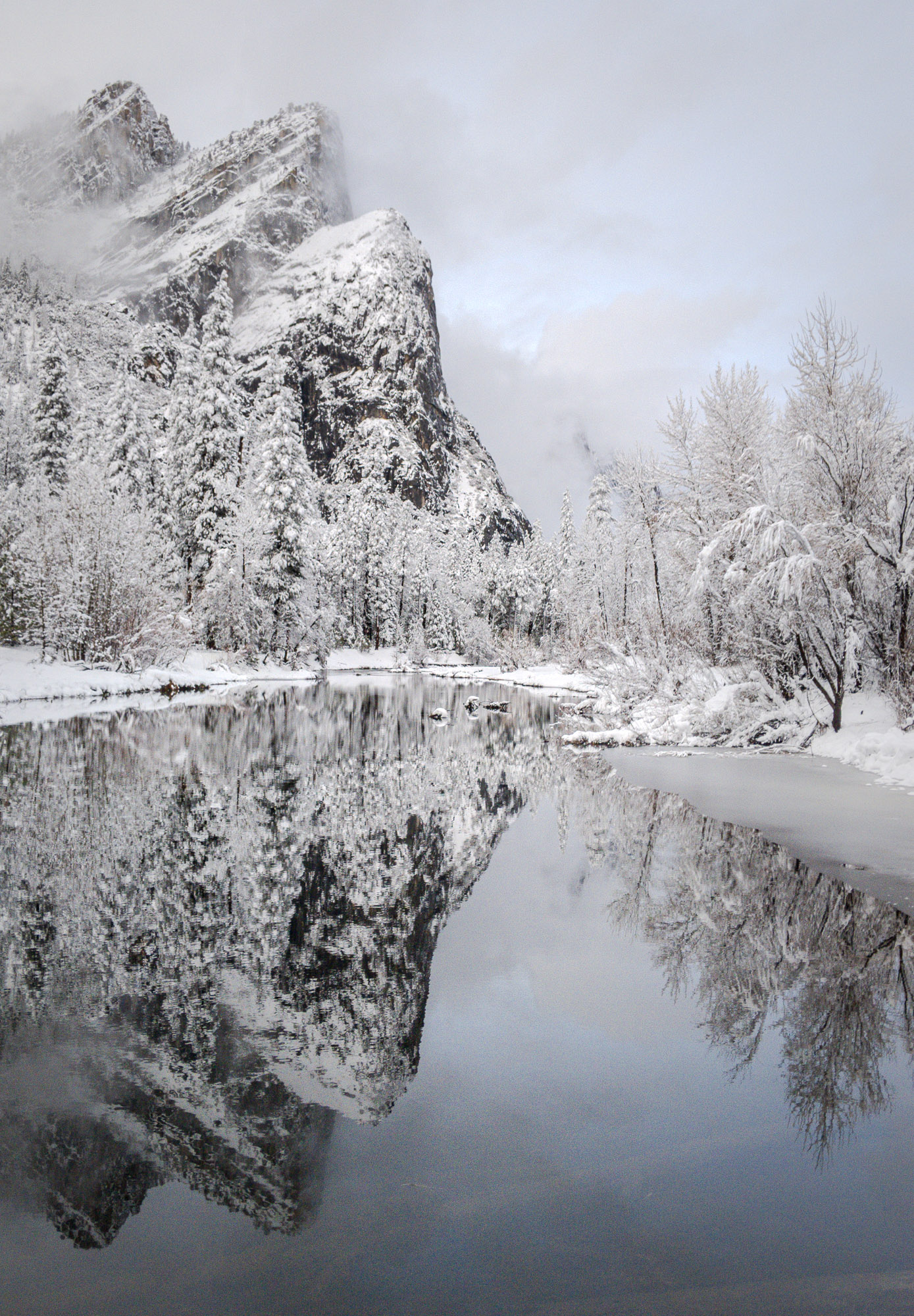
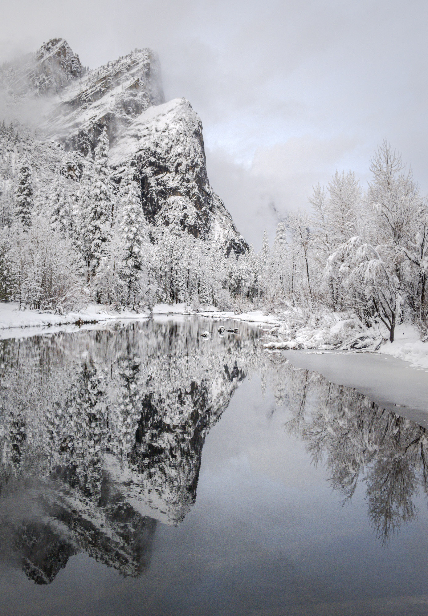
Yosemite in Winter. Hover over or tap the image to reveal the HDR version.
In other cases, a single frame is not enough. Here’s an example where I combined Lightroom’s existing Merge to HDR feature with the new HDR edit and export capabilities:
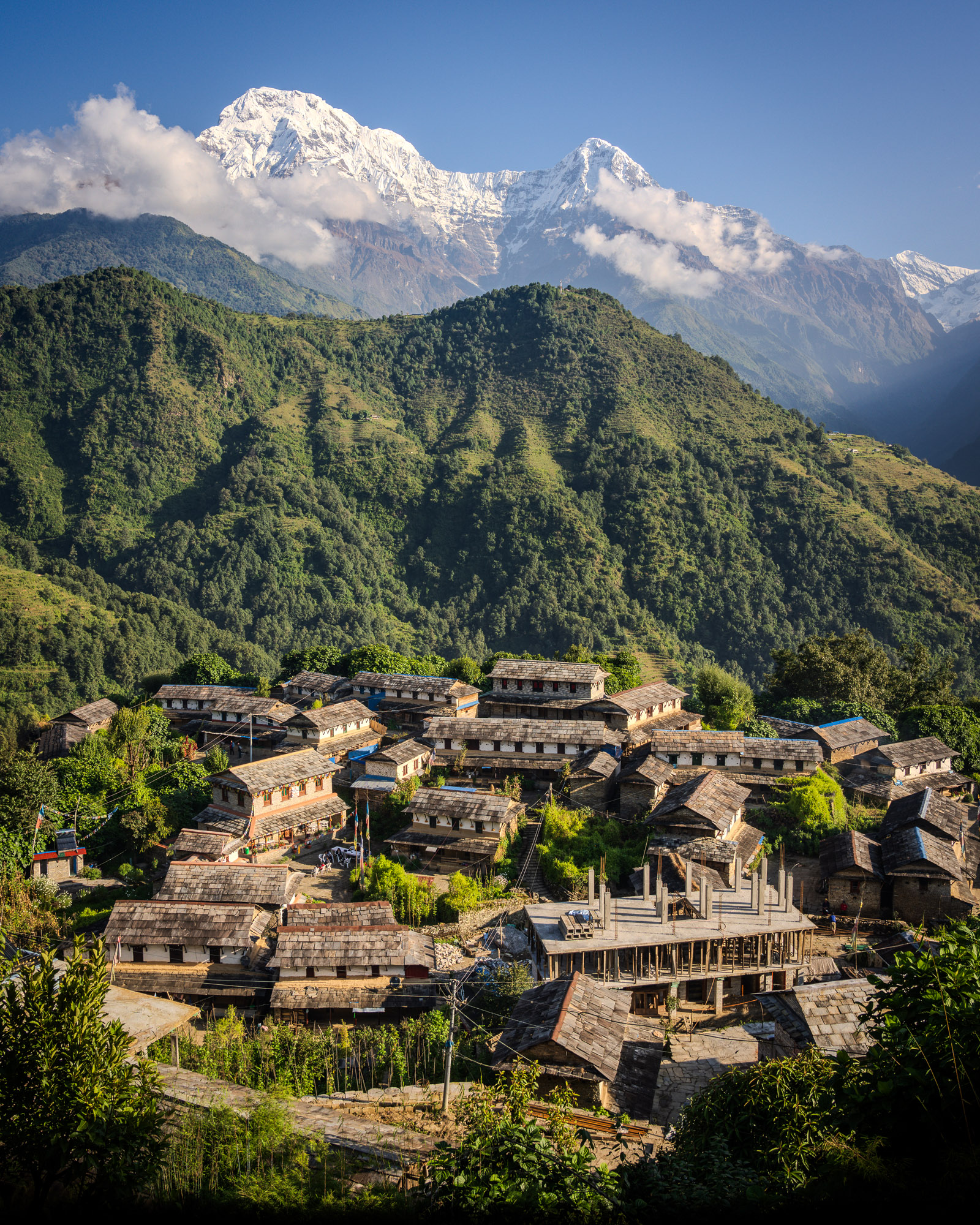
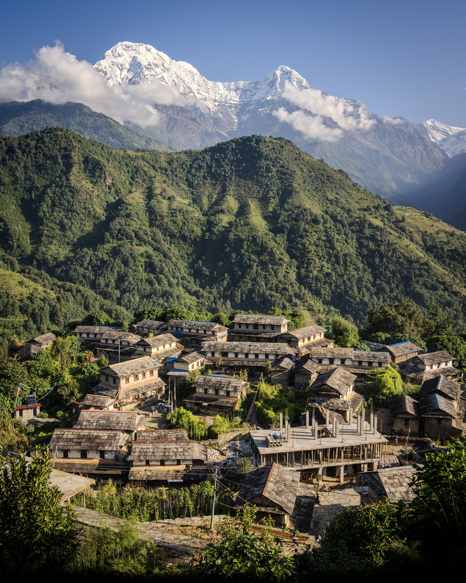
Mountain Village, Nepal. Hover over or tap the image to reveal the HDR version.
This scene has very bright highlights (the snowy mountain) and deep shadows (the shaded foliage). I used the exposure bracketing feature of my camera to record three separate frames (normal, 2 stops brighter, 2 stops darker). I merged these frames using Lightroom’s Merge to HDR feature to produce a DNG raw file that easily holds all the tones of the scene. Finally, I turned on the HDR button and made a few edits to create the rendition shown above.
I suggest starting with the Light panel (Basic panel in Lightroom Classic), especially the Exposure, Highlights, and Whites sliders. I also recommend using the Point Curve for fine-tuning, since it’s the only control that offers direct adjustment of HDR tones. If you haven’t tried the Curve before, this is a great time to learn! We’ll see a couple of examples later in this section.
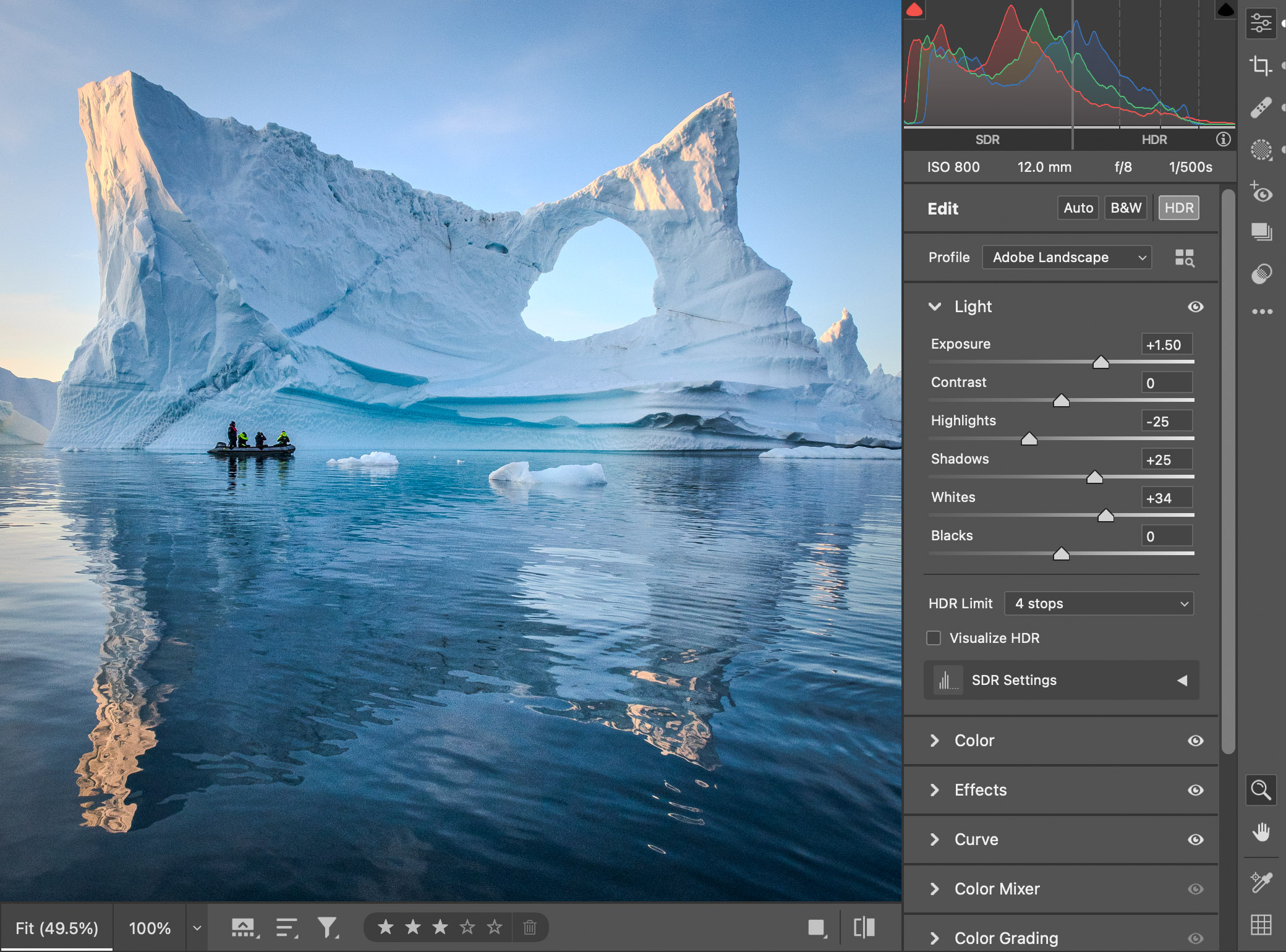
Giant Iceberg, Greenland. Using Exposure, Highlights, and Whites is a good way to get started with HDR editing.
At first, you may find it hard to wrap your head around HDR editing. For one thing, tones can now be brighter than the SDR white level. Think about that for a moment. Your photo can be brighter than user interface elements such as menus, buttons, and windows! To help you navigate this new world of HDR editing, we’ve added several visualizations to Lightroom and Camera Raw.
The histogram is a key visual aid for editing HDR photos. It identifies colors that are brighter than SDR and indicates when colors exceed your display’s HDR headroom. When the HDR button is on, the histogram is divided into two sections: SDR on the left, and HDR on the right:

The gray vertical bar between them indicates the SDR (or user interface) white level — when editing in SDR, tones can never be brighter than this level. In HDR mode, however, tones can be brighter, and this is depicted by histogram data to the right of that bar.
Dashed gray vertical lines indicate zones above SDR white in increments of f-stops. The first (leftmost) dashed line represents one f-stop above SDR white, the second (middle) dashed line represents two f-stops above SDR white, and so on.
The highlight clipping warning is a good way to learn about the abilities and limits of your display. When enabled, yellow horizontal bars appear underneath the HDR section to indicate HDR tones that your display can currently show. Red horizontal bars indicate ranges that are beyond the display’s current headroom and therefore cannot be previewed accurately. In the example below, the display has a little over two stops of headroom — the transition from yellow to red happens just to the right of the 2nd vertical dashed line.

When the highlight clipping warning is enabled, on-image color overlays use the same yellow-red color scheme as the histogram. This is a handy way to tell which parts of your picture are SDR (no color overlay), HDR and within your display’s headroom (yellow), and beyond your display’s ability to preview accurately (red):

If you’re editing on a laptop or mobile device, and you have automatic/adaptive brightness enabled, be aware that moving into a brighter or darker environment will cause your display’s available headroom to change. You’ll see these changes reflected dynamically in the histogram and on-image overlays as the balance shifts between yellow and red.
Another way to understand the HDR content in your photo is the Visualize HDR feature. This is a checkbox at the bottom of the Light (or Basic) panel. When enabled, the HDR tones of your photo are shown using four different colors, from cyan to magenta. The same colored bars are shown in the histogram. Using these colors can help you edit in HDR even if your display has limited headroom.
In the example below, many parts of the iceberg and sky are 1 to 2 stops above SDR white (cyan and blue), but there are some even brighter areas that are 3 to 4 stops above SDR white (purple and magenta).

In Lightroom Classic and Camera Raw, color readouts are another good way to learn about HDR tones. Place your cursor over the image and look at the numbers reported in the histogram. In SDR, Lightroom Classic displays RGB values using percentages from 0 to 100, and Camera Raw displays values on an 8-bit (0 to 255) scale. When editing in HDR, these apps continue to display SDR tones the same way, but they will also display HDR tones using f-stops above SDR white. For example, a value of +0.5 means half a stop above SDR white. In Camera Raw, this convention applies to both live and sampled readouts (using the Sampler tool). Just like with the highlight clip overlays, yellow colors indicate pixels within the display’s headroom, and red values indicate pixels beyond the display’s limits.

For the example above, I placed the cursor over the brightest sunlit part of the iceberg. All three-color channels of the underlying pixel are above SDR white. The red channel is 3.3 stops above, the green channel is 2.4 stops above, and the blue channel is 1.1 stops above. The display headroom is around 2.6 stops, which is enough to show the green and blue channels accurately (shown in yellow), but not enough to show the red channel (displayed in red). This is a clue that I should probably reduce the Highlights or Whites sliders to avoid clipping the red channel on my display.
Here are some tips for getting the most out of HDR.
Capture carefully. First, be careful when capturing new photos to avoid clipping the highlights! This is a good practice in general, but it’s even more important with HDR. When a photo with blown-out highlights is edited in SDR, those highlights tend to desaturate and fade smoothly to white, so the results aren’t too bad. When processed in HDR, however, clipped highlights really stand out (bright, but missing details and wrong colors), and the results often look terrible. When photographing a high-contrast scene, it’s much better to underexpose to protect the highlights, even if this means noisier shadows (which you can clean up with Denoise). If in doubt, use exposure bracketing to record extra frames.
Ocean Light, Portugal
Choose early! I recommend using (or choosing not to use) the HDR button early in your edit workflow. Although we kept the edit controls as similar as possible between SDR and HDR, there’s no getting around the fact that viewing photos in HDR is a very different experience. The choice of SDR vs HDR will often greatly influence how you adjust the other sliders, especially Highlights and Whites. Make your choice early, but don’t fret. All editing in Lightroom is non-destructive, so you can always change your mind later.
Enjoy the color buffet. Brighter highlights are an obvious benefit of HDR, but increased highlight color range is also important. When editing in SDR, very bright highlights tend to get washed out due to a limited color palette near white. When editing in HDR, however, the available color gamut expands significantly around the SDR white point (the center vertical line in the histogram). This means that even for low to moderate contrast photos, you may see a significant visual benefit to editing in HDR.
For example, the photo below doesn’t have many bright highlights, but it does have vivid blue colors:
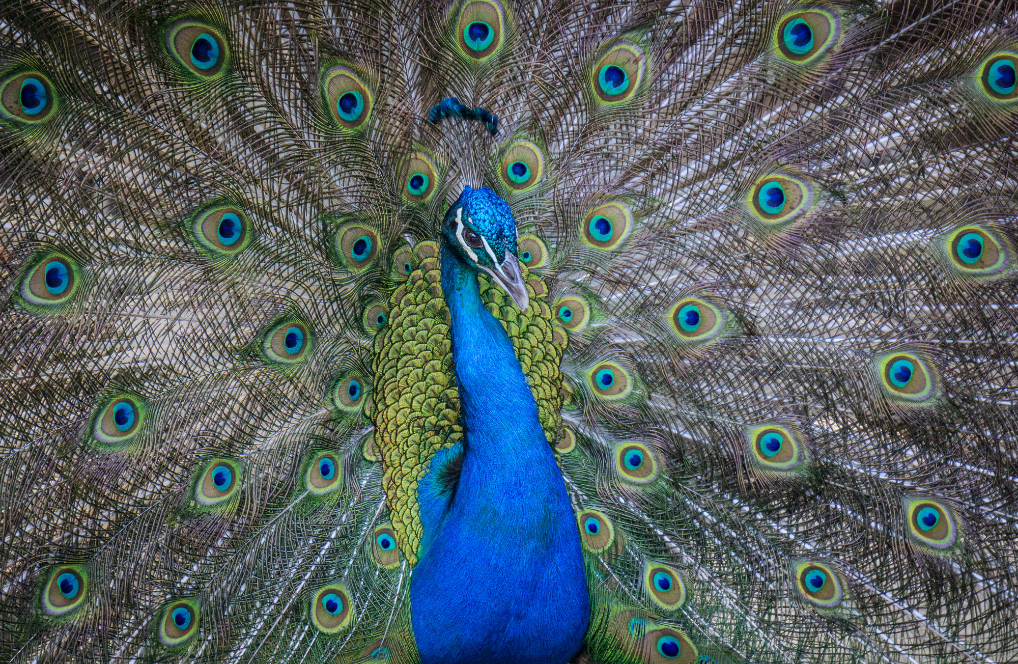
In the zoomed-in crop below, take a closer look at the sheen on the peacock’s head and neck. Notice how those areas in the SDR version appear slightly flat, whereas they have more details and color in the HDR version (place the cursor over the image to see it):
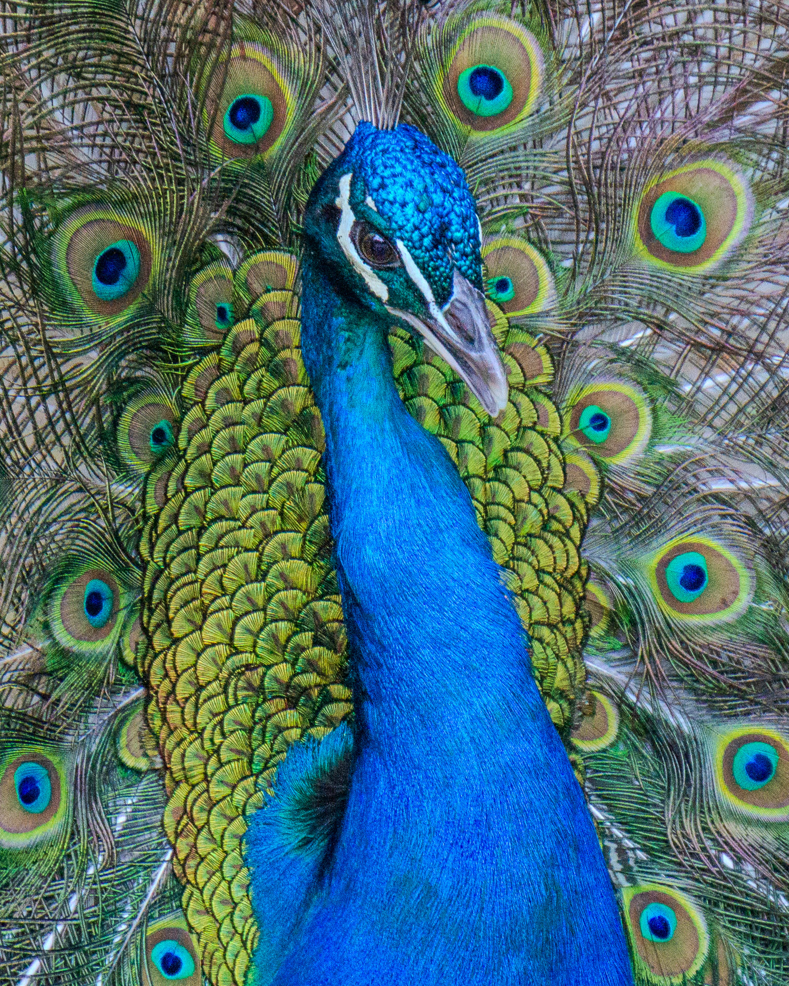
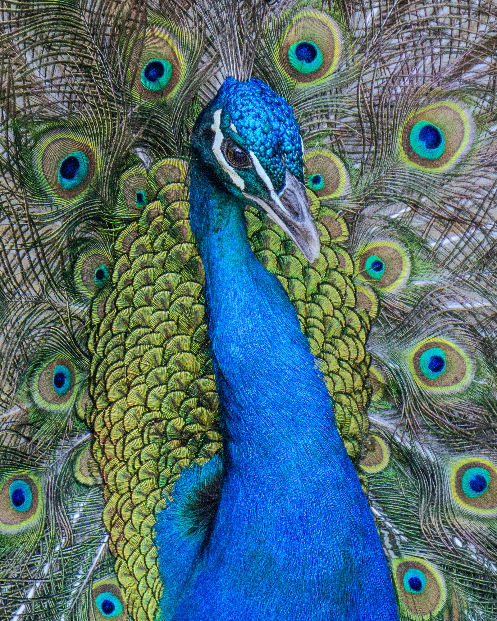
Hover over or tap the image to reveal the HDR version.
Here’s a second example showing the same principle. The tones and colors are somewhat muted in the SDR version — the windows and lights are obviously brighter in the HDR version (place your cursor over the image to see it), but another improvement is the stronger distinction between warm and cool colors.
Hover over or tap the image to reveal the HDR version.
Dynamic headroom. Be aware that if your display has automatic/adaptive brightness enabled, then your display’s HDR headroom will depend on the environment. The brighter your surroundings, the brighter your display will be, which means less available headroom. When you’re in a dark environment, your overall display brightness will drop, which means more headroom. The histogram and clipping indicators are the best tools for checking your display’s available headroom, as shown in the screenshots below:


With the clipping overlays enabled, look for the division between the yellow and red areas. More yellow areas mean more headroom. If you see the balance between yellow and red shift, it means your display headroom has changed, probably in response to a rise or drop in the ambient lighting. It can be disorienting to edit in HDR when the headroom keeps changing, so it’s best to edit in a location with stable lighting.
Sunglasses are not the answer. Even if your display offers a ton of headroom, it doesn’t mean you need to use all of it. You could crank up the Whites slider till the highlights are dazzlingly bright, but that’s not a great idea. Do you really want your friends to wear sunglasses when viewing your photos? Making compelling HDR photos doesn’t mean blinding your audience!
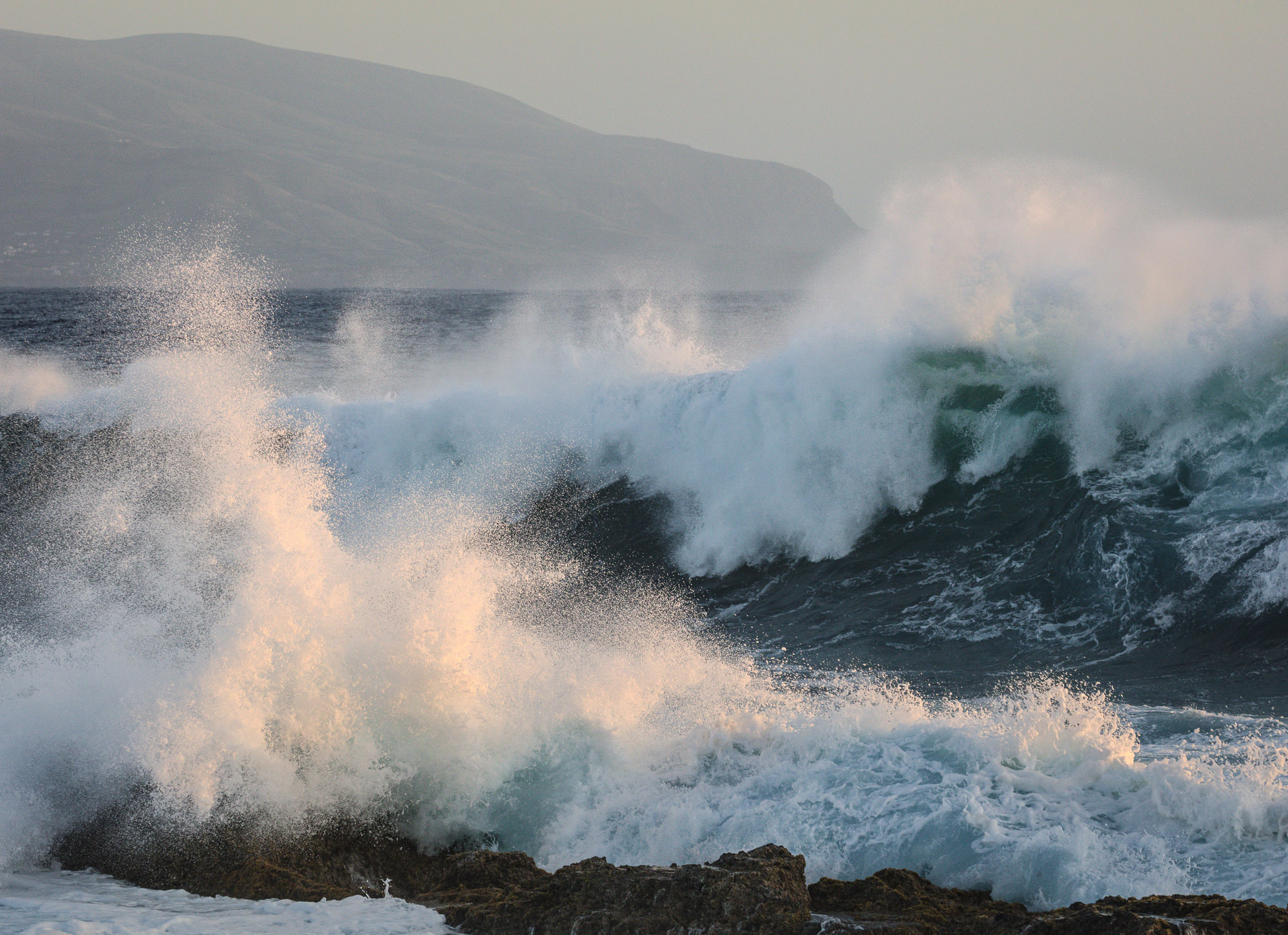
Crashing Waves, Portugal
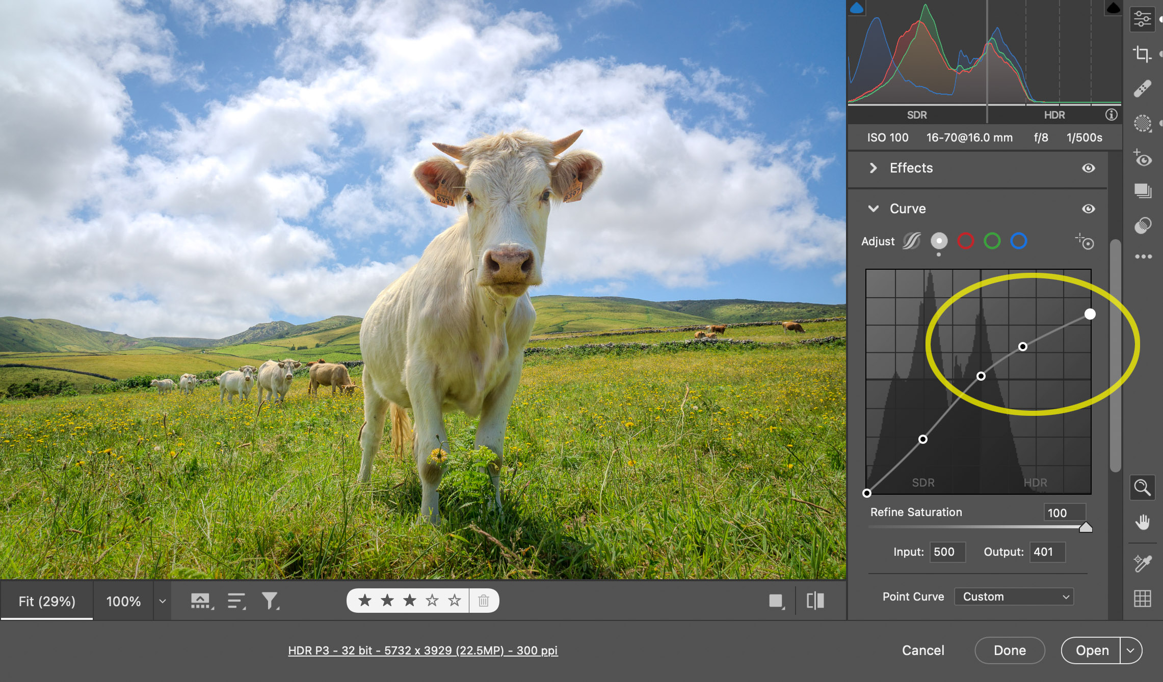
Tea for two. I’ve found in practice that using up to two stops of headroom is a good way to start. Try placing your brightest tones (metallic highlights, specular reflections, bright clouds, and so on) at the +2 marker on the histogram. That’s what I did for the above photo, where the crashing waves are catching the warm light from the setting sun. I started with the Whites control, then added a Curve to tune the highlight placement. The right end of the histogram meets the +2 vertical mark in the HDR area, circled in yellow in the screenshot below:

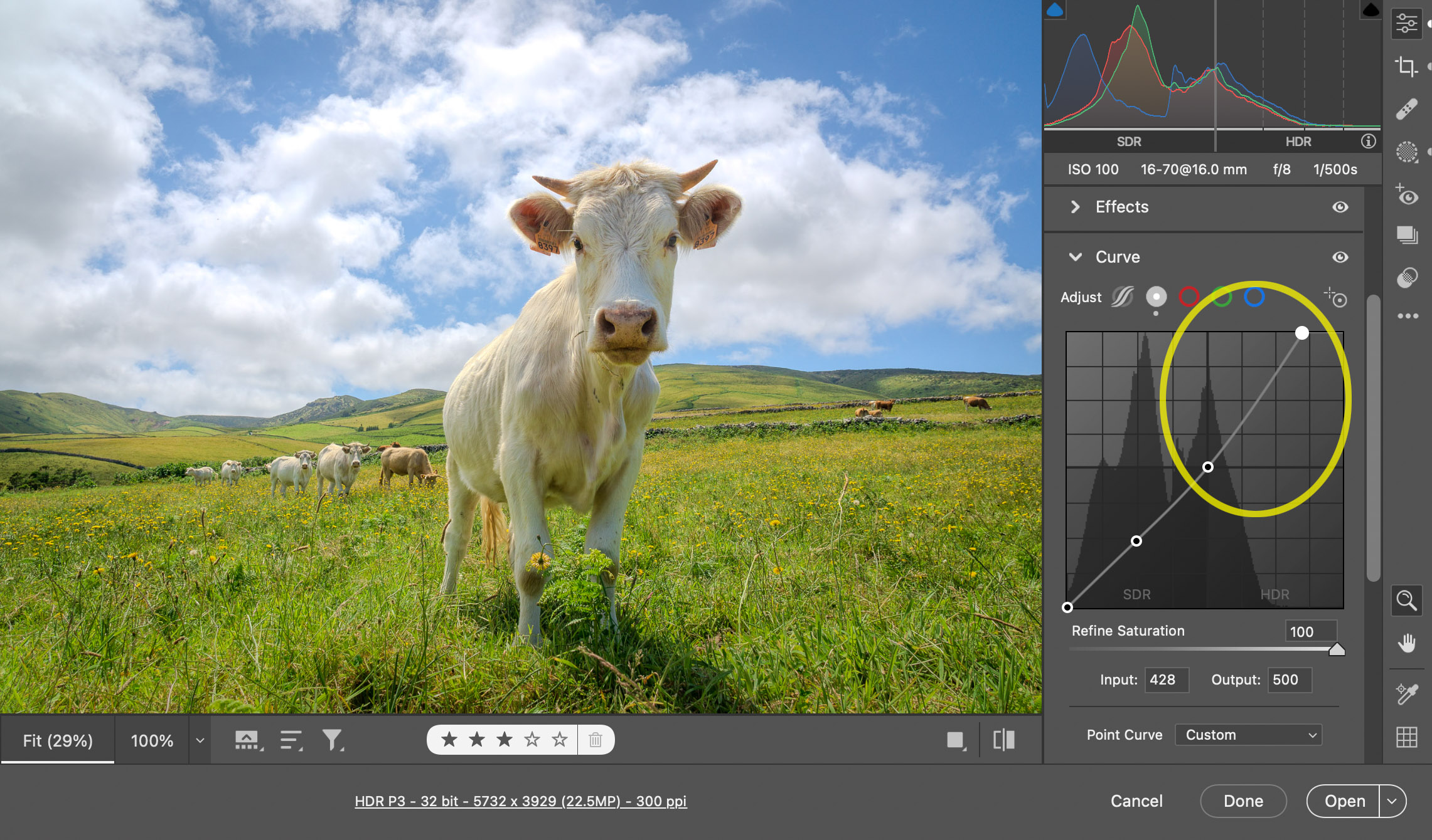
Sometimes, however, going beyond two stops can be very effective, especially if the highlights occupy a small area of the overall picture. To illustrate, here’s a photo that I captured a few years ago during a trek to Annapurna Base Camp:
Moonset at Sunrise, Nepal
The moon was setting behind Annapurna South just as the ridge was starting to light up from the rising sun. When I edited the photo in HDR, I placed the moon at around 3.3 stops above SDR white. It’s very bright, but I think the visual result is balanced, because the moon is small in the frame.
Here’s another example where going beyond two stops works well:
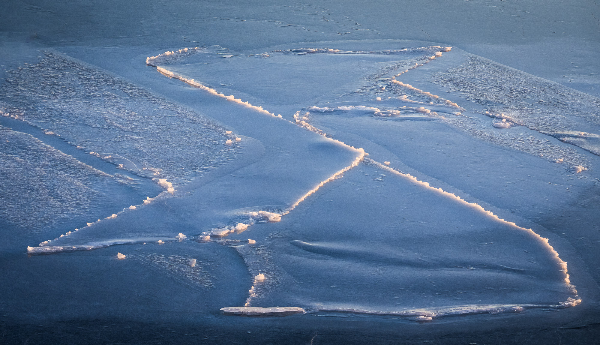
Backlit Ice Detail, Svalbard
I made this photograph hand-held from a boat deck during an early spring trip in the Arctic. The frozen bay had fantastic ice patterns, and the sun never rose far above the horizon. Some of the ice had raised edges that caught the rays of the low-angle sun. When I edited this photo in HDR, I chose to accentuate the differences between the flat ice interior (dark and cool) and the raised edges (bright and warm). The edges occupy a small part of the overall picture, so I felt comfortable letting them extend well beyond +2 stops. In fact, some of the warm pixels go all the way up to +4 stops, but they don’t overwhelm the photo because there are so few of them. Having a few tiny, super-bright areas adds that extra sparkle and pop.
Too much of a good thing? Brighter images tend to look better, so it’s tempting when editing in HDR to keep dragging the Exposure slider to the right. Nobody does this when editing in SDR, because eventually everything clips to white and the image clearly looks bad. In HDR, however, the image isn’t constrained by the SDR white level, so increasing Exposure results in a brighter and more colorful image. It’s easy to lose track of this behavior, especially if you’re editing in full-screen view with no obvious reference point. This often leads to HDR results that are much too bright. Another common problem is lack of consistency: two HDR photos might look fine when viewed separately but awkwardly mismatched (one appears much brighter than the other) when shown together, like in a web album.
To avoid these problems when editing in HDR, I recommend using various tools in Lightroom and Camera Raw that provide reference points and feedback.

White surround. Try using a white canvas (instead of dark gray) around the image, as shown in the screenshot above. In the desktop apps, right-click on the area next to the photo and choose “White” from the context menu. This is the SDR white level: in other words, the maximum white that is used for user interface elements like menus, buttons, and windows. If your HDR image is so bright that the “white” canvas actually appears to be a dull gray, you’ve probably gone too far.
The histogram is your friend. Keep an eye on the histogram. In HDR mode, it’s split into SDR and HDR sections. If a lot of your content is over on the right (HDR) side, like in the following screenshot, that’s another indication your image is probably too bright.

Use the highlight clipping overlays as a visual check on the image itself. Ideally, most of your image should be in the SDR range (no clipping, and therefore no color overlays). Yellow and red areas indicate HDR tones. If most of your image is covered with yellow and red overlays, as in the example above, that’s a bad sign!
Visualize HDR is also a good way to check for images that are too bright — watch out for large areas that appear with colored overlays.
In the desktop apps, use the Option (macOS) or Alt (Windows) modifier keys when adjusting the Exposure, Highlights, and Whites sliders to check for clipping and overrange tones. In Lightroom iOS and Android, hold a second digit while using the same sliders. They use the same yellow/red visualizations that the clip warning indicators use.
In the screenshot below, I’m using the Option/Alt key while dragging the Whites slider, and the visualization tells me that just the sky, mountain peaks, and edges of the ice are above the SDR white point — this is a reasonable balance. Since no areas are shown in red, I can feel confident that no part of the image is clipping on my display.

Master the Curve. The Highlights and Whites sliders are great for getting started with HDR editing, but mastering the Curve will take your HDR photos to the next level. The Point Curve is by far the best way to fine-tune highlights in HDR. Use a “flatter” upper section for a gentler treatment, like this:
Use a “steeper” upper section to make the highlights pop, like this:
For this image, I prefer the first (top) rendition with the flat curve, because the clouds blend in better with the rest of the content. For many other photos in this article, however, such as the image of the moonset at sunrise, I used the steep curve approach.
HDR Defaults. One final tip about the HDR button itself. It’s off by default, but you can optionally have it enabled automatically at import time for recognized HDR file types (such as DNGs produced by Merge to HDR). In our desktop apps, visit the Preferences dialog and check the box labeled Enable HDR editing by default for HDR photos:

In Lightroom iOS, you can find the same option in App Settings / Import / HDR edit setting.
In Lightroom Android, look in Preferences / Photo Import Options / HDR edit setting.
Viewing and editing a photo in HDR is exciting, but there are some reasons you might want to share an SDR version. Your intended audience may not have HDR displays, or they may be using software that doesn’t support HDR file formats. This is especially true in the short term, as industry adoption of HDR hardware and software continues to grow.
There’s a new section named SDR Settings at the bottom of the Light panel (Basic in Lightroom Classic). The controls within this panel allow you to preview and adjust how your HDR photo will appear on an SDR display. The idea is to match the appearance of the HDR rendition as closely as possible.

Checking the Preview for SDR Display box will squeeze your gorgeous, luminous HDR photo into the SDR range. The histogram remains split into SDR and HDR sections, but all the image data will be moved over to the left side. The result will often look dull and flat, and it can be somewhat deflating the first time you experience this. I suggest that you look away from the screen for a few seconds, blink a few times, then look back. Doing so helps the mind to adjust and “forget” the brilliance of the HDR version.
The sliders underneath the checkbox (Brightness through Saturation) affect how Lightroom performs tone mapping. The defaults are a good starting point for many photos, but you may need to tune them for best results. Tone mapping HDR photos to SDR is very much a matter of personal taste, just like any creative endeavor. Don’t be surprised to find yourself choosing different SDR Settings values for different photos!
Fire and Ice, Iceland. This is an HDR rendition with colorful highlights.
If your HDR photo has colorful highlights, like the example above, use the Highlight Saturation slider (sometimes abbreviated to Saturation) to adjust how those colors appear in the SDR rendition. Move the slider to the right to retain as much color in the highlights as possible, but watch out for clipping and loss of color detail. Move the slider to the left to minimize clipping and reduce saturation. Experiment and season to taste!
To illustrate, here are three SDR renditions of the same photo, with Highlight Saturation set to -100 (left), 0 (middle), and +100 (right). There are significant color differences in brighter areas, such as the warm mountain peaks, but minimal changes in darker areas, such as the blue glacier.


The SDR rendition that you see when Preview for SDR Display is enabled will be used by Lightroom in other areas of the app (such as Slideshow) that currently do not support HDR viewing. It also affects how your photos will appear when exporting with the HDR Output box unchecked in the Export dialog.
Once you’re done editing in HDR, you can share your photo with the world, and everyone will see your masterpiece in all its HDR glory — right?
Unfortunately, it’s not that simple.
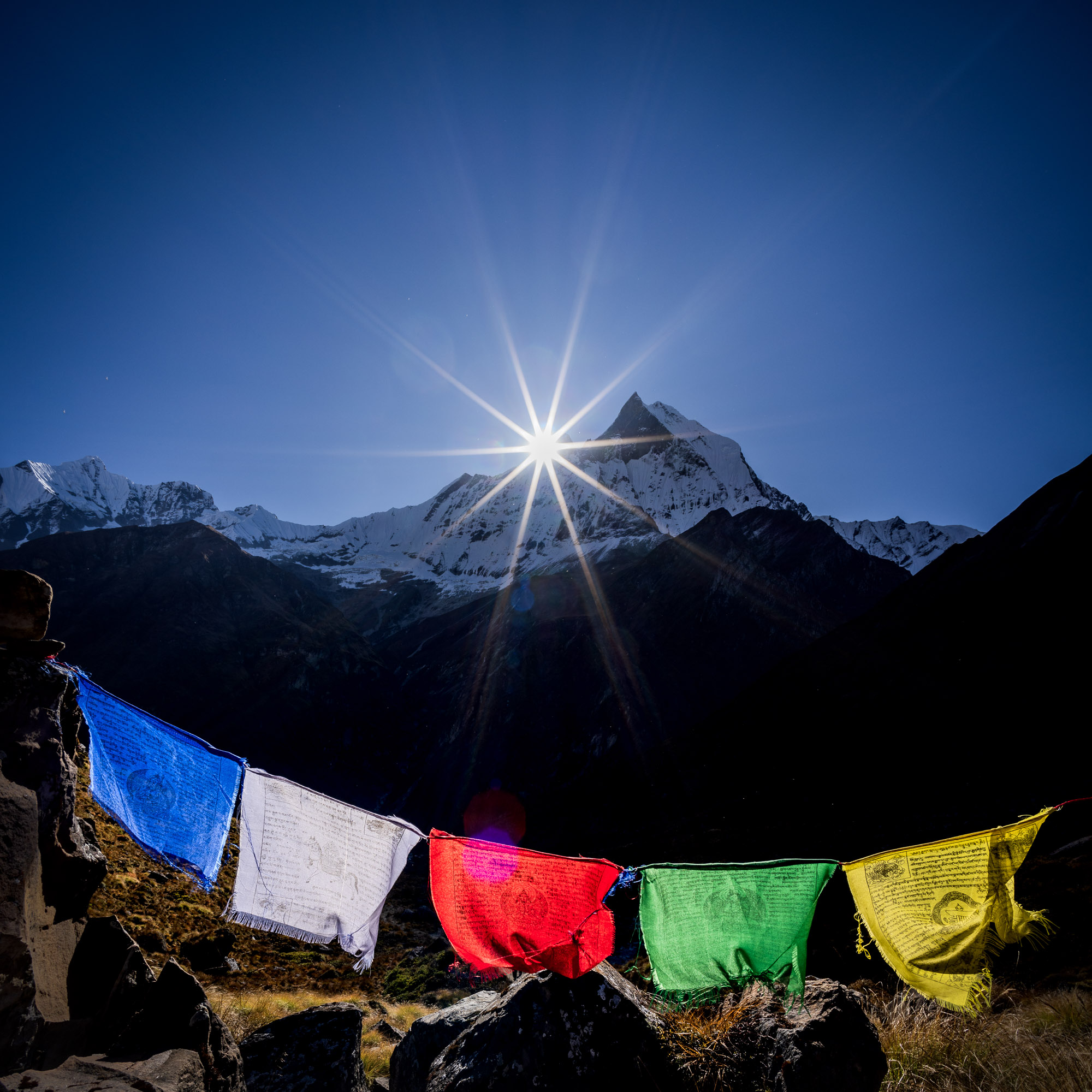
Sunrise above Machupuchare, Nepal
Exporting and sharing photos from Lightroom has been easy since the beginning. Support for the JPEG file format is ubiquitous. We can send JPEG photos to friends and not worry about them being able to view them, regardless of what device or platform they’re using.
Being an older format, JPEG has many limitations (such as 8 bits per channel) that make it inadequate for storing high-quality HDR photos. Newer formats such as AVIF and JPEG XL offer higher quality at reduced file sizes, making them great choices for HDR photos. For this reason, we’ve added import and export support in Lightroom and Camera Raw for both AVIF and JPEG XL.
The drawback of these newer formats is that they aren’t yet universally supported. Industry adoption is growing, but it will take time for all of your favorite apps and devices to read AVIF and JPEG XL photos and display them as HDR (instead of automatically tone mapping them to SDR, as is often done today). For now, this means that some apps and platforms will be able to show your HDR photos, but others cannot. I expect this situation to improve over the next couple of years.
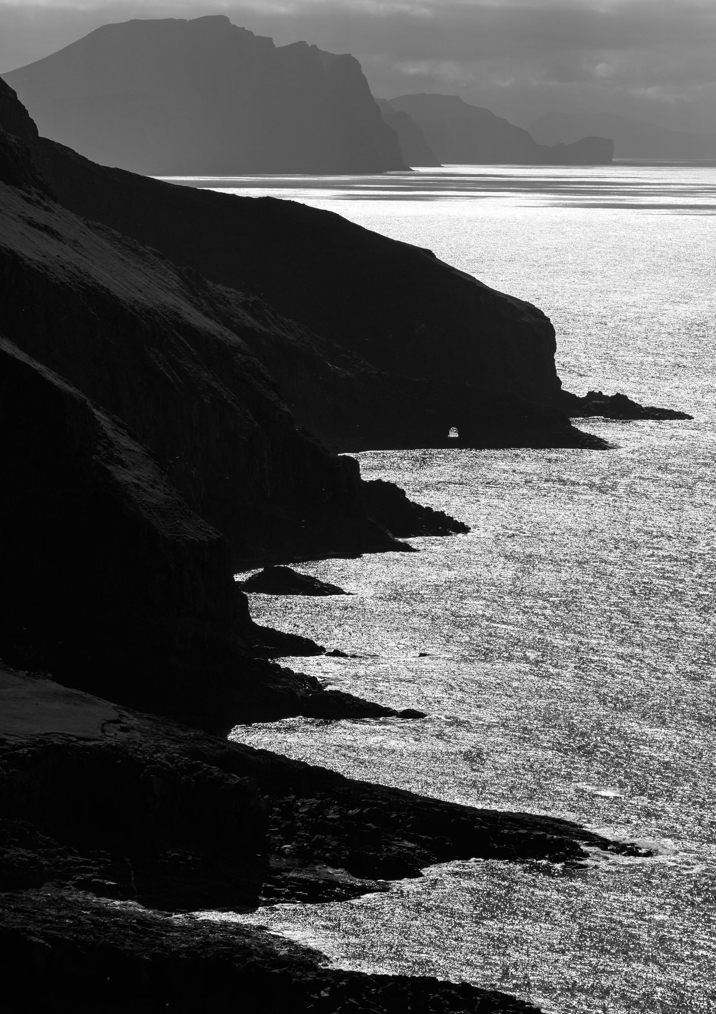
Seaside Sparkle, Faroe Islands
This is a fast-moving part of the industry, with major advances in just the past year. For the best available HDR support, I recommend using the latest versions of your apps and operating systems. For example, macOS 14 and iOS 17 have better HDR support in Apple Photos than previous versions. Android 14 has better HDR support than Android 13. Google Chrome 116 or later can display AVIF files in HDR — this makes it possible to build and share high-quality HDR web galleries.
Lightroom web albums are also a great way to share HDR photos online. The web albums internally use the AVIF format, so your audience will need to use a browser that supports HDR display of AVIF files. At the time of this writing, Chrome, Brave, and Opera are all good choices.
If your favorite browser doesn’t support AVIF, JPEG XL, or HDR display, make sure you have the latest version and check back often for updates. You may even want to send the developers a note indicating that you’d really like them to support these features!
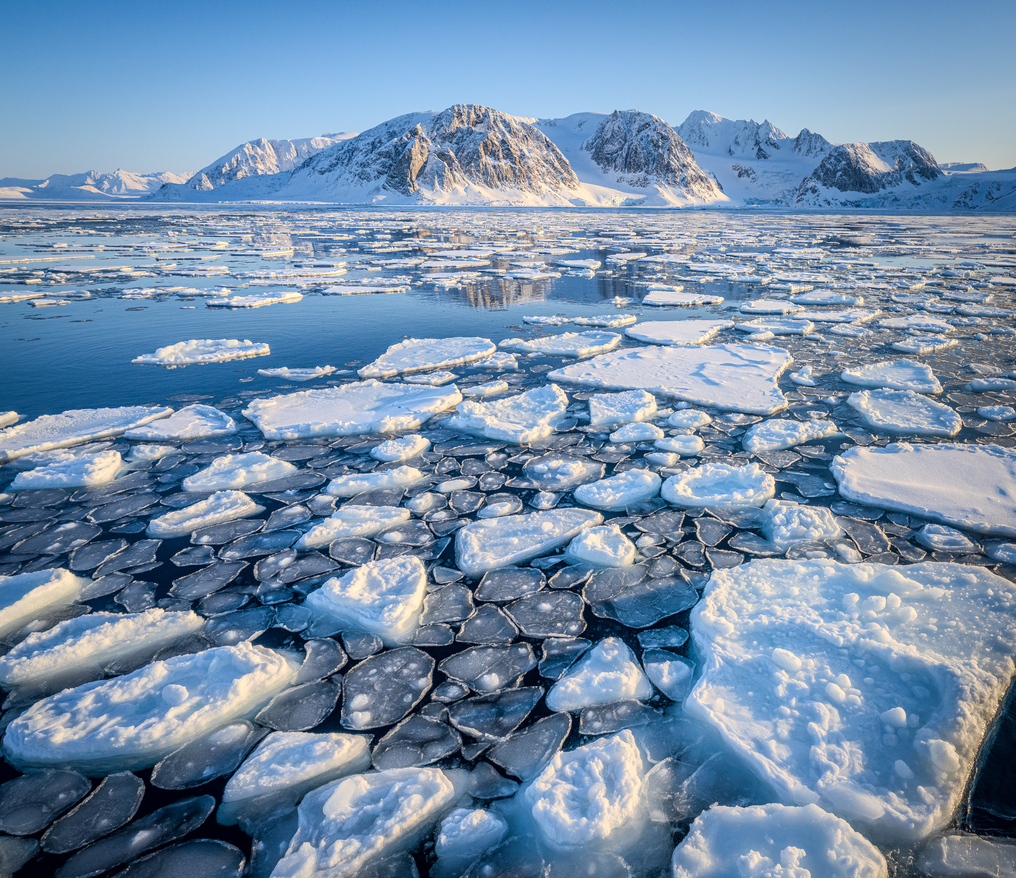
Ice Plates, Svalbard. Hover over or tap the image to see the HDR version of this photo. The HDR version brings out all the ice details, but we can’t print an HDR photo directly.
Does anyone still print? I do, and I still love it! A well-made print is a thing of beauty: a physical, tactile representation of a photograph that stands on its own.
Let’s be clear, though: prints are not going to look like the HDR photos shown on this page. That’s because prints on paper are inherently Standard Dynamic Range: we simply can’t print a tone that is brighter than paper white! Consequently, I don’t recommend editing in HDR mode if your goal is to make a print. Leave the HDR button off and edit in SDR mode instead.
You may want to make separate HDR and SDR renditions of a photo for different purposes. For instance, you can print the SDR rendition and post the HDR rendition online to a web gallery. Versions (Lightroom, Lightroom iOS, Lightroom Android) and Snapshots (Camera Raw and Lightroom Classic) are handy features for keeping these separate renditions organized.
I do most of my editing in Lightroom, but sometimes I need to bring an image into Photoshop for extra work, like compositing. Fortunately, Edit in Photoshop also works on HDR photos. I’ll walk you through how I made the following image, which is a composite of eight frames.
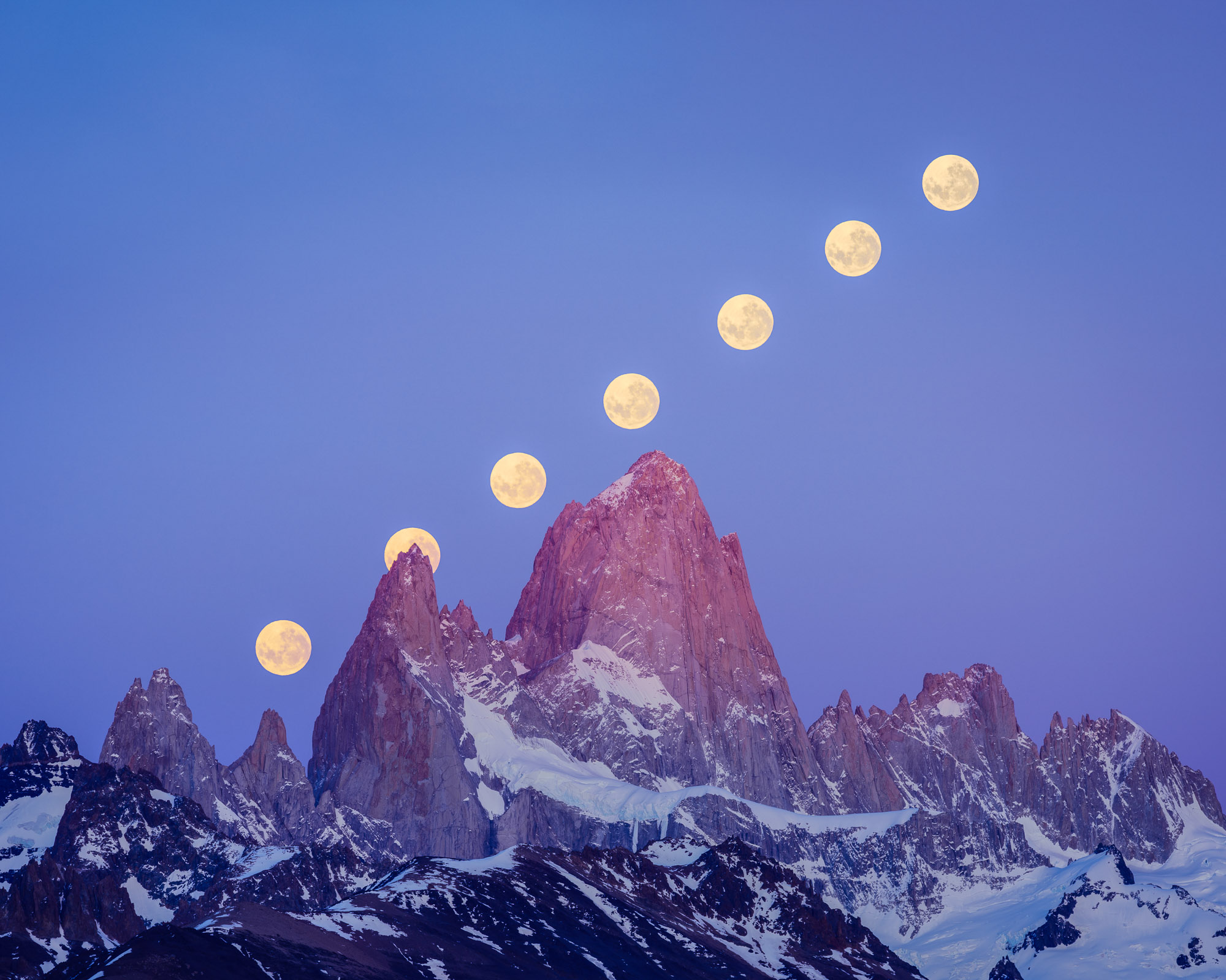
Many Moons, Parque Nacional Los Glaciares, Argentina
Early one morning during a visit to Argentina, I placed my camera on a tripod and recorded a sequence of raw frames. Dawn was approaching. The moon gradually set behind the mountains, just as the peaks started to pick up color. I selected seven frames of the moon (including one where it appears directly behind the rugged form of Aguja Poincenot), plus a foreground image of the mountains (which used a much longer exposure). In Lightroom, I edited all of them in HDR with identical settings, then sent them over to Photoshop. I stacked all the frames using the Lighten blend mode (so all the moons appear together) and saved the result as a 32-bit TIFF file. Back in Lightroom, I did some final tuning on the composite image, including cropping and some Curve tweaks.
By the way, this is an example of an end-to-end HDR workflow. I was working with HDR data at every step of the process, including raw capture, HDR editing in Lightroom, HDR compositing in Photoshop, and exporting to an HDR file. At no point did I tone map the image to SDR.
Using “Edit in Photoshop” with an HDR photo will open a document in Photoshop in 32-bit mode. Note that Photoshop itself currently only supports displaying HDR photos on macOS (Windows support is in progress). To display HDR content correctly in Photoshop on macOS, go to the Technology Previews section of the Photoshop Preferences dialog and check the Precise color management for HDR display option.
As of this writing, Photoshop offers limited editing support for 32-bit files. However, the Camera Raw Filter (found in the Filter menu) does support viewing and editing in HDR on both macOS and Windows. This is currently your best option within Photoshop for making color and tone adjustments to 32-bit files.
Here is another composite image I made using the same combined Lightroom + Photoshop HDR workflow. Not surprisingly, the star trails really take advantage of the extra highlight range and appear far more luminous than they would otherwise.
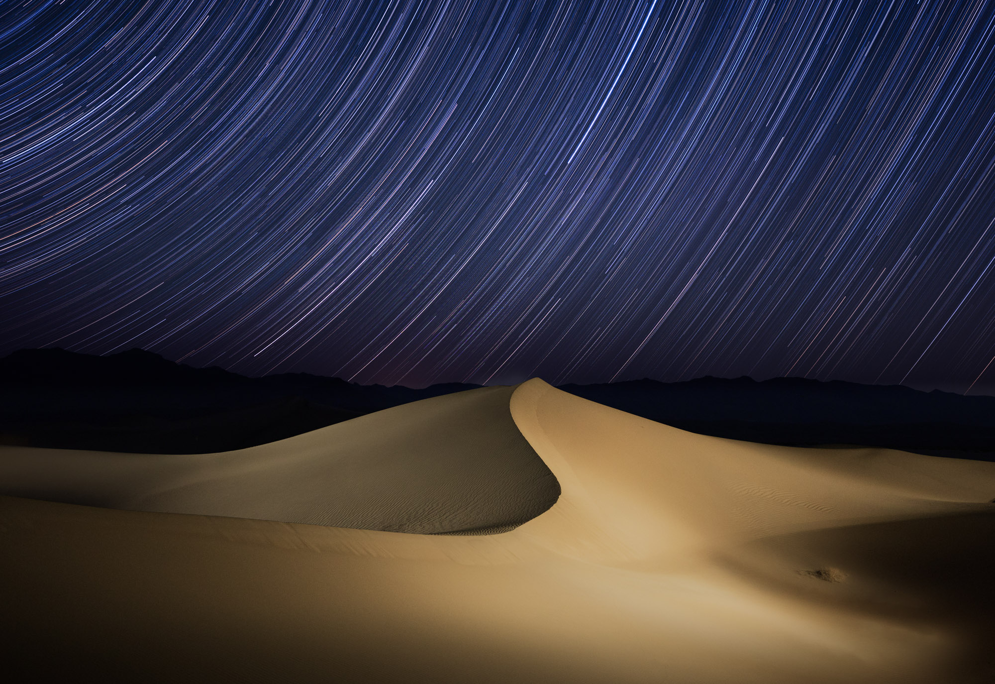
Dune and Trails, Death Valley
Let’s wrap up with a summary and a peek ahead. HDR displays represent one of the biggest leaps forward in pure photographic quality in recent memory. Many phones, tablets, and laptops now have HDR displays. In a few years, probably every new screen will be HDR with at least a couple of stops of headroom. It’s an incredibly exciting time to be a photographer!
Lightroom and Camera Raw now offer a complete HDR workflow: capture, import, merge, display, edit, and share. There’s never been a better time to photograph in raw mode. If you haven’t tried raw capture yet, now is the perfect time to start! It’s also a great opportunity to revisit old favorite photos and try editing them in HDR. In fact, that’s exactly what I did for this article.
There’s a lot to take in and learn. Here’s a few things to remember:
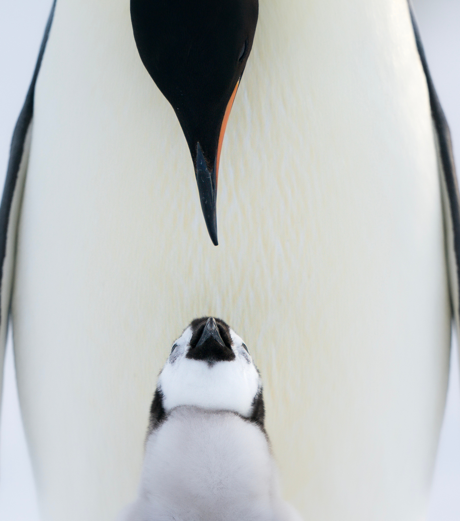
Emperor Penguins, Antarctica. Sometimes, the best choice for a photo is SDR.
Looking ahead, we still have a lot of HDR-related work to do, both at Adobe and in the broader industry. For example, Lightroom today supports viewing HDR photos only within Edit and Develop — other parts of the app show these photos tone mapped to SDR. Going forward, we intend to expand HDR viewing to other features such as Slideshow. HDR video editing is another exciting area for future work.
Sharing HDR photos remains a major challenge. Not all apps and platforms support HDR photos yet. Even among those that do, appearance can vary widely. It’ll take a while for HDR photos to be universally supported with consistent appearance. I think the results are well worth the growing pains!
To this end, Adobe is currently working with several other companies on standards for HDR file formats and image processing. For instance, one of our ongoing projects enables storing both HDR and SDR versions of a photo in a single file, which simplifies the sharing experience. In fact, the HDR photos on this page are using this proposed hybrid format. If you’re interested in learning more, check out this page.
Please let us know what you think about HDR in Lightroom and how we can improve it! We’d love to see your HDR edits and results.
Read more about the new features announced today in Lightroom here.

The latest from the stage and sessions in Los Angeles. Register to unlock new ideas, creativity, digital skills, and more.


Get a closer look at Denoise, our latest AI-powered feature for Lightroom and Camera Raw, explained by Adobe Fellow and ACR team member, Eric Chan. “From the ACR team” is a blog series that brings you insights directly from the team that builds the imaging features for Lightroom, Lightroom Classic, Lightroom mobile, Adobe Camera Raw, and the Camera Raw filter in Photoshop.
04-18-2023

Today, Adobe is unveiling new AI innovations in the Lightroom ecosystem – Lightroom, Lightroom Classic, Lightroom Mobile and Web – that make it easy to edit photos like a pro, so everyone can bring their creative visions to life wherever inspiration strikes.
04-18-2023

