suff
If you’ve used more than one Adobe tool over the years, you’ve probably noticed similarities: application layout, icon design, and color palettes, to name a few. These are all components of our design system, Spectrum, first introduced over ten years ago. That system is what makes all Adobe experiences “feel like Adobe”.
Today, we unveil Spectrum 2, the most significant update to our design system yet. Adobe’s core audience is growing, with generative AI via Adobe Firefly expanding our reach to new users. At the same time, Adobe continues to serve professionals with tools they need for creative work, marketing work, and beyond. Spectrum 2 is intended to make Adobe tools even more intuitive, inclusive, and joyful to use across platforms, while supporting our mission of enabling Creativity for All.
Here’s a look at why we’re updating our design system now and what you can expect as it rolls out across Adobe experiences in 2024 with a sneak peek at the end of this post.
Where Spectrum began and why we’re updating it now
Much has changed since we first implemented Spectrum across Adobe products and experiences in 2013. Adobe Creative Cloud is now multi-platform across web, mobile, desktop, and mixed reality. We’ve launched Adobe Express, which enables everyone from educators to social influencers to create. And Adobe Document Cloud and Adobe Experience Cloud have both fundamentally changed their products and grown their customer bases.
And with the release of Firefly, powerful generative AI capabilities have transformed workflows across several Adobe applications. In short, we’re serving a much broader audience than we were a decade ago. Adobe has evolved and our design system needed to as well.
Spectrum 2 is a comprehensive update that covers every design element including iconography, typography, color, brand, illustration, accessibility, product equity, personalization, data visualization, and more. This update will offer three major improvements for our users. It will make our products:
- More inclusive and accessible
- More approachable and expressive
- More “at home” on any platform.
The first updates will roll out across Adobe web products in early 2024.
The future is Spectrum 2
Spectrum 2: what’s next for Spectrum, Adobe’s design system
Learn more
More inclusive and accessible
Spectrum 2 needed to meet a high bar for accessibility so the widest possible group of people can use Adobe tools. The World Health Organization estimates that 2.2 billion people around the world experience some form of visual impairment. For Spectrum 2, our definitive starting point for making our web tools more inclusive and accessible is the Web Content Accessibility Guidelines (WCAG) — which Adobe also contributes to.
Success in accessibility means many things: Adequate contrast ratios of text and other controls and containers relative to their backgrounds, accessibility tags, keyboard controls, focus states, and other execution details. Meeting fundamental accessibility requirements was a great first step, but we wanted to go further. Every person is different, and we want future Adobe products to flex and adapt to personal needs and preferences.
We emphasized three main areas in Spectrum 2:
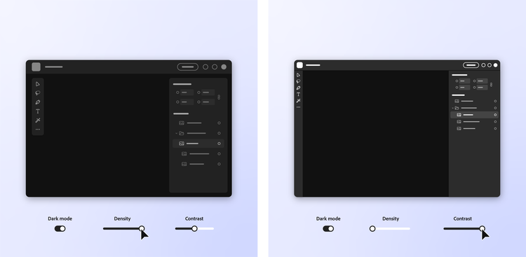
- Dynamic contrast and brightness: Using adaptive palettes to generate accessible colors in real time and give users a choice about how they want their interface to look.
- More accessible colors, that support various color vision deficiencies: This includes overhauling the colors we use for data visualization and removing color name conflicts where two or more colors might be called the same thing (peach vs. orange vs. salmon).
- Attention hierarchy, to prioritize specific visual elements: We removed extraneous highlight color in common controls, reserving it for the most high-action moments. We created separation between navigation and content zones, adding depth and elevation.
Our efforts dovetail with Adobe Design’s Product Equity practice, which further partners with design, product, and engineering teams to ensure that every person, regardless of human difference, can access and harness the full power of our products, without bias, harm, or limitation.
More approachable and expressive
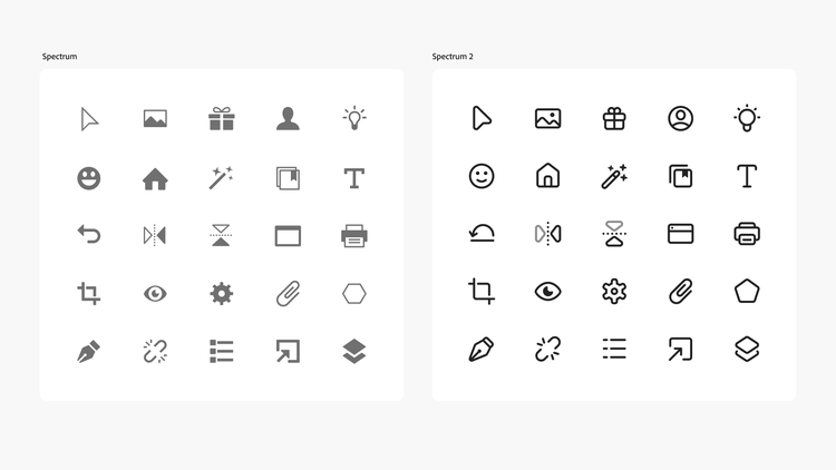
The first version of Spectrum was minimal, with a gray color palette designed to recede. Spectrum 2 reimagines icons, typography, and more to make the Adobe experience more approachable and bolder in design.
The Spectrum team began experimenting with a more welcoming design in a single product: Adobe Express, our all-in-one creativity tool made for a broad audience. In collaboration with the Express design team, we created a new UI theme that previewed key components of Spectrum 2: Adobe Express was made to be lighter, bolder, and rounder. Icons and typography were more friendly, strokes were a bit thicker, colors were brighter, and in general, it was a lot more approachable.
The sum of these changes made a big impact in how the application looked and felt to consumers. The work with Express became a crucial starting point, informing the new set of principles in Spectrum 2. These more expressive and approachable design elements will be foundational across Adobe applications, as Spectrum 2 gets rolled out in 2024.
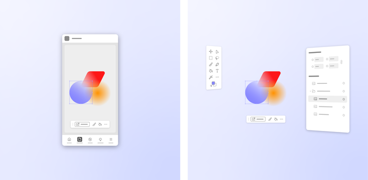
Spectrum 2’s appearance will vary between platforms. Because Adobe develops products across a variety of platforms (including macOS, Windows, iOS, Android, and web), we’ve had to think about the right balance between cross-platform consistency (where people can learn to use a tool on one platform, then transfer that knowledge to another) while also adhering to the conventions of each platform. Using a tool like Adobe Lightroom on, say, your work MacBook is different than using it on your personal Android-powered phone — but it still feels like Lightroom.
When Spectrum was first designed, mobile platforms were evolving rapidly and the user experience from app to app varied between operating systems, so we initially leaned into making Spectrum as consistent as we could across platforms. Spectrum 2 will supply specific variants for each, making Adobe tools feel “at home” on the device and platform where you want to use them.
Rethinking icons, colors, illustrations, and shapes
To support the vision of Spectrum 2, our team made changes across multiple underlying components in our design system. This includes rethinking icons to be more clean, friendly, adaptable, playful and familiar.
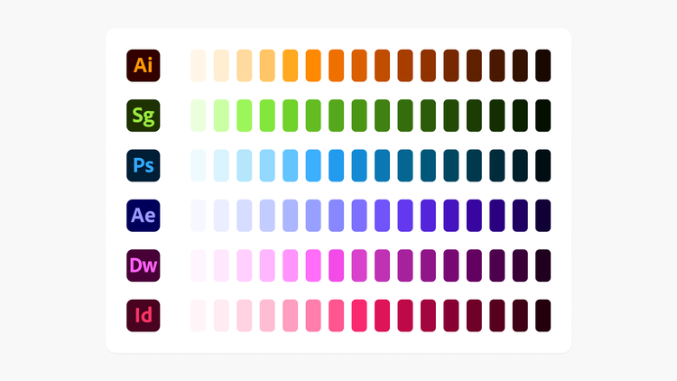
We adjusted our gray system to provide more contrast — and rebuilt our color system to utilize Adobe’s brand colors, laying the foundation for us to more organically integrate our brand into our product experiences. Aligning Spectrum 2’s color system with brand colors makes it easier to harmonize interfaces across products.
Illustrations take many forms in Adobe experiences. They range from simple line work to more robust, full-color editorial styles with colors keyed to the brand color of the product they’re supporting. The Brand Design team developed a new toolkit of geometric shapes that can be combined in infinite ways to create illustrations, banners, and other assets.
What to expect with Spectrum 2
You’ll start to see Spectrum 2 roll out across Adobe tools and experiences over the next year, starting with our web products. It's been a journey to bring Spectrum 2 from our original vision to reality, but we're only just getting started — like any design system, Spectrum is ever-changing. We’re currently hard at work developing the future direction of our desktop and mobile products, which will each get their own focused version of Spectrum.
Visit the Spectrum 2 site for a closer look at the system and what’s to come, and get a sneak peek at changes to familiar tools below: