Octo modernizes federal U.S. government websites with Adobe XD

Image source: Adobe Stock.
The design of United States federal government websites and digital services has dramatically improved over the past few years. In many ways, this is a reaction to increased demands from citizens, who now expect the same level of experience they get from websites and apps in the private sector when accessing government services. It’s also because of the incredible work of design teams and agencies, who balance these demands with many regulatory and accessibility requirements.
All government sites need to comply with Section 508, a piece of legislation that aims to ensure that public sector bodies within the United States are not discriminatory to people with disabilities. They also need to adopt the U.S. Web Design System (USWDS), which provides principles, guidance, and code to make it easier to design and build accessible, mobile-friendly government websites and digital services. Federal agencies are by law required to comply with website standards and make sure they deliver a first-rate user experience. The bar is set high — the government requires that design contractors show them, not just tell them, how they can deliver on all of the above.
Octo is at the center of this balancing act — a unique IT consultancy focused on helping the United States federal government rapidly modernize its infrastructure and enhance citizen engagement. Octo provides emerging technology, modernization, and digital services support to the federal government and specializes in scalable Agile software development, cloud engineering solutions, and user experience design to improve and optimize federal government IT systems. Customers include the Department of Homeland Security, the Department of Health and Human Services, the Department of Education, and many more. Adobe Creative Cloud, particularly Adobe XD, forms a key part of how they win and deliver on government contracts.
“There’s a lot of nuance to what we can and can’t do,” explains Joshua Wilson, UX/UI manager at Octo. “We have some flexibility, but the baseline is always to follow the rules and make sure everything is within the government parameters. There’s a big push to bring federal government websites and digital services in line with what people are used to seeing on their devices every day.”
The shift towards human-centered design
Two organizations have been instrumental in the adoption of human-centered design across federal government: The United States Digital Service, which created a playbook to meet the needs of the American people and build more effective digital services, and 18F, a technology and design consultancy within the United States government, which partners with agencies to improve the user experience of government services. Both organizations collaborated to create USWDS in 2015, and human-centered design has since become mandatory for government projects. It is now expected at the proposal stage already, something Octo has had to confront head on.
“Federal agencies have learned how an early focus on the user experience can help a project be successful, and we’re now being asked to demonstrate how we’re able to implement human-centered design in our proposals, even before the actual work starts,” says Brian Funk, vice president, technology solutions, at Octo. “USDS and 18F also pioneered a move towards agile procurements. Instead of a written proposal that’s a hundred pages long, they now ask us to show them the design work we’ve done.”
A big part of the bidding process is the technical challenge, which include innovation challenges and technical demonstrations that can range from just one day to three weeks. They provide an opportunity for design teams to collaborate and think outside the box to show the government how they solve certain complex customer challenges within a short time. During COVID-19, the technical challenge has switched to virtual, with everyone on camera the entire time. At the end of the day, the site or app is demoed.

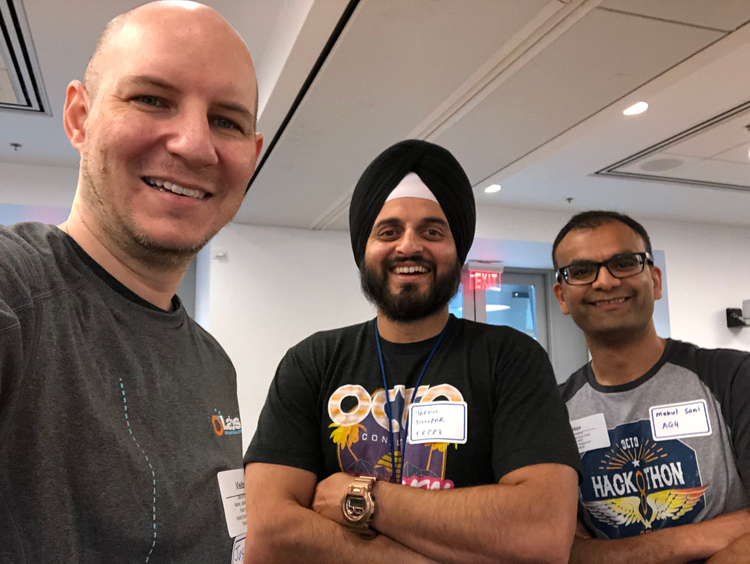
Three Octo teammates at the GSA hackathon.
When you are trying to win a contract, time is of the essence, and Octo developed a process to help them through this process as efficiently as possible.
Winning contracts with design systems
“With the technical challenge, you don’t have as much time as normal to digest a project, think through it, and carry out user testing upfront,” Wilson explains. “Especially if you have just one day and only find out what you’re going to build in the morning, being organized is hugely important. We can’t only then figure out what colors the website needs to be. We need to have assets pre-built and ready to go.”
“You’re coming in blind and have to be prepared across the board,” Funk adds. “The design is the most critical piece in many ways because it’s what you’re going to demo. So you have to be compliant with accessibility requirements and follow the USWDS guidelines. If we didn’t have the right tools, we couldn’t even compete.”
To save time and have a toolkit ready, the team uses Adobe XD to build design systems (including accessible components, typography, and color palettes) and create quick prototypes. One of the biggest wins is being able to share and update a project easily — not only does using Adobe XD help them win contracts by helping them ace the technical challenge, but these demo projects often end up closely influencing final deliverables.

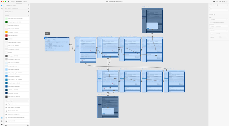
A prototype created in Adobe XD during a GSA hackathon.
“We’re able to share mockups with a development team without having to create separate documentation, which is hugely helpful,” Wilson says. “We just send them a shared interactive prototype that has design specs built in, and we can also share it with a product owner to get approval or feedback. It’s all in a single link, which remains consistent. No one’s looking at past projects or an older version of the file. It’s always current. That’s immensely useful.”
Since accessibility is such a high priority for Octo’s work, the team then uses the Stark plugin for Adobe XD to design with accessibility in mind from the start. Stark includes a color contrast checker and colorblind simulations, which gives the designers a good idea of what a user with vision challenges might see and what problems might occur for them in certain layouts.
Mobile-first as a differentiator
Responsiveness and building mobile-first experiences is just as important in getting a leg up in the competition. Even though the tech challenges don’t necessarily specify that a site has to work on a phone, Octo always makes sure it does.
“We mockup different layouts of the same application,” Wilson explains. “We use some of the different artboard options for phone and tablet designs and create components that are responsive. We build a page right the first time and then adapt it with XD’s Responsive Resize feature. It might not get developed, but it’s certainly beneficial to have visual proof that we’re thinking forward to the next version already. If we need them, we have the designs ready.”
Technical challenges often turn into the basis for real new features, products, or approaches. Once Octo has won the contract, the team continues to build what they started to work on during the tech challenge. They move a modernization project into production and base it on the designs that were built in XD.
“We often need to flush out what we included in the tech demo and build a full design system,” Wilson says. “I then get all the specs together and share the Creative Cloud libraries with my design team or other groups in the organization that may not be part of the project but may want to use them.”
Balancing user experience with government requirements
Ultimately, Octo’s mission is to create government sites, software, and digital services that aren’t just getting the job done but are pleasant to use. This requires toeing the line of what’s acceptable for the government and what is on the cutting edge of design. Trust is a huge factor, especially with services that ask users to enter personal information like their social security number.
“Paying attention to the small details is extremely important to bring some modern flare to government sites,” Wilson points out. “We make sure that what we build is tight. Even if it’s iterative, we need to give users something that is fully built. A design system, meanwhile, helps make the design consistent, which in turn communicates that the product is trustworthy.”

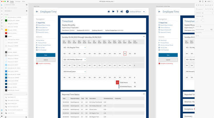
Adobe XD prototype created during a GSA hackathon.
“The unique missions of our federal partners are critical to our country,” Funk adds. “These agencies affect millions of people’s lives. The scale is enormous, and it’s crucial that the design of their services is easy to use and accessible and elegant and beautiful at the same time. There’s no reason we can’t have world-class design on federal systems. It’s really just a matter of having the right people and the right tools to do that.”