Recapture the magic of hybrid design workshops with Miro and Adobe

See how to run hybrid design workshops live in Miro’s Adobe MAX breakout session.
Before the pandemic, designers could get together in huddle rooms to scribble down ideas, draw connections, and lay out concepts. Ideas didn’t have to make complete sense because our teammates were there to add their own lines to what we were trying to draw. Scraps of paper, corners of notebooks, whiteboards, sticky notes, and even windows got marked up and filled with any thought we could get down.
How do we capture the magic of design workshops now that the way we work looks different? How do creative teams stay creative when there are no walls? Collaborating means dropping out of flow to message the team, set up a call, schedule, reschedule, and wait for everyone to get on. Then you can share your screen while everyone tries to get in a chance to say their feedback when just marking a few things up would be more helpful. Many times it seems so much better to just go at it solo.
As more companies think about the transition to hybrid work, I want to show how I have used collaborative tools like Miro with design tools like Adobe to run design workshops that are, dare I say, more visual, engaging, inclusive, and efficient than the traditional in-person workshops we feel like we have lost with the pandemic.
Using Miro’s whiteboard to bring visual collaboration online
Before I share my tips for effective hybrid design workshops using Miro and Adobe, here is a quick intro into Miro and the concept of an online whiteboard if you have never heard of it. Miro’s whiteboard acts like an infinite canvas for collaboration. It’s great for everyday design processes as it makes visual collaboration easy: you can ideate on the fly by dropping in sticky notes and images or using drawing tools and shapes and diagrams.
Miro has tons of other tools and templates to streamline and improve design processes. For example, you can provide more context for brainstorm sessions with a Journey Map. For design sprints, you can have all your docs in one place: a Miro board. And for design critiques, you can give everyone a voice through anonymous voting and place to give feedback together or asynchronously.
It gives us that “huddle room” feeling again for design workshops. With Miro, it’s easy to make that feeling real.
Tricks for mastering a seamless hybrid design workshop
Now that we have covered the tools that make online visual collaboration easy, it’s time to bring in principles and process. While hybrid work is a new transition for many, I have been running hybrid design workshops for over a decade, and will share the key principles to mastering them.
Number one: If one person is remote, act like everyone is remote. All too often I’ve seen teams point their laptop cameras at a whiteboard so that “remote attendees can see” what is going on. But remote participants aren’t in the meeting simply to “see,” they are there to contribute and collaborate. We still have to find ways to give everyone equal access. Miro can become the space for everyone to engage, leave feedback, and vote on things they like with features like sticky notes, comments, and the voting tool.
That brings me to principle number two: Keep it physical. This might seem counterintuitive to what I just said. Just because things are digital, doesn’t mean we can’t have physical aspects. I like to use Miro’s timer and music tool to drive energy and sketch together to get ideas rolling with the pen tool.
Principle number three is more of a fact: Writing and sketching are so much better than talking, talking, talking. There is a reason it’s called a design workshop and not a talk workshop. Humans can speak 125 words per minute, but we can process at 300-400 words per minute. This is a key reason people find meetings boring — you can only go 125 words per minute since only one person can speak at a time. On a visual tool like Miro’s whiteboard, you can bring in images and videos or create a diagram to say more faster.
Streamline and enhance workshops with the Miro and Adobe XD integration
Miro and Adobe XD have an integration to make it even easier to have those awesome collaboration sessions while also helping you take a design from prototype to launch. I know many of you work with non-designers who might be looking for a more approachable way to give feedback, contextualize designs into the scope of a project, and see prototypes/designs in context. Miro lets PMs, marketers, or engineers easily give input relevant to their role.
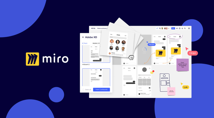
With the Miro for Adobe XD integration, you can choose artboards from your XD file to bring into Miro for review. That way, you don’t have to copy and paste images over. As feedback comes in on Miro from comments, doodles, or sticky notes, you can make edits in Adobe XD and then just refresh the Miro board to stay in sync with your latest design updates. I suggest giving everyone a bit of context, walking through the design, and then letting them drop in sticky notes with questions and comments.
Just like for in-person workshops, running an online workshop can be tricky. While they do require a bit of preparation, tools like the Miro and Adobe XD integration can make workshops more seamless and elevate the whole experience.
You might be alone in a room, but that doesn’t mean you have to work alone. You can have a space for creation. And in many ways, the collaboration can be better than it ever was.