A trio of typographic treats from Adobe Originals
Discover three remarkable typefaces: dreamlike typographic poetry from an acclaimed Japanese illustrator, a major update to the popular Source Han Serif, and a technological marvel that creates letters in rainbows as you type.
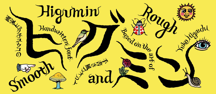
Higumin, a fairy-tale typeface by Ryoko Nishizuka
By Yves Peters
Traditionally, Japanese typefaces are square. Free-form handwritten characters evolved into their current monospaced configuration for the sake of efficiency and legibility. The continuing appeal of free-form handwriting, though, encourages type designers to break the square mold and draw looser, more organic characters. An unprecedented expression of this longing for typographic freedom is Higumin, the result of a unique collaboration between Adobe Principal Designer Ryoko Nishizuka — author of the award-winning Kazuraki, the first fully proportional OpenType Japanese font — and famous Japanese painter and illustrator Yuko Higuchi.
Yuko Higuchi draws wondrous worlds populated by fantastical fairy-tale figures like cats and rabbits wearing clothes, dogs with mushrooms growing out of their backs, and walking fish with party hats. The popular Tokyo artist has garnered a large following with her mind-expanding art. She has published several books, exhibits regularly, and has collaborated with brands like UNIQLO, Shiseido, and Gucci. The Higumin typeface is based on the expressive hand-drawn character shapes that appear in her illustrations and posters. They have weirdly curved forms and long terminals resembling sinuous, sensuous tendrils reaching outward and toward each other. It is as if the characters float on the page or screen like raven-black strands of hair carried on a breeze, connecting the characters to create words and meaning. This turns text into pure poetry.
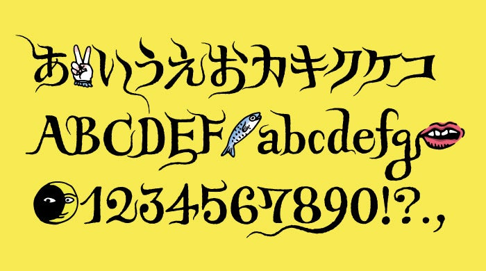
Higumin comprises hiragana, katakana, and the Latin alphabet — but not kanji. It is intended to be used as a composite font with other fonts that include kanji. Because of its lyrical, idiosyncratic design, the typeface is most useful for display purposes. The characters have many alternate shapes that are switched out automatically via rich OpenType features, or they can be selected manually to suit your personal taste. This lends the typeface a convincing hand-drawn appearance, as if Yuko Higuchi had personally lettered the text in your design.
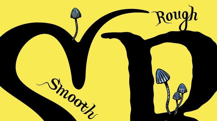
Higumin comes in two styles: smooth and rough. The rough version imitates ink bleeding into paper for a more tactile look. Besides the alphanumeric characters, Higumin is populated with a wealth of ornamental glyphs. They emphasize the illustrative nature of the typeface and add joy and mirth to a design. Let your imagination run wild and immerse yourself in Yuko Higuchi’s marvelous universe with Higumin.
A major update to Source Han Serif adds Hong Kong glyph support and variable fonts
By Zachary Quinn Scheuren
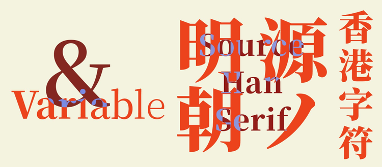
Continuing our long-standing collaboration with Google, we are pleased to announce Source Han Serif 2.0, a significant update of the serif component of the Pan-CJK typeface family Adobe first released in 2017. The new version introduces a number of fixes and improvements that bring Source Han Serif into closer alignment with Source Han Sans.
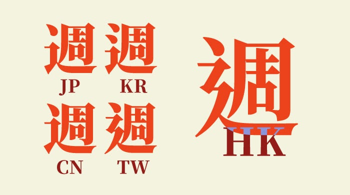
Notably, we have partnered again with our friends at Arphic Technology to provide support for Hong Kong and the HKSCS-2016 standard, adding upward of 4,000 glyphs to the family. The introduction of yet another region-specific glyph variant makes the already cosmopolitan Source Han Serif even more accessible and versatile.
Version 2.0 also adopts the variable font format. The family’s seven weights, as well as being packaged as discrete static files, now also come in a single file covering the entire design space. Weight exists on a continuum and is expressed in numeric values — using the variable version, designers can choose any value between the minimum and maximum values, precisely tailoring weight to their specific needs.
All of the fonts in Source Han Serif 2.0 are available for download on GitHub. Google’s own version, called Noto Serif CJK, will soon be available as part of their Noto Pan-Unicode font family. Complete details about Source Han Serif, including technical notes and details about the update, can be found in the release notes on GitHub.
Reading rainbows with Filicudi Color
By Yves Peters
Artwork courtesy of Ulrike Rausch.
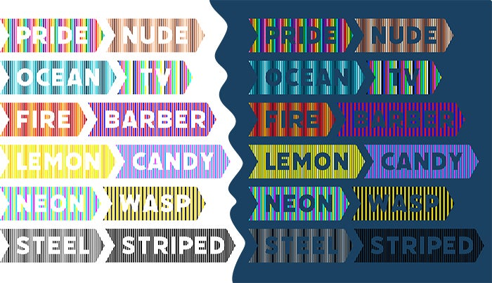
When you use Filicudi Color, a continuous rainbow pattern appears like magic behind the words you type. This new version of Filicudi Striped — one of the typefaces from the Tipoteca Italiana that German type designer and font technician Ulrike Rausch digitized as the Tipoteca Series — takes Filicudi’s concept to the next level. Whereas Filicudi Striped’s characters are rendered in pure black but can be colorized in apps, Filicudi Color is unique in that it is constitutionally a color font: its colors are built in.
It was almost inevitable that Rausch would choose to develop this mesmerizing technological marvel — after all, her spectacular color font LiebeHeide can’t be distinguished from actual handwriting with a ballpoint pen. It deservedly won a Certificate of Excellence in Typeface Design at this year’s TDC Awards. As someone who likes to push boundaries within her own work, Rausch saw the potential for expanding on the already impressive Filiduci Striped and started work on a color font version.
But she quickly ran into a challenge. The rainbow pattern is made up of eight colors. A wide letter like ‘W’, however, has twelve stripes — three times more than the four stripes behind the narrow ‘I’. The varying number of stripes fundamentally affects the rainbow pattern: if the final stripe has the “wrong” color, the pattern doesn’t continue seamlessly into the next letter. Not to be deterred, Rausch circumvented the problem by creating eight variants for each character, each variant starting with the next color from the rainbow sequence. She then programmed the Contextual Alternates OpenType feature to look for the color of the final line in a character and determine which variant of the next character needed to be inserted to create an uninterrupted rainbow pattern. Putting the rainbow sequence in the correct order happens automatically when the Contextual Alternates feature is switched on in the OpenType panel, so the user can simply use the font without giving it a second thought.
There is one caveat: the colors are intrinsic to the font — current technology doesn’t allow end users to modify the font’s built-in color values. Understanding the importance of being able to customize the appearance of text, Rausch developed twelve color schemes with help from Adobe intern Misba Tabassum. In addition to the rainbow pattern of the Pride style, Filicudi Color offers eleven other color schemes like Ocean, Fire, Neon, and Candy. The styles can be selected in the Font menu or the Character panel. Some color schemes work better on light backgrounds — others shine on dark backgrounds.
Just like the “regular” Filicudi, Filicudi Color is an all-caps font whose line pattern requires it to be set in large sizes. It has a full alphanumeric complement that covers numbers and punctuation, an assortment of miscellaneous characters, and many languages using the Latin alphabet. Extras include arrows and four different bookend characters that can be used to create banners on the fly.
This trio of typographic treats reaffirms Adobe’s commitment to breaking down borders and being at the forefront of technological innovation for the benefit of type users worldwide. We can’t wait to discover what you create with these new beauties.