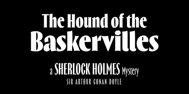
Spice up your summer designs with these additions to Adobe Fonts
When it comes to digital typography, every user has fundamentally different needs, and Adobe Fonts offers something for just about everyone, from type enthusiasts to design students to consummate professionals.
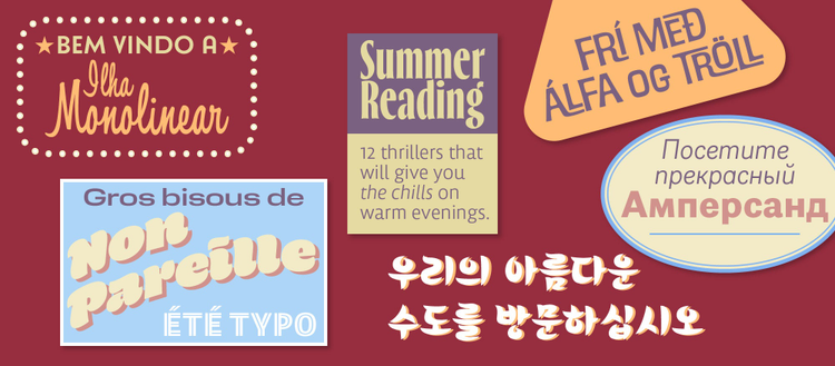
Since new fonts and families are being added to our collection all the time, you can easily discover typographic treasures in a wide range of styles and language support. Maybe you need an expansive type system for an annual report or visual identity. Or you’re looking for a fun font to use in a flyer announcing the neighborhood bake sale. Or a friendly, engaging text face for a newsletter. Or a striking titling family that can accommodate headlines of different lengths for the school paper. Whatever the case, we’ve got you covered. Read on to discover the latest additions to the library.
New foundries on Adobe Fonts
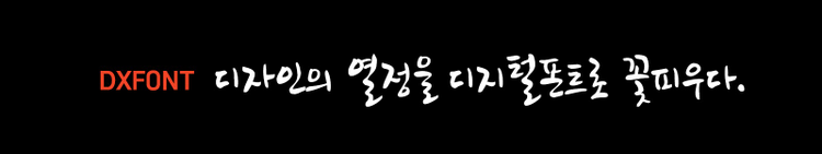
DX HdmB adds a human touch to your typography.
Adobe’s efforts to expand the range of choices for CJK users continue apace. Korean type foundry DX Korea joins Adobe Fonts with four typefaces. DX HflM is a contemporary display face with a sans serif Latin counterpart. If you prefer a casual style, DX HdmB looks like it was jotted down with a marker. DX Hotplace’s wide proportions are augmented with tiny sharp serifs for a vintage engraved look, and DX Rollercoaster mimics the tracks of the titular amusement ride.
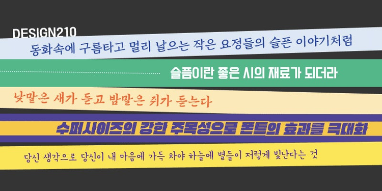
210 Jamak, 210 Computersetak, 210 Pyeonghwa, 210 Supersize, and 210 Byulbitcha are exciting additions to the library for a variety of moods.
Design210 — one of the leading type foundries in South Korea and another new addition to Adobe Fonts — develops high-quality typefaces for a wide range of applications. Besides offering around a thousand original designs, Design210 also creates custom fonts and provides font branding services.
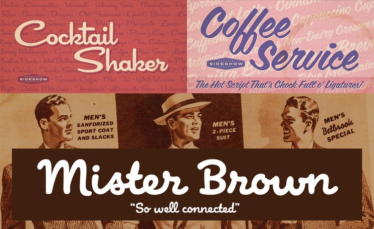
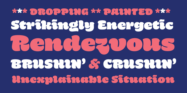
The Sideshow typefaces all exude a mid-century Mad Men vibe — each has its own, distinct personality.
The vintage look of the Sideshow collection projects a carnivalesque air. Take the brush script Coffee Service, for example, which transports the charm of hand-painted billboards and shop fronts to both page and screen. Cocktail Shaker seems to have jumped straight off the menu of a fifties diner, and dapper Mister Brown looks handsome on greeting cards, flyers, and packaging. The ornamental Old Lemonade is equal parts Wild West and Ferris wheel.
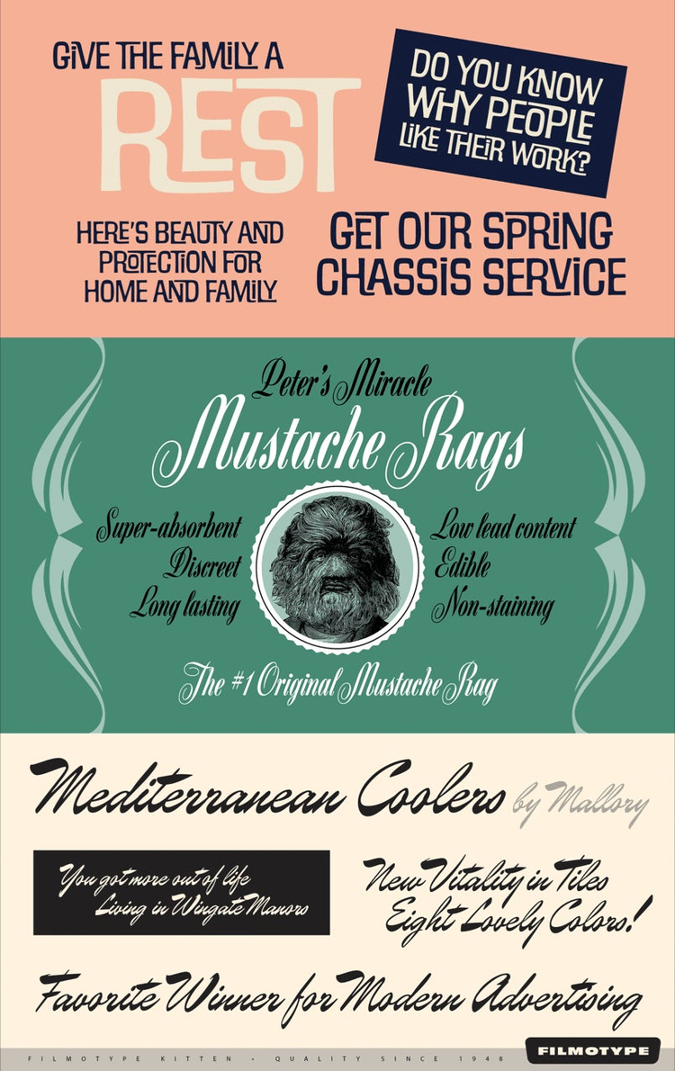
Filmotype’s exquisite vintage faces were expertly digitized by a diverse roster of top-tier type designers like Charles Gibbons (Filmotype Maxwell, top), Mark Simonson (Filmotype Zanzibar, middle), and Sudtipos’ Alejandro Paul (Filmotype Kitten, bottom).
Filmotype fonts, digitizations of the phototype collection of the same name, make these retro headline fonts available for the computer at long last. Like Old Lemonade, Filmotype Wand’s and Filmotype Western’s wide slab serif letters are steeped in Americana. Filmotype Maxwell’s casual interlocking capitals produce countless unique letter combinations, allowing users to create instant typographic logos and lockups. The elegant, high-contrast script Filmotype Zanzibar gives off a lovely nostalgic atmosphere. But if you prefer your scripts more casual, as if they were written with a brush, consider Filmotype Ace, with its narrow, energetic capitals. Or Filmotype Jade, a flowing upright condensed script. Filmotype Austin exhibits a distinct “wet brush” texture, and Filmotype Kitten brims with vitality.
Growing font families
Some typefaces welcomed new family members with this release.
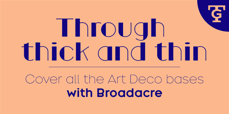
Now with ten new styles, Broadacre allows you to explore all of the nuances of geometric art-deco typography.
Greg Thompson has added 10 weights to his deco-inspired display sans Broadacre, bumping up the count to 25 decorative geometric styles for titling and packaging design.
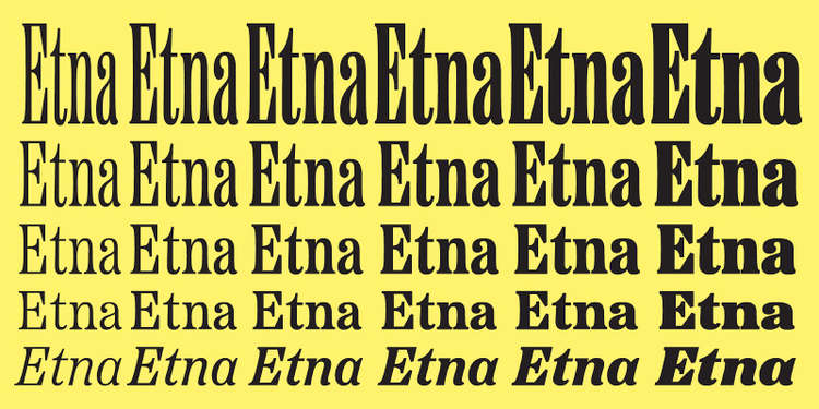
Etna’s X Condensed width adds six additional options for striking headlines inspired by vintage wood type.
Etna is another retro gem. Mark Simonson inserted six new X Condensed weights between Condensed and XX Condensed, guaranteeing that you can fit your headlines to the available line length.
Navigo — a great alternative to “standard” sans serifs — now has italics too, instantly increasing its usability as an all-purpose typeface with tons of character. Its many navigational pictograms make it an obvious choice for wayfinding systems.
New typefaces
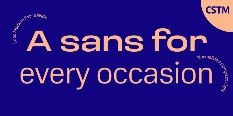
Loos introduces a pleasant vintage flavor into a contemporary sans serif family. Normalidad was optimized for on-screen use, but feels equally at home in print.
Besides Navigo’s welcome expansion, CSTM also released two large type families. Loos has publication design coursing through its veins: its closed sans-serif letterforms are perfect for powerful headlines and short bursts of text. Normalidad, originally designed for a wireless service provider, has slightly mechanical character shapes that sit comfortably on the pixel grid.
Thrillers’ six weights offer plenty of options for titles and headlines, as well as for packaging and branding projects.
NDISCOVER’s Thrillers is a narrow, high-contrast typeface that evokes the noir atmosphere of classic crime novel covers. With subtly curved features suggestive of serifs, its compact letterforms create spirited, attention-grabbing titles and headlines.
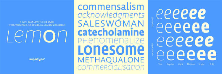
The Lemon Sans family comes in six weights and two widths, each in regular and italic styles, as well as a surprising unicase character set.
If your display type needs a little more restraint, Supertype’s Lemon Sans Next is a humanist sans serif with open letterforms and rather narrow proportions. The design strikes the perfect balance between traditional and modern. Need to fit more characters per line? Lemon Sans Next’s Condensed sibling squeezes in extra characters without sacrificing readability.
Hegante’s feel-good factor is off the charts and guaranteed to put a smile on the reader’s face.
On the opposite end of the spectrum, psType’s Hegante is a cheeky, bubbly titling face informed by casual brush lettering — but with a modern twist. The single style dances on the page with abandon.
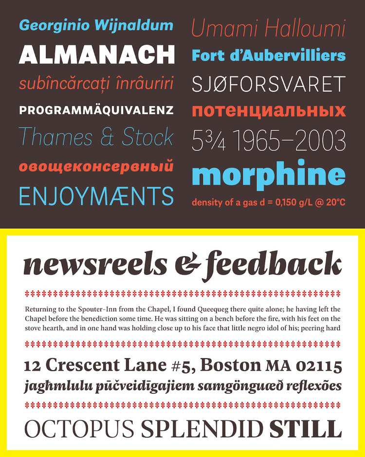
Almanach (top) offers ten weights from Hairline to Black with matching italics. Geller (bottom) has five weights with matching italics that come in both Headline and Text versions, making the family ideal for publication design.
It may be suitable for a wide range of applications, but that doesn’t mean Almanach by Capitalics is even remotely bland or devoid of personality. Curving gently inward, its stroke endings recall the personable early grotesques. Even though it’s a brand-new design, there’s an air of familiarity about Geller. Available in both Headline and Text versions, this reliable serif face is ideal for publication design.
Comprehensive type systems
Coordinated families of display and text typefaces allow you to remain consistent without having to obsess over type combinations when designing corporate, branding, or editorial projects.
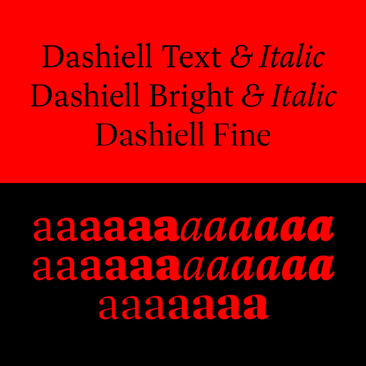
Dashiell’s ample counters and x-height, moderately open apertures, and unbracketed wedge serifs marry Caslon’s candor with Garamond’s grace.
Signal Type Foundry’s Dashiell’s three optical sizes make it a one-stop shop for editorial design. Dashiell Text produces highly legible copy with a timeless look, while Dashiell Bright creates crisp titles and subheads. As its name implies, the Fine variant sports the most refined detailing of the family to produce sparkling display typography in large sizes.
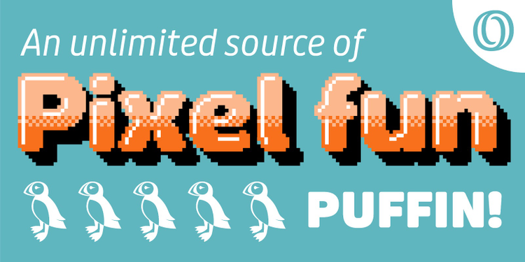
Puffin is a jolly sans serif with an impressive range, from practical to hilarious.
Bold Monday’s new release spans four subfamilies. Puffin is a generously spaced humanist sans serif with open letterforms that look friendly on the page and render admirably well on screen. Distinctly curved letterforms lend Puffin Display lots of personality, while the rounded corners on Puffin Display Soft’s terminals give it an even more amicable appearance. Last but not least, Puffin Arcade makes the typeface jump into an eighties computer game and run wild with the pixel decorations.
Natom Pro offers 18 styles — Including six upright weights optimized for display use — tailored to graphic and web design, as well as to mobile applications.
For those who prefer geometric sans serifs, Mostardesign delivers the goods with Natom Pro, a contemporary family with hints of art deco. Its all-caps titling styles dial up the geometry to create a distinct typographic rhythm that nicely differentiates the appearance of titles and subheads from the body copy.
Rig Shaded and Rig Solid now have a sleek geometric complement in Rig Sans.
If you’re enamored of Rig Shaded and Rig Solid’s extruded, shadow, halftone, outline, and inline variants and wish there was a matching text face, you’re in luck: Jamie Clarke has designed a streamlined geometric counterpart, Rig Sans, and has optimized it for clean body copy.
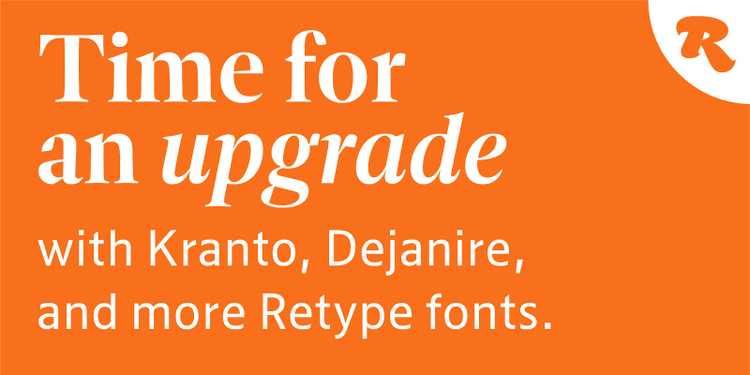
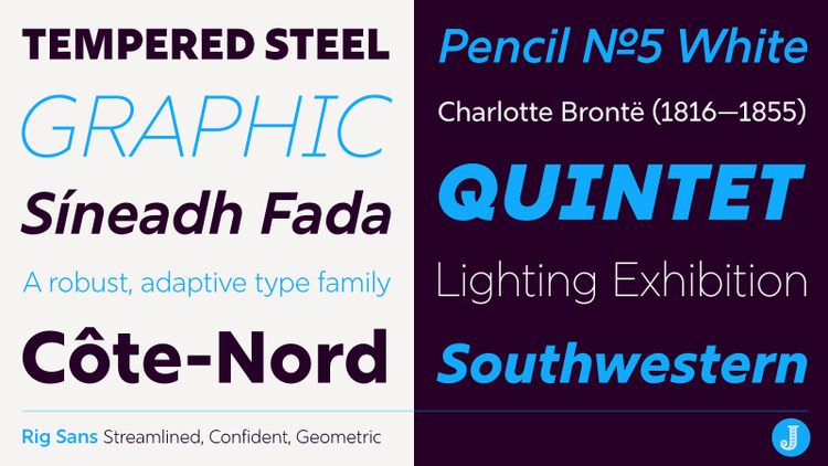
Though an undeniably modern design, Dejanire Headline (top) feels timeless. The versatile sans family Kranto (bottom) can tackle any contemporary design project.
Retype adds two type systems to Adobe Fonts. Dejanire Sans combines the distinguished serif titling face Dejanire Headline with a compact, general-purpose sans serif variant. Kranto Text, Kranto Normal, and Kranto Display have increasingly smaller x-heights. The many weights and three widths—each with surprising Black Inline variants—give this spirited sans serif an impressive breadth.
Single fonts for signature styles
Ramiro Espinoza also treats us to three elegant scripts that will look fabulous on wedding announcements, invitations, or any project requiring a delicate, refined touch. Medusa reinterprets formal English handwriting, Dulcinea finds inspiration in Spanish Baroque calligraphy, and Krul emerges straight from the windows of Amsterdam’s famous brown bars.
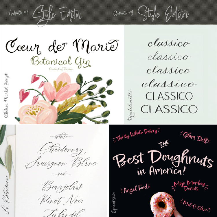
With Tart Workshop’s lovely hand-written fonts, you have an accomplished calligrapher slash hand-letterer at your fingertips.
Sometimes typefaces can look too polished, and you need something a little grittier. Tart Workshop emphasizes the “hand” in hand-written and hand-drawn. Epicursive, Audrielle, and Madelinette are connected brush scripts with slightly irregular contours, La Bohemienne’s fine features dance and twirl on the baseline, and Chelsea Market manages the formidable feat of turning a geometric sans serif into a casual design.
Whatever the requirements of your next project, you’re sure to find some unexpected gems in this batch of fonts. They are included with your Adobe Creative Cloud subscription at no additional cost, so don’t hesitate to activate them and take them for a spin.
