Close out the year with some fresh new fonts

For many of us, business tends to pick up as we near the year’s end. When your schedule gets packed, it pays to have a few fresh font cards up your sleeve to impress your clients. Sample the 339 new fonts included with your Adobe Creative Cloud subscription and show everyone that you’re ahead of the curve.
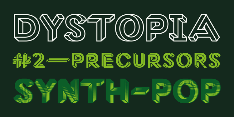
Tradition and innovation in Chinese from Tensentype
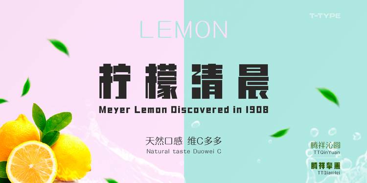
TT QianHeiJ and TT QianYuanJ are two of the many innovative styles in Tensentype’s library.
Tensentype is a well-regarded Chinese type foundry established in 2012 by Jiayu Liu, an experienced type designer from Beijing. Besides high-quality classic text typefaces like the calligraphic Song styles and the modern-looking Hei designs, Tensentype focuses on the development of original, contemporary fonts. From text to display, from formal to expressive — there truly is something for everyone in their library.
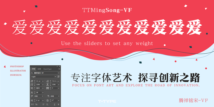
Variable fonts can be fine-tuned to perfection by choosing the desired weight on a sliding scale.
Tensentype also stays on top of cutting-edge technology by collaborating with German company jpFonts on the development of variable fonts for the Chinese script. jpFonts is the brainchild of Dr. Jürgen Willrodt, one of the world’s leading experts on font technology, and Peter Rosenfeld, who set up the renowned URW Type Library and led the worldwide distribution of its fonts and software.
A Dutch icon joins Adobe Fonts
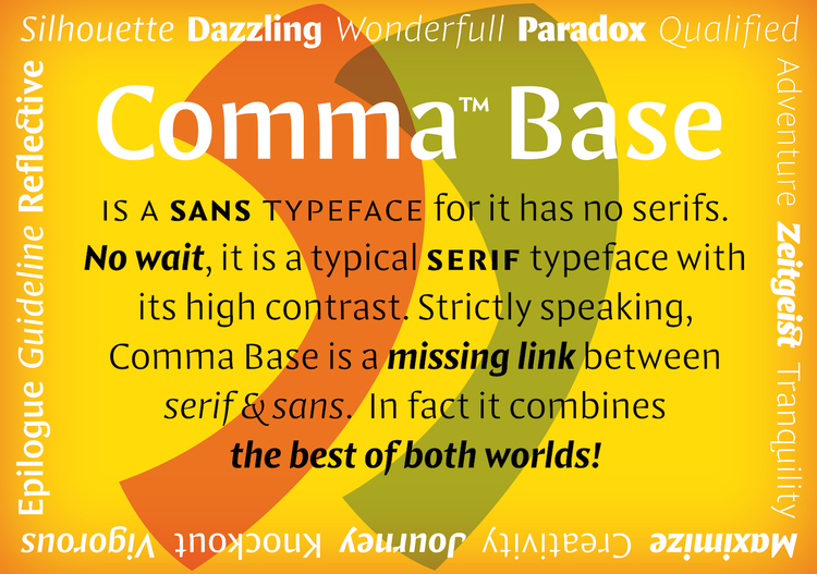
Comma Base occupies a unique place in the typographic landscape: it has the structure and contrast of a serif face but lacks serifs.
Every new typeface release from type designer Martin Majoor is an event. Majoor burst onto the font scene in 1990 with FF Scala, which became an instant and enduring global hit. After publishing additional designs under the influential FontFont banner and collaborating with popular type designer Jos Buivenga on the Questa project, Majoor recently launched his own foundry with the striking Comma Base. Its decisive, sculptural letterforms carve commanding titles on the page and make small text supremely readable.
A new foundry partner and new fonts from Type Network
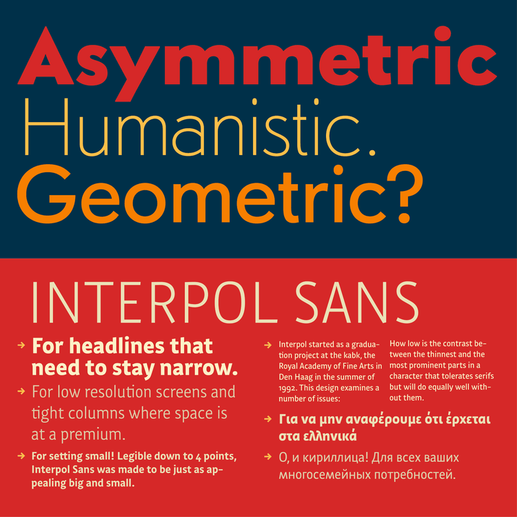
Sonar Sans (top) gives you the best of both worlds, combining geometric and humanistic traits. Interpol Sans (bottom) supports the Latin Extended, Greek, and Cyrillic alphabets.
Drawing on two influential typographic traditions — the Swiss and the Dutch — new Type Network foundry partner Famira Fonts develops versatile type families that can be used in a wide range of applications. Sonar Sans has generous proportions and incorporates humanist touches into a geometric skeleton for improved legibility. Interpol Sans is a space-saving sans serif with clear, open character shapes offering perfect readability in even the most adverse environments. As its name suggests, its sibling Interpol Correspondence has a subtly different flavor reminiscent of typewriter fonts.

Standardized versions of FinalSix’s most idiosyncratic characters can be activated with a stylistic set for editorial design.
Catalan foundry Type-Ø-Tones puts a joyful spin on the geometric sans serif model with FinalSix. The rounded tops, bottoms, and diagonals were inspired by the undulating motion of water in a swimming pool.
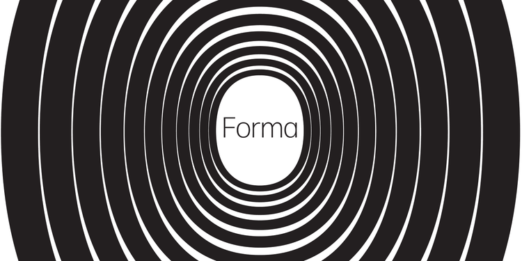
Belgian branding agency Today chose Forma DJR as the face of national broadcast network VRT.
Forma DJR is DJR’s formidable revival of the Nebiolo typeface of the same name. David Jonathan Ross reimagined this lesser-known Italian competitor to Helvetica as an expansive suite in weights ranging from Hairline to Black and in five optical sizes from Micro to Banner. The font family is a typographic powerhouse for complex editorial environments and beyond.
The mind-bending Macula is a favorite typeface of mine.
Macula, a new addition from Bold Monday, applies the optical illusion of the Penrose triangle to create impossible letterforms that dazzle and delight. Besides the composite Shaded weight, the typeface offers four styles that can be layered to create electrifying multicolor compositions.
Graceful curves and curls
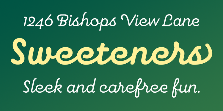
Contextual alternates and discretionary ligatures give Pauline Script non-connecting ending forms and seamless letter connections, respectively.
Inspired by various vintage sources from art deco signage to a simple spice label, Insigne Design’s Pauline Script is a rounded connected script in several weights. Playful with a touch of class, it gives invitations, signage, logos, and packaging a sweet vintage look.

Desire’s extensive character set including 644 alternate letters, 98 ligatures, eight flourishes, and six catchwords makes this elegant serif face a designer’s dream.
Borges Lettering & Design’s Desire transforms every typographic composition into a sophisticated piece of lettering. Let the OpenType features do the legwork for you, or manually pick and choose individual letterforms yourself to create one-of-a-kind logos, headlines, and titling for book covers, magazine spreads, packaging, advertising, branding, and more. Designed by Charles Borges de Oliveira for his daughter, Sadey Ann is a delicate upright connected script that exudes an endearing, childlike innocence.

Glodok has hints of nineteenth-century fat faces.
Another typographic beauty oozing retro grace is Mon Nicolette Toscane, Sudtipos’s interpretation of the intricate Tuscan type style. Use its curly forms in large sizes for fashion magazines, advertising, signage, albums, and book covers. Referencing vintage styles discovered in the oldest Chinatown in Jakarta, Glodok marries round curves with sharp, triangular serifs for a dark and compact, yet graceful, look. Equal measures geometric font and connected script, Confitería Script captures the simple beauty of lettering piped on cakes in branding and advertising applications, as well as on stationery and packaging.
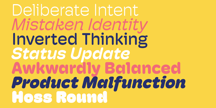
By adding weight at the top and the bottom of the letters, Mark Caneso gave Hoss Round extra stability and a forward motion.
The additions from ps Type are all curves. With a sly nod to the quintessential American feel-good font Cooper Black, the soft, inky Decoy is gentle and personable. Its heavy, round serifs and friendly character instill a sense of calm and comfort. Hoss Round adds bounce to your text. This dependable sans serif’s rounded letterforms and stroke endings make body copy and display text seem instantly warm and approachable.
Le French style, and an English classic with a Czech twist
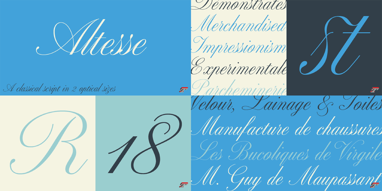
Altesse comes in two optical sizes: use the 24-point version for small sizes to prevent the hairlines from breaking up, and the 64-point version to ensure the finest features in display sizes.
Typofonderie adds a diverse selection to Adobe Fonts. Airco’s ultra-slanted letterforms with blunt corners evoke speed and technology without looking rigid or sterile. Altesse, a contemporary interpretation of copperplate scripts engraved by French writing masters from the nineteenth and twentieth centuries, effortlessly turns you into an expert calligrapher. Arteria Compress allows you to cram the maximum amount of text into a minimum amount of space for punchy headlines and titles. Allumi Inline introduces oblique inlines in upright sans serif letterforms, resulting in a playful, dynamic display face with a fifties vibe. An exploration of the Renaissance style, Basco’s friendly, soft appearance with calligraphic undertones makes immersive reading a frictionless experience.
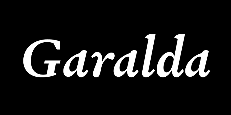
Garalda’s square serifs and idiosyncratic design details make it an undeniably contemporary typeface.
TypeTogether also dips its toe in French typographic tradition with Garalda. Xavier Dupré reinvented the foundational work of legendary sixteenth-century punchcutter Claude Garamond to create a timeless text face that reveals striking typographic details when used big.
Going back to Eric Gill’s original drawings, BC Eric Machat serves up a refreshing look into the classic humanist sans serif’s roots.
Artistically balanced, organic, and calligraphic — BC Eric Machat, Czech designer Matyáš Machat’s interpretation of Eric Gill’s seminal humanist sans, revives interesting variants of individual letters and does away with what Machat considered distracting features. Its condensed sibling BC Eric Machat Headline has narrow letterforms, allowing you to go big in tight spaces. BC Eric Machat Script, a compact, versatile reimagining of Gill’s handwriting, adds a human touch to poster titles, magazine spreads, book covers, logotypes, and signage.
Asian language extensions
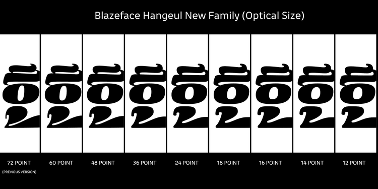
Blazeface Hangeul masterfully captures the spirit of the original Blazeface in Hangeul characters. Minjoo Ham added optical sizes for the best possible rendition at any scale.
Korean type designer Minjoo Ham designed Blazeface Hangeul as a counterpart to OH no Type Co.’s fabulous Blazeface. It translates the organic shapes and unique look of the original Blazeface Italic while respecting both the original typeface and the conventions for the Korean script.
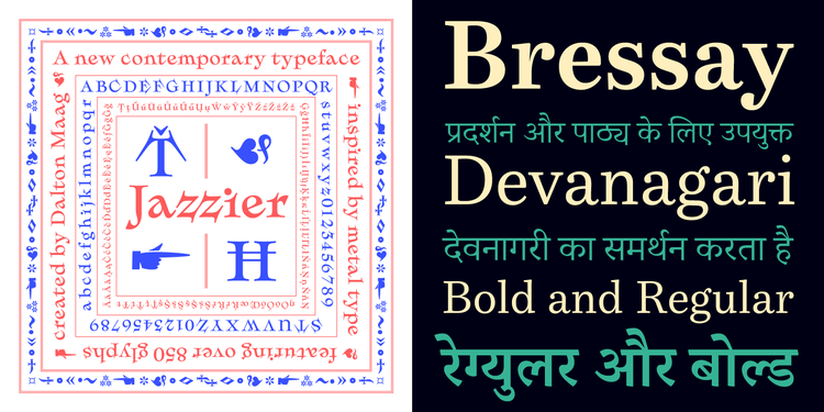
Dalton Maag caters to extremes: Jazzier is an idiosyncratic display font, while Bressay Devanagari is a versatile workhorse face.
After augmenting their workhorse serif family Bressay — which already supported the Latin, Greek, and Cyrillic alphabets — with the Arabic script, Dalton Maag has further expanded its reach with Bressay Devanagari, which covers over 120 Asian languages. A contemporary take on the decorative metal display types of the late nineteenth century, Jazzier’s squat proportions and exaggerated serifs not only stand out in book and editorial design, as well as in music artwork and merchandise, but also prove their mettle across a wide range of packaging applications.
Display type with pizzazz

Fort Foundry delivers three nostalgic typographic gems. From left to right: Alkaline, Cinder, and Pentz.
Though a recent collaboration with lettering artist Jonathan Ball, Alkaline exudes a 1960s atmosphere full of fun and flair. Taking cues from blackletter forms, Cinder’s elongated letters reference the title sequences and lettering of classic animation films from the 1950s. Pentz revives Tedesca, the ornate display face originally designed in the late nineteenth century that appeared on the album cover for Marvin Gaye’s masterpiece What’s Going On. The typeface was developed in collaboration with Commonwealth // McCann for the Motown Museum to celebrate the pivotal album’s fiftieth anniversary earlier this year.
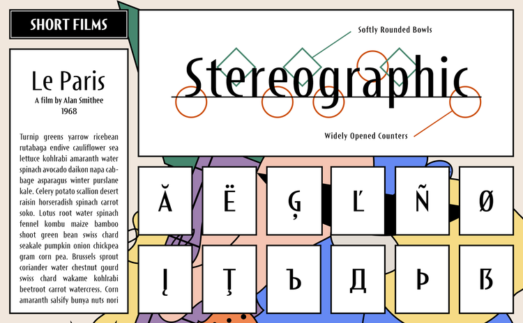
With its soft, rounded bowls and wide open apertures, Short Films adds a touch of class to your designs.
Dharma Type’s modern-looking Best Choice has many uses beyond developing, programming, and coding. Its monospaced design also lends itself to eye-catching titles and body text with a technical vibe. Short Films has a distinct retro flavor that feels perfectly at home on posters and in magazine spreads.

Inspired by decorative typefaces from the Industrial Revolution, Tuppence imbues your designs with a lovely nostalgic air.
Delve Fonts has adapted Rieven Uncial, their modern interpretation of the medieval lettering style, to look more conventional with Rieven Roman. Among many other applications, it’s perfect for suggesting Irish culture without being too on the nose. Tuppence’s wide proportions and inverted contrast project the warmth and craftsmanship of nineteenth-century Victorian type on food and beverage labels, greeting cards, and restaurant logos. Beyond being an affable display sans, Tilden Sans’s Regular and Medium weights produce body copy that is pleasant to read. Its squarish letterforms with incised terminals distinguish it from other sans serif faces.
While Menco’s rounded stroke endings made it look as if it had been routed, Menca adopts a more traditional aesthetic.
Kvant introduces Menca, Menco’s sibling with square stroke endings instead of round ones. The clear, open letterforms create clean, eminently readable text from sizes big to small.
These font families provide exciting new typographic possibilities that will keep you inspired for the foreseeable future. And remember, you can activate any and all of these typefaces at no extra cost and use them in your favorite Adobe Creative Cloud apps.