Discover new horizons with new fonts, families, and scripts

Different levels of “new” appear in this first font roundup of 2022. For starters, one of Adobe Fonts' three new foundries offers a coordinated type system catering to underserved languages on the African continent. There are also new type families, new language extensions to expand our horizons, and new weights that increase the versatility of existing typefaces.
New foundries and scripts

The Kigelia suite of typefaces applies one consistent aesthetic to all variants to achieve a unified multilingual type system for African scripts.
With the addition of JamraPatel, Adobe Fonts makes inroads into supporting Africa’s main writing systems. Kigelia offers typographic richness and technical functionality in the form of a versatile contrasted sans serif family. Kigelia LGC supports the Latin, Greek, and Cyrillic alphabets — Kigelia Ethiopic serves the Amharic, Tigrinya, Tigre, Harari, Gurage, Sebatbeit, Gamo, Basketo, and Gumuz languages of East Africa — Kigelia Tifinagh gives written form to the Amazigh language spoken by the Berber in North Africa and the Sahara region — Kigelia Vai supports the Mande minority language spoken in Liberia and Sierra Leone — and Kigelia Osmanya is a Somalian script of historical importance.
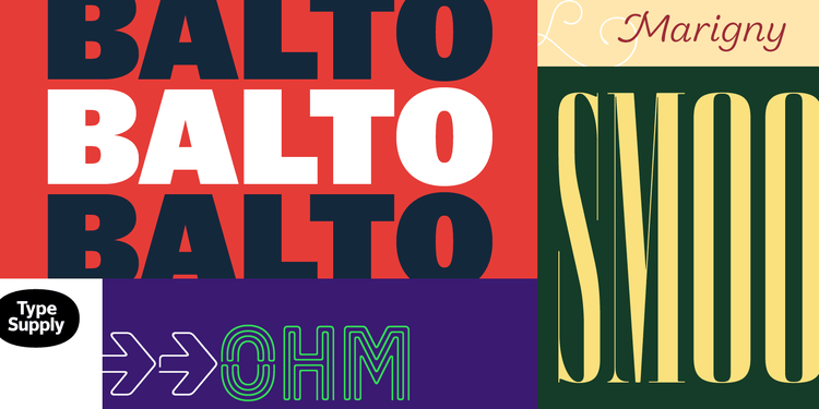
Tal Leming doesn’t just design type — he also (co)authored some of the most valuable type design tools, earning him the appreciation of the typographic community at large.
Adobe Fonts welcomes Type Supply, Tal Leming’s one-man foundry, with six distinct type families. Far from a formulaic revival, Balto is a modern interpretation of the popular American Gothic style that performs equally well in text and display. Marigny’s gentle letterforms with slightly swelling, perfectly round stroke endings give your words a relaxed, chummy look. Queue’s open letterforms were drawn with mathematical precision to deliver crisp, legible text on page and screen. The powerful titling face Timonium carries equal amounts of chrome lettering and ’70s record sleeves in its DNA. If you prefer disco’s neon lights, Ohm conjures up the excitement of sultry Saturday nights and late-night diners. Smoosh is a tour de force in economizing space: it offers the narrowest imaginable letters in a refined, high-contrast style.
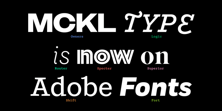
MCKL joins Adobe Fonts with an exquisite selection that features both text and display faces.
MCKL, also new to Adobe, looked at the International Style through the lens of handmade signs in Los Angeles. The foundry added warmth and personality to the style’s universalizing aspirations to create Owners and its sibling Owners Text, which is optimized for small sizes. Router has similar analog sources: the slight swelling of the rounded stroke endings mimics the line quality that results from carving into plastic with a rotating engraver. Years of experience as a graphic designer compelled MCKL’s founder Jeremy Mickel to design Fort, an all-purpose contemporary sans serif family with squared shoulders and counter forms. Taking cues from mid-century typewriter fonts, Logic Monospace is a personable monospace typeface with a unique connecting script variant. Shift is a slab serif steeped in Americana — its personality shifts from typewriter in the lighter weights to titling Egyptian in the heavier weights. The geometric sans serif Specter comes with a dramatic inline display weight. Superior Title can be seen as the missing link between Times and Bodoni, a high-contrast transitional titling typeface with expressive italic swash capitals.
New faces and families
Apparat takes cues from Metro, W.A. Dwiggins’ early twentieth-century design that sought to improve on the geometric sans serif models of the time.
Lettersoup blended the best qualities of geometric designs (balance and consistency of letterforms) and humanist designs (personableness and improved legibility) when creating Apparat. The workhorse sans serif has three additional widths, Semi Condensed, Condensed, and Extra Condensed, each in eleven weights with matching italics, for a total of 88 styles.
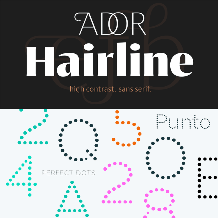
Ador Hairline (top) achieves a dynamic look thanks to its angled stress and finials. Punto’s dots (bottom) gradually vary in size to reflect the thickening and thinning of strokes.
With Ador Hairline, Fontador created a high-contrast sans serif combining friendly, dynamic character shapes with sharp almost-serifs and ink traps. Hundreds of ligatures, contextual alternates, and swash letters make it ideal for logotypes, branding, and editorial design. Punto has more harmonic letterforms than other grid-based fonts because the optically corrected dots always have the same distance between them.
Capitana’s open letterforms make it more readable in smaller sizes than many geometric sans serifs.
Floodfonts’ Felix Braden used basic geometric shapes — circle, triangle, and square — and humanist proportions to design Capitana. Its minimalistic design and almost imperceptible contrast makes it a typeface of choice for on-screen applications like web design and app development.
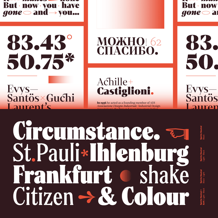
Mixta (top), with its high-contrast serifs and sharp, triangular details, also supports the Cyrillic alphabet. Spirits (bottom) is based on Hermann Ihlenburg’s early twentieth-century design Schoeffer Old Style.
Latinotype’s expansive serif type family Mixta combines different types of terminals to achieve a unique appearance for editorial design, advertising, branding, and on-screen applications. With narrow proportions and a generous x-height, Spirits comes in three flavors: Soft’s gently rounded details give it a vintage air, Neutral’s formal serifs make it a good candidate for editorial design, and Sharp looks the most contemporary.
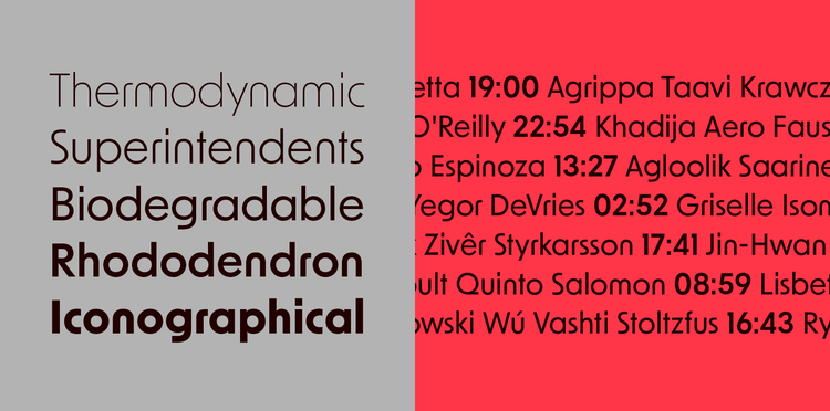
Loretta’s calligraphic forms were forged into a stable typographic framework.
Working with moderate contrast and open character shapes, Nova Type Foundry designed Loretta to be an expressive serif text face for editorial use in books and on the web.
New weights, styles, and languages
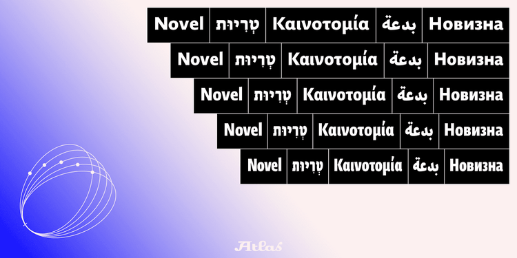
Classic proportions and a calligraphic italic give the modern humanist sans Novel Sans a timeless appearance.
Novel started 14 years ago as a single family of serif fonts and gradually expanded into a comprehensive type system. Atlas Font Foundry’s language expansions for Novel Sans include Cyrillic, Greek, Arabic, and Hebrew.
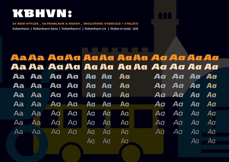
Thanks to the addition of 24 weights in the heaviest range of the weight spectrum, the Kobenhavn series now boasts 106 distinct styles.
To further increase their versatility, Fontpartners drew new Ultra Black and Heavy styles for all variants of their popular Kobenhavn suite of typefaces: Kobenhavn, Kobenhavn Stencil, Kobenhavn C, Kobenhavn C Stencil, Kobenhavn Sans, Kobenhavn Sans Stencil, and Kobenhavn CS.
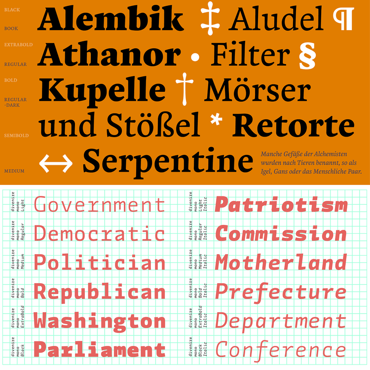
Zenon (top) was developed from the analysis of historical models to create a contemporary roman text type. The angular display sans Divenire’s lack of uniformity (bottom) heightens its readability.
Four new weights — Book, Regular-Dark, SemiBold, and ExtraBold — with matching italics allow users to fine-tune CAST’s serif face Zenon with increased precision for immersive reading or powerful display settings. The dynamic, chiseled sans serif family Divenire’s fixed-width sibling Divenire Mono adds personality to coding and any other application where all characters need to occupy the same amount of horizontal space.
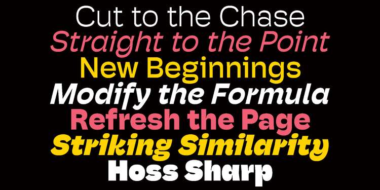
Hoss Sharp’s subtle horizontal contrast guides the reader’s eye along the lines of text.
By making Hoss Round’s stroke endings angular to create Hoss Sharp, ps Type reined in the typeface’s bounciness without losing any of its warm, charming personality.
While Tenon (top) is a performant typeface in its own right, pair it with its serifed sibling Mortise to tackle demanding editorial and branding projects. Auger Mono (bottom) adds variety to programming and other monospace typography.
Similarly, Signal Type trimmed Mortise’s serifs to create Tenon, a design that straddles the geometric and grotesque genres. Auger Mono has been outfitted with a host of alternate letterforms to give it a stylistic range rarely found in fixed-width typefaces, ranging from serviceable to strikingly geometric. And Kōsetsu takes geometry to the extreme: the modular alphabet was constructed by repeating and arranging a single isosceles triangle shape on a grid.
Past forward
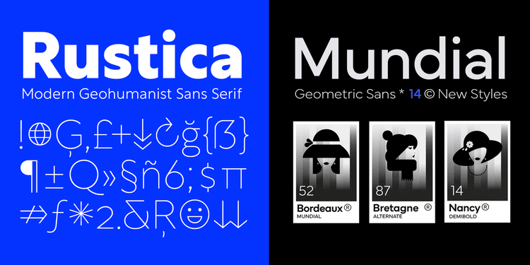
Rustica shares DNA with TipoType’s geometric sans Rotunda.
Rustica looks back at the determined, precise geometry of the classic sans serifs of the early twentieth century and updates it for the twenty-first century. Mundial’s name, which translates as “worldwide,” encompasses TipoType’s idea of synthesizing distinct traits from different typographic traditions to come up with a typeface well suited to these times.
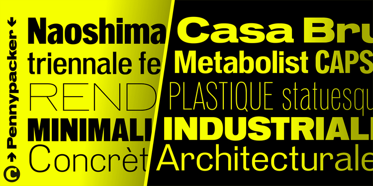
If you’re bored with the mathematical precision of contemporary sans serifs, Pennypacker will add a vintage touch to your designs.
Sturdy and reliable, Pennypacker is CJ Type’s take on the earliest sans serifs. The expansive family in five widths and nine weights marries style with functionality and feels as at home on posters and packaging as it does in mobile apps and digital signage.
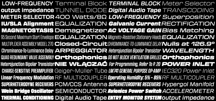
Transducer’s five weights with matching italics in three widths, totaling 30 styles, give the family breadth.
JTD captures the look of yesteryear’s electronic equipment in the boxy Transducer, adding some humanity to the squarish sans serif letterforms. Use it for any tech-inspired project.
New Order’s striking geometric features give the sans serif a surprisingly modern look.
Aside from being a new wave icon, New Order is now a typeface, too. Inspired by the geometric sans serifs that revolutionized typography in the early twentieth century, Newlyn collaborated with Rutherford Craze to create a rigorous, rational family of five for analog and digital use.
New from Type Network
Type Network’s foundry partners have added ten type families to Adobe Fonts.
Though they are versatile typefaces on their own, the identical structure and harmonized weights of Brando and Brando Sans guarantee they combine seamlessly.
From Bold Monday, the foundry named after New Order’s breakthrough dance track, come the siblings Brando and Brando Sans. With clear, open letterforms, the two families are a publishing powerhouse that can tackle any typographic challenge.
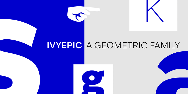
Jan Maack’s subtle interventions increased IvyEpic’s versatility.
The Ivy Foundry tempered IvyEpic’s geometric shapes with slightly tapering stroke endings and a few humanized letters like a and g. These details thaw the coolness usually associated with this typographic genre and improve IvyEpic’s legibility in smaller sizes.
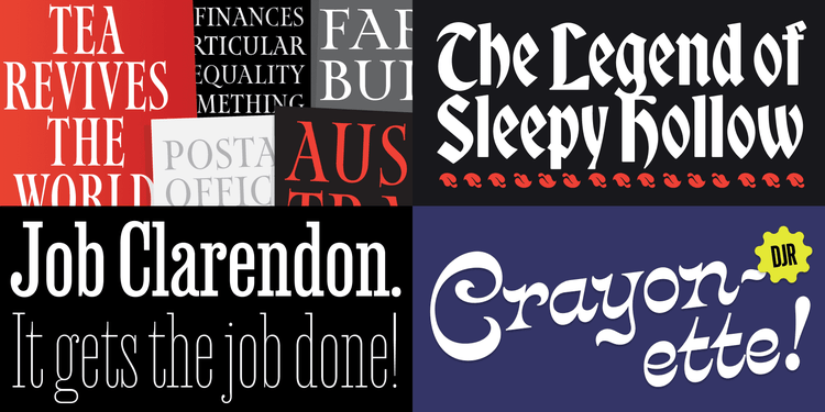
DJR’s eclectic offerings are characterized by a combination of usability and fun.
DJR is unparalleled in discovering obscure, quirky, vintage alphabets and turning them into surprisingly contemporary fonts. Job Clarendon, a joint effort with Bethany Heck, is a condensed slab serif that comes in many weights for all your titling needs. Upon admiring illustrated maps of early twentieth-century British graphic artist MacDonald (Max) Gill, Ross designed Map Roman to replace the ubiquitous Trajan and Perpetua Titling. Bradley DJR is quite literally a fairytale blackletter based on the Sleeping Beauty storybook in Disneyland’s famous castle. The weird and wonderful Victorian script Crayonette DJR makes invitations, menus, packaging, and posters stand out.
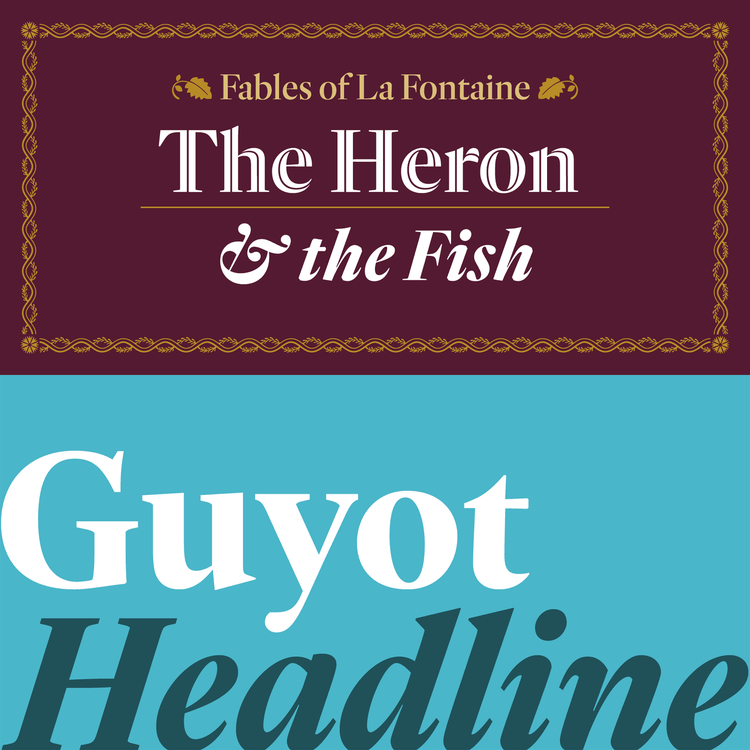
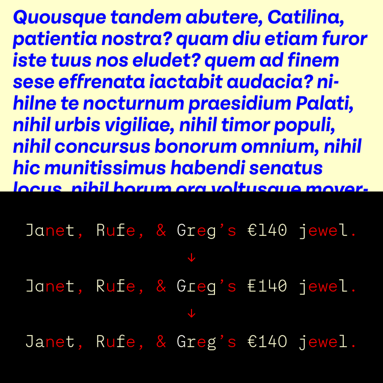
Retype’s Heron (top) has a striking inline variant for headlines. Guyot (bottom) is based on sixteenth-century types cut by François Guyot.
In a similar vein, Argentinian-born Ramiro Espinoza examines both near-forgotten classic types and the vernacular alphabets of the Netherlands he has called home for almost twenty years. With hints of seventeenth-century baroque serif faces, Reiher Headline gives titles in publications a distinguished air. Guyot Text is a reliable workhorse family for immersive reading, while the Headline cut is optimized for display use.
Once again, Adobe Fonts presents Adobe Creative Cloud users with a wide range of new fonts and intriguing possibilities. Activate them now at no additional cost to diversify your typographic palette.