Fresh new foundries and fonts from the Americas, and Hidden Treasures revisited
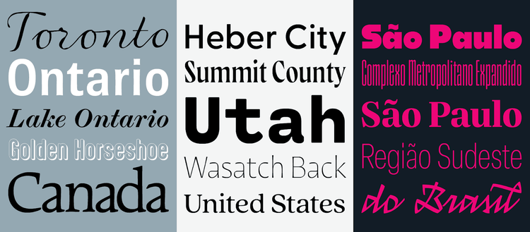
The three new foundries that recently joined Adobe Fonts — Shinntype, Connary Fagen, and Blackletr a— hail from different parts of the Americas: Ontario in Canada, Utah in the United States, and Brazil in the heart of South America, respectively. These three one-person operations have added so many fonts to Adobe Creative Cloud at the same time that we needed an entire roundup to introduce them!
In this article
- Shinntype
- Connary Fagen
- Blackletra
- Two updated Adobe Hidden Treasures
Shinntype
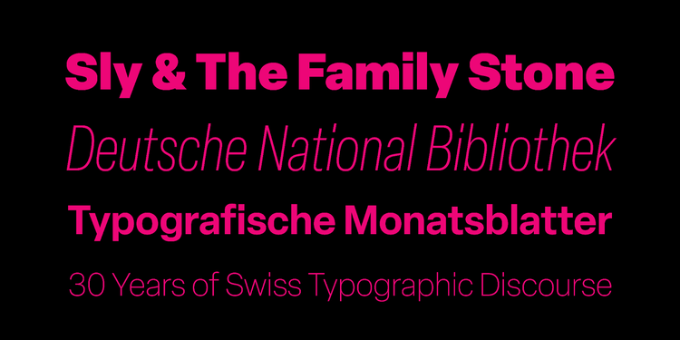
English-born Canadian type designer Nick Shinn of Shinntype purposely stays away from typographic trends and fashions. Instead, he follows his instincts, drawing on decades of experience as a graphic designer and ad agency creative director. His ever-inquisitive mind explores daring concepts when drawing new typefaces. Whether innovation is clearly visible or simmering just beneath the surface, his designs are wickedly useful and always informed by robust typographic research and practice.

Nick Shinn builds on his experience as a graphic designer and art director to create type that is both beautiful and useful.
Marrying high style with perfect proportions, Beaufort Pro looks sharp — literally and figuratively — at any size. Brown Pro’s almost imperceptibly curved straight lines and slightly protruding corners combine softness and sharpness in this workhorse sans serif. Is Paradigm Pro a sans serif with tiny serifs or a serif face without contrast? Whatever you call it, it refreshes a traditional look to suit contemporary editorial projects and branding. Richler Pro PE stands strong on squarish, open letterforms. (“PE” is short for Pan European support of the Latin, Greek, and Cyrillic alphabets.)

With small caps, oldstyle figures, swash characters, and extended language support for most families, Shinntype fonts feature all the bells and whistles for sophisticated text typography.
Shinn has a firm grasp of typographic history. The Modern Suite finds him revisiting London from the Industrial Revolution: the elegant Scotch Modern with its fine, long serifs and Figgins Sans, a contemporary take on early British sans serifs, form a distinguished duo for publication design. Bodoni Egyptian Pro investigates how eighteenth-century master Giambattista Bodoni would have drawn a monoline slab serif today. Going back to Nicolas Jenson’s 1467 foundational roman type, Goodchild Pro is optimized for complex typography, specifically immersive reading. Dair pays tribute to the first roman typeface designed by a Canadian, Carl Dair’s Cartier. A narrow fit and large x-height guarantee optimal legibility for this space-saving family.
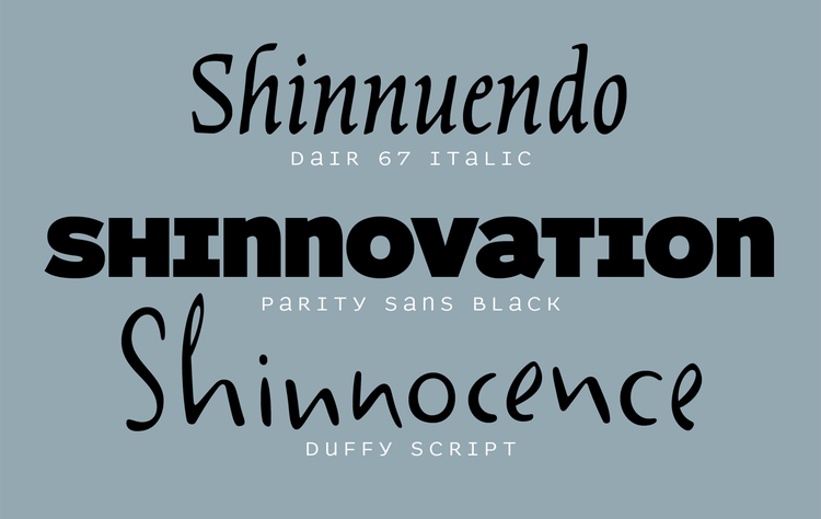
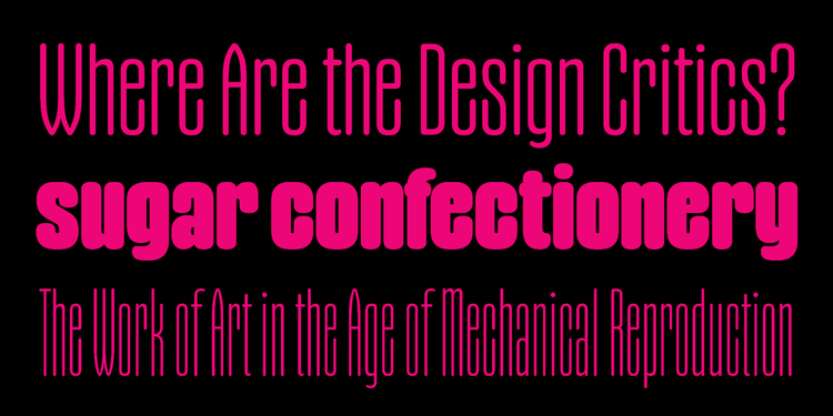
Nick Shinn’s type designs range from interpretations of historical faces and genres like Dair, to typographic investigations like Parity Sans, to just plain fun fonts like Duffy Script.
With Parity Sans, Shinn experiments with alternating uppercase and lowercase forms to create a surprising font family for posters and advertising, packaging and branding. Handsome Pro investigates how shaping the same cursive handwriting with different writing instruments changes its appearance — above all, though, it’s a lovely, connected script face. If you prefer your script unconnected and casual, Duffy Script alternates between four variants for each letter to create the illusion of actual handwriting. Shinn explores constraint-based design with Aptly, a condensed, rounded display face reminiscent of industrial lettering pressed in metal. The display face looks great on posters and book covers and can also be put to good use in packaging and branding. The sans serif and the serif variants of Gambado joyfully bounce along the baseline, making them a wonderful candidate for games and candy wrappers, comics and children’s books.
Connary Fagen
After stints doing agency and freelance work as a graphic designer, Connary Fagen’s love of art, the written word, and learning new languages led him to start up his own type design studio slash foundry in 2015. Fagen sees type design as a continuous discipline — he tirelessly updates his fonts with new features, additional language support, and more whenever he deems it necessary.

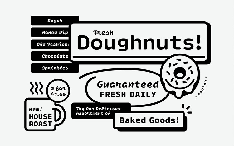
From general-purpose font families to striking display types, Connary Fagen offers a comprehensive typographic toolbox for all your communication needs.
Greycliff CF is the all-around typographic solution you didn’t know you needed. Open letterforms and a generous x-height guarantee excellent readability, while rugged shapes and soft corners lend the geometric letterforms warmth and approachability. The expansive family includes the Latin, Greek, and Cyrillic alphabets, and offers additional language support with Greycliff Arabic CF, Greycliff Hebrew CF, Greycliff Thai CF, and Greycliff Gurmukhi CF. Fagen tapped into the universal appeal of the International Style to create Articulat CF, a multipurpose neo-grotesque whose letterforms don’t get in the way of your message. Manifold CF’s squarish shapes lend themselves to technical copy, posters, and headlines, as well as to branding and packaging of tech products.
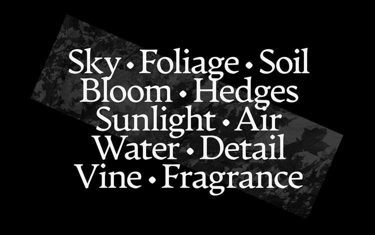
Artifex FX is a gentle, reliable text face that embraces readers’ minds and soothes their eyes.
The serif and sans serif siblings Artifex CF and Artifex Hand CF form a coordinated set of smooth, text-friendly typefaces built for human-centered editorial projects. Similarly, no sharp corners can be found in Quincy CF, whose generous letterforms create a fluid reading experience. Argent CF is a little more serious, a business-like text face with a personable air. Fagen also offers fonts for programming that don’t look cold or technical. Cartograph CF and Ellograph CF feel just as at home on a page of code as they do on posters and in magazines and user interfaces.
Ellograph CF puts the fun in functional. Who said coding should be tedious?
While most of his typefaces are characterized by their versatility and ability to be deployed in a wide range of applications, Fagen also designs display types that have personality in spades. Quiverleaf CF’s slender, lithe letterforms are reminiscent of the gorgeous hand-painted lettering on book covers from the mid-twentieth century. Wayfinder CF’s high-contrast letterforms with sharp features manage to strike the perfect balance between commanding and agreeable. Both font families will make your posters, magazine spreads, advertising, and packaging impactful and memorable.
Blackletra
Established a decade ago, Blackletra is Daniel Sabino’s São Paulo-based type foundry. Besides developing custom and retail typefaces, he also designs lettering and logotypes. His typefaces are rooted in typographic history and often display calligraphic influences. Sabino’s experimental streak spices things up, producing a surprising and exciting undercurrent in his designs.
Elza offers typographic versatility in a wide range of weights and widths, plus size-specific cuts.
Sabino understands the need for size-specific cuts for optimizing legibility in small sizes while enhancing the character of titles and headlines. Silva Display and Silva Text comprise a type system for publication design. Their economic width, generous x-height, and robust serifs make them fit for onscreen use too. The differences between Ofelia Display and Ofelia Text are subtle but essential. They guarantee that this utilitarian sans serif with clear, open letterforms looks its best in any setting. Elza is an all-in-one typographic system for complex typographic environments. Not only does Sabino offer a text version with Elza Text — an often-overlooked necessity in grotesk sans serifs — but he offers users additional flexibility with Elza Narrow and Elza Condensed, for whenever more characters need to fit on a line. Built with geometric shapes and sporting sturdy slab serifs, Elizeth also has a space-saving variant: Elizeth Condensed.
Limited space? Gothiks offers unlimited options for fitting headlines and titles in the narrowest columns imaginable.
It’s in his display work that Sabino’s knack for finding new, refreshing approaches to typeface design comes to the fore. This results in display faces with distinct personalities. Noka dials the geometry of its sans serif letterforms up to eleven to achieve maximum impact. While it adheres to a strict hexagonal grid, Gandur New is still influenced by pen-drawn blackletter design for a more humanistic, contemporary appearance. Gothiks’s rhythm and texture are also informed by Textura types, but its letterforms lean more toward mid-twentieth century titling types. Their vertical structure lends itself naturally to extreme condensation. The strokes of Gothiks Round’s characters end in half circles for a softer look. Taking the opposite route of most script fonts, Haltrix is a striking connected script whose angular letterforms carve decisive words on the page or screen. It comes with several swashes and alternates, and offers extensive language support.
Noka packs a punch in compact letterforms for powerful display typography.
It’s impressive how just three foundries can add such a wealth of expression to your typographic arsenal. Fire up any of these new typefaces in Adobe Creative Cloud to explore new avenues in design and publishing.
Two updated Adobe Hidden Treasures

Some typefaces reveal new potential over time and invite their designers to take another stab at them. In its constant pursuit of excellence and desire to offer users the best possible typographic tools, Adobe Fonts presents an improved version of Alfarn and two new styles for CarlMarx.
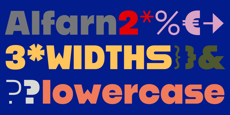
Alfarn captures the spirit of 1920s Bauhaus-influenced posters — a timeless style suitable for contemporary designs.
Céline Hurka reworked Alfarn, released in 2018 as part of Adobe’s Hidden Treasures of the Bauhaus Dessau. The typeface was originally an all-caps design based on the capital letters Bauhaus student Alfred Arndt drew in 1923 for a poster advertising a bakery in Jena, Thuringia. Alfarn 2 introduces a completely new lowercase and includes more extensive language support, two sets of punctuation, and a full redesign of the three uppercase widths and small caps.
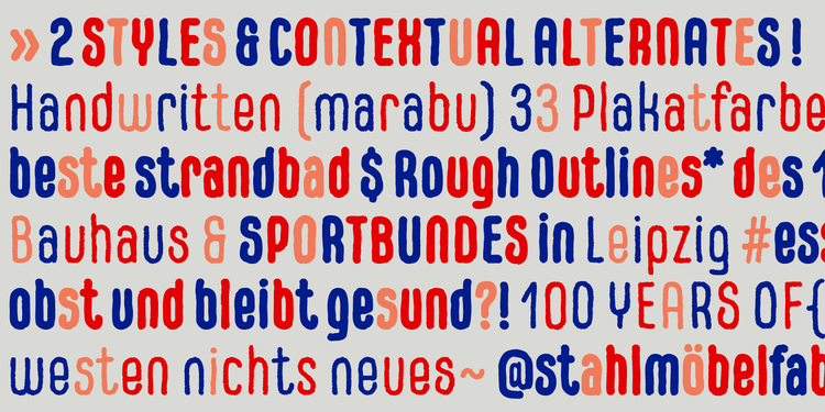
CarlMarx’s letterforms were not constructed using a compass and ruler, but drawn with brush and marker, lending the words a warm, lively touch.
CarlMarx Handwriting is an additional style for Hidetaka Yamasaki’s CarlMarx type family from the same collection. The design is based on lettering by Carl Marx, designed in 1932 during his first semester at the Bauhaus in Joost Schmidt’s class. The wobbly glyph outlines of this new variant create the impression that the letters were written in ink on paper. Almost all characters have several slightly different alternate forms. They show up randomly when the Contextual alternates OpenType feature is activated and produce a genuinely handwritten effect.
Ironic but true: by traveling back in time with these cutting-edge updates of historical alphabets, you’ll give your typography a refreshingly contemporary kick.
