If you’re still enjoying a summer break, having time off is the perfect opportunity for getting fresh ideas by experimenting with new fonts. Or if you’re already back-to-school or work, why not test-drive new typefaces in a real-world setting? Whatever the case, there’s plenty of inspiration to be found in the latest additions to your Adobe Creative Cloud subscription.
Traces of Japanese, Chinese, and Korean calligraphy permeate Neil Summerour’s fine brush scripts. His love for these styles is on full display in Positype’s latest additions to Adobe Fonts. Baka and Baka Too, Fugu, Nori, Cherry Blossoms, and Dream Big allow you to pick out the exact writing style you are looking for. The script Good Karma offers a Smooth option, as does the high-contrast script Rough Love, with its Love Script variant. Also using a fine brush, Summerour drew very narrow sans letters to create Romp. So Lovely mimics writing with a pen on rough paper. Shameless is a tight and energetic script, while the monoline Flirt Script woos the reader with its loose, gentle loops.
Scotch is a suite of serif faces for editorial projects. It consists of Scotch Text for body copy, Scotch Deck with finer details for larger sizes, and the exquisite Scotch Display for distinguished titles. All three variants come with a Condensed width for situations where space is tight, and even Compressed weights for the Deck and Display cuts. The extra wide Halogen has acquired two siblings: Halogen Flare’s stroke endings widen ever so slightly for an incised look, and Halogen Slab has been outfitted with decisive serifs.
Ice Cream’s luxuriant curves and swirls occupy fruitful ground between formal and casual styles. Kari adds a little lilt by connecting the characters and enhancing the display versions with cute, curly details. Rhythm is a groovy display script that seems ripped straight from early twentieth-century jazz albums. Juicy’s styles can be layered to create multicolored (sometimes called “chromatic”) typography. Its extremely bold letterforms make Courage a visually striking display face.
Adding a single weight to a family might not seem like a big deal, but it highlights Dalton Maag’s level of attention to detail. The new Semibold weight enables you to fine-tune the multilingual superfamily Aktiv Grotesk to your exact specifications. Also new is the flexible Venn, an all-purpose sans serif in five weights and five widths. If you like your fonts tight, the compact Monte Stella offers a second, ultra-slanted oblique style called Turbo that adds extra velocity to words. If, on the contrary, you’re more into expansive type, try the aptly named Widescreen. Its innovative Mixed style alternates the Normal, Extended, and Ultra widths, offering a ready-made solution for motion graphics and dynamic typography. Another wide type family is Shader, with its decorative sibling Shader Inline. Their futuristic look is ideally suited for gaming, energy drinks, and activewear.
There is casual type, and then there is Caraque, a friendly display sans with rounded stroke endings whose unique Melted variant is devoid of any straight lines or angular corners. The ethereal Neumond is quite the opposite: ultrafine, long serifs adorn tense yet delicate letterforms. And Mendl Serif is a throwback to the art deco movement, perfect for luxury-goods packaging.
Korean type foundry Design210 showers us with new options for Hangeul. If you’re tired of formal fonts, you’re in for a treat: 210 Epilogue’s and 210 Eorinai’s letterforms look like they were hand-printed with a fine marker, while 210 Bucketlist appears to have been written with a brush pen. The casual sans 210 Cracker looks so tasty you’ll want to bite off a chunk. Because 210 Manyeosoop is constructed out of tiny straight lines, it looks extra crispy. 210 Santorini’s blunt corners lend it a friendly feel.
Users who enjoy futuristic geometric fonts will appreciate 210 Mamablock. 210 Timeline’s wide letterforms give off a full-blown sci-fi vibe, while the narrow 210 Tinkerbell sports a distinct contrast between vertical and horizontal strokes. The striking 210 Sogeumjaengi is constructed exclusively with straight line segments and angular corners. 210 Yeonnalligi is a rather relaxed sans serif style with subtle wavy features. 210 Cheoeumcheoreom adds small serifs for extra schwung.
Tart Workshop creates handwritten and hand-drawn fonts that look great not only on cards and invitations, social media, and scrapbooking, but also on posters and packaging. Salthouse is a narrow slanted all-caps sans serif drawn with a fine brush. Moonblossom’s sans serif capitals are a little more regimented, but still full of vitality. Hey Eloise is upright and looser, with a convincing Watercolor variant that uses the power of SVG to create the illusion of words painted in watercolor. So does the curly script Chelsea Market Watercolor, and the all-caps Fiora Monograms even adds full-color flowery capitals. OpenType magic makes it seem as if the energetic Lindsey Signature was scribbled by hand. The personable, hand-drawn serif capitals of Romana look less formal than purely typographic options. Carrotflower is a casually printed sans serif whose scrawled forms and irregular baseline make it appear to dance.
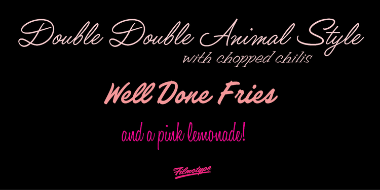
The connecting scripts Filmotype Yale and Filmotype Yukon are two exquisite examples of formal penmanship. Sign painter scripts, very popular in the 1950s, have made a well-deserved comeback. You can sample all the different flavors with Filmotype Lucky, Filmotype LaSalle, Filmotype Keynote, Filmotype LaCrosse, and Filmotype Honey. Filmotype Carmen is a casual slanted brush serif that is deliciously retro.
Thanks to its friendly, easygoing demeanor, Darden Studio’s versatile Omnes has become one of the most popular rounded sans serifs. Having already been augmented with the Cyrillic and Arabic character sets, this approachable font family now also writes in Greek and Georgian.
Device Fonts’ rounded, geometric Droog flawlessly nails the aesthetic of seventies comic books, album covers, and candy wrappers. Guildhall’s sharp, tiny serifs ground the face’s tight, strong letterforms. Wilko is anything but sharp and offers Highlight and Inline variants. Panther Black jumps straight from the popular comic books and movie to your computer.
Rian Hughes also knows how to create expansive, multifunctional type systems. Urbane Condensed, the space-saving member of the Urbane family, joins previous additions Urbane Rounded and Urbane Adscript.
Büro Destruct keeps treating us to remarkably idiosyncratic typefaces. BD Supper is a personable, humorous display sans that combines geometric and organic qualities.
Type Network’s foundry partners prolifically add font families to your Adobe Creative Cloud subscription. Read on to discover what you’ll find in the latest batch.
Bold Monday added a new language extension to the sans and slab serif siblings Brando and Brando Sans: Brando Arabic. The smooth Nitti is a surprisingly warm monospaced design, while the gritty Nitti Typewriter variant goes back to its mechanical roots. Quinn Text is a sturdy, crisp serif face for immersive reading; its titling counterpart Quinn Display tackles the larger sizes in book design and editorial projects. More than simply a serif typeface in regular and condensed widths, Mala offers ornamental swirls and swashes inspired by ancient cartography that will surprise and delight adventurous typesetters.
PampaType brings its Latin sensibilities to Amster, a lyrical text face with sharp features that combines charm and excellent readability. It offers a multitude of ligatures, ornaments, and contextual alternates.
Retype added a new variant to their Guyot Text and Headline combo. Guyot Press has shortened ascenders and descenders for more compact typesetting. Named in homage to Argentinian feminist activist Mabel Bellucci, Bellucci is a compact, constructed headline face for use in editorial and poster design.
Ending the latest additions with a bang, Greg Thompson’s Agenda is one of the iconic typefaces of the nineties. The extensive family was completely overhauled and relaunched as Agenda One. The pristine, sleek humanistic sans is a typographic all-in-one solution in Regular, Condensed, Extra Condensed, and Compressed widths and weights ranging from Thin to Black.
There are so many exciting new fonts in this release it’s hard to decide where to begin, but they’re all available at no extra cost in your Adobe Creative Cloud subscription.
Adobe Fonts
Unlimited fonts, no extra charges, already licensed.
Learn more